Mobomo webinars-now on demand! | learn more.

We are excited that our team has been selected as one of the 20 Phase 1 winners of @NIOSH’s Respirator Fit Evaluation Challenge! We are thrilled to be recognized for our innovative approach to respirator fit evaluation. Our team has been awarded a prize of $5,000 and we now move on to Phase 2 of the challenge, where we will prototype our solution. To learn more about the challenge and the other winners: bit.ly/3PPdxuW.

To learn more about Mobomo: www.mobomo.com

Author

Understanding-the-Scaled-Agile-Framework

Whether you're a business looking to build a world-class website or a government entity looking for a custom CMS solution that ticks all-the-boxes, finding the right CMS provider is the single most important step in your website journey. But how do you find the right partner? For government projects, website needs and budgets may need to be carefully defined in a solicitation guide for contractors. Businesses, on the other hand, often forge website proposals to send to multiple agencies.

So, what should you include in these proposals and solicitation guides? After all, choosing the right partner can make-or-break your entire website, and you need a holistic, best-fit partner to execute your website project with fervor, ambition, and purpose. Here's the scary part: over  30% of IT projects fail to meet initial guidelines, over 45% fail to meet the budget, and a terrifying 14% outright fail. A carefully crafted website proposal and solicitation prevents website failures and gives your CMS creator a concrete guideline for your website execution.

A Checklist for Your CMS Creator

Before you start writing your website guidelines, you need to know exactly what to include. Writing any type of proposal or solicitation guideline is a monotonous, labor-intensive process. It involves plenty of workshopping, stakeholder touchpoints, and language crafting. So, despite your guideline being a make-or-break component of your website design, many public and private bodies rush through their guideline and hope to discuss downstream details with their provider in-person. That's a bad idea. Your guideline sets the tone for your entire project. You want a thorough, well-defined project scope, and you want to include as many details as possible without overwhelming potential providers.

Let's look at a checklist of every core component your CMS project guideline should have.

What is Your Budget?

Let's start with the big one: budget. While capital isn't necessarily synonymous with beautifully-designed and hyper-functional CMS websites, your budget may restrict your features. You should be upfront and honest with your budget requirements. Every website has one goal: delivering wonderfully purposeful experiences. Your budget will help determine how those experiences get delivered.

An expert CMS designer will be able to help you work within your budget. You may need to shed some "wants" and focus on less-disruptive designs if you have a low budget, but that doesn't mean you can't create an impactful website. If you're honest and upfront about your overall budget, you'll find the most appropriate CMS provider for the job.

What Are Your Aesthetic and Functional Requirements

There are two primary types of website needs: functional and aesthetic. Your functional needs involve features and your overall CMS architecture. These needs contribute to the bulk of your website. You may need custom modules, API integrations, and modular components that deliver meaningful experiences to your customers. Sit down with your stakeholders and discuss what your website needs to do in a functional capacity. Again, your CMS provider will help you immensely with this step. They have the technical experience to navigate the increasingly-complex website component ecosystem, and they'll help you drill down and articulate the types of features you want.

Aesthetic requirements are very personal. Often, your aesthetic needs are based less on your target audience and more on your brand. Who are you? What colors, designs, and patterns represent you? And how can you leverage your brand in a very physical and aesthetic way? 86% of people say that "authenticity" is a key consideration when choosing who to do business with, and using a simple brand color can boost recognition by 80%.

Who is Your Consumer?

Touch base with your stakeholders and consider your end-user. Who is going to be using your websites? And how are they going to be using it? As an example, a public agency looking to create a public-facing news website may want to appeal to a broad, less-defined audience, while businesses often lean into buyers' personas and target audiences. Generally, the more defined you get, the better. Websites that leverage personas are 5 times easier to use for those targeted users.

While we heavily recommend discovering your end-user upfront, this is an area that an expert CMS creator can help you with. At Mobomo, we leverage over 16,000 modules to architect one-of-a-kind Drupal-based CMS solutions. So, we have a wealth of experience in building niche, user-driven solutions for a variety of public and private bodies. We can lean on that experience to move you towards an ideal user. But it's best to come at least semi-prepared.

Who is Your Internal User and What Are Their Needs?

Along with customers, you need to consider your internal users. For internal CMS websites, this is your entire audience. Otherwise, consider who will be using your website internally. Unfortunately, many people ignore internal requirements. Customer-facing websites often get drenched in feature-rich, hyper-visual design with tons of bells-and-whistles while internal users are left to pick apart the scraps. Clunky, outdated modules and generic UIs plague internal pages. But they shouldn't. Creating an internal website that's easy-to-use, engaging, and mobile-accessible can drive productivity and reduce workplace frictions.

During your proposal or pitch, discuss your internal user needs. Any industry-leading website designer will be able to deliver spectacular solutions that cater to internal users or amazing customer-facing websites with easy-to-use back-end architecture for internal developers.

Understanding Needs vs. Wants

Separate your needs from your wants. Not only does this help prioritize your features, but it gives you financial flexibility. For example, a CMS provider may see your proposal and be capable of delivering 95% of your proposal for the budget specified. Having a clear and comprehensive need vs. want structure helps them identify which areas they can exclude. Additionally, categorizing needs prevent you from being approached by providers and creators that may try to haggle with you and exclude must-have features.

Ideally, you want every single feature specified in your proposal, but that may not be possible within your budget. Give CMS providers flexibility and wiggle-room to approach you with a best-fit solution.

Mobomo Can Help You Build Your Dream CMS Website

At Mobomo, we fearlessly pursue rich experiences that go above-and-beyond expectations. Our agile-driven development process and hyper-customizable websites are intricately designed, purposefully experienced, and entirely brand-driven. Are you looking for a world-class government website or business solution?
Contact us
. We're ready to help you create websites built on fundamentally disruptive and security-driven architecture.

Categories
Tags
Author

pros-and-cons-of-an-agile-engagement-model

Seventy-one percent of organizations use Agile to drive their app development process. By now, most of you have already heard agile-fanatics screaming from the rooftops and corporate execs using the word "agile" as if it's the most modish term on the planet. But what is agile, really? It can be difficult to wade your way through the dense forest of hype artists and the trendy alphabet soup of "agile-like" acronyms to discover the real, tangible meaning of agile.

So, let's cut through the red tape, ignore the trendy buzzwords, and uncover the truths of agile. No. It isn't a catch-all development solution, and it certainly isn't perfect for every development project. In fact, agile has some serious downfalls that seem to be excluded from those 25-page long "Agile Manifestos" that developers and companies are putting out at the speed of light.

To be clear, we're agile "fanatics." We're SAFe certified, and our entire motto (i.e., PUSH) is driven by agile-thinking, and we've used agile methodologies to execute massive-scale projects like NASA.gov 2.0 and The United Service Organizations' app. However, we're going to take a step back. Let's put away the biased hats, ignore the hype, and dig into the nitty-gritty of today's most popular engagement model. Here's everything you need to know about the agile engagement model.
 

What is an Agile Engagement Model?

Engagement models are frameworks that define the relationship between an outsourced development team and your company. In other words, engagement models are "how" your app is getting executed, and your project is being delivered by your development team. There are a wide variety of engagement models, and each of them has specific pros and cons.

Agile engagement involves rapid-fire iterations, immense flexibility, and plenty of collaboration. The overarching goal of agile is (as the name suggests) marketplace agility. So, when the environment outside of your development team changes, agile gives them the tools to quickly react to those changes. Typically, agile development teams have daily meetings, use tools like Kanban boards to execute bite-sized chunks of development, and have the flexibility to rapidly change requirements and needs based on internal and external factors.

In today's fast-paced, digitally-drenched software development lifecycle, agile brings a ton of value to the table — especially on long-term projects that have to cross that oh-so-scary "pit of scaling." According to PMI, 70% of organizations use agile development today, so it's certainly a popular and results-bearing approach to software development.
 

When Does Agile Make Sense?

Since agile requires strong cultural structures, unparalleled collaboration, and iterative-driven strategies, it's best for outsourced projects that leverage in-house teams. In internally-driven development cycles with in-house teams, agile is often used to execute from start-to-finish. However, when you're leveraging outsourced developers, start-to-finish projects may work better with more traditional engagement models like firm-fixed — since they prevent cost-traps and unnecessary cost scaling.

Agile really starts to shine when either:

In the first scenario, your outsourced team will send boots-on-the-ground to your location (or Zoom-on-platform in today's ecosystem). These are people who integrate themselves into your business, so you can push cultural and collaborative requirements onto them. In the second scenario, it doesn't matter as much if you have in-house or external outsourced teams — since you don't have to worry about cost-traps or over-the-scope project requirements. To be clear, agile is very powerful in these two situations. In fact, we would argue that agile can completely change your delivery cycle and help you create more fantastic customer experiences. But there are also plenty of situations where agile isn't strong.
 

Understanding the Pitfalls of Agile

We love Agile. Being SAFe certified, we leverage agile to execute massive government projects and huge client apps. But, despite the hype, there are very real situations where agile simply doesn't make sense. In particular, agile engagement models — meaning you are using outsourced development to execute and grow a project  — are tricky to leverage on from-the-ground-up projects. For starters, agile's iterative and flexible processes don't lend themselves well to budgetary projections. You don't get a firm, upfront quote like you would with firm-fixed. Since project requirements change throughout the lifecycle, agile can breed unpredictability and budgetary concerns into off-the-ground launches (i.e., costs change with the growth of the project and as new demands hit your outsourced team.)

Also, there's a tangible scope issue. Agile development doesn't have a set-in-stone scope. So, it's easy to overthink and over-scope projects with agile. You may start feeding new requirements to your outsourced team on a regular basis. And while these requirements may be things you desperately want, they also incur additional costs. Over time, your budget may grow out-of-control. This can also cause relationship frictions between you and your outsourced partner. The raw flexibility and scalability of agile are exactly what makes it so dangerous for some projects. Requirements can spiral out-of-control.
 

Which Engagement Model Works for Your Business?

There's no such thing as a perfect engagement model. But there is a perfect engagement model for your unique project. Obviously, agile is the most hyped, utilized, and championed engagement model in today's fast-paced development ecosystem. And for good reason. It's amazing. But it isn't ideal for every project. Unfortunately, the disadvantages of agile often get drowned out by the agile fanatics. Not every project fits with agile, especially full builds that leverage outsourced talent.

Will agile work for you? It depends! If you're looking to support an ongoing app or bring over an internal team of outsourced experts, agile could help you execute faster, smarter, and with more purpose. But if you want an off-the-ground app via outsourced talent, agile may put you in a dangerous cost-cyclone that's detrimental to your finances, forecasting, and relationship with your outsourced solution. Are you looking to create an amazing project?

Contact us. We have the skills, experience, and frameworks you need to execute projects across a variety of engagement models. From firm-fixed to agile and beyond, we're here to hand-pick the best solution for your business.

Categories
Author

argument-open-source

Inc. magazine today revealed that Mobomo LLC is No. 4742 on its annual Inc. 5000 list, the most prestigious ranking of the nation’s fastest-growing private companies. The list represents a unique look at the most successful companies within the American economy’s most dynamic segment—its independent small businesses. 

“This is all about our awesome team,” said Mobomo CEO, Brian Lacey. “You can't make it on the Inc 5000 list 8 years in a row without an elite team of designers, developers, operations engineers, and managers leading the way and that is exactly what we have here at Mobomo. Congrats and thank you to all of Team Mobomo, both past and present, that have been a part of this accomplishment.” 

Complete results of the Inc. 5000, including company profiles and an interactive database that can be sorted by industry, region, and other criteria, can be found at www.inc.com/inc5000.

More about Inc. and the Inc. 5000


Methodology

The 2020 Inc. 5000 is ranked according to percentage revenue growth when comparing 2016 and 2019. To qualify, companies must have been founded and generating revenue by March 31, 2016. They had to be U.S.-based, privately held, for profit, and independent—not subsidiaries or divisions of other companies—as of December 31, 2019. (Since then, a number of companies on the list have gone public or been acquired.) The minimum revenue required for 2016 is $100,000; the minimum for 2019 is $2 million. As always, Inc. reserves the right to decline applicants for subjective reasons. Companies on the Inc. 500 are featured in Inc.’s September issue. They represent the top tier of the Inc. 5000, which can be found at http://www.inc.com/inc5000.


About Inc. Media

The world’s most trusted business-media brand, Inc. offers entrepreneurs the knowledge, tools, connections, and community to build great companies. Its award-winning multiplatform content reaches more than 50 million people each month across a variety of channels including websites, newsletters, social media, podcasts, and print. Its prestigious Inc. 5000 list, produced every year since 1982, analyzes company data to recognize the fastest-growing privately held businesses in the United States. The global recognition that comes with inclusion in the 5000 gives the founders of the best businesses an opportunity to engage with an exclusive community of their peers, and the credibility that helps them drive sales and recruit talent. The associated Inc. 5000 Conference is part of a highly acclaimed portfolio of bespoke events produced by Inc. For more information, visit www.inc.com.

For more information on the Inc. 5000 Conference, visit http://conference.inc.com/.

Categories
Author

argument-open-source
The PRNews Digital Awards program recognizes the most innovative and industry-altering digital communicators and campaigns. This year, the Maximus New York State of Health (NYSOH) Mobile Upload app received first place in the Mobile App category. Mobomo has been a partner to Maximus for product design and development for the last three years and now have won back-to-back PRNews awards – also winning the 2019 PRNEWS Digital Award for the Healthy Louisiana Mobile App.

ABOUT THE APP

In partnership with Mobomo, Maximus launched the NYSOH Mobile Upload app in October 2019 which streamlines the health insurance program eligibility process, significantly reduces intake and processing time and enables New Yorkers to access insurance benefits sooner. The app allows New Yorkers to take pictures of and securely upload the required documentation needed to finalize their health insurance program eligibility determination. The functionality of the app helps consumers identify the documents they must submit by choosing from a list, capture the best possible photo by using edge detection and auto capture functionality and securely upload personal information.

Prior to the NYSOH Mobile Upload app, consumers who were applying for insurance coverage through the NYSOH Marketplace needed to submit supporting documentation by mail, fax, or computer upload. The process was time-consuming, inconvenient and caused delays in beneficiaries receiving insurance coverage. By eliminating the need documents through the mail, and instead, consumers can send documents directly into a secure system, with greater confidence that their information is being handled appropriately. The new app now allows faster access to the most vital health insurance programs.

NYSOH Mobile Upload has seen incredible user adoption success. In the first 90 days after the app launch, submissions via NYSOH Mobile Upload surpassed fax to become the second leading channel for document submissions to Maximus, and in April 2020 the app surpassed mail submissions to become the leading channel for consumers to upload relevant materials. In addition, the NYSOH Mobile Upload App currently has a 4.8 out of 5 rating on the iOS and Google Play app stores.

Prior to NYSOH Mobile Upload, consumers applying for insurance coverage through the New York State of Health Marketplace needed to submit supporting documentation by mail, fax, or computer upload. The process was time consuming and often caused unnecessary delays in consumers receiving insurance coverage. By eliminating the need for submitting documents through the mail, consumers can now send documents directly into a secure system, with greater confidence that their information is being handled appropriately. The new app now allows faster access to the most vital health insurance programs.

“Maximus continues to be recognized as a digital innovator in supporting our state clients’ efforts to improve the customer journey when applying and accessing state benefits programs,” said Bruce Caswell, President and CEO of Maximus. “This award puts a spotlight on the real achievement of building technology that enhances the consumer experience and helps ensure Medicaid beneficiaries receive vital health coverage efficiently and expeditiously.”

ABOUT MOBOMO

Mobomo is a world-class developer of high-performance applications and websites which we carefully craft to fit the needs of government agencies. We work hand-in-hand with our clients to deliver mobile, web, and cloud solutions using advanced DevOps techniques, which we integrate with our proven Agile software development methodology. For more information, visit mobomo.com.

To reach out with any media or partnership questions, please contact Ryan McNey.

Categories
Author

Rx

Your healthcare organization has a lot to juggle: patient care, revenue, administrative efficiency, and a million other things.

Is your website helping your efforts … or hindering them?

The good news is that 52% of consumers search medical providers online before engaging with hospitals. The bad news? Multiple studies have shown that healthcare websites are confusing, hard to navigate, and have a reading level well above that of the average adult in the United States (and the level recommended by the American Medical Association and the National Institutes of Health.)

A website that is informative, accessible, easy to navigate, and authoritative is key to establishing your organization as a go-to, trusted resource — the kind of place where people will choose to spend their healthcare dollars. (And that spending doesn’t seem to be going down anytime soon. U.S. health care spending grew 4.6% in 2018, reaching $3.6 trillion or $11,172 per person. In 2018, health spending accounted for 17.7% of the US economy.)

What this means for your healthcare organization is opportunity, and plenty of it.

So, how do you make sure your healthcare website stands head and shoulders above the rest? Here are 12 best practices to keep in mind.

1. Focus on the Patient

A customer-centric or patient-centric approach to website should be a driving force behind your work. Healthcare website design should include designing for clarity – and emotion. A hospital website needs to be designed in such a way that users immediately feel that they are in good hands. The website copy, design, and navigation need to meet the needs of the user, helping them find the information they seek as simply and easily as possible.

2. A Mobile-Friendly Interface

These days a mobile-friendly website design is a must.

Sixty-two percent of smartphone users use their device to look up health information, and that’s just the beginning. An in-depth Google survey of how people choose health providers revealed some powerful information:

  • 77% have used their smartphones to find local health services in the past six months.
  • Almost half (43%) of health service customers wish more businesses had mobile-optimized sites.
  • "Near me" searches for health-related services have doubled since 2015.

Mobile-friendly sites are a product of responsive design, which allows sites to adjust to display as intended on any browser or device. Investing in responsive design ensures that a hospital’s site provides a consistent experience to all visitors.

3. Fast Load Times

Potential patients have little time for online delays and expect your website to load fast. Fifty-three percent of mobile site visits will leave a page that takes longer than three seconds to load.

If your site loads too slowly, they’ll simply look elsewhere.
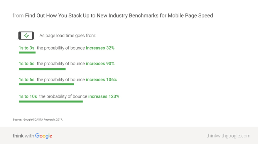
Page Speed - healthcare site design

4. Simple Navigation

Site navigation is one of the most important aspects of a healthcare website. It must be clear and easy to understand. In healthcare, it’s safe to assume most visitors are in a hurry and possibly a little stressed out. If a visitor can’t easily find the information they need, they’re gone – taking their business with them.

Clear organization keeps visitors engaged with your content and encourages them to spend more time on your website. This can reduce your bounce rate, or the percentage of all sessions on your site in which users viewed only a single page. A high bounce rate (especially if users click on many other similar sites after leaving yours) can send signals to search engines that your site is not satisfying users’ search intent – which can send you plummeting down the search rankings.

If you’re looking for inspiration, number 7 on our list of top 10 Drupal websites provides an excellent example of beautifully clean and intuitive navigation.

5. Clear Hours, Location and Contact Information

Some people just want to know where you are, when you’re open, and how to reach you. And if they can’t find that information quickly and easily, they’ll look elsewhere. While it may seem obvious that hours, location, and contact information should be front and center, it’s surprising how many websites have this information buried on their About Us page or in the footer of the site

Remember your visitors’ state of mind. Anything you can do to simplify and streamline their experience is worth consideration.

6. Comply with ADA Regulations

The Americans with Disabilities Act (ADA) protects individuals with disabilities from discrimination. In 2010, the ADA issued a series of regulations about website accessibility, turning up the pressure on site designers to create user experiences that live up to minimum standards of accessibility.

The ADA uses the Web Content Accessibility Guidelines to determine whether a site is compliant. These guidelines have very specific recommendations for various aspects affecting the user experience of a digital property.

Creating a compliant website design for hospitals is more than an exercise in fair play. It can also improve your SEO as Google rewards website owners that make efforts to meet compliance standards.

7. Website Typography

Well-designed typography is very important on healthcare websites, particularly in places where content is dense or lengthy. Screen after screen of text can strain visitors’ eyes and make it difficult to find specific information. A well thought out typographic design can minimize both issues and give users a better experience.

However, don’t rely solely on typography: Make sure your copy has plenty of paragraph breaks, white space, and imagery to break things up and make the page easier on the eyes.

8. The Right Website Color Palette

Most healthcare websites use a cool or muted color palette. That’s because cool or subdued tones help users stay calm and help limit the sense of excitement, panic or urgency that warmer colors might evoke. Typically, blue and white are popular colors for healthcare websites, as they evoke trust and cleanliness, respectively. However, keep your organization’s branding at the forefront. A children’s hospital, for example, may want to use more vivid tones, while a palliative care center may be better served by a more subdued palette.

9. Healthcare Site Design Imagery

Is a picture worth a thousand words? When it comes to images on healthcare websites, absolutely. The use of positive or calming photography can introduce some comfort into the user experience and create a positive impression of the brand.

But it’s important to keep imagery accurate. Forget stock photos of models dressed as medical pros smiling knowingly or holding their chins while listening intently to each other. Instead, consider investing in the services of a professional photographer to capture real people in real settings – actual medical professionals interacting with patients and each other, posing in front of the facility or working together. Photos of real patients providing testimonials makes a powerful impression, giving visitors a sense of the care they can expect when they become patients.

10. Smart Use of Video

As with your site photography, professionally shot and edited videos go a long way in establishing a positive impression of a healthcare facility. Tours of the hospital and specific units and informal, conversational interviews with doctors and staff give potential patients both a clear picture of the facility and the welcoming environment that awaits them. It also provides an excellent way for site visitors with lower literacy levels or visual impairment to access important information.

Some ideas for videos include:

  • Educational pieces on commonly asked questions or medical conditions
  • Patient reviews
  • Physician profiles
  • Procedure and treatment overviews

11. Content that Promotes the Brand

You may have a beautifully designed website, but to become the provider of choice, the site needs to answer this question: What makes your organization or facility different?

A healthcare facility’s website should tell the brand’s story and highlight what makes its staff and services stand out from the crowd.

Share highlights like specialized procedures, award-winning staff, community-based projects, and other points of pride that potential patients would find appealing. This will help you stand out in their minds and position you as the provider of choice.

Other areas that highlight authority and expertise include the following:

  • Affiliations
  • Associations
  • Awards
  • Links to research papers and studies
  • Notable achievements
  • Rankings in professional and consumer publications
  • Testimonials

One caveat: Your home page is not the place to list every achievement or bit of news. Remember that the primary goal of the website is to serve the patient. Instead, a small news feed or helpful link can make it easy for visitors to find that information if they choose, without being overwhelmed on the home page by the digital equivalent of a trophy case.

12. Customized Patient Portals

As Millennials and Gen Zers comprise a larger share of your potential healthcare consumers, you need to up your digital game to meet the technology expectations of both generations. As digital natives, they want to do business with companies that provide a robust, personalized, one-stop-shop website experience. A CDW Health study found that 98% of patients feel comfortable communicating with providers via online patient portals, while seventy-one percent of Millennials prefer online scheduling.

Additional digital resources to consider include:

  • Commonly used forms
  • Internal search function for doctor or specialist lookups
  • Emergency room wait time trackers
  • Chatbot-based telehealth sessions, with the option to chat with a live practitioner

Designing clear and effective websites for hospitals and healthcare facilities comes down to one simple truism: The better your design appeals to the wants and needs of the patient, the better for everyone – patients, hospital executives and the communities you serve.

Does your healthcare website need a shot in the arm? Contact us today.

Categories
Tags
Author

acquia

Vienna, VA – MARCH 4, 2020 –  Mobomo today announced it has been selected as the recipient of Acquia’s Partner of the Year Award for 2019, given for its superlative performance during the past year. The Acquia Partner Award recognizes outstanding contributions from partners over the course of 2019. 

Acquia has been a long standing and valued partner of Mobomo and we are honored by their recognition. Between our solution expertise and their cutting-edge cloud services, we are glad that our partnership is not only financially successful, but that we can work together to create innovative solutions for federal organizations.

“The Partner of the Year award distinguishes Mobomo as the leader who is committed to customer excellence and partnership,” said Brian Lacey, CEO of Mobomo. “Acquia has been a trusted service that allows us to create out of the box solutions for FedRAMP certified large scale and high-availability projects. We live in an age where everyone is trying to accelerate digital transformation, and Acquia gives us the platform to do so.”

Acquia recognized 15 partners across five global regions based on their overall revenue performance, overall growth with Acquia, and number of new customers secured last year.

“Mobomo is to be commended. 2019 was an incredible year for Acquia and our partners, with demand for our world-class digital experience solutions driving significant growth,” said Joe Wykes, SVP, global channels and sales, at Acquia. “2020 promises to be another amazing year, and together we’ll help our customers set the bar for delivering impactful customer experiences across channels.”

Over the past year, Mobomo has continued to enhance its Acquia implementation for NOAA Fisheries that has leveraged the platform to increase both customer satisfaction and customer traffic. As a result of the partnership with Mobomo and Acquia, NOAA Fisheries has been recognized with a number of industry awards including the 2018 MUSE Creative Award, the Acquia 2018 Public Sector Engage Award, the 2019 Webby Award, and the 2019 W3 Award. Mobomo also deployed a new Drupal platform based on Acquia Cloud Site Factory (ACSF) for Voice of America (VOA) that will provide a foundation for over 40 different language sites. Finally, Mobomo is deploying a similar ACSF platform for the Middle East Broadcasting Network. 

Leaders in digital experience delivery, Acquia partners support the world’s leading brands in facilitating amazing customer experiences. A full list of Acquia Partner Award winners can be seen here

About Mobomo

Mobomo is a world-class developer of high-performance applications and websites which we carefully craft to fit the needs of government agencies. We work hand-in-hand with our clients to deliver mobile, web, and cloud solutions using advanced DevOps techniques, which we integrate with our proven Agile software development methodology. 

About Acquia

Acquia is the open digital experience company. We provide the world’s most ambitious brands with technology that allows them to embrace innovation and create customer moments that matter. At Acquia, we believe in the power of community - giving our customers the freedom to build tomorrow on their terms. To learn more, visit acquia.com.

Categories
Tags
Author


Part 3: The Final Installment

This is the final installment of Drupal Taxonomy that we feel is important for one unfamiliar with Drupal to know! At this point, hopefully, you understand some of the key language that is regularly used in the Drupal Community.  For reference, our first two blogs, Part 1 and Part 2, should provide you any background you may not already have.  Mobomo is the team that is behind NASA, the solar eclipse with NASA, the USGS store, and NOAA Fisheries, all of which are Drupal sites.  Similar to these organizations, Drupal is the CMS system for you if your needs are more complex, you are developing an e-commerce portal, or if you have a large amount of content to maintain.  If you have a Drupal project in the works or are about to migrate versions or CMS systems, Mobomo has some of the best and brightest Drupal developers in the DC area.

Key Terms:

  1. Permissions - This is a tool for controlling access to content creation, modification, and site administration at the application level.
  2. Template - This refers to a file to express presentation
  3. Theme Engine - This is a set of scripts that interprets code and makes theming a site easier. These scripts take the dynamically generated content and output it to HTML.
  4. Theme Hook - This is an identifier used by the calls to the theme() function to delegate rendering to a theme function or theme template.  Modules which extend Drupal may declare their own theme hooks to allow editors to control the markup of that module in their theme.
  5. Trigger - These typically result from a characteristic change in an entity maintained by a module.
  6. Triage - A new issue is assigned a priority based on its severity, frequency, risk, and other predetermined factors.
  7. Zebra Striping - This refers to the to the alternating colors between rows of data. It is most common for rows of data to alternate background colors between white and gray.
  8. Testbot - A continuous integration service for testing patches submitted to project issues on Drupal.org.
  9. Roles - A name for a group of users, to whom you can collectively assign permissions. There are two predetermined, locked roles for every new Drupal installation:
  10. Path - This is the final portion of the URL that refers to a specific function or a piece of content.


Please reference Drupal.org for more information!

Categories
Author

Part 2:

In our previous blog post, we gave a brief intro to some terms that we believe are necessary to understand the basics of Drupal.   Here we have what we believe to be the next round of terms that we consider necessary to understanding those basics. Recently, we had the opportunity to assist Matrix AMC in migrating from Drupal 6 to Drupal 8.  They were unable to use their website because of the version of Drupal that their website was hosted on was out of date and no longer supported by the Drupal community. While these specific terms are consistent across Drupal versions, they are crucial to understanding the importance of being up to date in with your version of Drupal.

Key Terms:     

  1. Block - the boxes visible in the regions of a Drupal website.
  2. Region - defined areas of a page where content can be placed. Different themes can define different regions so the options are often different per-site. Basic regions include:
  3. Roles - a name for a group of users, to whom you can collectively assign permissions. There are two predefined, locked roles for every new Drupal installation:
  4. WYSIWYG - What You See Is What You Get; An acronym used in computing to describe a method in which content is edited and formatted by interacting with an interface that closely resembles the final product.
  5. Book - a set of pages tied together in a hierarchical sequence, perhaps with chapters, sections, or subsections.  Books can be used for manuals, site resource guides, Frequently Asked Questions (FAQs), etc.
  6. Breadcrumbs - the set of links, usually near the top of the page, that shows the path you followed to locate the current page.
  7. Form mode - this is a way to customize the layout of an entity's edit form.
  8. Multisite - a feature of Drupal that allows one to run multiple websites from the same Drupal codebase.
  9. Patch - a small piece of software designed to update or fix problems with a computer program or its supporting data.
  10. User - the user interacting with Drupal. This user is either anonymous or logged into Drupal through its account.

Refer to Drupal.org for any other questions!

Categories
Author
1
Subscribe to Commercial