
Companies on the 2022 Inc. 5000 Regionals Mid-Atlantic list had an average growth rate of 161% percent.
Vienna, VA, March 15, 2022 – Inc. magazine revealed today that Mobomo, LLC is No. 123 on its third annual Inc. 5000 Regionals: Mid-Atlantic list, the most prestigious ranking of the fastest-growing private companies based in Washington, D.C., Delaware, Maryland, North Carolina, Virginia, and West Virginia. Born out of the annual Inc. 5000 franchise, this regional list represents a unique look at the most successful companies within the Mid-Atlantic region economy’s most dynamic segment – its independent small businesses.
The companies on this list show a remarkable rate of growth across all industries in the Mid- Atlantic region. Between 2018 and 2020, these 131 private companies had an average growth rate of 161% percent and, in 2020 alone, they added 7,365 jobs and $1.9 billion to the Mid-Atlantic region’s economy. Companies based in the Richmond and Washington, D.C., areas had the highest growth rate overall.
Complete results of the Inc. 5000 Regionals: Mid-Atlantic, including company profiles and an interactive database that can be sorted by industry, metro area, and other criteria, can be found at inc.com/mid-atlantic starting March 15, 2022.
“This year’s Inc. 5000 Regional winners represent one of the most exceptional and exciting lists of America’s off-the-charts growth companies. They’re disrupters and job creators, and all delivered an outsize impact on the economy. Remember their names and follow their lead. These are the companies you’ll be hearing about for years to come,” says Scott Omelianuk, editor-in-chief of Inc.
Mobomo — a private company headquartered in the D.C. metro area — is a premier provider of web and mobile development services to commercial businesses, government agencies, and non-profit organizations. We combine technology expertise with disciplines in digital strategy, interactive marketing, and branding to create innovative applications and websites. From private sector companies to government agencies, we have amassed deep expertise helping our clients enhance and expand their existing web and mobile suite.
Interested in learning more about Mobomo? Take a tour of our capabilities, our past performance, the team members who make our clients look so fantastic, and feel free to reach out with any questions you might have
More about Inc. and the Inc. 5000 Regionals
Methodology
The 2022 Inc. 5000 Regional are ranked according to percentage revenue growth when comparing 2018 and 2020. To qualify, companies must have been founded and generating revenue by March 31, 2018. They had to be U.S.-based, privately held, for-profit, and independent—not subsidiaries or divisions of other companies—as of December 31, 2019. (Since then, a number of companies on the list have gone public or been acquired.) The minimum revenue required for 2018 is $100,000; the minimum for 2020 is $1 million. As always, Inc. reserves the right to decline applicants for subjective reasons.
About Inc. Media
The world’s most trusted business-media brand, Inc. offers entrepreneurs the knowledge, tools, connections, and community to build great companies. Its award-winning multiplatform content reaches more than 50 million people each month across a variety of channels including websites, newsletters, social media, podcasts, and print. Its prestigious Inc. 5000 list, produced every year since 1982, analyzes company data to recognize the fastest-growing privately held businesses in the United States. The global recognition that comes with inclusion in the 5000 gives the founders of the best businesses an opportunity to engage with an exclusive community of their peers and the credibility that helps them drive sales and recruit talent.
The associated Inc. 5000 Conference is part of a highly acclaimed portfolio of bespoke events produced by Inc. For more information, visit www.inc.com.
 Our work as designers is filled with many repetitive tasks that can become time consuming, we have talked about ways to
  If the button has a strong color accent on the screen, its place as a CTA (call to action) is evident. As seen in the figure above it is possible to have style variations for secondary actions that we don’t want to emphasize, as well as disabled actions (as long as there is something the user can do to enable them). It’s important that the “air” around the word is enough for the element to be recognized as a button, but not that much for it to end up being a huge color patch on the screen (which starts to defeat the original purpose of playing along with content). We can see in figure 2 below that by using the exact same style but minimizing the margins around the word the element loses its button purpose. If it is used that way the call to action still poses an actionable property, maybe as a selectable item with on/off states or an item that is draggable:
  Other buttons that are flat with no words may be useful for some situations even if they are less evident for the user. The trick for those is to have an action related to their context and visually be in the correct position. We can see in the next image below that the same round element can play different roles depending on its placement in relation to the content on the page. Google’s
  Icons have a similar two-face behavior. They can either be an active element to interact with and perform an action or an illustration supporting and decorating a message resulting in no user interaction whatsoever.
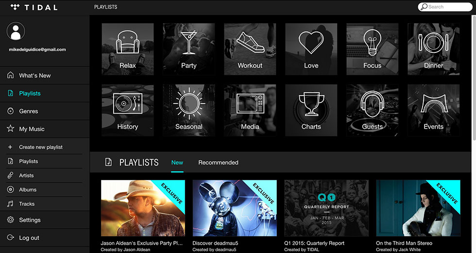
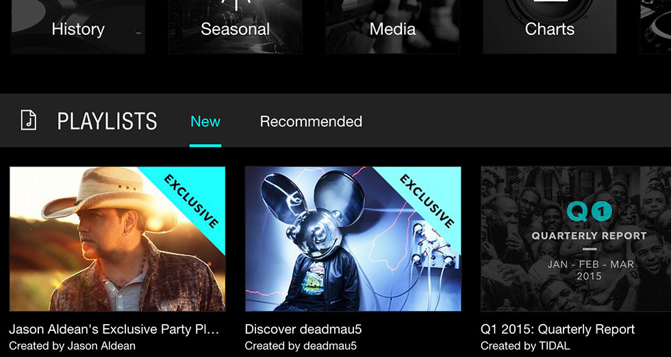
  Back to my original point, context is everything - once the context is in place, the user experience typically follows as to what action you should or should not take. Through users' past experience with navigating different digital platforms the user will quickly identify the icons on the top and bottom borders of the screen are a means of navigation. Normally icons over a certain size that are placed just above or to the left of a paragraph serve as an illustration element. Other positions and size ratios invite the user to interact as it becomes apparent they represent actions related to the piece of information that precedes. While not always depicted in color, we can see here the contrast color helps to distinguish them as something actionable:
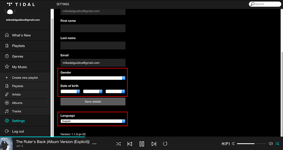
  Tabs, fields and dropdowns pose less trouble- they do have a similar style because they have been a part of UIs for a long time. Their typology is strongly installed in users minds however, fields are the most striped down ones of the group, sometimes styled in a really minimalist manner. For example, imagine a line acting as a row with a label above it mentioning the expected input. A rule of thumb for fields is that the labels should be aligned to the left since we type and read from left to right so the text input is prepared for the content it expects. That would be one of the main aspects that help reveal their function because as we can see in the following deliberately inflated examples the line dividing one type of element from the other can be very thin, coming all down to type style and alignment:
  Flat design is the standard today, but as technology evolves devices transform and new type of design interactions are needed. Due to graphic resolutions and computing power growing higher each product generation we are seeing subtle but powerful graphic effects starting to get into the mix. There’s always a learning curve for users, but as designers we should at the very least not stand in their way!