
Mobomo webinars-now on demand! | learn more.

For Federal Offices of Communication, the act—and art—of balancing websites that both cater to the public and promote the organizational structure and mission of the organization is always top of mind. Accordingly, those partnering with Federal offices must prioritize meeting both needs when designing and building agency sites. On numerous projects, our team has successfully managed to increase usability and deliver user-centric designs while simultaneously building sites that allow our Federal clients to bolster their brand. A sample of results for some clients:

-a swift 4% increase in first-time visitor overall satisfaction
-76% of all mobile users strongly agreeing that the new site made content easier to find
-88% of frequently visiting teens being satisfied with the new site

Below are some of the tools we’ve implemented to achieve success:

Navigation and Information Architecture

Treejack is a great usability testing tool that development teams can wield to test the information architecture and navigation of the site prior to even beginning a design. It is best used to test the findability of topics in a website using different navigational hierarchies. For one of our projects, both internal and external stakeholders were given 46 tasks to perform using a variety of different navigation hierarchies to find the most optimal site organization for both constituent groups.
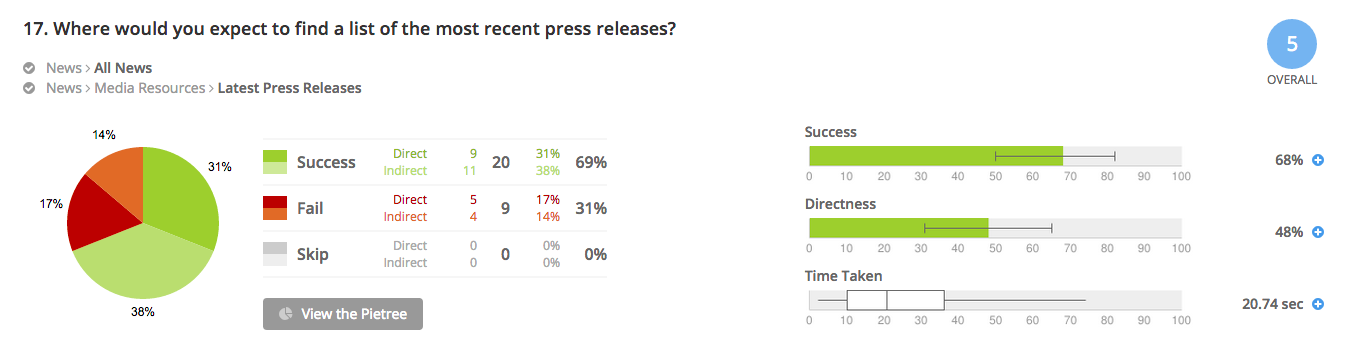
treejack-information-architecture-software

Usability Testing

For usability testing, our team leverages both Loop11 and Usertesting.com. Using a live, interactive environment, both of these tools allow development teams to gain deep understanding of user behavior by observing users as they complete a series of tasks and questions on the site and/or mobile app in question. Interactions are captured and then analyzed in comprehensive reports. As an added bonus, Usertesting.com provides video footage of the interaction for review:

user-testing-video-footage

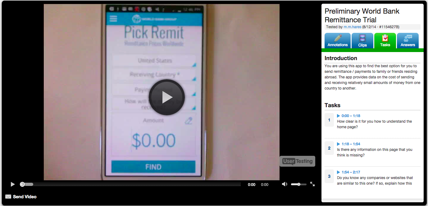
http://bit.ly/1rRvEAm

In summary, Federal websites and applications are often designed with too much emphasis on organizational hierarchy and goals, and too little focus on meeting end-users’ needs and expectations. User-Centric Design (UCD) tools can help government agencies buck this trend, however, allowing them to create websites and applications that engage users and maximize their interaction. Ultimately, this results in a sure win-win: Federal agencies’ constituents can experience an efficient, satisfying, and user-friendly design, and—with constituents’ increased engagement—organizations can ensure that their missions and information are communicated effectively. Act balanced.

Categories
Author


At the time of this writing (pre-WWDC 2015), there are a number of limitations on what Apple Watch code can do. The primary limitation is that watch apps cannot exist by themselves. It is necessary for the watch app to be a part of a corresponding phone app. Apple has said they will not accept watch apps where the phone app does not do anything itself. Also, watch-only apps (such as watch faces) are not allowed for this same reason—although it’s rumored that this may change after WWDC 2015.

Another Apple Watch limitation is that Core Graphics animations are not supported, but animated GIFs are. Complex layouts (such as overlapping elements) are not allowed. However, elements can be positioned as if they overlap—provided only one element is visible at a time. Using actions such as taps and timers, the visibility of these "overlapping" elements can be changed. This can be implemented to provide a more dynamic interface. Another major limitation (also whispered to change after WWDC 2015) is that watch apps cannot access any of the hardware on the watch including the motion sensor and heart sensor.

Most watch app processing (controller logic) is done on the phone instead of the watch, and some delays are inherent in the Bluetooth communication that transpires between the watch and the phone as the view (on the watch) talks back to the controller (on the phone). This view/controller split is not obvious in the code, but the watch/phone split is obvious in the code, as the watch cannot access anything from the phone, even though the controller logic is running on the phone side—except via a specific watch-to-phone request.

One notable feature is the watch app’s ability to explicitly call the phone app with a dictionary and obtain a dictionary response. This functionality allows the developer to then set up a number of client-server style requests, where the watch is the client, and the phone is the server. For example, the watch can request information from—or record information to—the phone. The phone (which has storage and may have Internet connectivity) can then fulfill the request and provide data in response to the watch. This can drive the phone app's UI to provide near-real-time synchronization of the watch app display, as well as the phone app display.

Custom notifications (both local notifications and push notifications) are supported on the watch. These custom notifications can have a somewhat customized layout as well as having the ability to define a set of custom actions. After performing one of these actions, the watch app is started. Apple mentions not to use notifications as a way to just launch the watch app from the phone app. Apple maintains that the notifications should provide useful information.

One developer test limitation relates to custom watch notifications (for local notifications).  Since watch notifications are only displayed if the phone is asleep, there is no direct way to test custom watch notifications.  Because of this, XCode does provide a mechanism to test push notifications in the simulator (using a JSON file), but there is no similar mechanism to test local notifications. Still, one can certainly test local notifications with the physical device.

Categories
Author

We were particularly proud to see one of our favorite clients, Peter Dewar, Chief Technology Officer at the District of Columbia Retirement Board (DCRB), participate in a thought-provoking panel on Wearables and the Internet of Things. The session's description as a “visionary panel” proved to be true, as all of the participants outlined the groundbreaking mobile capabilities they foresaw as feasible within the next five years.

Dan Mintz introduces Peter Dewar and other panelists

Mr. Dewar described his vision for implementing Google Glass in the office, at conferences—even for pension fund participants, staff, and Board members. Taking the idea of “smart rooms” even further, he also described a futuristic conference room, which would be able to set up a meeting’s required media (think dial-ins, projectors, etc.) upon the meeting organizer’s entrance or (biometric) authentication.

We from Mobomo were on the edge of our seats thinking about the possibilities, and excited about building them—especially for our government clients. Congrats to Peter Dewar for a great panel session, and thanks to Tom Suder for hosting yet another fantastic summit. We’re looking forward to next year’s—and to the future of mobile (in the government!).

Categories
Author

I've been doing a bit more Ruby and Ruby on Rails coding lately by virtue of silently commandeering the Intridea.com codebase. shhhh, it can be our secret.

Riding the Pipeline of Assets

Last month I upgraded the site from Rails 2.3 to Rails 3.1; getting up and running on the asset pipeline was a much larger project than I imagined, and while I had plans for a supremely awesome post on all the details of the upgrade, I spent less time taking notes on all the cute little steps and more time... LOST IN TIME AND SPACE with all the.... complications. #ahem

This week I got the site running on Rails 3.2, which thankfully was pretty easy. The instructions on RubyonRails.org were succinct and helpful. I did run into a few minor hiccups but overall it was a breeze. The biggest problem I ran into was one involving Rack 1.4.1 and cookies. For a view of the crime scene, check the gist.

A quick search on StackOverflow told me a lot of others were having this issue as well, but a simple act of clearing cookies fixed their problem. It wasn't so easy in my case. In the end I had to rollback to Rack 1.4.0, but I've got my fingers crossed for a fix in some future release.

i to the P

With Rails upgrades out of the way, I am focusing on smaller enhancements here and there as time permits. This week I added a helper file for our blog categories. These categories are generated dynamically based on the popularity/density of tags in blog posts (thanks to Michael Bleigh's Acts As Taggable On gem), but I wanted to capitalize the category names and appropriately not capitalize the "i" in words like "iPhone" and "iPad" and consequently capitalize the second letter in those specific words. It's not rocket science, but if you are upper-casing words in your app and want to create exceptions for Apple products, here's some code for you:

module TagHelper   def tag_title(tag)     name = tag.name.downcase     iProduct = %w(iphone ipad)     if iProduct.include?(name)       apple_product_titlize(name)     else       name.capitalize     end   end    def apple_product_titlize(name)     name[0] + name[1].capitalize + name[2..-1]   end end 

This method is called by a bit of Ruby in our view:

<% @categories.each do |tag| %>   <li><%= link_to "#{tag_title(tag)} (#{tag.count})", "/tag/#{tag.name}" %></li> <% end %> 

The Before & After

Updates? Yeah, we do that

So there you have it - a long overdue update on intridea.com upgrades and a snippet of code to help you manage the "i" pandemic.

Happy coding!

Categories
Author

Pill Finder enables rapid identification of unknown solid-dosage medications (tablets/capsules) based on physical characteristics including: imprint (characters or number printed on a medication), shape, color, size, and scoring. Once a medication is identified, Pillbox provides high-resolution images of tablets and capsules (if available) as well as links to drug information and drug labels. Pillbox uses the National Library of Medicine's Pillbox API which is not intended for clinical use. Images contained within this resource are not part of the Structured Product Label and have not been verified by the sponsor/manufacturer.


Categories
Author

It’s been nearly a year since the release of the iPhone 4, and much to the dismay of the tech community, it’s still the only product in the Apple lineup with a high pixel density ‘Retina’ display. While the much-hyped feature drew universal praise when the device was unveiled, some were wondering the following:

  • Would consumers see this as a compelling feature?
  • Would competitors follow suit, establishing critical mass for high PPI displays?
  • Would Apple eventually launch a Retina display for iPad or Macbook Air? Or would another manufacturer release an ultra-high resolution tablet or laptop?

In a little over 10 months time, high PPI displays are currently everywhere in mobile. Walk into any carrier retail store, and chances are that the featured smartphones already feature high-resolution displays. Those that don’t have them likely will within an iteration or two.

Retina display for Mac will be here sooner rather than later. Apple’s yet-to-be-launched OS X Lion includes built-in support for the Retina display, along with ultra high-res desktop wallpapers and icons. It’s a decent bet that we’ll eventually see some variation of the Retina display across the entire product line. And of course, as happened in mobile, the rest of the industry will follow Apple’s lead, effectively eliminating the concept of a default dpi standard.

How can designers and developers prep for this change?

Embrace resolution-independent design practices for the web, not just mobile. Up until this point, designers and developers who haven’t worked in mobile have been able to avoid the extra hassle of prepping content for high PPI displays. But with the classic notion of the ‘pixel’ fading away, it’s a good time to reiterate the importance of resolution-independent design practices across the board. Specifically:

  • Minimal use of bitmaps (reserved for photography, video, and illustrations)
  • CSS3 for buttons, gradients, shadows, and lines
  • HTML5 canvas and SVG libraries for complex and interactive graphics
  • @font-face for custom type
  • Vector graphics for interface elements

Start to use Scalable Vector Graphics (SVG) on the web. With Internet Explorer 9 finally getting onboard with the basic SVG feature set, it’s time to adopt vector graphics on the web (for real this time). Unless you are designing for a specific audience using certain browsers (in which case you may need fallbacks), now is a great time to consider using SVG for:

  • Icons
  • Background images
  • Custom type treatments
  • Logos and mastheads

Get comfortable with Adobe Illustrator. This advice was doled out around the web when the Retina display was first introduced, and one year later it rings more true than ever. Photoshop is still the industry standard for producing web graphics, but as the web steers towards resolution independence, so should the toolkit.

Photoshop users: keep all of your source files in vector format for as long as you possibly can. If you must use Photoshop (full disclosure, we love it and use it daily at Intridea), it’s a good idea to create your interface elements as vector Smart Objects, or import them directly from Illustrator. This way, your elements can scale when you resize the source files without effectively losing resolution.

For time being

The current process of designing for high PPI displays is a bit of a hassle, but it’s hopefully transitional. Designing for the Retina display with targeted CSS and high-res bitmaps is already intensive. Throw in the eventual release of high PPI displays on tablets and laptops and it’ll be painstaking.

There are a number of established design practices for supporting high PPI displays. Many of the tutorial articles written soon after the iPhone 4’s launch are still relevant (here’s a great list of some key takeways).

Categories
Author

Introducing SparkTime

A few months ago Intridea decided to splurge and upgrade our (already awesome) benefits package. In addition to the basic perks like amazing health insurance, hardware funds and an annual subscription to Amazon Prime, we started a new program called SparkTime. SparkTime is much like Google's 20% time – everyone spends a few hours a week working on something that they are passionate about. We record our ideas in SparkBin, team up if we want to collaborate, and then we get down to the business of impassioned creation.

The Spark

In addition to being a UI Designer here at Intridea, I’m also a grad student in the Human-Centered Computing program at UMBC. This semester, my professors Dr. Amy Hurst (co-creator of http://nickelforscale.com/) and Dr. Ravi Kuber (author of many great papers on computing and the visually impaired) suggested that I work on a mobile rehabilitation application for stroke patients. This sounded like the perfect opportunity to bridge my educational and professional worlds.

Research = Time Well Spent

I’ve been prepping for this project by taking Dr. Hurst’s course on Assistive Technology. Chris Selmer is my “internal client” and he sent me to an iOS crash course where I had gotten the basic fundamentals of iPhone MVC architecture and learned Obj-C syntax. These courses have been extremely helpful, but I also needed requirements from real doctors and nurses on how this mobile application should actually work.

Before I started wireframing and coming up with designs I needed to do some research. So I talked with nurses and physicians in the stroke unit at the Kernan Rehabilitation Center. I had the opportunity to communicate with stroke victims and in doing so, I observed the deficiencies caused by stroke trauma. The physicians described exercises that they would like to see in a mobile device. I visited with Dr. Mark Young (physician with a specialty in stroke trauma) and my friend Michelle Jones (occupational therapist at UMMC) who both helped me strengthen my idea and gave me insight into rehabilitation for those with physical and cognitive deficits.

Armed with some really useful information, I was able to approach the blueprints for the mobile app. Initially, I had imagined that I would be creating an application that focused solely on physical rehab using a smartphone; but, as it turns out, what stroke victims really need is an application that stimulates their coordination, cognitive abilities, and fine motor skills. I had planned on using an iPhone but I have since decided to start with an iPad, so the user will have more screen area to start with.

I saw firsthand why user interviews are so necessary and why design should rarely be an effort by the designer alone.

The Beginning of a Great App

I’ve named the project CogConnect, and plan to keep my entire process and code open-source. I’m in the design phase right now and I'm happy with the wireframes and the direction of the project. I'm looking forward to spending my SparkTime working on this application!

Categories
Author

During the past several weeks, Brendan and I have been developing an iOS app with Titanium - a tool to build native applications with web technology. During my development process, I had several questions and found that the most helpful resource was on the Titanium Q&A site. I want to list these questions and solutions, since I think these are common problems and could be of great help to any developer using Titanium.

# How to get height of Labels? #

Reference [http://developer.appcelerator.com/question/9951/get-label-height-when-height-property-is-auto](http://developer.appcelerator.com/question/9951/get-label-height-when-height-property-is-auto)

I want to display many elements vertically on a window,when I put an element,I need to know the top attribute first,the top is according to the height of previous element,may be a label.

# How to prevent dashboard editing #

Reference [http://developer.appcelerator.com/question/61881/dashboard---prevent-editing](http://developer.appcelerator.com/question/61881/dashboard---prevent-editing)

In the app,we use dashboard to group the features,and the default behavier of dashboard is that when you hold the dashboard icon for seconds(about 1 sec),the icons will being wobbling and you can change the order of icons and delete the dashboard item.
But our app don't allow users to edit dashboard,so we need to forbit it.

Is it works?No,when you want to edit dashboard,the icons are not wobbling,and you can't delete the items, but you can order the items,and the icon image is changed to selectedImage.The effect is not good,Is there any other attributes to present dashboard editing,I can't find.

After change the const,you can build the project directly in Xcode,if you want to build with Titanium,you can change that in Titanium SDK.

# How to pass data to local html #

Reference [http://developer.appcelerator.com/question/27781/pass-data-to-webview](http://developer.appcelerator.com/question/27781/pass-data-to-webview)

Our app display news for user,every news is on a local html,and pass news content to the html.But in the html,we can't get the currentWindow variable,so we need to find other way to do it.

# How to open links on webview in new window or safari? #

Reference [http://developer.appcelerator.com/question/89981/webview-links-to-open-in-a-new-window](http://developer.appcelerator.com/question/89981/webview-links-to-open-in-a-new-window)
There are links on the news view,when user click the links,the web page will be opened in the current window, so the content of current window is missing,you can't back to the content. We could like to open the web page on a new window,and user can back to the news.

Categories
Author

When Apple introduced the highly anticipated "Copy and Paste" feature for the iPhone, it came with a default menu editing implementation. With the release of iOS 3.2, this implementation has been updated to include configurable menus to ease the iPhone developer's job. It's simple and elegant. In addition to using UIActionSheet to provide a list of commands/actions to choose from, the UIMenuController is worth a try too.

While working with the UIMenuController I struggled for several hours and couldn't find any helpful information even after an exhaustive Google search. So I hope this blog post will help to save you some time and frustration if you are trying to do the same thing. Otherwise, I'm sure this post can help you understand how to use UIMenuController better.

Below is an example of the UIMenuController after I found the best implementation; this is a screenshot from the Present.ly iPhone client which is currently in development.

Notice that the ">>" and "

Before I arrived at the above implementation using ">>" and "

The font size is small and what's worse is that when you add a new item the title will automatically shrink. That's why I need ">>" to expand those less critical but still useful items. So my first version at adding the ">>" is as follows:

      - (void)setMenuItems {          ...          [self becomeFirstResponder];          UIMenuItem *expandItem = [[UIMenuItem alloc] initWithTitle:@">>" action:@selector(expandMenu)];          NSMutableArray *menuItems = [[NSMutableArray alloc] initWithCapacity:5];          for (NSInteger i = 0; i     

Unfortunately, this did not work because when I clicked the screen or an item in the menu, the menu would automatically hide. In the last section of "Display and Managing the Edit Menu", it says:

  • Dismissing the Edit Menu
  • When your implementation of a system or custom command returns, the edit menu is automatically hidden. You can keep the menu visible with the following line of code:
  • [UIMenuController setMenuController].menuVisible = YES;
  • The system may hide the edit menu at any time. For example, it hides the menu when an alert is displayed or the user taps in another area of the screen. If you have state or a display that depends on whether the edit menu is visible, you should listen for the notification named UIMenuControllerWillHideMenuNotification and take an appropriate action.
  • But either I couldn't find the "setMenuController" method or the [UIMenuController sharedMenuController].menuVisible = YES didn't work. So the next step I tried was with UIMenuControllerWillHideMenuNotification and UIMenuControllerDidHideMenuNotification and I set the menuVisible to YES there.

      - (void)willHideEditMenu:(id)sender {          LogDebug(@"Will hide edit menu: %d", [UIMenuController sharedMenuController].menuVisible);          [UIMenuController sharedMenuController].menuVisible = TRUE;      }        - (void)didHideEditMenu:(id)sender {          LogDebug(@"Did hide edit menu: %d", [UIMenuController sharedMenuController].menuVisible);          [UIMenuController sharedMenuController].menuVisible = TRUE;      }        - (void)viewWillAppear:(BOOL)animated {          [super viewWillAppear:animated];          [[NSNotificationCenter defaultCenter] addObserver:self selector:@selector(willHideEditMenu:) name:UIMenuControllerWillHideMenuNotification object:nil];              [[NSNotificationCenter defaultCenter] addObserver:self selector:@selector(didHideEditMenu:) name:UIMenuControllerDidHideMenuNotification object:nil];      }  

As I feared, it still didn't work because the flow is:

The property menuVisible is always TRUE in those methods. So I doubt after UIMenuControllerDidHideMenuNotification, the SDK will do more work such as set the menuVisible to false and then hide the menu. Maybe accessing the private library would help but Apple doesn't allow that.

Look at the flow again. It doesn't work but at least we know that it works when there is no menu in the screen and the menu is hidden after UIMenuControllerDidHideMenuNotification. Keeping these two points in mind I then updated the expandMenu method to let the menu show action delay for a while.

      - (void)expandMenu {          UIMenuItem *collapseMenuItem = [[UIMenuItem alloc] initWithTitle:@"    

Wow, it works as expected! Note that I take 0.5 as the delay period which I think is a reasonable value. You can also execute this method in the didHideEditMenu to be safer.

A few additional notes about the UIMenuController, for your benefit:

  • In order to show menus, you should implement canBecomeFirstResponder in your controller and then invoke [self becomeFirstResponse] before showing the menu.
          - (BOOL)canBecomeFirstResponder {          return YES;      }  
  • You can decide which methods can be executable by implementing canPerformAction:withSender:
          - (BOOL)canPerformAction:(SEL)action withSender:(id)sender {          BOOL retValue = NO;                    if (action == @selector(expandMenu:) )               [NSArray arrayWithObject:ColorTileUTI]];              retValue = YES;          else              retValue = [super canPerformAction:action withSender:sender];          return retValue;      }  

Hopefully my notes and observations will be helpful to other iPhone developers. Happy coding!

Categories
Author
Subscribe to Iphone