Mobomo webinars-now on demand! | learn more.

Mobomo's CEO, Brian Lacey, was recently featured in a new research report about how UX impacts browsing behavior.

The report was published by Clutch, a leading B2B ratings and reviews firm in Washington, DC.

Mobomo is currently ranked as a Top 10 UX agencies in Washington D.C. on Clutch.

User experience encompasses all end-user interaction with a website. Good UX means a site is easy to navigate and designed with a clear interface. UX enhances the content on a page, but certain usability pitfalls can lead to a decline in web traffic.

Clutch surveyed over 600 people who visit five or more websites every month. They found that over half of people will leave a website for a particular session if it’s unreliable (54%) or slow to load (53%).

Unreliable pages prevent people from reaching the content they desire by presenting error messages, broken links, or a glitchy interface.

We know people are accustomed to getting the online content they want immediately, particularly now that mobile searches outnumber desktop searches.

Mobomo Tackles Mobile Web Challenges

More than half of people (52%) will abandon a slow website for good. With mobile, users expect to have answers to their most pressing questions at their fingertips. A page’s speed can determine where those users will turn with their queries.

Lacey identified speed as the main challenge when designing for the mobile web.

“You can never control how someone is going to be able to connect; if they’re on 3G or on the metro,” Lacey said. “The ability to get someone the results they need at that exact second without having to download a million libraries is the most important part of mobile web user experience.”

Lacey also commented on the price companies will pay if they do not prioritize speed on the mobile web.

“With so many distractions out there, if someone has to wait more than three seconds, they’re going to exit out and do something else.”

People are accustomed to getting the content they want immediately, and we provide creative user experience solutions for mobile browsers. When we designed for NASA’s 2017 solar eclipse coverage, we made sure we could accommodate the most trafficked federal event online to date.

What About Apps?

Nearly two-thirds (63%) of people won’t return to a website if it’s consistently unreliable. If a page functions well on a desktop browser but not on mobile, it could lead to a significant decline in traffic.

Since growth in mobile app session activity is on the decline, web design companies must meet the rising demand for functional and reliable mobile web pages.

“If you look at general trends in the app store, people used to download 10 mobile apps a month. Now it’s down to two a year,” Lacey said. “Rarely does a user go explore for a mobile app unless there’s a specific reason such as a marketing campaign driving downloads.”

We’re meeting this challenge by focusing app development efforts in the business to business space

“As a mobile developer, we mostly have moved a lot of our services to business to business apps or apps that help with people doing their job, more vocational type things. Business to consumer apps that are outside of games are just kind of on the decline because of that.”

Mobomo continues to lead among design agencies in Washington, D.C., and we are excited to have Brian share his wisdom on Clutch.

Categories
Tags
Author

Person typing Our work as designers is filled with many repetitive tasks that can become time consuming, we have talked about ways to Automate Photoshop to Improve your Workflow, and Design Etiquette - all of these things help make our lives a little easier.  Now lets talk through some ways you can improve your UX/UI workflow in Photoshop by implementing some of the standard keyboard shortcuts the program offers, how to edit them and create your own shortcuts. Which will save you time! Who doesn’t want to save time?

Create new layer behind selected layer

  • MAC: CMD+New Layer icon
  • WINDOWS: CTRL+New Layer Icon

New layer via copy

  • MAC: CMD+J
  • WINDOWS: CTRL+J

Create new layers from existing ones. You can copy text, images, even folders with these shortcuts. Need to re-use the card you already designed? Just copy it!

Bring layer forward

  • MAC: CMD+]
  • WINDOWS: CTRL+]

For those times when you need to rearrange the order of your layers - forget the mouse and use the keyboard instead.

Send layer back

  • MAC: CMD+[
  • WINDOWS: CTRL+[

Pro Tip: Create a shortcut for renaming layers (In my case I use CMD+Shift+R) this is an easy and quick way to copy/paste/rename a layer name. Also, if you press ‘tab’ while the rename layer is active it will cycle through your layers with the name that is highlighted and it will be ready to be edited or you can press (shift+tab to go in a different direction).

Deselect the entire image

  • MAC: CMD+D
  • WINDOWS: CTRL+D

Reselect

  • MAC: CMD+Shift+D
  • WINDOWS: CTRL+Shift+D

We recently found this shortcut and it is really useful for when you click away from the selection and you need to re-do it.

Invert selection

  • MAC: CMD+Shift+I
  • WINDOWS: CTRL+Shift+I

Select all layers

  • MAC: CMD+Opt+A
  • WINDOWS: CTRL+Alt+A

Need to select all your layers to create a new group? Here’s your solution! Tip: Did you know you can collapse all your groups from the layer Menu?

Deselect from the selection area

  • MAC: Opt+drag
  • WINDOWS: Alt+drag

Increase/decrease size of selected text by 2pts

  • MAC: CMD+Shift+>/<
  • WINDOWS: CTRL+Shift+>/<

Align text left/center/right

  • MAC: CMD+Shift+L/C/R
  • WINDOWS: CTRL+Shift+L/C/R

Not convinced about the shortcuts Photoshop offers? You can customize them yourself, go to the application menu, under ‘Edit’, you’ll see “Keyboard Shortcuts” or just press Alt+Shift+CMD +K or Alt+Shift+Ctrl +K

In this window you’ll see all the different shortcuts that photoshop has to offer, there are many you won’t need as often when working as a UI/UX designer, so you can take advantage of this and create your own shortcuts for the tools you do use for example, copy/paste/clear layer styles; save them as a set to keep a copy and, if you want, share it with your team!

You can set shortcuts for the application menus, the panels (How about giving that ‘Collapse All Groups’ feature a shortcut?) and of course, tools. Tip: See that Menu tab? Here you can define special settings to the menu, assign a color to different menu options, even hide the ones you never use!

Did you know you can create a shortcut to align elements to the left/right/center/middle? There’s also another way to create your own shortcuts for repetitive tasks, through actions! We have talked a little bit about how to do so in our post Automate Photoshop to Improve your Workflow  be sure to check it out!

Categories
Author

web-designer-at-computer

Being a designer is a very broad term in which many can misuse and confuse easily. You could be an industrial, print, interior or tech designer, all have different job descriptions in different industries. Speaking in terms of the tech industry there are two commonly used types of web and mobile app designers, UX and UI.

You often hear the terms UX and UI, but what do they actually mean? UX stands for User Experience and UI is User Interface. While they are two distinct concepts and have different actions in the design process they are both closely intertwined to the point one cannot exist without the other.

“User Experience” tends to be used as a broad term and often times different things can be grouped under the larger term but speaking in the realm of digital it is the inception of a product dedicated for a User always defined as the user or group of users and it’s goal is to establish the best form of engagement between the product and it’s user within a designated goal. The UX focuses on all the processes required to build this product which is ruled by purpose.

Once the User Experience is determined, “User Interface” or UI comes into the picture. Since the UX defined the clear goal, and a purpose for the interface, guides the interaction with the user has to be created for the product, it is now time to figure out how the layout will work. This will not be a random array of controls and style choices, but custom made efforts that target the specific needs and behaviors of the user, and will achieve the overall goal and purpose of the product. UI designers are responsible for creating a cohesive style guide, as well as ensuring that a consistent design language is carried out throughout the product. The UI designer must be able to make sure that the screens they are creating communicates clearly to what the UX designer has laid out.

Can one exist without the other? No, UX without UI is a plan, a thought, a strategy. UI on it’s own is just a graphic anecdote that lacks clear purpose. Be sure to check out our design page.

Categories
Author

responsive-website-mobile-app

Every company should have a mobile strategy but first you need to decide what's right for your business - a mobile application or a responsive website? Sometimes companies have one or the other or they may have both. This is all depending on the company and how they reach their users.

Some businesses have to choose between a mobile website or a mobile app based on their budget, let's discuss the pros and cons so that you can make the most educated decision whenever you're deciding on your mobile strategy. 


Mobile Website

Reach: Probably the biggest  benefit the mobile website has over a mobile app is the amount of reach you have; you’re able to access a much larger audience because of its discoverability and marketing potential, and it has low barriers to entry.

Content Sharing: If your primary goal is content consumption, a mobile website will usually suffice. While apps have the ability to make content sharing easy with a great design, a website can do these things with less overhead.

Ships Fast: Generally, obtaining an model view presenter (MVP) for a website requires less resources than launching a mobile app.

Marketing: Marketing a mobile website is easier and more effective than marketing a mobile application. Two tactics in particular work very well with website: Search Engine Optimization (SEO) and Pay Per Click (PPC).

Some disadvantages are:

Functionality: Products with singular functions are generally better delivered via a mobile application than a mobile website. If you think of calendars or email, Uber or Instagram, you'll likely agree that these functions are more effectively delivered through mobile applications than a mobile website.


Mobile Application

User Experience: The biggest benefit of a mobile app is the rich experience it delivers. Think of the UX on Facebook, Spotify, and some of your other favorite apps. Chances are the experience on the mobile application version is much more satisfying than their website versions.

Stand alone services: Applications are ideal for products that offer stand alone services. Weather, health, and banking apps all provide singular services to the user.

Re-engagement: While marketing an application via App Store Optimization is not very effective, apps offer push notifications. Push notifications are a great way to call the user to act even when they’re not actively engaged with your brand or product.

Some of the disadvantages are:

Storage: There is a limited amount of space on a user’s phone and your app is taking up some of that valuable real estate, I think we can all say we’ve seen the message “Storage Full”. When a user gets that message, they are then forced to decide whether or not to keep the app. Generally, apps get deleted before photos, emails, or other personalized storage.                                                                                                                                                                            

Best of Both Worlds

If you’re unsure which route to take (and you don’t have the budget for two builds), then Progressive Web Apps are a great alternative.

By combining the best of the web and the best of app, Progressive Web Apps maintain a website’s far reach and an app’s exceptional UX. Some of the benefits:

If you have questions about which mobile strategy is right for you, feel free to reach out to us! If you’d like to learn more about some of the mobile strategies we’ve put into place, check out the mobile apps and responsive websites we’ve developed.

Categories
Author

format-inner
Here it is peeps, the second post in our journey to create a killer design team…PROCESS. EEEK,*GASP*...I know, firsthand, that process can be a “dirty” word, the bane of creation, and something most companies don’t effectively use. But in this post we’re not going to talk about traditional process, the one where X person get’s a job then hands over some requirements to another person and so on and so on. No...no, here we’re going to be talking about the design process, and yes the two go hand in hand and a lot of the same people are involved (or should be), but in this post I’m going to discuss the parts that make a design team stronger, more efficient, and produce better work.

So where do we start with our design process, especially in the ever changing landscape that is the web? Clark Wimberly from Invision has some great ideas in his post Reimagining The Web Design Process, most notably is that of an agile team. One that is able to easily adapt to changes, and make rapid adjustments as needed. No longer do we work (and live for that matter) in a world that has static or fixed content, so it’s only right that as a team we should be able to rapidly shift to match this.

He goes on to say that we need to stop using mobile first as a buzzword and actually start to approach our design process with smaller screens, using an “Atomic” approach, as Brad Frost would say (more on this in a minute). Clark couldn’t be more correct, especially since Google has recently (May 5th) said they are now getting more search queries on mobile than on desktop.

So, back to that Atomic Design thing...what is it? How does is play into our design process? It’s an amazingly simple, but complex, ideology on how to handle the design and layout of websites. Breaking it down to it’s most basic idea is that you start with a single “brick”, something like a font, or a few color options.Then take those pieces and make a small UI element, like a form or menu, you keep adding small “bricks”, bit by bit, until you’re left with an assembled page. From there it’s rinse, wash, repeat on the other sections of your site. So, how does this work into our process? Quite naturally, by taking our mobile first approach and combining it with this bit by bit assembly we can very quickly and early in the game start to target the areas of our layout that need adjustment, and make the necessary corrections before we’ve gone too far.

Methodology is just one aspect of the design process, there are actual steps, hence the process part, that should accompany that. What those steps are will vary from team to team, but loosely they should be: planning, research, design/development, iterate. What do these mean though?

  • PLANNING: figuring out what the project timeline is, when it starts and ends, when milestones need to be met, etc. This is also the phase when we need to determine who will be involved throughout the project, making sure the right people are brought in at the right time.
  • RESEARCH: Make sure that the problem we’re solving is the right one, ask questions WHY, HOW...dig deep to understand the project. Determine who our target is, establish restrictions and needs, to help eliminate questions that may arise later.
  • DESIGN/DEVELOPMENT(and prototype): Start to layout the concept, get ideas down into something more solid. Simultaneously development can begin with prototypes to test ideas.
  • ITERATE: Today a design is never truly finished, even after handoff things are bound to come up, so take feedback, comments, etc, and adjust your product to match the needs of it’s users.

A good process, much like a good team, needs to be agile in it’s execution. Not every project will have a need for every step nor will it all allow for every step, so it’s ultimately up to your team lead to make sure the right parts are followed at the right time. Remember that establishing or adjusting a current process can’t happen overnight, it’s a gradual shift, much like our Atomic Design theory, an effective design process should be built upon, bit by bit and allow for rapid adjustment.


Want to learn more? Check out Mobomo's post on Forming A Design Team, Part I: Structure

Categories
Tags
Author

For Federal Offices of Communication, the act—and art—of balancing websites that both cater to the public and promote the organizational structure and mission of the organization is always top of mind. Accordingly, those partnering with Federal offices must prioritize meeting both needs when designing and building agency sites. On numerous projects, our team has successfully managed to increase usability and deliver user-centric designs while simultaneously building sites that allow our Federal clients to bolster their brand. A sample of results for some clients:

-a swift 4% increase in first-time visitor overall satisfaction
-76% of all mobile users strongly agreeing that the new site made content easier to find
-88% of frequently visiting teens being satisfied with the new site

Below are some of the tools we’ve implemented to achieve success:

Navigation and Information Architecture

Treejack is a great usability testing tool that development teams can wield to test the information architecture and navigation of the site prior to even beginning a design. It is best used to test the findability of topics in a website using different navigational hierarchies. For one of our projects, both internal and external stakeholders were given 46 tasks to perform using a variety of different navigation hierarchies to find the most optimal site organization for both constituent groups.

treejack-information-architecture-software

Usability Testing

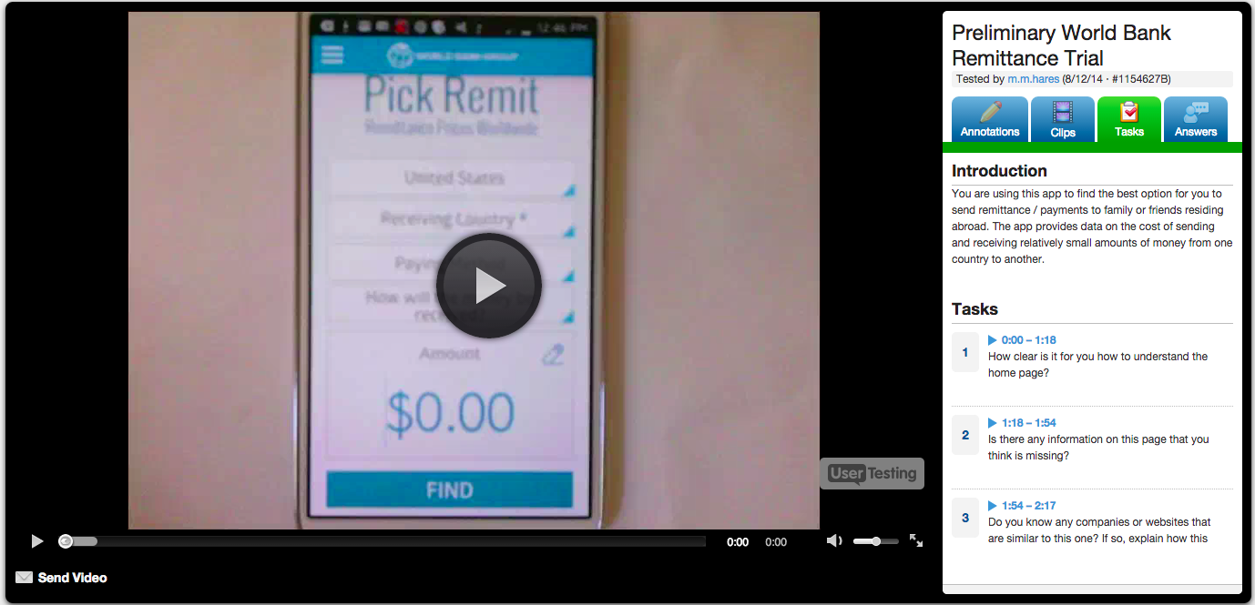
For usability testing, our team leverages both Loop11 and Usertesting.com. Using a live, interactive environment, both of these tools allow development teams to gain deep understanding of user behavior by observing users as they complete a series of tasks and questions on the site and/or mobile app in question. Interactions are captured and then analyzed in comprehensive reports. As an added bonus, Usertesting.com provides video footage of the interaction for review:

user-testing-video-footage

http://bit.ly/1rRvEAm

In summary, Federal websites and applications are often designed with too much emphasis on organizational hierarchy and goals, and too little focus on meeting end-users’ needs and expectations. User-Centric Design (UCD) tools can help government agencies buck this trend, however, allowing them to create websites and applications that engage users and maximize their interaction. Ultimately, this results in a sure win-win: Federal agencies’ constituents can experience an efficient, satisfying, and user-friendly design, and—with constituents’ increased engagement—organizations can ensure that their missions and information are communicated effectively. Act balanced.

Categories
Author

As a UX designer, improving the end user experience is my passion. When an interface or interaction seems confusing, I often find myself asking “What would I tell the user if I was there?” And immediately picture myself as a bystander, brainstorming every possible solution.

When you eat and breath this on a daily basis, it can quickly spill into the analog world. Suddenly, you have a heightened awareness of places and things where designers have built with the user in mind. And it’s in those instances, you can almost sense the designer looking over your shoulder, giving you a helping hand.

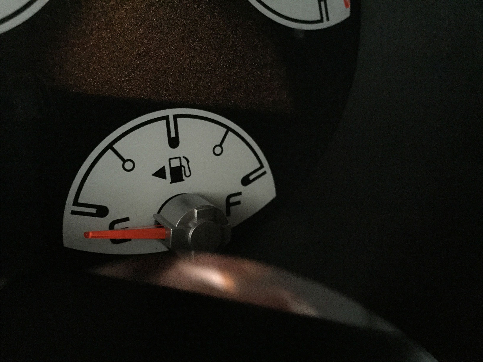
My first observation of this was the gas pump. We’ve all experienced “gas cap confusion” or the internal debate as to which side that dang cap is on! No matter how long you’ve been driving your car, this situation occurs more often than we’d like to admit. If you know where to look though, there’s a bit of user experience design making life a little easier. For years auto manufacturers have included a tiny arrow next to the gas pump icon indicating which side it's on.

GasPump

It’s such a simple touch. Just a tiny little arrow. But if you know about it, it can save you a world of frustration when heading to the pump.

Which got me thinking, are there other ways to simplify daily life via user experience design? And so began my pursuit and practice of Guerilla UX.

When we moved into our house, a point of frequent confusion was our garage doors, or more specifically the control panels that opened them. There’s a garage door on the left and another on the right, but with the panels stacked vertically (poor user interface design) it was impossible to remember! With a bit of Guerilla UX though, determining which pad opened which door was quickly resolved. Arrows now clearly indicate the side the control panels open.

GarageDoor

Another place with some added UX love is my printer. It’s a common hurdle; which side of the paper will the printer print on? And it’s of special concern when printing on special paper or making labels! Pre-UX, I’d always make a mark at the bottom of a plain sheet of paper and print a test page to avoid wasted time and paper. My Guerilla solution? A simple label with an arrow showing which direction to load the paper and a smiley face to indicate the top as well as what side it will print on. Tada!

Printer

These are just a few places I’ve added Guerilla UX to my daily life, but I have a feeling other designers (and non-designers) may use a bit of Guerilla UX to make their lives easier too.

Got some good examples? Tweet them to us with the hashtag #GuerillaUX and we’ll share the best ones!

Categories
Author

tidal
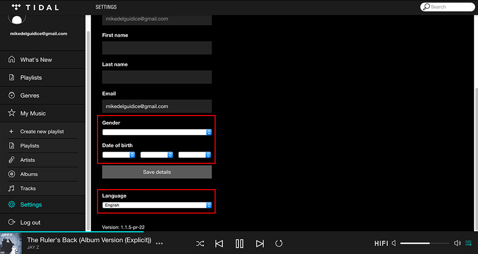
With "The ruler’s back” kicking off one of Jay-Z's greatest albums to date and the recent (re)launch of his streaming service Tidal, my hopes of a Jay-Z disruption were extremely high.

With claims to revolutionize streaming and pay artists what they deserve, Tidal depicted the utopian ideal of edgy design, quality, and fairness. I was pumped to check it out, not merely as an H.O.V. fan, but as a UX/UI junkie craving to experience music streaming in a new way. With creds for shaping one of the most popular music genres, you'd think Tidal would bleed the Jay-Z innovation as well. Yet, what I discovered was anything but revolutionary.


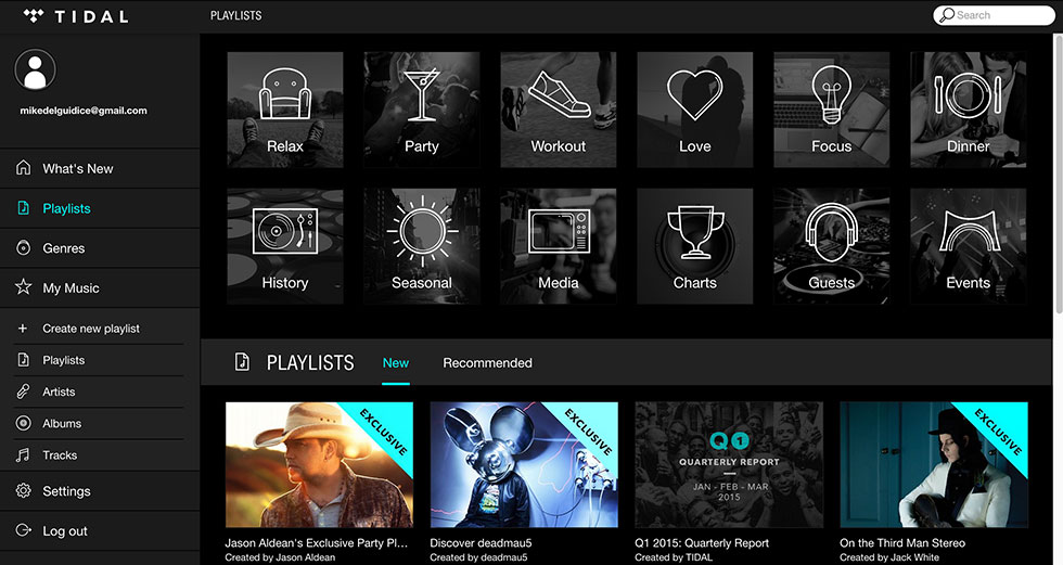
The interface is the same grid layout we’ve all come to know (and love) from our other player, cough Spotify. Not that there is a problem with the way big “S” handles their layout, in my opinion, it does some pretty amazing things, especially in regards with how it handles an incredible library of content.

Tidal
I just expected more with Tidal, especially coming from J-HOVA, someone who’s built his career by straying from the beaten path. I wanted something that would blow my mind, something that made me NEED Tidal, but it just wasn’t there.

There were glimpses of what Tidal could have been, with slick transitions that make sense to a user and don’t remove them from the moment.


There were literally two instances when this level of detail was applied. And the look of the app is super sharp, black on black with pops of neon blue that scream for you to click.

Tidal2
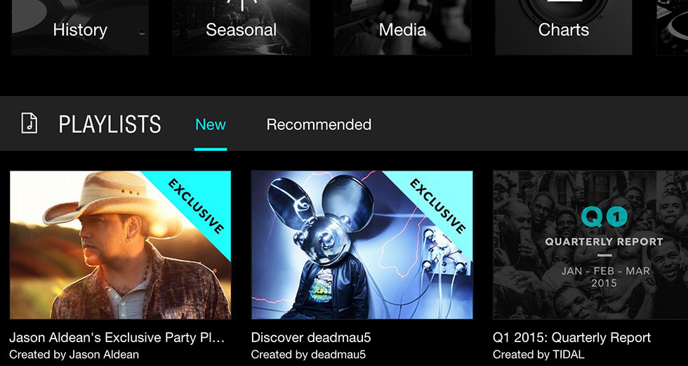
Also, there’s no denying that Tidal has a very trendy look, but it’s the details that make a truly immersive and engaging experience. Unfortunately, with Tidal's design inconsistencies and jarring page transitions, it was difficult to convince myself I needed this new platform for music streaming. And with a price tag of $19.99 for premium membership, Tidal, missed the boat (pun intended) on this user.

Tidal 3
Let me clarify though, this is in no way a put down to the team of incredible designers who obviously spent countless nights away from their families. This is merely my take on a, now, very traditional service from someone who has made a name for themselves by rising above, not floating amongst his peers.

What are your thoughts? Would you make the switch from Spotify to Tidal? Let us know.

Categories
Tags
Author

5apps

Paperless Post | For planning.

Paperless Post is an ecommerce company with a focus on design-driven online and printed stationery. E-cards can often feel subpar to the “real thing”, with personality driven options though, Paperless Post makes the digital card world aesthetic and beautiful. In addition, not only are the cards custom and unique, but PP offers a variety of features from tracking and internal updates to community event boards.

Uber | For time.

If you haven’t heard of these guys yet - you’re missing out. Uber is an on-demand taxi service that can be requested at any moment. Got a relative coming into town, but nobody to pick them up? Request an UberX for them via your phone and give your relative minute by minute updates as to the ETA of their car’s arrival.

Airbnb | For space.

Yes, we love our families, but sometimes extended stays can be a bit stressful. This year, why not book an Airbnb in the area? It’s better than a hotel, will give you space after hours with Uncle Arty, and will keep the family in a happy, stress-free state.

Seamless | For the inevitable hangry moments.

Seamless is your personal delivery food site and as the name would suggests - takes the headache out of online orders. With Seamless you can search for restaurants in your area, create an order, pay online, and get updates on your delivery status by the minute.

YogaStudioApp | For your health.

If there’s any time you shouldn’t skip out on health - it’s the holidays. Make time to take care of yourself. YogaStudioApp is a great resource with custom workouts based on the # of minutes you’ve got, your experience level, and the space you’re in. There’s no excuse, take time to refocus and keep yourself healthy!

What's your favorite app for the holidays? We'd love to hear from you!

Categories
Tags
Author
Subscribe to Ux