
Mobomo webinars-now on demand! | learn more.

Visuals of data

Let’s start with the basics.  Big data refers to complex sets of data that are too large for analysis by traditional analytical applications.

For a business it can be difficult to accurately learn from the data gathered on consumers. Capturing efficient data is challenging, and then you have to analyze that data which can sometimes be even more challenging. So the big question here is how do you use data to predict user trends and user behavior, and how do you ascertain value from the acquired data?

What makes big data challenging is the tremendous size of the data, the speed at which you can analyze so much data, and trying to zoom in on which data is meaningful, given the wide variety of data being recorded. Managing to accurately interpret your big data can ensure efficiency in your consumer strategy, and reduce risk for your company’s investments.  You should perform diagnostics on how effectively you are interacting with your data.  Ideally, if you can accurately read consumer trends, then it should be easier to make a successful business decision based on that data.

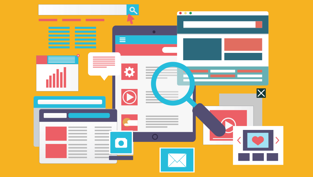
There are a few different methods for visually representing your collected data. But which visualizations will show us the consumer trends that we don’t expect to see?  Think about a few standard website analytics: page-views, clicks, bounce-rate.  Using a line graph, you can visualize and compare these numbers across a few days, weeks and months.  But, how do you interact with those numbers to make smart investments?

One method for interacting with big data is to let that data permeate your company, or the 50 monkeys on 50 typewriters technique.  If your entire staff has hands-on tools for interacting with your big data analytics, then they can all problem-solve and innovate with that data.  One of the best practices for extracting value from your big data is to invest in an environment for visualizing your data.  You can have data analytics for every single human thought, but if you don’t organize it into a logical environment, then the data is useless. Given the complexity of big data, it is easily distorted.  Establishing an accurate data representation is the most important thing that you can do to help guide your company's investments.  

Innovation will develop from cross-referencing, and combining various, and what may appear to be disconnected data values.  It is challenging to integrate disparate data sets, but integration is essential to understanding the relationship between your business and the consumer.  Let’s look at an example.  IBM and The Weather Channel partnered in an attempt to counteract the economic effects of weather, which costs billions of dollars for businesses across the US.  The partnership intends to forecast the weather by collecting over 10 billion data points from phones, vehicles and other sensors.  Businesses can use the data to adjust staffing and other expenses.  Upfront this is an expensive and challenging venture, but it will likely save an exponential amount in the future.  When you look at massive amounts of data holistically, then you can make intelligent investments.  However, if you were just looking at individual segments of data those logical investment choices might not be visible.

Successfully incorporating big data into business strategies is mostly a mystery.  The recent development of virtual reality in the data analysis field has the potential to transform.  Your brain absorbs information in three dimensions- if we can develop smart data representations in 3D then our understanding of the data will be much more efficient.  Two dimensional data representations are ubiquitous right now. Biologically speaking, humans are poorly designed for comprehending the complexity and multidimensionality of big data.  2D visualizations reduce their data sets so that we can understand them.  If we could visualize multidimensional data sets and simultaneously have the ability to separate that data into individual parts, it would be much easier to understand data patterns.  Virtual reality has the potential to create these nuanced representations.

VR technology is being incorporated into big data analysis in small increments.  We are still waiting on the first major VR data visualization for goal oriented data discoveries. The recent VR trend in video game development has provided rapid advancement for this technology.  Google's VR software has been open sourced and Oculus Rift is a popular VR technology owned by Facebook.  Software development for VR games has a niche market right now, but VR games compared to their predecessors are like sound cinema to silent film.  It is only a matter of time before VR is ubiquitous for game technology and before it transcends games.  VR will be used for all types of data interactions.  I predict that the proliferation of VR hardware in the coming years will equate to the transformation of PC’s in the 80’s to their ubiquity today.  The tech is becoming more powerful, affordable and more convenient.

Currently, our best 2D data projections consist of complex data sets built into digital environments that allow the viewer to manipulate the model.  Within a 3D VR projection the user can navigate their data from any angle they choose.  Scaling for the point of view of the user is difficult in 2D modeling.  Scaling can be particularly challenging when you have varied data sets, and want to find a specific  value.  Smaller details tend to get lost in 2D abstractions, while trying to represent big picture analytical comparisons.  The interactive capability of VR will solve for this problem.  Accounting for individual bits of data within a mass is an essential building block for 3D visualizations.  Depth of detail will ultimately be dependent on the specific VR environment, but 3D has the capability of incredibly deep representations, while 2D does not.  Imagine that you are looking at a city that is 4 square miles.  Now imagine trying to understand that city by looking at it in a profile view, and only seeing 2 miles.  From that perspective, you can stack the buildings on top of each other or line them up in one long line.  Using that profile, or 2D visualization to calculate the average living space per person can be accomplished.

But, imagine trying to calculate the average daily walking distance for each person, or the average distance from a house to a store, or other specific data.  These calculations can be made with the 2D visualization, but they are much more complex and challenging to comprehend. Now imagine a scalable 3D interactive simulation of that same city.  You can walk around the city and you have interactive tools for breaking it into individual parts.  The calculations, though complex, are much easier to wrap your mind around.  Your brain absorbs a story faster than it can internalize a raw data set and the digital visualizations create visual storytelling. Without the right framework you will not recognize important patterns in your data.  With enough people studying your data you will get insights, the same is true for crowdsourcing any problem.

The best way to maximize our big data integration is to establish a good interactive environment with that data. We don’t yet have great tools for big data analysis but there are a number of tools available.  Right now, we are trying to find where the secrets of big data are hidden, and all we have is a compass. We are trying to reach the point where we can locate those secrets with Google maps.  It is a large gap. The newest innovation is big data analysis with virtual reality.

So the question remains, where will big data visualizations on VR lead us, and how successful will they be?  Time will tell.


Categories
Author

drupal-government-sites

Over the last ten years, the government has been gradually migrating to Drupal as their primary content management system, but for what reason? Well there are a few but lets talk through what Drupal is as well as the systems that were used prior.

Drupal is a free, open source software that can be used by individuals or groups of users, even those who may lack technical skills are still able to use-- it is easy to create and easier to manage. The application includes a content management system as well as a development framework. It's flexibility and scalability has made Drupal an industry go to- not to mention, its one of the most secure platforms that exist.

Before Drupal, government websites were all over the map in terms of the technologies and proprietary software that they used. Although there isn’t an official log of government website platforms over time, it is well known that there was never one single content management systems (CMSs) to rule them all.

A quick rundown of some of the past CMSs used by the government include the following:

In 2009, WhiteHouse.gov launched it’s new website powered by Drupal CMS scoring a huge win for the open source community and open source advocacy groups. Of course Drupal was well known before the White House made the switch from what may have been Expression Engine. But with such a high profile website being powered by a community driven, open source platform, other government agencies starting paying attention.  

With each passing year, the list of Drupal government sites grows longer and longer. Not only is the federal government using Drupal, but local and state governments have also turned to this powerful open source software to fulfill their needs.

So what makes Drupal attractive for government agencies? Why is an open source platform, such as Drupal, a good option for high level, high security websites? Here are a few reasons why the government has been making their shift from other content management systems to Drupal.

Financially Attractive

Proprietary software will definitely become a drain of project dollars faster than you think. When you factor in the updates to the core software, support charges, security patches, modules or plugin updates, Drupal looks very attractive. It’s free and can be maintained for a fraction of the price of comparable proprietary software. For a government entity, this is likely the single most appealing factor.

Support

The open source community for Drupal is second to none. With so many Drupal developers around the world tackling a wide variety of tasks, it’s very easy to find a post in the Drupal.org forum that may point you in the right direction. And if you can’t find the solution, the community is fantastic at helping others find a solution. The more developers that address a problem, the stronger and more well developed the software becomes.

You own the code

Proprietary software is mostly closed and the code is simply not open for all to see. This makes the ability to audit the code virtually impossible. At this point, you’d have no choice but to trust the software provider’s word on their products solid security. Drupal’s code is open and can be viewed and audited. It’s yours. You own it.

Flexibility

Drupal can handle all kinds of projects ranging from large scale, resource intensive projects such as a documents database to intranets or individual personal websites. It can be exactly what you want it to be. Out of the box, you have the capability to create content types and add fields of your choosing. And with the ability to extend modules and themes, the possibilities are endless. Proprietary software is not expandable or flexible without cost.

Reliability

Drupal’s software is peer reviewed and community driven. Modules are documented and reviewed prior to them being listed on Drupal.org’s module list. Open source software such as Linux and Apache have proven themselves to be hardened and reliable in demanding situations. 

We have migrated a few government websites to Drupal, check out the work we have done for NASA and USGS.

Categories
Author

sketch


The short answer, yes, Sketch is becoming a popular choice for interface design. Two years ago a new race commenced when designers started looking for a faster and cheaper alternative to Photoshop, which at the time was the market leader- I don’t think anyone is doubting that Photoshop is still the most commonly used tool in the market but Sketch entered the race and has made quite a positive impact for another designer tool option.

What is sketch?

Sketch is a development tool for UX and UI designers - it is vector based tool entirely focused on the user interface design.

Sketch identified a gap in the market and started to capitalize on items that Photoshop seemed to be missing. Aspiring to be an icon company of the 21st century and a customer engagement champion at heart, Sketch successfully transformed into one of the most usable tools for UI designers. Sketch was perceptive to the needs and behavior of their clients. They understood how to cross all barriers we assumed were set in stone.

Here are some basic differences between the two:

  • Speed: Sketch seems to be much faster and works smoother than Photoshop. It’s a fast application which is intentionally minimal in its offerings. The result is less time thinking about how slow the software is and more time designing. This makes it way easier when working with complex workflows. Sketch is only 45MB compared to Photoshop CS6 and its 4GB.
  • Sketch Mirror: Another cool feature that comes with Sketch is the possibility to mirror your artboard directly in your iOS device. So you can easily test it and see how the designed screen will look without having it implemented in the application.

Sketch really outdid themselves when they came into the market- this allowed designers to use another program that may cater to their needs more specifically than Photoshop, and at a cheaper price.

Which program do you use? Photoshop, Sketch or both?

Categories
Author

NASA and team have unrolled a new website re-design for a new and improved science.nasa.gov and ciencia.nasa.gov, and it looks awesome! The website is a fully responsive design, meaning that science.nasa.gov can be accessed on any mobile or tablet device at the touch of a fingertip. This engaging new look and feel encourages users to explore NASA science through a rich new interface and search capability. Congrats to NASA and team on another successful launch, the new site is out of this world. Check out the before and after of the redesign-

Before: 

nasa-web-design


After: 

nasa-responsive-web-design


Categories
Author

woman-writing

Relationships are hard, whether it be with friends, your family, or a working relationship with a client. An incredible amount of work goes into making them successful, let alone last for an extended period of time. Let’s focus on the client-designer(s) relationship, one that we’ve had many years of experience with, and how the two parties need to establish clear goals for each other in order to be successful.

As with any partnership, the one between a web design agency and their client is no different. Establishing clear goals helps to set the foundation of the rest of your time together. But what should those goals be? Should they be solely focused on the product? Should they be set only for the design team? Should your client have goals set for them as well? Simply put, YES. All of those actions need to happen to ensure that both the design team and client are happy and successful.

I thought this might be a great time to share some of the goals/objectives that our web design team created in order to make our lives easier on projects

Communication:

Communication might not seem like a “goal”, but it could be argued that it might be the most important goal any design team and client can set for each other. Establishing clear communication patterns - like daily or weekly check-ins - is a great way to build trust and to show progress. From our experience, nothing shows a client you care like over communicating and keeping them in the know.


Milestones:

Setting up finite and clear deadlines for work - whether it be a check in, a project deliverable, or a status meeting - is another great way to establish trust. These milestones not only show that you care about a project, but they’ll help to keep both parties accountable and sane.


Constructive Feedback:

Feedback is easy to give, anyone can say they like something (or even easier, pick out the things they don’t like). What takes effort is explaining why you don’t like something and offering potential solutions to fix the issue at hand. Whether it’s client feedback on work you’ve done, or a design team pushing back on feedback they’ve received, having a clear, thought out rationale for the reasoning and explanation against doing something is more likely be accepted.


Transparency:

Transparency could potentially be a subset of communication because, at it’s core, it is a specific type of communication. I personally have learned through the years to be as straightforward and honest with not only my design team, but also our clients. If you’re not going to make a deadline, if you don’t agree with something, if you don’t understand something…SAY SO. Never hold back something if it has the potential to 1.) Derail a project, or 2.) Make that project better. Nothing can turn off a client or coworker more than hiding issues or concerns you may have. When in doubt, be as transparent as possible.


Trust:

Everything I’ve mentioned previously has led up to trust. Without trust from both parties a project is doomed from the start. Like any relationship trust is the glue that holds the project together. If your design team can’t trust you or the client, then regardless of how great your work may be there will always be uncertainty. If your client can’t or doesn’t trust you then continuing on the project is an exercise in failure. So the big question is how do ensure that you can establish a trusting relationship? Communicate, set milestones, give constructive feedback, and be transparent. It’s not difficult, but it takes work and time.

I can wholeheartedly say that if you and your web design agency start your next project with these goals in mind you will have a much more enjoyable experience. I’d love to hear of your team’s successes and other goals that you set for yourselves. Tweet us @MobomoApps or shoot us a note at hello@mobomo.com so we can hear your success stories.


Categories
Author

The dashboard is a critical part of all web applications. It's the first thing users will see when they visit your website and often times there is some sort of information within the dashboard that the user may be looking for - dashboard web design does not have to be difficult, but I will admit it can be tricky. Here are 5 common pitfalls I see frequently, hopefully this will help you build your next dashboard.

Mistake #1) Believing There Is One Type Of User Dashboard

web-dashboards

The dashboard is a critical part of all web applications. It's the first thing users will see when they visit your website and often times there is some sort of information within the dashboard that the user may be looking for- designing a dashboard does not have to be difficult, but I will admit it can be tricky. Here are 5 common pitfalls I see frequently, hopefully this will help you build your next dashboard.

Since the evolution of applications and products, dashboards are no longer a cookie cutter visual experience. We need to use visuals sparingly and focus on actions. Look at the products you use in your everyday life. Next time you log in at your bank or pay for your credit card, pay your cable/electrical bill, or even log into Facebook, do you see a sea of large visual charts telling you about everything? No. All you care about is paying that bill you forgot about. Therefore, stop looking at Dribble for inspiration to create your dashboard concepts because it's going to lead you down the wrong path. Start looking at real life applications around you or the problems you are trying to solve.


Mistake #2) Assuming You Know What Your Users Wants

dilbet-user-testing

With dashboard web design, your object is to create a forgotten experience when completing their tasks. Why forgettable? Because then we are not asking the user to think. Users only remember bad experiences, a more complicated dashboard equals a bad experience which equals an unhappy user. In order to avoid this, we need to figure out their routines and what information is most important to them. Why are they logging in? How often are they logging in? What types of information are they constantly looking to get? What is working and what isn't? All of these questions help construct a dashboard that users will love and forget they are using while in the moment. However we answer all these questions in conference rooms and not directly with our user.

Your second mistake is thinking you know your users habits. Analytics are fantastic, frankly, I am not sure what we did before they existed, yes you can get user information from analytics but unfortunately, those metrics won’t take you far enough. Before building any product you will need to sit down with your users/target audience and listen. It’s a simple task that companies are sometimes afraid to do before they invest thousands of dollars, which is foolish. If time is of the essence in kicking off your project and the user experience is the hold up, there are simple ways to gain user feedback from your existing user base. Reach out to your newsletter directory and ask them to take a quick 5 min online survey. Showcase a sticky call on your dashboard asking for feedback. These two steps alone can lead to quick and simple feedback in a short period of time that provides more value than before. By knowing what you your user needs and what their habits are will help you towards building an amazing “forgotten” experience.

Mistake #3) Believing That Design Will Solve All Your Problems

dilbert-product-design

There will always be projects that feel like everything is broken. Especially when dealing with a dashboard that hasn’t been recently updated. Our first instinct as a designer is “oh we can make this better, so much better with a modern design!” This is very true, a simple way to refresh your ascetics. We can easily fix the hierarchy and make it feel light and trendy. Also another true statement. However, if we are not solving any user or technical problems in the process there is no point.

This causes your third mistake, believing that we can rely on design to make our product and dashboard amazing. It's easy to make something look modern, but it's hard to make it work seamlessly. In order to accomplish this, we need to know what the user problems and habits from Mistake #2. Simple things like monitoring your dashboard analytics will easily tell you what links are getting clicked and viewing page load times to see what areas are lagging and how you can refactor the system to speed up the results. All these aspects will help you build a beautiful dashboard that solve the user problems.

Mistake #4) Thinking that User Feedback Comes Only After Launch

dilbet-cartoon

Talk, design, build, test, and launch. It's a traditional process that companies and design firms use to build your project. Once the product launches, we may get slight feedback, on what works or doesn’t, but will not know for user. An iterative process that is a perfect way to always improve your dashboard. However, when time, resources, or reputation is valued, you can’t always afford to drop the ball for these long feedback loops.

Your fourth mistake is thinking we can wait until a product launches to get actual user feedback on the dashboard. It is a big risk to invest 3-12 months to build an application to find out you drop the ball on the first page. Especially when we can easily obtain feedback at every step of process from concept to final product.

Wireframes and flat designs are not difficult to test with today’s web applications like Invision App which is an interactive prototyping application that brings flat designs to life. Within minutes your designer will have a clickable prototype for you to test your dashboard to your users. Remember, it takes fewer calories to make changes earlier than later after everything is coded. As a result, we're able to launch a proven dash dashboard that you know solves your users problems.

Mistake #5) Ignoring Your First Time User

greatest-engineer

When designing our minds always focus on designing for the active state. We start laying the components and solutions when data charts are full, graphs have data, users have messages, and receive notifications. It makes sense that we want to showcase all the possible functionality of our dashboard to meet the user needs.

This leads to our final mistake when creating a dashboard, we forget about designing for the first time user. This is the most important because it sets the tone for the rest the application. If the dashboard is empty it will confuse the user on what to do next. We immediately set them up for failure. As a result, people will not stop using your application.

A dashboard should always guide the user to accomplish a task even if it’s empty or a first time user. In order do this, we have to design for the first time user’s vision of your dashboard. What will it look like when it's empty? What task(s) does the user need to complete in order to show information. How can we unobtrusively guide the user around. Simple solutions could be creating a task list for them to complete or even a welcome message at the top with common actions that want to complete. Designing for the first time user will aid usability of your product, but will also help user retention.

Let’s Recap

Creating an amazing dashboard isn’t hard, but isn’t straightforward either. Your application is unique, and your dashboard should be as well. Talk to your users and see what their habits are in addition to their needs. Read between the words to see what they really need and build solutions around that. Remember to also test these assumptions we have made to ensure they are right. And lastly remember your first time users because they will dictate if your product is a success. Check out some of our dashboards that we have done for clients such as: World Bank, Great Minds, and Spark Post.
What design needs are causing you to stay up at night? Get in touch for a free consultation!  

Categories
Author

apple-app

Apple continuously takes its technology to the next level. Among the many releases announced this week, Apple also made improvements to their app store. This update comes packed with new capabilities and tools to improve your app’s business and its engagement with new and existing customers. Let’s review the Apple App Store updates.

The App Store is home to over two million apps, Apple took things upon themselves and made major improvements, viewing quality to customers as its highest priority. “We love helping customers discover innovative, useful, and exciting apps on the App Store. […] Quality is extremely important to us,” Apple wrote.

According to Statistica, as of June 2016, Apple's App Store remained the second-largest app store with 2 million available apps. Just to put things into perspective, Apple receives 100,000 App submissions each week- insane! However, many of the apps are never downloaded or were probably built on an older version of iOS and were never updated or they just don’t work at all. So it was time for some App Store improvements.

Apple plans to remove “abandoned” or “problematic” apps which do not follow their current review guidelines from the App Store. According to the email, however, app developers obviously get informed about issues found with their app.

The App Store improvements don't end with the removal of apps that are abandoned and demonstrate lack of usage - they plan to eliminate apps that are spam related, or have lengthy names. Many stuff their app names with promising keywords which commonly results in inaccurate search results as some include keywords not directly related to their app in hopes of getting better search results in the App Store. As anyone can probably assume, having apps that are stuffed to the brim with keywords and having users search for certain keywords and to have the results not match what the user is inputting can create a rather frustrating user experience. Not only is it frustrating to the user, but the user is seeing no value in the search- so it’s a lose lose situation.

If an issue is found with your app, you will get informed by the App Store team. After that time, you have 30 days to submit an update in order to keep your app on the App Store. If you don’t fix all necessary changes asked by the App Store team, your app will be removed from the App Store until you submit an update. Apps, that already crash on launch will be removed immediately. The character limitation for app names from now on applies to any app that gets updated or newly submitted to iTunes Connect from here forward. So better make sure to prepare your app for App Store improvements. Apple updated their App Store Review Guidelines with details on subscriptions, SiriKit and iMessage.

The Apple App Store updates was inevitable, I think we can all agree, it was a long time coming. Many of the apps that live in the App Store haven’t been updated in years. In some cases, that might be OK, but because of various changes to iOS, that means that some apps either don’t work or are extremely buggy- so ask the question, what if your company made an app years ago, you didn’t think updates were needed, and now.. The App Store is forcing people to clean up their act.

So what does this information mean for your company’s app?

Once Apple starts reviewing apps, if they find something that does not abide by their guidelines the developer will receive a notice and have 30 days to make an update to the app, if no updates happen within 30 days then your app will be permanently deleted from the App Store. As you can assume, if your app is removed, this could be detrimental to your brand, you can read more on why your company needs a mobile app and the importance that apps contribute in your brand awareness.

If you think your app may need some improvements in order to meet the requirements of the Apple App Store updates, drop us a note.


Categories
Author

What is it that makes a good app great? It’s not really one thing that we can point to that makes an app amazing, think about it in terms of  the 86’ Mets- there's a lot of things that need to come together to make it great. First and foremost, a great app needs to be the best solution to solve a person’s problem. Second it has to be highly usable, intuitive even, and it should not confuse or upset people as they’re navigating through it. Lastly, it should surprise and delight people, in the same way a movie you had no interest in seeing becomes the best movie you’ve ever seen. A mobile app development company will aim to encompass all of these aspects, not just one or two.

Even though there are a lot of moving pieces to make an app great, I am going to focus on the surprise and delight aspect that makes a great app. It’s a broad term that could range from how an app transitions from one screen to another, a tiny detail that makes it easier to use, or an aesthetically pleasing appearance. With over 2 million appsavailable for people in the major app stores, it’s this tiny aspect that sets apart great apps from the rest of the noise. When it comes to the specific things that delights an individual it can be anyone’s guess, but there is a commonality between everyone who is using the app… they enjoy it.

Below are a few examples of the apps I think got it just right, they combine the problem solving, usability, and delight that makes up a great app:


Waze:


01_waze


Something:

02_something

Operator:

03_operatorAndroid Pay:

android-pay

Acorns:


05_acorns

Which apps did we miss that you think should've made the list? If you're looking for a mobile app development company, we'd love to build something great together.

Categories
Author

computer-screen-sass-web-design

When considering the architecture for mobile app development, one of the primary concerns of any team should be code quality. One of the ways developers ensure their code is error free is through tools called linters. Linters check code for style or programming errors, and can be configured to run at various times - as part of your build process, or via your text editor so you can catch errors as early as each individual keystroke.

When planning the architecture for a mobile app, you want to ensure its ease of setup for all team members who may be contributing. When looking at the default architecture of Ionic 2 apps, the tech stack looks like this: Ionic, Angular, TypeScript, Sass, Gulp, Cordova and npm. There’s one item in that list that stands out as depending on a very different architecture than the rest of the project: Sass. Sass is a Ruby gem, so without looking any deeper, you would assume that you’d have to have the Sass Ruby gem installed on your machine to use Sass for web design. This post looks at removing the Ruby on Rails dependency from an Ionic app’s architecture.

First of all, Ionic apps use npm, so we already have the foundation for a Node environment. It makes little sense to mix Node and Rails environments, if possible. This is well known in the community, and there’s been much work around porting Ruby gems to Node. One example is the gulp-sass Node package (which Ionic uses for Sass compiling). Gulp-sass is a wrapper for node-sass, which is a Node binding for libsass, which is a C port of the Sass precompiler, which was originally written in Ruby. As you can see, there’s been a lot of work around removing the Ruby dependence to compile Sass in a Node environment, and further, Ionic 2 apps are using this port by default.

In searching for a Node package for Sass linting, there are plenty of options. But we’re looking specifically for a package that lints using the Node version of Sass, not the Ruby version. If we look at the sass-lint GitHub repo, we find the following:


sass-lint

Huzzah! Sass-lint is easily installed using npm, and from there, you need to point it at a config file with your linting rules. The sass-lint npm docs provide examples of both a sample config, and the default config file, but, if you have a .scss-lint.yml file that you previously customized for Rails projects, you can quickly convert it.

Once you have the sass-lint package installed and a .sass-lint.yml file in your project, it’s just a matter of how you want to use it. There are two primary options for my local setup, but the beauty of this solution is that it doesn’t matter what your local setup is, it will work for you, and that’s our goal.

First, linting while you’re editing is the ideal scenario. Getting feedback per keystroke is not only extremely helpful, it allows you to fix the issue while you’re still in context, which is important. I use the Atom editor, and we can see from the sass-lint IDE integration docs that there is an Atom plugin available. There are also plugins available for Sublime Text, Brackets, WebStorm, Visual Studio, Vim, and more. After installing the plugin in my editor, I can see contextual clues as to what rules I’m breaking:


2-editor


Secondly, we can additionally lint our codebase as part of our build process using Gulp, which allows further control (for example, requiring developers to fix errors before they can check in code to Git, or displaying errors on GitHub before a PR is merged). Setting up sass-lint to run in Gulp is as simple as requiring the module, and then setting up a simple task:


sass-code


This gives us a nice output on our console, and you can obviously customize the Gulp configuration to meet your personal build requirements:


scss-code
I hope this helps see the value of code quality, making projects accessible to team members, how to get Sass linting setup quickly in Ionic 2 projects, and most importantly, how to do it all with Node instead of Rails. Happy linting!

Categories
Author

software-development

Modern communication abilities are available at the touch of a fingertip, software development teams have the potential for better team interaction than some workers who are working in the same office. Yes, team leaders are essential, but sometimes they can hinder the productivity of a team by micromanaging and enforcing rigid processes rather than letting new strategies evolve organically. Remote dev teams are separated from your office politics, and other factors that can slow the dev process. The good news is devs are result oriented and we all know it’s harder to manage every detail from a distance, remote dev teams encourage a mentality of, “here’s a task, tell me when it’s done.”

Transitioning to a remote software development company can be an intimidating. But if your software development and design team is on the same page, then it should work like clockwork. Your developers should be working with the same technology, the same process, and the same principles and if they aren’t well there will be more problems combining code if everyone is not working with the same values.

Let’s disassemble the methodology built around scrum development and then construct a framework for skillfully managing your dev shop.


Communicate, the team lead should have weekly interactions with the client whether thats onsite or over a teleconference. The lead can then communicate essential tasks and details to the web development team. When you set project goals with your client, always account for the planning fallacy. The planning fallacy suggests that we are given to an optimistic bias in estimating how long a task will take.  In the planning stage, everyone imagines ideal working conditions, and forgets murphy’s law: if something can go wrong while you're on a tight deadline, then it definitely will go wrong. To avoid overly optimistic deadlines for your project, try to rethink traditional software development techniques.  A popular method for deadline projection is “planning poker,” also called scrum poker.  With planning poker you incorporate each member of the team in estimating how long a task will take. Your team’s input is essential, but over time every system can break down. Your software development team will overestimate timelines to make their lives easier but the best thing that you can do is to anticipate factors that affect project-time estimations, and make reductions that you can accommodate.


Goals, the team lead for each web development team should be setting realistic goals.  As a team lead, don’t lay out a plan for the complete project development when you first meet the product owner,  stick to the essential building blocks of the project. Only discuss goals that can be accomplished in the short term. Maximize your time by getting ahead and moving on to the next task set, rather than trying to expand the product features. Ideally each member of your software development team is capable of analyzing their task.  They should be independently segmenting their projects and establishing goals for each segment.  This makes it easier to hold each member accountable for their segment of development and to evaluate their progress.

Shorten daily project meetings.  Have one quick stand up meeting everyday, we like to do ours in the morning so that we can discuss the work that needs to be completed for that particular day, it’s important to incorporate the whole team to promote focus and communication.  Be sure to report yesterday's progress, today's goals, and any roadblocks that you have along the way. This may seem like a needless chore, but it will prevent having tons of smaller check-up meetings throughout the day.  Having a daily standup meeting with everyone frees up your day to focus on pertinent issues with members of the team that actually need to be there.


Promote a self-organizing team, wherein team members can make decisions and adapt in a moments notice. Ideally individuals in the team can anticipate work and then start on the next project segment without being tasked with it. Train your team to grasp the depth of project goals.  In the ideal environment you're the team lead is open to answer essential questions, and devs can innovate in the process and recommend improvements.  The scrum master ensures that his team is getting necessary training and growing to improve the team’s collaboration.  Cross training allows software development teams to work on different skill sets that they may not normally have the opportunity to do so- for example, if one developer is a master at back end work, this would be his opportunity to work on front end work. In each iteration of the project, have devs work on new sections of the system that way they each get different experiences and are tested outside of their comfort zone.


Avoid over-engineering your software system, and trim away unneeded features.  “Feature creep” will happen when you add more and more features that go beyond your essential needs and over-complicate the product.  The features that you add to make your software better are often imperceptible, while the user experience is noticeably decreasing due to increased memory use and the need for more processing power. Attempting to anticipate and account for every problem is a poor development strategy. Your project goals will evolve and change direction as you go deeper into a project’s development.  Always incorporate simplicity into your design goal to account for these changes.


Programming features that are required by the user.  Don’t add a feature until it is absolutely necessary.  Strictly focus on keeping designs simple to maximize your efficiency.  Only incorporate a feature when you need it.  Always delay a decision until it is absolutely necessary for you to decide on adding a new feature. This is not procrastination, waiting allows more time to gather information about which features are essential.  Every design decision should be based on your needs, rather than working on a feature that you assume you will need. Waiting on additional features allows you to reduce your assumptions so that you are only choosing the features that are essential to your program.  Designs evolve as you get further into the dev cycle. If you end up taking your program in a different direction, then a simple design can prevent wasted resources on features that you will never use.

At the end of each sprint, you should have a tangible product increment. You should have a quick sprint review that happens quickly.  Reviews take minimal effort and preparation, use the review to demo and review the product features.  You should also keep a relevant burndown chart to continuously understand the progression of your project, and avoid wandering from your project deadline. The burndown chart is a graph representing how much work you have left on a project versus how much time you have left to do it.  Make the burndown chart efficient as possible. Recalculate estimates of project completion times if your estimates were off to maintain accuracy.

Review your team at each project’s completion, incorporating an analysis of the shipped product, the PO’s perspective, and a retrospective on the team’s effectiveness in delivering the product.  This is a good time to rethink and improve your software development process.  Highlight your accomplishments to supplement future plans.  Review the effectiveness of your team’s communication, and of your tools.  Identify areas of weakness.  All of these things are particularly important for remote software development teams, because it is easy to lose track of the details from a distance.

Categories
Author
Subscribe to General