 Who doesn't love a shirt or a pair of pants from GAP? GAP has been an American staple for years, and I can personally say I love their quality of clothing. A few months ago I wrote a piece on my frustration with GAP’s website and trying to navigate around it..specifically the home page. So I did what any rational person would…and redesigned it.
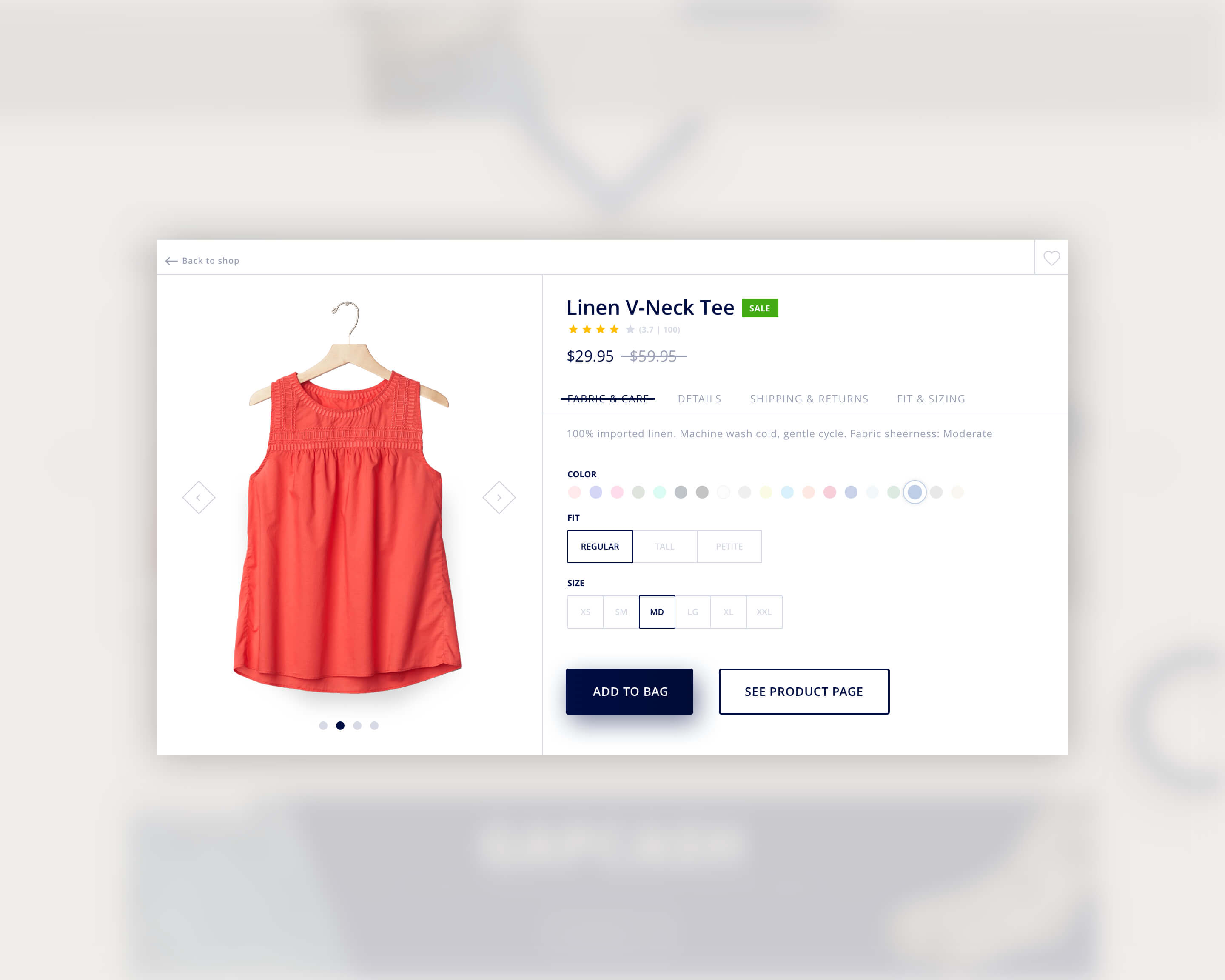
As with any feedback I give, in regards to a web & app design, I strive to make sure that it’s constructive, not to be misconstrued as merely being malicious but rather helpful suggestions based off of my professional experiences. However in the case of my previous post I wasn’t able to complete my perceived vision of what GAP.com could be in time and thus broke my rule. Below is my version of what GAP.com could be, with a little run down of the decisions I made and why I made them.

GLOBAL:
TOP NAV:
MAIN NAV:
MASTHEAD:
PAGE SECTIONS:
Hopefully if time permits I’ll have the chance to layout a product page, and take a stab at a mobile layout.
Just to be clear, this is in no way a sanctioned design by GAP, or an official Mobomo piece of work, but rather my take on what e-commerce and specifically what the GAP could be with a little web redesign effort. I’d love any thoughts or comments you guys have, so hit us up on twitter @MobomoApps or email us hello@mobomo.com - we love feedback!