Mobomo webinars-now on demand! | learn more.

gap.com-redeuxWho doesn't love a shirt or a pair of pants from GAP? GAP has been an American staple for years, and I can personally say I love their quality of clothing. A few months ago I wrote a piece on my frustration with GAP’s website and trying to navigate around it..specifically the home page. So I did what any rational person would…and redesigned it.

As with any feedback I give, in regards to a web & app design, I strive to make sure that it’s constructive, not to be misconstrued as merely being malicious but rather helpful suggestions based off of my professional experiences. However in the case of my previous post I wasn’t able to complete my perceived vision of what GAP.com could be in time and thus broke my rule. Below is my version of what GAP.com could be, with a little run down of the decisions I made and why I made them.

gap.com-redeux

GLOBAL:


TOP NAV:


MAIN NAV:


MASTHEAD:

gap.com-redeux


PAGE SECTIONS:

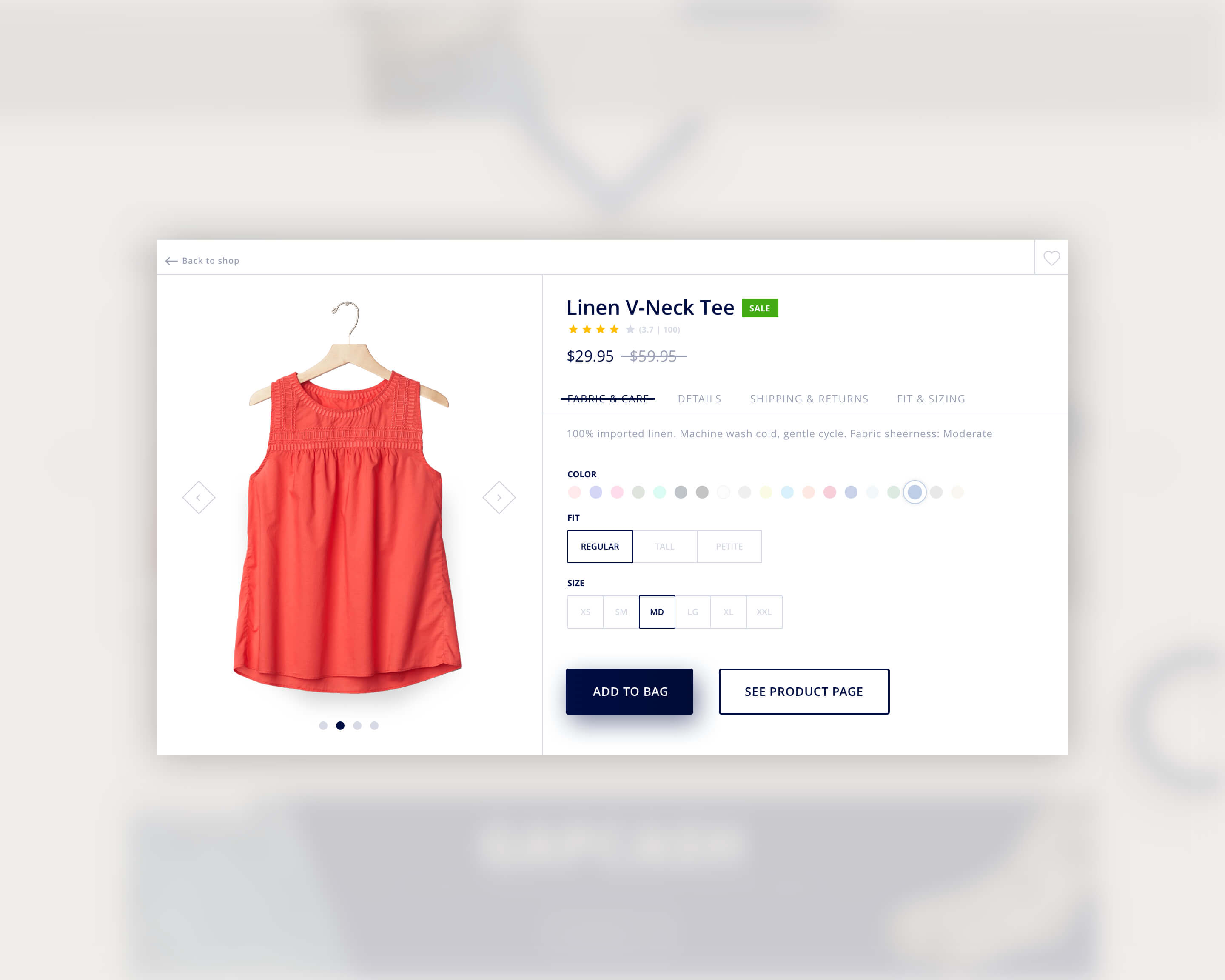
Hopefully if time permits I’ll have the chance to layout a product page, and take a stab at a mobile layout.

Just to be clear, this is in no way a sanctioned design by GAP, or an official Mobomo piece of work, but rather my take on what e-commerce and specifically what the GAP could be with a little web redesign effort. I’d love any thoughts or comments you guys have, so hit us up on twitter @MobomoApps or email us hello@mobomo.com - we love feedback! 


Categories
Author

struggling-use-computer

The other night my wife was browsing the GAP(gap.com) website, itching to spend her “gap bucks”. She asked if I needed anything and as I browsed through the site looking at clothes I didn’t need, but maybe wanted, I found a constant, frustrating theme throughout…this site was not designed for anyone to actually use. Let me clarify below…

In The Beginning…

Let’s start at the beginning of any website, the homepage. It seems that on many large retail sites immediately upon landing you are bombarded with the latest trends in e-commerce sites, a full page interstitial takeover, begging you sign up for their newsletter for an extra XX% off your purchase.


gap-interstitial

After dismissing the popup you are able to actually land on the homepage, though almost wishing the popup would return, so there was a clear message or action to take. The sheer amount of available options is overwhelming. I wasn’t sure when looking at the homepage, if GAP wanted me to:

gap-homepage

Since I am a professional designer but also a user, when I go to a clothing site to purchase something, that’s all I want to do…purchase that item. I hope that retailer websites such as GAP improves their site so it's easier to navigate, because who doesn't love a good sweater or pair or pants from GAP?

On the flip side I do understand the need from a marketing perspective to answer consumer needs and questions that may relate to the aforementioned list. But surely there is an alternative approach to providing people that info.

Perhaps as someone goes through the shopping experience you can lay these bits of content out in appropriate spots. How about when I add an item to my cart? Why not present me with a coupon option then. Or maybe offer me recommendations of other brand items I might like after the checkout process, perhaps on a thank you screen or in my email confirmation. Crafting a breadcrumb trail like this, and targeting people to take action at the right time, could inevitably lead to more e-commerce sales.

Ultimately it doesn’t matter though, because design at it’s core is about solving problems. And if GAP has found that the way their site is structured solves the problems of their users, that’s all that matters.

Categories
Author
1
Subscribe to Gap