Mobomo webinars-now on demand! | learn more.

UI Kit

We have launched the second kit of mobile navigation flow templates! It is incredibly helpful to have a template, such as this, in order to speed up a mobile design workflow.  This can happen because of it is easy to use and flexible. The package takes into account the latest trends in interface design.  It can also be easily manipulated with smart objects as well.

How is This Useful?

This can help apply your branding and styles across the screens. This kit includes many modern and multicolored designed components developed for the best user comfort and functionality. If you missed the UI Kit vol.1, here we tell you how to handle smart objects.  All you need to do is double-click on the thumbnail of the layer and edit the source file. This is also helpful to apply your branding and styles across the screens.

UI kit

You can add your own content in a few simple steps:

  1. Open the file in Adobe Photoshop.
  2. Look for the layer labeled “Replace me” or “Add content here” and double click.
  3. A second image (PSD) will appear to drag and drop your content in.
  4. Save and close the PSD file.

UI kit PSD file

The package contains:

  • 8 Screens that cover the flow of login for any app.
  • Canvas Size 320 x 560 for iPhone

The screens included are:

  • Splash screen
  • Menu
  • Timeline
  • Profile
  • Gallery
  • Search
  • Comments
  • People
  • Settings

Fonts Montserrat https://fonts.google.com/specimen/Montserrat Format: PSD file Size: 12 MB

Categories
Author

/Design-trends-to-expect-in-2018

Trends for 2018

In recent years we have moved from Skeuomorphism to Flat Design, in 2017 shadows and gradients made a comeback and we have also seen typography being used as a design element and color taking over our art boards. So what design trends should we expect to see in 2018 for website and app design? We believe this is going to be an eclectic year regarding trends, we’ll see influences from the late 80’s, 90’s and 00’s, bold colors and playful typography - elements from the periods of de-constructivism and brutalism will also be seen in 2018. Now, let's check out some examples of what we should expect in 2018! 

1. Bolder Color

Brands are using vivid, vibrant colors to stand out more, examples of this can be seen in Youtube’s and Spotify’s rebranding in 2017. We should expect to see other brands following suit, changing their colors and probably new brands stepping away from pastels - this is a clear example of the 80’s and 90’s influence in design making its comeback. 

2. Creative Typography

Typography is a great way to convey emotions to an audience and for presenting important information. In 2017 we saw typography used more and more as a graphic piece, it’s bolder and bigger. This year we will see some of the same but it will follow different approaches, for example, font as illustrations, liquid effects, sliced texts, brighter colors, photomasking.

Liquid Effect

Typography as Illustration

3. Photo Masking

Photo masking is the use of shapes/text elements/ to mask part of a photo in an interesting way, it can be used in different pieces such as, posters, websites, covers. The first image below shows pictures within letters for a magazine cover, the second image shows an array of images that make up the shape of Bill Murray's head. 

4. Organic Shapes

Since the release of iOS 11 we’ve seen more and more rounded corners in app designs, even rounder fonts used, to convey user friendliness and for brands to appear more approachable to their users.

5. Gradients and Gradient Mapping

“A Gradient Map matches Light Levels to different colors. It analyzes the Highlights, mid-tones, and Shadows in your image and maps them to different Colors. The original colors in a photo will be replaced with the Colors in the Gradient Map”. One thing we’ll definitely see more and more this year are gradients in app design and gradient mapping on photography, this will also influence poster design, websites, branding and more!

Categories
Tags
Author

Apple watch interface

Interfaces are intrinsic to technology 

Each piece of technology that is used by a user has an interface. Computers date back from the first half of 20th century, their physical appearance… well let’s just say, we have come a long way with the look.  Nevertheless, those big pieces of machinery were designed for users to operate them. The user physically had to get their hands on the hardware of the machine to operate.

Technology is constantly changing

Companies like Apple and Samsung are bringing new devices to the market with capacity and intelligence that definitively surpasses all of NASA’s computing power 50 years ago. This level of sophistication begins to explain the user experience, being further from the manual tweaking or direct manipulation of the technology itself. The user experience was the connector or rather the middleman between the user and the physical machine. The user needed to find value in the user experience in order to satisfy the purpose the user had in using the machine in the first place.  If we extrapolate this idea, we can predict the next trend should be about reducing physical stress from the user interaction. This notion has already been seen with each iteration of smartphones-  with the transition towards chamfered edges, bluelight/night screen filters, and each generation becoming a little more ‘wireless’ (whether it be wireless charging or wireless earbuds).

The hypothetical extreme of this will be not having to physically move your body but instead just thinking of the action that is needed, resulting in a response from the machine (creepy sci-fi, right?). Ergonomics is playing a much more prominent role now that technology has reached the point of where it is at today. Comfort and reliability are key aspects that allow the general public to reach and utilize these interfaces on a daily basis.

Voice Technology 

At one time, speech recognition was a concept that seemed like something of the distant future, machine speech recognition has now made its way to be the reality. Most smartphones and online chatbots allow for full-fledged conversations in various languages. Consistent upgrades and machines are being pushed out to implement this field and technology into the home as “Amazon’s Alexa” and “Google Home”. Of course, it is still not perfect and its application as a user interface tool is in its infancy but the technology has already pushed past many fundamental checkpoints. As a result, the artificial intelligence behind it has outperformed.

Bridging the Gap

Besides this race towards smoothness and fluidity, there is also the issue of merging with the environment. Many of the current interface prototypes are intending to bridge the gap between flat, two-dimensional screens and our 3D space. For example, we already know about augmented reality - having some form of visualization tool overlaying graphical elements and information over real world objects (be it a phone screen using the camera, a VR helmet, or special glasses). Yet developers are also leaning towards a more immersive augmented reality, whether that means aligning alongside virtual reality or somehow bridging the two to find a middle ground. Virtual reality has also began to make its mark in the market with larger companies such as HTC, Google, and Samsung paving the way with their higher end VR headsets and constantly updated software for it. Virtual reality’s claim for computer simulated, three-dimensional environments is a clear step into the more immersive and interactive interface space.

The real challenge designers and engineers are facing is to make 3D space be the interface. Ideas and prototypes of kinect-like applications, where items are accessed and arranged back and forth through air gestures are in development. The actual ‘things’ being manipulated are graphical elements projected either to or from a flat surface. There is certainly the ability to ‘read’ or track gestures in space but creating digital imagery that appears in that space as if it were an organic entity is not here...yet. However, prototypes where physical objects are manipulated around space in order to interact with technology are being developed.

There is another possible route ahead for the future of interfaces related to biotechnology, or the implant of synthetic materials/technology into the body. Research is advancing in this field, mainly for repairing body functions, leveling body chemistry, and gathering information. At the moment, common products in this area consist of synthetic body parts. Interfaces have become integral in our daily lives, ranging from the slabs of glass in our pockets we call cell phones to screens in our cars that help us navigate- there is no chance of backtracking to a simpler time without them.

So now it is time to think of a future where these goals are met and we can trigger events with our body so that we can feel and see things beyond our natural perception.

Categories
Author

Did you know the first website was created only 27 years ago? We tend to forget how young the internet actually is - it has made tremendous advancements since the first website was launched. We are now living in an age where websites have to be responsive, dynamic, and user-centric, all these things we will continue to see enhancements as the years go on.

Let’s walk through the history of the website designer and the evolution of the role, shedding some insight into what led to the death of the web designer and how specialist dominated the industry.

When Webmasters Ruled the Web (1991-1997)

The first website went live on August 6, 1991 - while very few had access to the internet it opened a new world of possibilities. In the mid-90’s, only 30-70 million had access compared to today's 3.1 billion.

At the time, web design did not even exist because a website consisted of just text and links. Webmasters (aka the developers of those days) dominated this new world wide web since graphics were limited. A web designer was not a common position that you would see on someone’s staff and “digital design” was more often associated with software. Moveover, design tools like Adobe Photoshop 2.0 were on the rise to popularity and Macromedia Flash didn’t appear until 1996. It wasn’t until 1998 when the design industry began to see its golden era.

Freedom of Design (1998-2004)

The internet became more accessible to the public in the late 90’s as 100 million new users started using the internet each year. Everyone wanted to carve out their own space on this strange new medium known as the ‘web’. Site builders like Geocities, Tripod, Angel fire were some of the first in the market to create basic website templates, anyone who wanted to create a website could - no designer or developer needed. During this timeframe, the amount of websites grew 438%, as websites were created and launched - more and more users flooded to the internet, supporting the correlation of website growth meant more internet users.

From kids to adults, everyone at the time seemed to be a webmaster and a designer. The web started to become a visual medium as images, music, animations started to scatter the internet. Macromedia Flash grew in popularity giving designers the freedom to be truly original on the web. No longer were the days that website designers were limited to table base layouts, more creative freedom was finally insight.

It was common to see agencies such as 2Advanced who solely focused on web design- they were able to gain an early footprint in this unknown market. At this point, graphic designers were listing web design as one of their many abilities. However, the largest limitation during this era was the fact that dynamic content did not yet exist. It wasn’t until the creation of PHP and MySql to mark a new era of the Web 2.0 and how we would start building and designing a website.

The Rise of the PSD Templates (2004-2007)

The turning point of modern web design was the introduction of server-side scripting and database management. This gave the perfect entryway to content management systems like Wordpress, Joomla, Drupal, and Brogger. It was apparent at the time the industry needed talent who understood the ‘new’ web, this was a defining point because web design started to become a stand alone profession.

Through the mid 2000’s the web as a whole was moving to an organized standardization. As this standardization was becoming known, designers had a new role which was to create template based layouts for dynamic content. By implementing this new role, this shifted the design process from building unique static pages to creating uniformed dynamic templates with CSS. Adobe Photoshop finally became the dominate design tool after Adobe purchased Macromedia. Google Analytics made its introduction in 2005 to better monitor site traffic and behavior.

Even though designers had new responsibilities within their roles - web design best practices didn’t really exist even though the web was becoming more advanced. The web was full of images of fonts, shadows, and large textures. CSS did not exist - there were no shadows, web fonts, and gradients until 2010. Flash still made up 25% of all sites on the web until its fall in 2013.

No one really knew what the future of the web would be especially as mobile and tablets were advancing, it was clear that designing and building for the web would be difficult because of the different screen sizes that would start to evolve in the coming years.  

On January 9, 2007, Steve Jobs announced the launch of the iPhone which would turn the world upside down. From that point on, web design was no longer seen as a single device solution. At the time, the web was built for users to access via desktop which was a problem because the iPhone had launched -- this was the point where everyone needed to rethink how to design and develop for not just desktop but for mobile as well.

Designers had to start thinking outside of their monitors. Fluid grid systems such as 960.gs provided an organizational structure that didn’t really exist in designs in the past. Other solutions aside from the fluid grid systems were created to build a dedicated mobile site separate from the desktop. It wasn’t until 2008 when the concept of responsive design started to surface. Even though this term was starting to become a “buzz” word, it didn’t become a dominant solution until 2010 because of CSS3 advancements with breakpoints, webfonts, and mobile browsers. Moreover, with the introduction of the iPad there was proof that there was need for an adaptive solution.

All of these advances helped to pave the way for the beginning of UI frameworks, like Bootstrap, in 2011. A new design strategy of focusing on mobile first emerged, prioritizing mobile context when creating user experiences and then working up to desktop layouts. A new Adobe competitor was released in 2010 called Sketch; that’s when a lot of UX startup services began to appear. The terms ‘user experience’ and ‘user interfaces’ were soon re-introduced into our vocabulary in 2009.

As a result of these new programs and terms coming back to light, this is when the designer who had specialization started to become relevant replacing the general profession of web design.

In 2011, everyone seemed to have a website but just having a website was no longer good enough. The focus began to shift from “mobile first” to prioritizing the user first in the overall design strategy. By prioritizing the user, this opened up more responsibilities in the role of web design - it was now the ‘user experience designer.’

The ‘user experience designer’ was certainly a known position in software design but it has slowly become an essential part of web design. As a result of user experience designers being thrown in the mix, new processes of wireframing, user personas, user research, information architecture, and prototyping were added when building a site. All this placed more focus on strategy than aesthetics, which created a need for new talent/role. Better design tools emerged like Invision, Optional Workshop, and UserTesting.com, providing designers with the right tools to test and create a better more usable web.

In 2012, a designer named Brad Frost helped rethink the design process by introducing the concept of Atomic Design. No longer is design seen as templates locked into a PSD, but rather it’s made up of similar elements that build modules compared to just simple pages. User interface designers no longer have to color in wireframes but are able to build pattern libraries of elements that make up the wireframes. Matched with the popularity of agile methodology, websites were no longer seen as a static solution which makes the web not only user friendly, but even more standardized and efficient.

The Next Era of Web Designers

Web design will continue to specialize as time goes on especially as new technologies and thinking evolves - designers will need to be agile in order to adapt these challenges. Designers will not be lumped into one broad job title, as specializations are made known designers will be able to blend across many job roles that may have different specifications. A designer's role is no longer building out photoshop templates, we are living in an era that needs constant continuation in order to stay up-to-date. These are the elements that help create a better, more friendly web.

Categories
Author

Photoshop logo We specialize in interface design and we take pride in our process but there is a lot of work done behind the scenes before the design is complete. When you work as a digital interface designer, you spend your day interacting with many tools and files. Sometimes you find yourself doing repetitive tasks which can become annoying after awhile but being methodical and organized can definitely help. We have talked about design etiquette and how to keep your files and folders organized which can help improve your workflow - but what about shortcuts on tools…Let’s talk ways you can customize Photoshop to save you time and hopefully improve your workflow.

The Actions Panel

‘Actions’ are one of the tools you can use to help automate things in Photoshop. "An action is a series of tasks that you play back on a single file or a batch of files” —menu commands, panel options, tool actions, and so on. For example, you can create an action that changes the size of an image, applies an effect to the image, and then saves the file in the desired format”. Source  Adobe Support Actions dropdown in Photoshop There are many ways you can take advantage of this tool, for example, instead of having to manually copy and paste the style of a layer - you can have it attached to a keyboard shortcut in an action. There are some tools that don't have an option for a keyboard shortcut, having actions allows the user to give a keyboard shortcut to a specific tool to use it later. Batch screen display Not all the tools in photoshop have keyboard shortcuts. Actions can be used manually in ‘Batch’ or you can utilize Droplet which are small applications that automatically process all files that are dragged onto their icon. More about actions

Template files and the CC library

Artboards make working with multiple files easier - in combination to smart objects linked to CC libraries, you can have everything you need without needing extra .psd or .psb files in your computer. You can access them from the cloud, no matter where you are and no matter what device or application in the adobe family you are using. This is helpful when dealing with images that are going to be used in different social media sites. Photoshop home screen

Scripts

You can have an event, such as opening, saving, or exporting a file in Photoshop that triggers a JavaScript or a Photoshop action. Photoshop provides several default events, or you can have any scriptable Photoshop event trigger the script or action. See the Photoshop Scripting Guide for more information on scriptable events. Source  Adobe Support Scripts are similar to actions but they allow access to elements not accessible by actions and this gives more flexibility and automation to some tools. There are many useful scripts for example Template Generator, Lighten / Darken Color and many others, just search for “Photoshop Scripts” and you’ll get many results, or create your own! Related: https://www.ps-scripts.com/

Plugins and Extensions

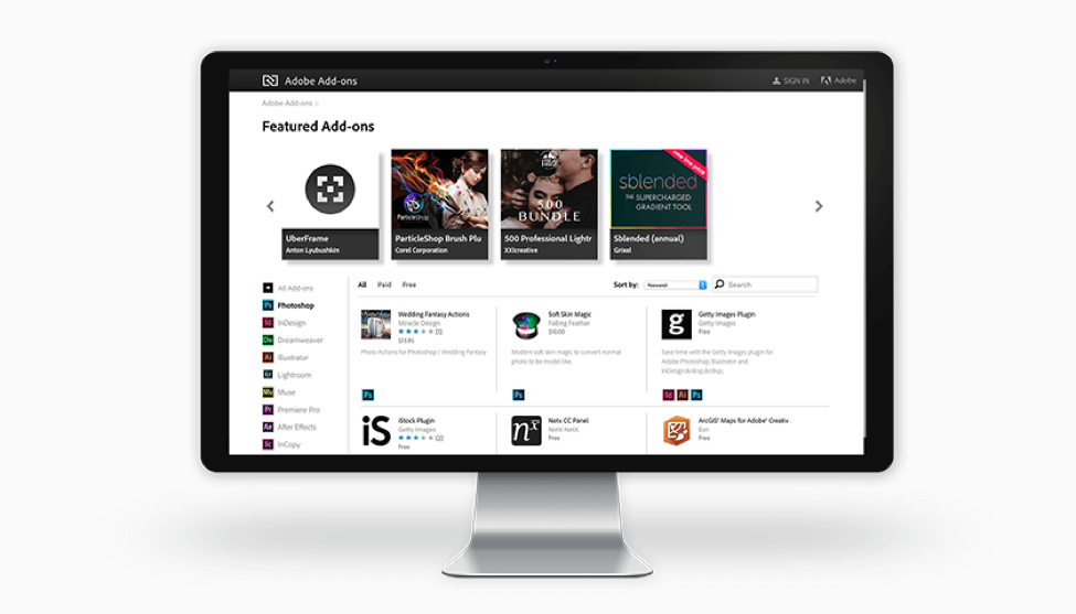
Add-ons allow complex tasks to be done with a single click, you can add special effects to a picture, modify layer names in batch, and more, there are many available paid and free plugins available from Adobe’s Creative page.Adobe add-ons Do you have suggestions or is there a particular tool that you would be interested in learning more about to improve your workflow? Reach out!

Categories
Author

/Designing-With-Developers-in-Mind Nothing in the design process is absolute. I am sure many designers can relate, it is frustrating when you create a design and then when you see the final product (after development) the design looks different than what was intended. It is fair to say not all designs translate in the development process but as a designer we should start designing with developers in mind. In a world that isn’t perfect and where you have little control, designers, it is time to be flexible.  Designer's take pride in layouts, making sure each element has a purpose and it’s own place. Crafting “pixel perfect” designs is an achievement that we strive for after years of hard work and practice. Because of the effort that’s put into designs, we have a tendency to get upset with developers when our layouts haven’t been transformed perfectly.

We should not fault the developer

Recognize that this is a glitch within the design process. Our static, “pixel perfect” comps will only ever truly be that...static comps. Once we bring a design to life through code we have very little control over how someone will view it. What we should be striving for is a deeper and closer connection with developers, working in tandem throughout the process. As designers we must be flexible and think of each composition no longer on the basis of exact measurements, but relative proportions. This applies to things like height and width in relation to other page level elements, i.e. margin and padding. The logic is quite simple, an element with a width of 400px over 1300px of visible area is perfectly reasonable, but on a small screen it will be cropped out.

The Solution

The solution here is either create a mobile based layout that accounts for smaller device sizes, or to ensure that the item being cropped out on smaller screens isn’t pertinent to the use of the site. Which ever route you take a certain level of foresight is necessary to ensure that proper design and development are accomplished. I know it can be frustrating to see developers work in non-absolute units of measure. However abandoning pixels and switching to ems, rems and percentages make for a more flexible and fluid layout. If designers start thinking about these more liquid and dynamic measurements initially, there will be an easier transition from static comp to developed website, allowing everything to remain harmonious and relatively intact on different device sizes.

Color

This adaptable mindset also applies to colors. We can’t predict the calibration of each user screen, something that varies according to style, manufacturer and specific light conditions. Websites and apps can’t be handled like a Pantone catalog on printed paper, making it common for subtle color variants - which may appear too dark, shiny or contrasted.

How do we combat the unknown here?

By selecting a broad range color palette that suits both the device that the product is being viewed on, and also the matches the tone of the business. Learning about the technical characteristics and limitations of a browser is vital in order to avoid unexpected surprises when the product is finished. After interpreting the HTML, CSS and Javascript the browser renders a product according to its capabilities. Sometimes forcing us to think beyond devices, and to start thinking in terms of which browsers. For years IE was the bane of a designers existence, limiting the boundaries that we could push, because it was so far behind technically. Knowing which browser your design has to be supported in will help you determine what and where you can push the limits. So, designers - let’s start working and understanding the development process so that we can all be rockstars when designing for digital media.

Categories
Author

/design-etiquette As designers we know that our work is successful when it is not only beautiful but also when it is useful. That’s why when working we should always keep in mind other individuals that might need to access our design files - which means... stay organized! Our files should be structured and organized for easy access. In the end it doesn’t matter which software you are using but for the purpose of this article I will use Photoshop as an example so I’ll mention PSD files and smart objects. We have outline some basic design etiquette rules that should help you to avoid issues when someone like a developer is trying to access your files.
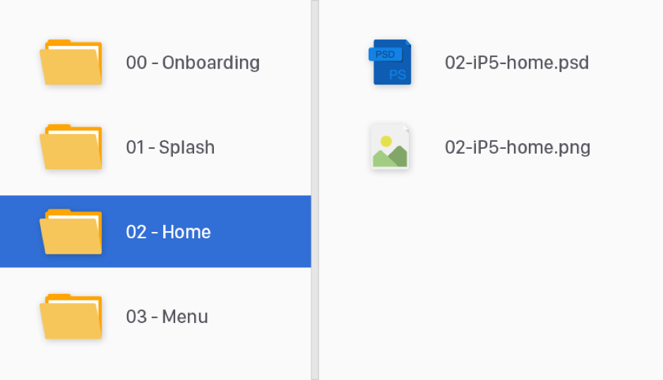
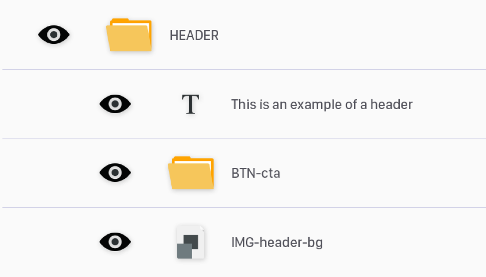
File Handling

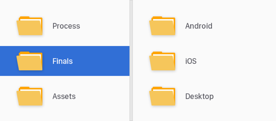
It is that time on the project when you have set aside a day or two to organize the files you’ve been working on so they are organized for the asset handoff (most times to the developer). So the first rule is to always have everything accessible and uploaded - set yourself a reminder for the end of the day to remind yourself to upload the latest to your file folder. Let’s start by saying that organizing files for asset handoff shouldn’t be that tedious and hopefully everything is in the cloud server where you and your colleagues saved it and that no one forgot to upload the last piece they were working on. As designers we work with project managers, developers, and clients during the course of the project - as we all know everyone tends to work differently and may be particular about file organization. The folder structure you use is mostly a personal preference especially when working alone but when others are involved it can be helpful to collaborate to find out if there are expectations of the folder structure. During this initial collaboration we find it helpful to discuss pros, cons, ideas as to how everyone expects it to work. Make sure you, as a designer communicate to the team to let them know how you’ll manage the files - and make sure to listen to feedback when deciding on naming conventions and exporting assets. /design-etiquette

File Naming

Choose a convention and stick to it.  When working on a project, decide early on how you’ll name your files and folders. Pick an order for the folders, use dashes or underscores (not both) and never use spaces and decide on using uppercase or lowercase. You should talk with the developers and learn what makes more sense, for example, when working on Android it’s recommended to use underscores. For some, dashes work better than underscores because it’s easier and quicker to edit the name of the file, improves the readability and if it is an exported asset dashes are recommended for SEO optimization. /design-etiquette

Layers

Always name your layers. It can be a group or an individual layer, no one should waste time hiding and unhiding layers to know if that shape “Rectangle 3” is the one you need to export. The last thing you want is to have to go back, rename and delete those unused or dated layers when preparing a file for a client or for a teammate. Don’t be a layer hoarder, there are many useful scripts and plugins that can help you with this task. It’s recommended to arrange everything by section, header, body, aside, footer, etc. It will make it easier to navigate the contents - before closing that file, collapse all layers, so the next person that opens it, can see the structure at first glance. Be smart, use non-destructive edits when working on images, that means use smart objects and masks, and don’t apply the same to 10 different layers optimize your workflow, group them and use just one mask if possible. Globalize common elements, use linked smart objects either to a .psb file or use CC libraries, and symbols in Sketch. Use blend modes carefully and know your strokes - it’s not the same effect if it goes outside, inside or centered. Tip*** be aware of the light source when using blending modes, you want to have a consistent light source it will make the components more realistic. /design-etiquette

Icons and Images

When working on icons, it’s best if you use a shape instead of bitmap or a smart object for a vector file can work as well. The reason being- a bitmap does not scale correctly so you will not get the proper pixelation which leads to poor visual quality. Try not to color them using blend modes, people should be able to get hex values from layer properties and that will make it faster to edit the color as well. When working with images such as stock photos make sure you purchase them especially if the product is ready for production.

Type

Use text-boxes when you’re writing a paragraph and make sure the box is not longer than the actual text. It can make it difficult to select things that are behind it and can lead into frustration and then it becomes a waste of time. Make sure you use proper alignments, headings and lists elements should have their own text-box. Use CC libraries character styles to maintain consistency. Be sure to include all the fonts used in your project that are (or should be) in the assets folder especially when using licensed fonts. These folders should be in the same directory as your design files.

Assets and exporting

Be aware of screen resolution and density. Your images should be optimized either for web, print or wherever your files will be used. When working with web images, they tend to be much larger in size, so image optimization should be a priority. This will allow for faster loading on a desktop, and remove the data concern from mobile users loading an image heavy site. There is online image optimization software but you should know how to get the best image from Photoshop. It is important to keep in mind that 80% of file quality will look closely to the same image at a 100% but the file size will be considerably smaller. As a designer, it is key to keep your files organized. This was only a short list of recommendations - be detail oriented. As mentioned before, it takes discipline but it will make everything faster and easier in the long run for you and others.  


Other sources that we found valuable for a second opinion of design organization are: https://www.smashingmagazine.com/2011/08/the-lost-art-of-design-etiquette/ https://www.photoshopetiquette.com    

Categories
Author

App icon

Some may be familiar with app icons but for those who are not, an app icon is the icon graphically representing an app in your smartphone (for launching it, managing it or previewing it in the store). The artwork has to be a certain size, most of the time it is rendered at a dimension of 1024×1024 to be exact. It is fair to say that a design can determine the success of your product. When you have a design that is not good it will more than likely effect the success of your product. It is super important that you think about some of the design aspects before you launch your app - you want to make sure that your design is perfect and will stand out from the rest of the competition. There are some important aspects we want you to remember when thinking about designing your app icon. Lets focus on characteristics found in the design of an app icon and what you can do to make your app icon stand out from the rest.

Branding

Your brand is the single most important part of your company. Your brand identifies who you are, what your company believes in, the services or products that your company may offer and much more. Often times your logo (the symbol of your company) is used to represent the company in various situations like a letterhead or your social media “default picture”. It is important to remember that your app icon is not your logo. The app icon is the visual representation of your product (what is inside the app) that appears in a tiny space on your screen. We are not saying that the design of the actual app should avoid any of the company’s branding guidelines - you should follow its colors, graphic styles, text styles and even tone in order to best align to the bigger “brand” picture. The best advice we can give is... do not use your company logo for your app icon and make sure the app icon design is consistent with the look and feel of your application.

Be Concise

We have all heard the saying less is more, and this saying can very much so be applied to design as well. As we all know the size of the canvas is restricted and the renderings of the app icon can be as small as the settings panel. It is important to keep the core design elements relevant to the app, leave out excessive detail and do not try to apply two or more different concepts in the same space - your design will look over complicated, too busy and it will be confusing for the user. Think about your favorite app, I am willing to bet that it has good functionality and an appealing design. The app icon is the first impression that the user will have, they will see the app icon before they even open the app. It is important that your design is concise and can tell the user what the app will offer by their design illustration. 

Identity

There is nothing more disappointing than searching for a specific category in the app store to only find a million app icons that look the exact same, you feel like you are looking at the same app over and over again. Any app icon that can stand out in the app store as well as among installed applications will get the attention of the user. If you can catch the eye of the user, you have a better chance of the user downloading your app which then leads to the user engagement. Even though established patterns of navigation and screen flows ease the user experience, having a recognizable and unique appearance is what distinguishes apps from one another. Users would have no trouble identifying the apps they love most if they are presented with just a screenshot of the app icon because the user has a connection with that app and can instantly recognize the app icon as a result. The combination of color, layout, elements on the screen, and function is the main separation of the app identity. Bottom line, there are many elements that go into designing a great app icon for your company. When you are competing in the app store it is especially important to have your app icon stand out from your competitors. We take design very seriously and we understand the importance of your app needing the best in class design in order to succeed. Do you have questions about how your app is performing based on your current design? Get in touch so that we can give you a free design consultation.

Categories
Author

Apple desktop Mobile apps have become such an ubiquitous item that it seems everyone imaginable has one, literally everyone… even Barilla pasta has an ‘iPasta” mobile app. The question is what sets mobile apps apart from the OK from the GOOD from the GREAT?

Designing a great mobile app is no simple task and it’s more than just what the app “looks like”. We have compiled a small list of helpful tips to think about while you make your next mobile app. 

Execute one thing, really well

Ok so obviously.. Right? Everyone wants and needs to execute something in order to be successful. Being able to have a functionality that you can execute on really well is the foundation for all great apps. Think about Netflix, Uber or Dropbox-  they do ONE thing really, really well. They each became extremely successful by not over complicating their purpose, Netflix: watch a movie/TV show, Uber: find a ride, and Dropbox: access your files from anywhere. Each started with a single purpose and each grew to become much more than that.

To be truly successful you need to focus your energy on making sure your product does one thing perfect. Whether that’s showing people where the cleanest water fountains are in the city, or rating their favorite libation. Our suggestion would be to start small and then add features to your core application once you have established what you are and what you want to be.

Solve a user problem

If your application doesn’t solve a need that people currently have it will never be successful. The market is flooded with apps that do little to nothing at all for the people who download them. If a user doesn’t see benefit, well more times than not the user will delete the app. Users are looking for something out of your app- you need to be able to give them something in return.

People have little to no time to spare on your product, so creating something that can save them time, or give them some time back will make a huge impact. Apps like Operator, which offer on-demand “concierge” type services for buying products are on the front line of a new wave of app design. By allowing people to shop with a simple text request you can save someone hours of site browsing, allowing them to spend their time doing things that matter most to them.

Consistency

Making sure that your app has the same feel throughout does several things. It ensures that a button designed on one screen looks and acts the same on every other screen it appears on. It adds a level of polish to your finished product that makes it more professional, and it establishes an interface pattern that allows users to recognize similar elements on different screens. Without consistency in your application users will get frustrated and annoyed.

User experience

At Mobomo, we take user experience seriously. We make sure that all of our designs are user centric. You need to account for things like empty states, error pages, users who are less savvy, physical and technical limitations,etc.

The best way to make sure your application meets these requirements is to ensure that your discovery and IA phases dive deep into what your users are expecting to get out of your product. Make sure that their needs are being met, and that your business needs are aligned with their expectations. Doing things like user testing and user interviews will help you to get to a place where you can truly understand what it is that your users want.

Lastly, make sure you’re listening to the people using your product. Take their feedback seriously, listen to what they’re saying and refactor your application to meet their needs.

Pleasing visual design

While visual design is far from the only part of your application, it still ranks as one the most important. An aesthetically pleasing product is like having a well manicured lawn in front of your house, it’s the first thing people see and can either drive them to explore further, or turn them away entirely. Recently the Nielsen Norman Group released an article stating that users are actually more tolerant of minor usability issues if the application or product is visually appealing.

Fast and reliable

Last on the list is the optimization of your application. Make sure that your code is written as concisely as possible, fixing any bugs that arise as soon as possible, and making sure any bitmap assets are as compressed as possible will help to keep your product running fast and smooth.

Now it will take a little more than just this list to create a well designed mobile app, but this is a pretty solid foundation, and one we follow here at Mobomo on our projects. We’d love to hear from you about your thoughts on the subject too, what steps you take and any tips you might have.

Categories
Author

User design The first time someone comes across the term “User Centric Design” there might be confusion because isn’t all design user centric??? Arguably yes, but…
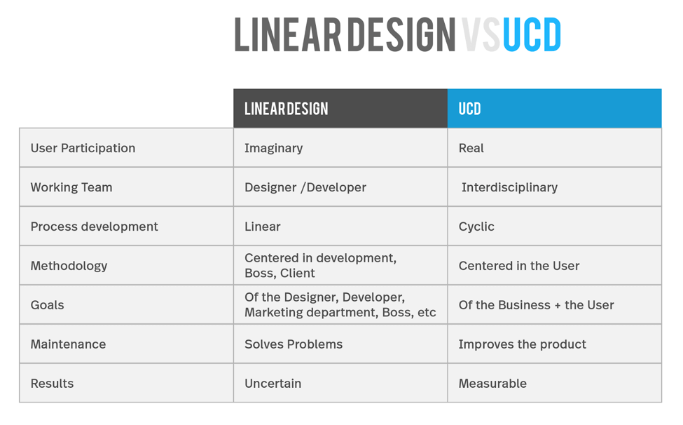
User centric design is a fairly new design concept which involves real users throughout the design process. User centric design also known as (USD)is an interface design methodology that is based on the research and the participation of the final users of the interface.

Before we dive into the advantages of user centric design lets look at the design concept that was used prior to UCD, linear design. Prior to UX and UI becoming a household concept, design projects were normally in “linear design” which meant the center of the design thought process was based on the client or stakeholder. Typically, during the design phase there are multiple teams involved which could include the client, the designer, the developer and the project manager. The only issue was each person involved had different opinions on how the design should and maybe should not look. As you can imagine not all opinions align which creates conflict between all teams. Aside from the difference of opinions, each member involved was missing what was most important- the end user!

End users are so important because that’s the whole point of creating the design to being with, right? You want to make sure that the end user’s “needs” so to speak are addressed in the design process so that the end user has the best experience possible. The problem with the linear approach is that it tends to produce products that are out of touch with the end user. Thankfully, user centric design made its debut in the design process.

User centered design (UCD) establishes a unified program of needs and goals based off of research (and not vague ideas from the team involved). The client's business and user goals are still very important in the design process however they are addressed in the strategy phase so that designers, developers and project managers know how to best guide the project based off of the goals of the client. The purpose of this approach is to create products that are based on real needs and expectations of the end user.

To outline things further, we have created a chart (below) which gives you a better understanding.

Chart on linear design versus user centered design It’s always good to have a pulse check on your design to make sure its still meeting the needs of your target audience. If you are questioning the effectiveness of your design, get in touch, we are happy to chat! In the mean time, be sure to check out our UCD design process.


Categories
Author
Subscribe to Design