
Mobomo webinars-now on demand! | learn more.

CSS Grid

Replicate Bootstrap 3 Grid Using CSS Grid

The past few years have seen a wide variety of methods for creating web page layouts. CSS Grid is one of the newest and most game-changing tools at our disposal. If you haven’t started tinkering with it yet, now is the time. It is a wildly different way of thinking about positioning content, and it currently has nearly full support across all common web browsers.

In order to replicate the majority of the features of the Bootstrap 3 grid system, we only require a small portion of the features that CSS Grid has to offer.

The key concept introduced in the Bootstrap 3 grid system which we will be replicating is the ability to explicitly define a grid container’s proportions for each responsive breakpoint. In comparison, Bootstrap 2 only defined the proportions for desktop, and any viewport smaller than 767px would render all grid items at full width, stacked vertically, in a single column.

1. Define our class names similar to those used in Bootstrap 3.

.row for a grid container

.col-[screenSize]-[numColumns] for a grid item where [screenSize] is one of our size abbreviations (xs,sm,md,lg,xl) and [numColumns] is a number from 1 to 12.

To use the CSS Grid, we simply apply display: grid; to our row class

.row {
  display: grid;
}

2. Define the number of columns in our grid and the size of the gutters (the space between items/columns).

Bootstrap uses 12 columns with 15px gutters.

.row{
  display: grid;
  grid-template-columns: repeat(12, 1fr);
  grid-gap: 15px;
}

repeat(12, 1fr) is a shorthand for “1fr, 1fr, 1fr, 1fr, 1fr, 1fr, 1fr, 1fr, 1fr, 1fr, 1fr, 1fr” where ‘fr’ is a fractional unit. Setting all 12 of our columns to 1fr means they will all be the same width. By changing these values, we could easily create a grid with a different number of columns or with columns of varying widths.

3. Define the grid items that will go into it.

To do so we need only set the grid-column-end property for each variation of the grid item. Setting it to a value of ‘span 1’ would make the item one column wide. ‘Span 6’ would make it 6 columns wide, half of our 12 column grid.

There is much more that we could achieve with this property or with similar properties and shorthands for these properties. I encourage you to explore the possibilities and understand that we are only scratching the surface in this demo. https://css-tricks.com/snippets/css/complete-guide-grid/

4. Fill out all the different span sizes at all the different breakpoints.

This is the most complex task we have to  The pattern is as follows:

@media (min-width: 0) {
  .col-xs-1 {
    grid-column-end: span 1;
  }
  .col-xs-2 {
    grid-column-end: span 2;
  }
  .col-xs-3 {
    grid-column-end: span 3;
  }
  // ...up to .col-sm-12
}
@media (min-width: 768px) {
  .col-sm-1 {
    grid-column-end: span 1;
  }
  .col-sm-2 {
    grid-column-end: span 2;
  }
  .col-sm-3 {
    grid-column-end: span 3;
  }
  //...up to .col-sm-12
}

...repeat for ‘md’ at 992px and ‘lg’ at 1200px

5. Build the pattern with a nested loop in Sass (once we understand the pattern) like so:

// Loop through responsive breakpoints
@each $size, $abbr in (0,xs),(768px,sm),(992px,md),(1200px,lg){
  @media (min-width: $size){
    // Loop through col classes
    @for $i from 1 through 12{
      .col-#{$abbr}-#{$i}{
        grid-column-end: span $i;
      }
    }
  }
}

6. Set a full width default for situations where the width is not defined.

For example, a grid item with the classes “col-md-4, col-sm-6” does not have a width defined when the viewport is smaller than 768px (the sm breakpoint).

However, it is defined for viewports larger than 992px (the md breakpoint) because the media query will continue applying the width for all viewports wider than 992px unless it is overridden by defining the lg width.

Rather than requiring devs to assign xs width for every item, we can safely make it full width as a default that the user can override if they choose to.

[class^=col-]{
  grid-column-end: span 12;
}

This style rule will apply to any element with a class that begins with “col-” and set a 12 column width. The rule will be placed above our nested loop to ensure that the other grid styles override it.

See it in action. (Open in Codepen and change the viewer size)

[codepen_embed height="265" theme_id="dark" slug_hash="MpxQmW" default_tab="css,result" user="mobomo"]See the Pen Bootstrap 3 Grid with CSS Grid by Mobomo LLC (@mobomo) on CodePen.[/codepen_embed]


This implementation has several advantages over Bootstrap 3’s grid:

Categories
Tags
Author

css-enterprise-websites

Modular CSS has established itself as a crucial part of modern web projects. You may have heard of methods like BEM, SMACSS, OOCSS, and Atomic CSS. At Mobomo, we put the best of these approaches into practice, and we’ve seen impressive benefits. The larger the app or website, the more important role modular CSS plays. How can modular CSS benefit your enterprise? Let’s take a look.

Structuring your CSS in a modular fashion has three main benefits:

Performance has an enormous impact on revenue and growth. This is magnified substantially on mobile devices. If you decrease your page load time by even milliseconds, you will see improvements across the board. CSS is one of the pieces of that puzzle, specifically the weight or overall file size.

Over the course of time a project has multiple redesigns, features, and developers working on it. With enterprise projects, the number of developers contributing can be extremely large. In one recent project we completely refactored the CSS architecture to be modular, and saw a 26% decrease in overall file size. This was a refactor, but when you start from scratch with a modular CSS setup, the file size will be much smaller, further contributing to performance gains.

One of the reasons you see performance gains with modular CSS is that maintenance is vastly improved. When your CSS is encapsulated, and organized in separate files, it’s much more straightforward for a developer who is new to a project to feel confident in first locating the files they should be working on, and further ensuring the additions or edits they make won’t adversely impact an element somewhere else in the project that they didn’t intend to change. Again, for enterprise apps, you can extend the application quickly to see how beneficial modular CSS is to decreasing time spent on maintenance.

When you put it all together, modular CSS increases development speed, which goes hand in hand with lowered cost. When you write modular CSS, you’re allowing developers to avoid reinventing the wheel with each new feature that’s added to a project, simultaneously making the components reused more consistent. It helps you locate old, unused CSS rules. Modular CSS helps brand consistency, by ensuring your brand colors are managed from a single location, and you don’t end up with slight variations of your company’s brand colors that look off for some reason (secret: not using modular CSS is the reason!).

Speaking in terms of enterprise projects the benefits are huge. If all developers contributing to a project have direction from the start, an organized structure and examples of how to keep things organized during the development process you can scale your app or website while retaining the benefits in performance, maintenance, and cost. If you have a project that could benefit from Mobomo’s experience, get in touch!


Categories
Author

bootstrap-web-design-development

Over the past few weeks, I’ve heard a great deal of pushback around Bootstrap. The first argument is focused around general feedback that Bootstrap isn’t suitable for production, and the second is that using frameworks like Bootstrap is limited from a design perspective. I’d like to offer a few insights into the practice of implementing Bootstrap in an optimized fashion.

At a recent An Event Apart in Nashville, there was a panel discussion with Jeffrey Zeldman, Eric Meyer, Rachel Andrew, and Jen Simmons. During this discussion, Bootstrap came up a few times:

“If people want to use Bootstrap, or anything, whatever it is, as long as you don’t release it to the public that way.” - Jeffrey Zeldman

"There were back to back presenters today who talked about how we really feel like people should stop using Bootstrap. And you were saying Jeffrey, that it’s great for prototypes, and I’ve heard a lot of people say that, Karen McGrane said that on the show not long ago, “Oh, Bootstrap’s great for prototypes”. - Jen Simmons

Before I demonstrate a few implementation methods, I first think it’s prudent for us to remember that, as in many cases in web development, it’s not the tool’s fault, but the implementation. A shining example of this is when smartphones first appeared, we had developers who had been building desktop sites for decades, who for the first time were being presented with the mobile form factor. Using methods that worked on powerful desktop machines with broadband had to be reassessed, and for a while, the idea that the web is slow on mobile was very popular. This was not the fault of the web, the mobile web, smartphones, or anything in between. This was (and still is to some degree), the fault of developers sending desktop content to mobile devices, among other implementation challenges.

In the case of Bootstrap, the biggest culprit of negative performance impact comes from site authors who include the entirety of Bootstrap’s CSS or JS files. With both, we must always include only the modules used in our app or site.

When implementing Bootstrap’s CSS, this is accomplished by making a copy of the Bootstrap manifest file that imports each individual Bootstrap module. This is placed with your app’s CSS modules. It is typically imported before everything else:

Bootstrap-CSS

Start by commenting out every module in this master Bootstrap manifest. As you work on your site, only uncomment the modules you’re using:

Bootstrap-CSS

This allows for a completely customized Bootstrap CSS file, without having to depend on a generator or tool to build a custom version of Bootstrap for you, and ensures that you have the most optimized version of Bootstrap CSS possible running in your app, because you’re only enabling modules as needed.

The same method can be applied with Bootstrap’s JS. In Rails, it’s very easy to include individual Bootstrap JS modules in your app’s application.js file:

Bootstrap-CSS

Your implementation may differ, but the idea stays the same: only include CSS & JS modules that are being used.

With an optimized implementation of Bootstrap, you can be confident that your performance won’t suffer as a result of using the framework.

The other popular sentiment is that Bootstrap limits our design, a sentiment echoed at the same An Event Apart conference:

“I feel like if you use it as a prototype then you’ve just, right from the first brushstroke, set yourself up to stay within a very small box. Now, it used to be a very small box inside a of a just slightly larger box, but now it’s a very small box inside of a box that’s about to get really huge, and I want to be in the rest of the box.” - Jen Simmons

Using the same CSS architecture described above, we can easily add variables in our Bootstrap manifest that override the Bootstrap defaults, effectively giving us the flexibility to design & build anything we want:

Bootstrap-CSS

These are only a few examples, but they will have a big impact on the site layout. You can customize any variable provided by Bootstrap. The options in Bootstrap’s variables file are virtually limitless.

While Bootstrap allows designers & developers to customize design & layout to their heart’s content, it’s also worth noting that design patterns exist for a reason. Users have certain expectations, and in many cases, breaking those expectations can cause confusion. This is best demonstrated with the Ionic hybrid app framework. Ionic offers a set of components that adapt to iOS, Android and Windows platforms. With Bootstrap’s components, you get a base set of components that users are familiar with, but also the flexibility to customize them.

It may be true that the defaults for Bootstrap make it too easy for developers to implement a bloated or cookie-cutter version of the framework. But, with the methods described in this post, you can easily break outside that box, and ensure your work is delivered in an optimized fashion to your users.

Categories
Author

css-architecture

Tired of being terrified that one CSS change will cause a ripple effect of bugs across your site? How about trying to make a simple change only to learn that the previous developer nested the styles five layers deep and slapped an !important on it? Learn how you can help bring sane and scalable CSS architecture to your projects and organization.

[pdfviewer width="100%" height="849px" beta="true/false"]https://mobomo.s3.amazonaws.com/uploads/2016/05/CSS-The-Specificity-Wars-1.pdf[/pdfviewer]

Categories
Author

Javascript

There's been a tremendous push in recent months to move all of the components used for building anything for the web in to JavaScript, and only JavaScript (abandoning the use of HTML for templates and CSS for styling). While I can understand how we've gotten to this point, I think we're at risk of ignoring potentially more robust solutions. Rather than build up your application (or site) using a single monolithic JavaScript framework, I implore you to consider something that's a bit more open-web and future friendly: continuing to build with component-based architecture using all of the current tools available to you, and looking forward to use web components.

Before we get into why I think component-based architecture is the correct way for now, and web components are the way of the future, let's explore how we've gotten to where we are today.

It starts out innocently enough: you apply an ng-click attribute to a link or a button in your template. Then you add a couple of additional lines of markup to handle an if/else pattern to that template (<span ng-if="truthy"></span><span ng-if="falsy"></span> seem familiar?). Before you know it, you're applying ng-mouseover and writing custom directives to handle events specific to your markup.

Others might be looking at this and decide that it's lunacy to have all of that written by you, in-line in your template (and they're probably right -- if you're adding a lot of logic to your template, you probably need to reconsider what you're doing and approach the problem from a different angle). It's difficult to maintain, tightly couples your template to the controller logic behind it, and it's really not the template's job to manage complex logic.

However, rather than refactor to use unobtrusive JavaScript patterns or to extract out difficult logic so it's not present in the template, there's a push (primarily from the React project) to build everything up using JavaScript. Your logic (controllers, models, etc), your templates, and even your CSS. The thinking is, for the most part, that if you are doing these complicated decision trees in the code, then it should be handled by something designed to handle said complicated decision making.

For those who've been building websites and applications for long enough, seeing something that looks like this:

<div   onMouseOver="{() => this.setState({ hover: true })}   onMouseLeave="{() => this.setState({ hover: false })}"   style={{borderColor: this.state.hover ? 'red' : 'transparent' }} /> 

...should remind you of nightmares of years past. This largely disregards the efforts of WASP (Zeldman, Meyer, Holzschlag, et al) and, more recently, the Web Standards Sherpa that lead the charge on making the web more maintainable (proper HTML markup, separation of style, content, and behavior) and future friendly. Additionally, we return to a state where the separation of concerns is being tossed out altogether and we're being asked to ignore years of learning in the favor or writing everything in JavaScript.

A typical React component would look something like this:

var buttonBase = {   padding: 5,   border: "1px solid #aaa",   borderRadius: 5,   backgroundColor: "#eee", };

var buttonBaseHover = _.defaults({ backgroundColor: "cyan", borderColor: "magenta", cursor: "pointer", }, buttonBase);

var BasicButton = React.createClass({ getDefaultProps: function() { return { type: "button", label: "Click me", }; }, getInitialState: function() { return { isHovering: false, }; }, propTypes: { type: React.PropTypes.string.isRequired, label: React.PropTypes.string, }, handleMouseOver: function() { this.setState({isHovering: true }); }, handleMouseOut: function() { this.setState({isHovering: false }); }, render: function() { return ( <button type={this.props.type} style={this.state.isHovering ? buttonBaseHover : buttonBase} onMouseOver={this.handleMouseOver} onMouseOut={this.handleMouseOut} > {this.props.label} </button> ); } });

React.render(<BasicButton label="Demo Button" />, document.getElementById('container'));

See the Pen React Button Component by Mike Tierney (@miketierney) on CodePen.

While this has the merits of being transportable (one of the better arguments for this style of development), it lends itself to higher maintenance issues. Like the common complaint of CSS, this is the sort of thing that quickly ends up creating bloat - it's easy to envision a scenario where a "BasicButton1" gets added because a developer is uncertain about making changes to it. While conditionals could be added to the render method, you then have added processing impact on whether or how to render the button. Many developers will make the same mistake here that they do with CSS: "I don't know where this is used, so I'll just make a copy of it, modify it, and use that in my implementation." Both are signs of maintenance issues, and both can be addressed with proper processes and practices (like code reviews).

One Tool For All Jobs

If we move towards using One Tool For All Jobs (in this instance, JavaScript), we neglect the fact that the tools we're abandoning are actually quite good at doing what they need to do. CSS does a great many of the things that are related to styles far better than JavaScript and it has the added benefit of being cacheable, leveraging readily available resources (rather than littering your JS scope with event handlers for every element that needs to support interactivity; that can impact performance pretty heavily), and with proper use of the cascade you can more easily create variant styles as needed (site theming as a whole, for example).

To handle that hover effect from earlier in the post, you'd need to do this:

<div class="hover-div"/> 
.hover-div:hover, .hover-div:focus {   border-color: red; } 

I've also added the :focus pseudo-class so we also have keyboard support. It'd take more than that to add that same support into that inline sample, and you're providing better support for your users. :focus is a relatively small thing by itself, but think about the broader implications. A natural byproduct of this is to rebuild native components. As an example, we're already rebuilding the select menu (because it's too hard to style natively), and that's just the start of a slippery slope. This should not be the norm - rebuilding existing browser components and behaviors in pure JavaScript might seem appealing (because you have total control over what it does, more or less), but the overhead of creating it in the first place is inevitably going to be greater than anticipated, and then you have to take into consideration the fact that you now have to maintain that. Furthermore, you now have to accommodate all current and future interaction patterns, UX experiences, and many other OS-level features that users are already familiar with in order to make your fancy widget not seem out of place. Is it really worth that? Do you really need (or have) that level of control? Why would you want to abandon future improvements that will roll out as browsers and standards improve? Finally, on this particular point, you'll also need to factor in support for assistive technologies. Just because you're building a "web app" doesn't mean you get a free pass to just ignore those users.

Many of the proponents of using this all-in-javascript approach are focused solely on making sure that everything is managed locally (as opposed to globally, which is how CSS operates). They neatly solve this "pollution" of the global space by injecting all of the styles directly on the element being styled, which is truly the only way to avoid that issue. However, this comes at a cost -- more complex elements can potentially have a significant number of style selectors (and let's be honest here, we're still using CSS whether it's in the DOM or in a dedicated stylesheet). This leads to greater DOM bloat, and more re-draws of elements within a page when states change, content is updated, or the initial view is rendered. While these things may not impact the immediate load time of the page, there's an overall impact on page rendering because of this. CSS isn't free of this, certainly, but one advantage of loading those files once is that this is minimized. Additionally, for things like layout and global styles, you want to have a more global take on things. For re-usable components (buttons, form elements, links) - why make the browser evaluate and render style for every element one at a time when you can pre-load the styles into memory and when a node appears that matches the selector, the styles will be applied.

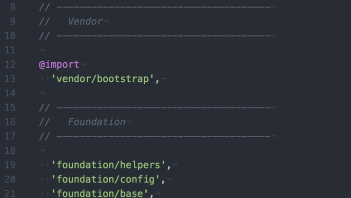
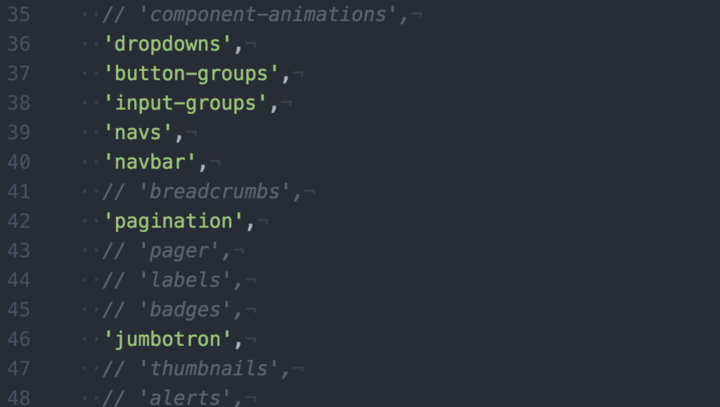
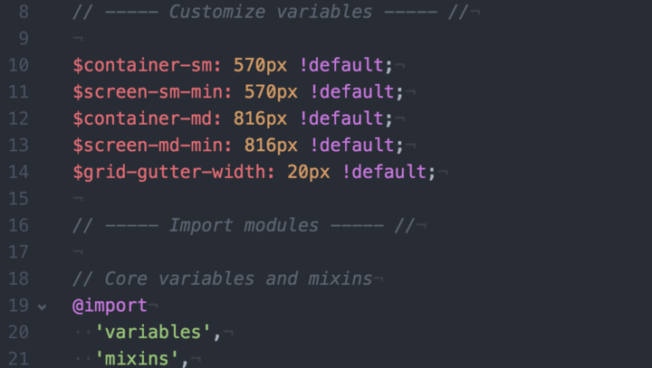
Component-based Architecture

My counter-proposal would be to use one of the better trends we've seen lately: component based architecture. Build small to large - much like the members of the React team who are advocating for using CSS in the JavaScript application want to do. This can be done with traditional techniques, however, and diligence to fending off entropy and bad practices. With tools like Sass and Less, we have the ability to create small files that are focused purely on building out a single component, which can then be stitched into the larger application as whole. When building a single page application, we can even start using an approach where our JS, HTML, and CSS all live together in the same directory, to later be concatenated,minified, and then moved into the appropriate locations. With a reasonable application of namespacing in CSS (pick your poison; I'm partial to SMACSS), we can accomplish the same goals - re-usable, easy to maintain, components - without jamming everything in to JavaScript.

Right now, I think a compromise is a mix of global and local styling. I still think styles added directly to DOM nodes is a mistake (with some exceptions -- an argument can be made for inlining styles on canvas/svg-based charts, for example, and I'm sure there are other situations, but those should be the exception and not the rule). We should think about making our components themable as much as possible, re-using tools that are available to us (the Cascade naturally supports this sort of behavior), and embrace the fact that we never have 100% control over the way our web-based application will look and behave. There are simply too many variables that are out of our control.

If you're concerned that your team is too large and you cannot communicate some of these practices widely, there are plenty of tools available to look for unused CSS, duplicate CSS, "bad" CSS, and inefficient selectors. These can be integrated in to your build process or development flow, depending on your preference.

One final point to make here is that we need to ensure that we are optimizing for our users. When we make the browser do all of the work for us because it makes maintaining a code-base easier, that's fine up to a point, but we need to be mindful of the overall impact that that has on the experience of the end-user. This also means, rather uncomfortably, that we (as developers) need to embrace that there are a great many things that are out of our control, and we should build our solutions to be as flexible as possible. Otherwise, we'd still just be building it all using Flash.

Additional recommended reading:

Categories
Author

Ionic
With the release of Ionic 1.0, we’ve reached a new level in building hybrid mobile applications via web technologies. While Ionic is probably more well known for its CSS components and JavaScript/AngularJS extensions, I’d like to highlight a few tools that have really improved my ability to develop applications rapidly, which are included with the Ionic CLI.

The first, and probably most time-saving tool in the Ionic CLI, is the ability to live reload your app as you make code changes. Prior to being able to live reload, if you wanted to preview/test changes in a simulator or on an actual device, you would have to “build” (or compile) your app’s package, and then “run” (or install on the device, and launch). Web developers familiar with using live reload in Chrome to debug web apps will be very familiar with the Ionic CLI live reload process. Each time you save an HTML, CSS, or JS file that’s being “watched” in your app, the app will refresh while running on your device, so you don’t have to build & run each time (which is a very slow process). You can also change the files being watched by editing the watchPatterns in your ionic.project file. Read more about the live reload tool on the Ionic blog, or in the CLI documentation.

One of the great features of developing hybrid apps is leveraging the same code base for building iOS and Android apps. Ionic’s CSS components and JS extensions appear differently on iOS and Android, as they’re geared to mimic each native platform closely. The Ionic Lab tool allows developers to launch a browser window displaying how the app would look and behave on both iOS and Android. Since its running in a browser, it’s not going to allow you to preview native-level functionality, like if the ngCordova $cordovaCamera service performs differently on each platform, but it is very handy for monitoring CSS changes, and whether a change you made breaks something on one platform, but not the other. It also comes with the aforementioned live reload tool built in, so you’ll see both the iOS and Android version of your app refreshing in real time. Read more about Ionic Lab on the Ionic blog, or in the CLI documentation.

The last tool I really appreciate is the ability to print your app’s console logs to the Terminal tab you’re running the app from. There was a time when, before Safari allowed debugging of an iPhone connected to a Mac, developers had to hack together a solution in order to gain visibility into the JS running in their hybrid app running on a device. This consisted of Xcode logs and a tool called WEINRE (“WEb INspector REmote”). It was not pretty. Suffice to say that the ability to access the console logs of your app running on a device by simply passing the “-c” flag when running the “ionic serve” command is nothing short of a godsend. Read more about the command line flags available with the Ionic CLI.

While using live reload, Ionic Lab, and a combination of console logs and other tools available with the Ionic CLI have vastly improved the speed with which I can build hybrid mobile apps, the Ionic CLI currently has many additional features. You can emulate or run your app on a simulator or actual device, automatically generate the icons and splash screens required for both iOS and Android, or share your app with others using Ionic View. There are also many more exciting things in the pipeline, like Ionic Deploy (update your app without having to resubmit to app stores), Ionic Analytics (track all activity in your app), and Ionic Creator (prototype Ionic apps using drag-and-drop components).

Its an exciting time to be a hybrid mobile app developer, and Ionic is leading the pack when it comes to modern hybrid frameworks. Start building your own apps today!

Categories
Author

Pay it Forward


Always be a student…

My first official ‘lesson’ in web development was a six week beginner’s Javascript class. It was offered by the Columbus chapter of Girl Develop It or GDI. I didn’t know it when I signed up, but this would be the springboard for my career.

Honestly, I didn’t retain much of the knowledge presented in those six weeks. I was as green as could be to the programming world. Most of the information sailed right over my head but I did gain something incredibly valuable from attending: the spark to learn more. I wanted to understand, why I didn’t understand. I was hooked.

Teach to Learn

After a year of sharpening my skills and making the leap into full-time web development, I was approached by GDI to TA for the beginner/intermediate HTML/CSS courses.

Talk about feeling extremely under qualified! How was I supposed to stand in front of a group of students and tell them how things should be? What if I didn’t have the answers or steered them in the wrong direction?

After several internal debates and a bit of pressuring though, I decided to give it a go. Not only were my fears terribly off, but teaming up with Columbus’ GDI community was one of my best decisions. Getting to ignite, hone, and nurture students is a pretty great feeling. I never thought I was capable of helping folks in such a significant way. Seeing a student go from overwhelmed and confused to confident in their skills is something everyone should experience.

Since my first course, I’ve assisted five additional semesters and its only gotten better. Now, it’s not just about teaching the curriculum, it’s about finding better, more efficient ways to present the information. As a teacher, the planning and prep has not only helped to sharpen my own skills, but its kept me in the student mindset; always looking for ways to make web development approachable and fun.

Give back

Girl Develop It is an international organization providing affordable and accessible programs to women who want to learn software development through mentorship and hands-on instruction. Although their focus is getting women into tech, they also welcome men to attend classes as well. GDI has chapters all across the USA. And, if they don’t already have a chapter in your town, GDI will help you get a chapter started in your area.

GDI holds all types of events throughout the year. Ranging anywhere from the aforementioned beginner HTML/CSS and javascript classes to more advanced classes, meet ups and social events.

Want to give back and hone your skills in web development? Hit them up and see if you can help!

Categories
Author

This article originally appeared on the Divshot blog. Divshot is a developer-focused platform for deploying modern front-end applications. It was also started with Intridea's support by Michael Bleigh!
Motion is quickly becoming one of the most important emerging techniques in building a quality user experience on the web. Angular 1.2, currently in release candidate form, provides an overhaul of Angular's animation system and makes it spectacularly easy to bring your interface to life.

Of course, hand keying animations can be time consuming especially when you're trying to prototype something in quick order. Luckily, Animate.css provides a library of ready-to-go animations that can be dropped in quickly and easily. But how can we use these together?

Introduction to Angular 1.2 Animations

Animations in Angular 1.2 take a very simple convention-based approach. Here's basically how it works:

  1. Angular automatically detects and triggers animations based on certain events (namely enter, leave, and move)
  2. When one of those events occur, Angular automatically attaches a special class to the element (for example ng-enter when a new item is added to a list, for example)
  3. This class can be used for setup (for example, to set attributes for the "before" of a transition), but after this class is applied another class is applied (ng-enter-active, for example) to indicate that the animation should begin.
  4. The ng-{event} and ng-{event}-active classes are removed automatically after the animation concludes (determined by introspecting the CSS and determining transition duration)

This all sounds relatively complex, but it's actually quite simple in practice. Basically, for a custom animation you would just need to define some CSS like so (vendor prefixes omitted for brevity):

.some-element.ng-enter {   transition: height 1s;   height: 0px;   overflow: hidden; }  .some-element.ng-enter-active {   height: 100px; } 

The above code would automatically resize an element from zero height to 100px over the course of 1 second when the "enter" event is triggered.

Animating on CSS Class Changes

In addition to events like enter and leave, Angular provides the ability to attach animations to the addition and removal of any class. One of the most common ways would be for show/hide. If I have:

<div class="fader" ng-hide="checked">Animate this!</div> 

This works basically the same as if I had this:

<div class="fader" ng-class="{'ng-hide': hidden}">Animate this!</div> 

To trigger animations when classes are added and removed, you just apply transitions or animations to the class name with -add and -remove postfixes. Here's an example of how I might make a fading animation for ng-hide:

.fader.ng-hide-add {   opacity: 1.0;   display: block !important;   transition: opacity 1s; }  .fader.ng-hide-add-active {   opacity: 0; } 

Activating Angular 1.2 Animations

To use animations in your Angular code, you will need to include the separate angular-animate.js file. If you're using Google's CDN, you can include both Angular 1.2 and Angular Animation in your code. You will also need to create an angular module that consumes the ngAnimate provider to activate animations:

<html ng-app="myApp">   <head>          <script src="//ajax.googleapis.com/ajax/libs/angularjs/1.2.0-rc.2/angular.min.js"></script>     <script src="//ajax.googleapis.com/ajax/libs/angularjs/1.2.0-rc.2/angular-animate.min.js"></script>     <script>       var app = angular.module('myApp', ['ngAnimate']);     </script>   </head>   <body>        </body> </html> 

One of the most powerful aspects of Angular 1.2 animation is that you don't have to specifically invoke it; instead, it "just works" when any animation-triggering event happens in your page.

Bringing in Animate.css

But what about that nice library of existing animation we already have with animate.css? Simple: because Animate.css provides named keyframe animations, you simply need to apply the given animation to the element when the appropriate Angular animation class is applied. Here's a simple fade in/fade out scenario:

.my-element.ng-enter {   animation: fadeIn 1s; }  .my-element.ng-leave {   animation: fadeOut 1s; } 

That's seriously all there is to it! You can use any of the named animations from Animate.css in the same manner and it will all work, fast and easy.

To demonstrate how easily this can be accomplished, I used Divshot to quickly snap together a "todo list" interface and added some animations. I've published the result to JS Bin, just click below to see the code.

View Todo List Demo
Got any questions, suggestions, ideas? Keep the conversation going! We'd love to hear from you.

Categories
Author

If you're using SVG in your web design you've probably read (and hopefully bookmarked) the excellent post Using SVG by Chris Coyier on CSS Tricks. The article is a great introduction to everything you need to know about using SVG on the web.

One of the most powerful aspects of SVG on the web is the ability to style it with CSS. The only downfall to this technique is that the SVG has to be inline. Even if you're using something to optimize SVG files they can add some serious bloat to your document and can make editing your file cumbersome.

In the Using SVG article he suggests using a back end language like PHP to "clean up the authoring experience." This is a great suggestion, and I've used it, but sometimes I am not using PHP or any backend language. Since I've been using Angular lately on a lot of my projects, I have found I can leverage that to import my SVG files. If you're already using Angular on your project this is super easy, if not, it makes a great way to dip your toe into the Angular waters.

1. Adding AngularJS library to your project.

If you're already using Angular on your project, skip ahead to step 3. If not, add the Angular library to the head of your HTML document.

<script src="//ajax.googleapis.com/ajax/libs/angularjs/1.2.23/angular.min.js"></script> 

2. Change thetag at the top of your document to the following:

<body ng-app> 

3. Add the following code to import an SVG file:

<ng-include src="'path/to/file/logo.svg'"></ng-include> 

I will frequently inject the SVG into into a div just to give me a little more flexibility when it comes to styling it.

<div class="logo" ng-include="'path/to/file/logo.svg'"></div> 

Got any questions about AngularJS? We’d love to hear from you.

Categories
Author

Some of the best known features of Sass are the availability of mixins, variables, and the ability to extend selectors. However, what you might not know is that you can also define functions for use in your rulesets.

What is a Sass Function?

If you've used any of Sass's Operations, then you've used a function. Alternately, if you've used Compass or Bourbon, you've probably used a function. They look like this:

p {   # Pure Sass   background-color: transparentize($coolBlue, 0.25);    # Compass   margin: 0 auto rhythm(3, 42px);    # Bourbon   font-size: em(16, 14); } 

Why do I care?

While it's not uncommon to see mixins get used for this purpose, they're often undesirably verbose or rigid. More importantly, using mixins alone encourages some bad behavior, making monolithically large functions that do too many things. In practice, it's better to have small discrete functions that just do one thing, but do it very well.

My most common use case is similar to what you see in the Bourbon example above, that of converting a pixel-based font size to a relative font size (em or rem).

Defining a function

The syntax for defining a function is similar to what's used to define a mixin:

@function myFunction($var: default) {   // function logic ...   @return $someValue; } 

To create a rem function like the em one that is shown above, we'll actually need to define two functions, one for the actual conversion of pixels to rems, and another to strip the units off of a number. Why do we need to strip the units? Because, due to the way that Sass's math functions accommodate the presence of units, if we leave them there we won't get the value that we desire.

First we'll define strip-units:

@function strip-units($number) {   @return $number / ($number * 0 + 1); } 

Then the rem function:

@function rem($pxl, $base: 16) {   @if not unitless($pxl) {     $pxl: strip-units($pxl);   }    @if not unitless($base) {     $base: strip-units($base);   }    @return ($pxl / $base) * 1rem; } 

Note that we’re using yet another function, unitless, which is provided by Sass (read the docs). Though you don't need to have that check (the strip-units will work even on numbers that don't have units), it's good to not do more computation than necessary.

Once this is added to your Sass environment, you can call it at any point by simply writing your rule:

font-size: rem(24); // This will be output as "font-size: 1.5rem;", // since it will take 24 and divide that by the // default value of 16 that we set in the function 

Functions, Functions, Everywhere

With functions, our Sass files can be even more efficient, the amount of code generated can be reduced, and maintaining these files is even easier. When trying to decide if you should write a mixin or a function, the easiest barometer is this, functions should return a value of some sort, mixins should return rules.

You can read more about the @function directive in the Sass documentation.

Got any questions? Let us know! Also, for more DIY tips + tricks, check these out:

  • How to Refresh an iOS Hybrid App
  • Get Clearer Code with Underscore.js Chaining Syntax
  • Using Storable and Faker to Create Mock Collections
Categories
Author
Subscribe to Css