
Mobomo webinars-now on demand! | learn more.

Design Thinking

“Design for the user.”

It seems like a common sense approach. After all, if your website or your custom app aren’t designed with the end user in mind, will it get used?

Common sense notwithstanding, there’s a large gulf between the idea of designing for the user and the actual implementation of it. Plans go astray, different stakeholders have different ideas about what the user would want, and of course, there are always practical considerations like timeline and budget to consider.

Fortunately, design thinking can help project teams establish clear markers that keep them on track toward a seamless, positive user experience.

What Is Design Thinking?

Design thinking goes beyond the surface-level “design for the user” philosophy. It involves a highly tangible, iterative process that allows teams to move past their own viewpoints and levels of understanding in order to gain deep insight into the user’s needs and identify new strategies and solutions that might not have been immediately evident.

In short, design thinking is a process that gives teams concrete steps to help them get out of their own heads and into the user’s, to ensure the team is meeting the user’s genuine needs.

How Does Design Thinking Work With UX?

Most models of design thinking involve five steps:

  1. Empathize: Understand your user’s pain points and greatest wishes.
  2. Define: Figure out what problem the user is experiencing.
  3. Ideate: Let creativity run wild and break down assumptions or traditions.
  4. Prototype: Build a model that you can test with real users.
  5. Test: Learn what works, what doesn’t, and then adjust.

Let’s explore these in more detail, in the context of UX design:

Empathize

The most successful apps and websites are those that were designed with the user firmly in mind. The folks at Interaction Design Foundation agree, saying that UX tasks “can vary greatly from one organization to the next, but they always demand designers to be the users’ advocate and keep the users’ needs at the center of all design and development efforts.”

But to do that, it’s necessary to understand who the user is and what they want and need. It’s also important to recognize if more than one user persona is in the picture.

Here’s an example: Let’s say we want to create a video app for children ages 6 to 12, with kid-friendly content.

In this situation, there are two main users that we need to understand: the children, and their parents.

  • The children want intuitive (intuitive for them, not us) navigation, an easy way to binge-watch content from specific creators, and a fun way to interact with the creators and other viewers.
  • The parents? They’re concerned about online predators and inappropriate content and want to make sure they have a way to keep an eye on things without having to constantly watch over their child’s shoulder.

These are fairly basic descriptions of user needs – and to really get a good handle on what each end-user wants from the UX, there’s only one foolproof method: talk to them. There is simply no replacement for sitting down with users and getting a first-hand account of what they need, like, hate, fear, enjoy, and find frustrating.

Define

The main challenge in this step is to clearly articulate the problem that needs to be solved, or the need that must be met.

Ideally, near the end of the Define process, there should be a clear answer to the blanks in the statement, “The user needs to _____________ because ________________.”

From there should arise a problem statement for the team to drive towards, such as “Create an easy and accurate way for both users and parents to filter and find video content.”

To get to this point, it’s vital for teams to take the data they gathered during the Empathize stage and process it in an organized, systematic fashion, unpacking the findings and discussing what they mean. A good practice is to keep asking “why,” digging down past surface-level problems and into the deeper, emotion-driven issues. From there, the data can be used to map out a User Journey, breaking down precisely how the user might interact with the app or site and what they’re looking for.

Ideate

In the ideate stage of design thinking, assumptions and constraints are thrown out the window. This can be much harder than it sounds – as we become more experienced, we often fall into certain patterns or draw on our existing knowledge, making it difficult to look at things from a completely different perspective.

In the ideate stage, “stupid” questions are often the key to unlocking new avenues, because those types of questions tend to disrupt long-accepted, “obvious” practices that should have gone challenged long before.

In the context of UX, the Ideate stage is crucial – it is too easy for teams to fall back into best practices or standard ways of designing the user experience. By applying design thinking, a team opens itself up for those “eureka!” moments that are only possible when the mind is open to every possibility, and it’s those moments that lead to groundbreaking design.

Prototype

This is where the rubber meets the road. Once a team has come up with what they think is the best possible way to design the UX for an app or website, they need to test the feasibility of that idea. And they need to test it with real users.

The prototype step can have multiple stages, from initial sketches, to wireframes, to actual working prototypes, all the way to beta versions that are available for a limited number of public downloads. The team may even create multiple prototypes if they’re not certain which idea will fly with users.

Test

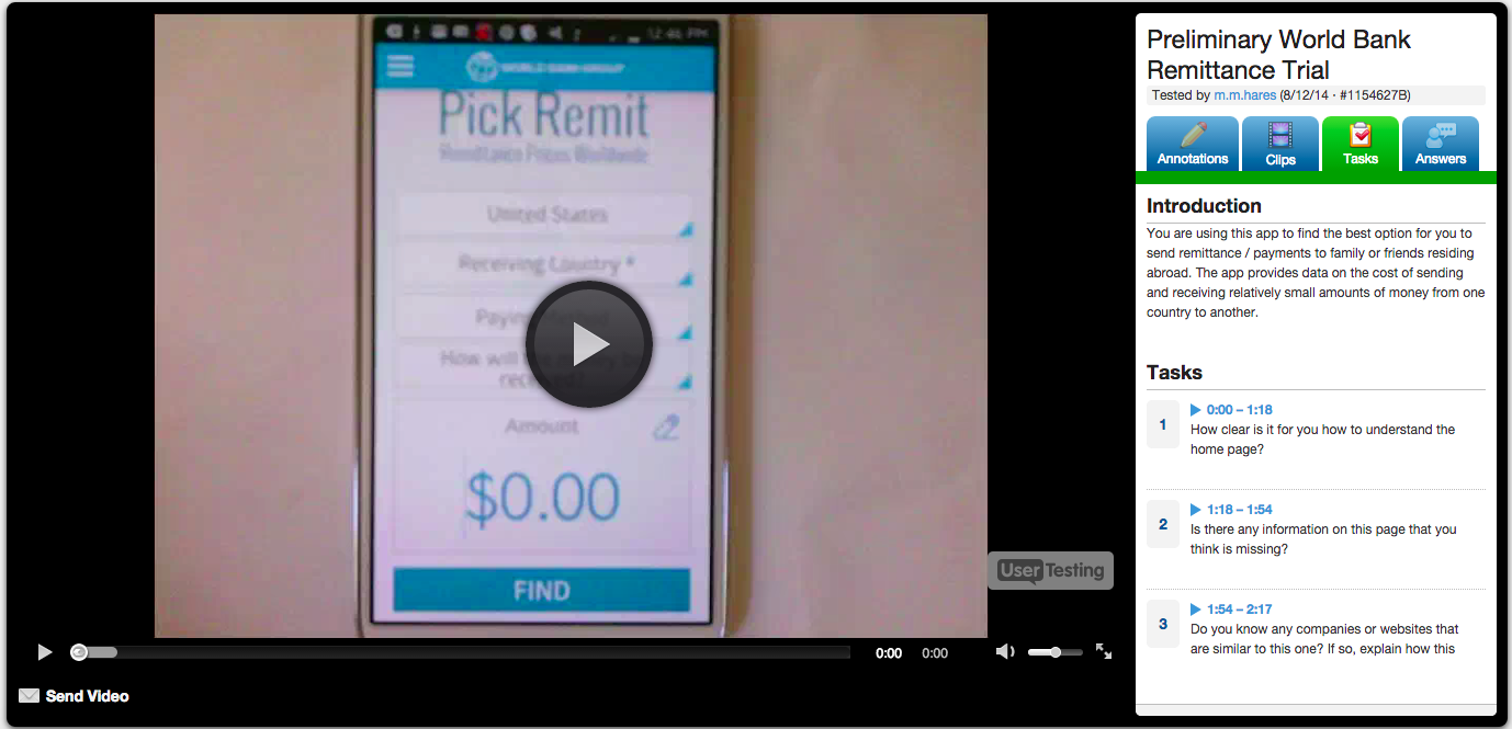
Once the prototype is created, the team must learn — from real users — what works, what doesn’t, and then focus on iteration. To make the most of the testing stage, it’s absolutely crucial for the team to have in place mechanisms to gather and assess feedback. The more detailed the feedback is, the better the chances of fine-tuning any little UX issues that could harm the success of the finished product.

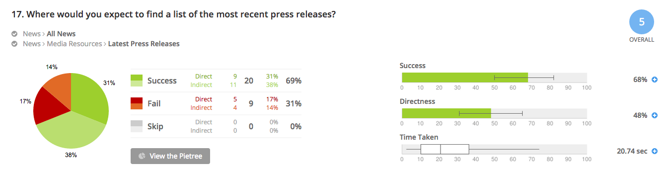
During the testing phase, it’s important that the testers not be coached or steered toward a certain type of feedback. Ideally, the team should refrain from telling testers what the purpose of the site or app is, or how it works. If testers can figure it out easily and accurately without any guidance, the UX is definitely on the right track. On the other hand, if the testers are confused about what the app or site is for, or how to use it, then both the messaging and the UX need some work.

The principles of design thinking can be applied to a multitude of challenges, and these principles truly shine when they’re applied toward the UX design of a website or application. By following a proven process that involves, above all, listening to the user, teams can create a finished product that will be enthusiastically embraced, adopted, and used for years.

Contact us now and find out how Mobomo's approach to design can benefit you.

Categories
Author

Mobomo Top 1000 2019

For the second time in a row, Mobomo has been awarded the Clutch Top 1000 Companies in the world! This award highlights only 1% of the companies on the platform and is the most exclusive award offered by Clutch. Companies are ranked based on the quality and recency of verified client reviews, as well as the companies’ market presence and industry leadership.

With passion and expertise in creating cutting-edge, functional, and successful experiences, Mobomo has become one of the top mobile app development companies in the Washington, D.C. area.

In a recent project reviewed on Clutch, Mobomo received 5 stars for developing a custom web portal and Android and iOS apps.

It has been an honor to receive this recognition as 2019 comes to an end. Mobomo is grateful for the support we have from our amazing clients, who have taken the time to provide detailed reviews on Clutch. We are excited to see what 2020 will bring for our team and clients!

About Clutch
Clutch (clutch.co) is a business to business research firm located in Washington, D.C. They are best known for connecting agencies and software solution companies in order to enhance business goals across businesses. Their ratings and reviews platform publishes the most extensive and referenced client reviews in the B2B services market.

Categories
Author

Vienna, VA March 19, 2019—Mobomo,

Mobomo, LLC is pleased to announce our award as a prime contractor on the $25M Department of Interior (DOI) Drupal Developer Support Services BPA . Mobomo brings an experienced and extensive Drupal Federal practice team to DOI.  Our team has launched a large number of award winning federal websites in both Drupal 7 and Drupal 8, to include www.nasa.gov, www.usgs.gov, and www.fisheries.noaa.gov.,These sites have won industry recognition and awards including the 2014, 2016, 2017 and 2018 Webby Award; two 2017 Innovate IT awards; and the 2018 MUSE Creative Award and the Acquia 2018 Public Sector Engage award.

DOI has been shifting its websites from an array of Content Management System (CMS) and non-CMS-based solutions to a set of single-architecture, cloud-hosted Drupal solutions. In doing so, DOI requires Drupal support for hundreds of websites that are viewed by hundreds of thousands of visitors each year, including its parent website, www.doi.gov, managed by the Office of the Secretary. Other properties include websites and resources provided by its bureaus  (Bureau of Indian Affairs, Bureau of Land Management, Bureau of Ocean Energy Management, Bureau of Reclamation, Bureau of Safety and Environmental Enforcement, National Park Service, Office of Surface Mining Reclamation and Enforcement, U.S. Fish and Wildlife Service, U.S. Geological Survey) and many field offices.

This BPA provides that support. The period of performance for this BPA is five years and it’s available agency-wide and to all bureaus as a vehicle for obtaining Drupal development, migration, information architecture, digital strategy, and support services. Work under this BPA will be hosted in DOI’s OpenCloud infrastructure, which was designed for supporting the Drupal platform.

Categories
Author

Vienna, VA March 13, 2019—Mobomo, a leading web, mobile app, and cloud-solution provider, is proud to announce that it has won two awards from the Acquia Partner Awards’ Public Sector segment: Partner of the Year and Growth Partner of the Year. The Acquia Partner Awards recognizes the success and contributions of the partners throughout the course of the year working with the Acquia Platform. The Growth Partner of the Year award specifically recognizes growth from the previous year, while Partner of the Year honors the overall business performance.

When asked about the recent award recognition, Mobomo CEO Brian Lacey offered a few thoughts, “We are humbled by Acquia’s recent recognition. This company has been a reliable, trustworthy partner of ours. Between our solution expertise and their cutting-edge cloud services, we are glad that our partnership is not only financially successful, but that we can work together to create innovative solutions for federal organizations like NOAA Fisheries, which increase user engagement on their sites and streamline their information systems.”

The project was awarded based on Mobomo’s collaboration with Acquia and the National Oceanic and Atmospheric Administration (NOAA) Fisheries to revamp NOAA’s website. In 2016, Mobomo and Acquia worked with NOAA Fisheries to redesign their online presence, streamlining the site’s content contribution and dissemination system.

Mobomo also credits Acquia’s cloud system for facilitating the process and ensuring that the NOAA Fisheries project was a success. Mobomo selected Acquia as its application development partner for its quality of cloud services, as well as its compliance and relationship with the Federal Risk and Authorization Management Program (FedRAMP). The government-wide program standardizes the security assessment, authorization, and continuous monitoring of cloud products and services. Acquia holds an Authority to Operate (ATO) certificate, which FedRAMP only grants to cloud providers that meet strict conditions.

Lacey also added, “We are honored by the awards, but more so by our partnership in general. We are excited to continue this fruitful relationship, collaborate on future projects, and help other companies and organizations optimize their online presence with advanced solutions and efficient cloud services.”

For more information, please contact Mobomo at:
(888) 676-1049
hello@mobomo.com
www.mobomo.com

Source: https://www.acquia.com/resources/case-study/noaa-fisheries

Categories
Author

We are in the business of awesome user experience, software engineering, mobile products, and web design. Our award-winning solutions leverage new technological developments to propel our clients to new heights. With today’s competitive technology industry, we know the importance of software developers for our clients’ success. We want to provide the best of the best for our clients. To ensure we are doing so, our company joined Clutch to see how we stack against the competition in our industry.

Clutch, a B2B ratings and reviews platform, evaluates companies across various industries in order to help businesses choose the best service provider. They analyzed Mobomo based on our services offered, client base, and case studies of projects we’ve executed for former clients. More importantly, they spoke directly with our former clients in phone interviews to obtain an accurate and verified understanding of their experience working with the Mobomo team. The interviews have been an incredibly valuable resource for our clients to provide their feedback on our service, and for our own team to reflect on how far we’ve come as an agency.

You can find these former client reviews on our Clutch profile. Here’s a glimpse of the praise so far:


“[Mobomo] has extremely talented developers with a knack for finding the most efficient solutions.” – Branch Chief, Government Agency


“Because of Mobomo, things run much smoother and more efficiently now.” – Website Project Manager, Nonprofit


“The team is responsive to all inquiries, questions, and concerns.” – Program Analyst, Center for Strategic and Budgetary Assessments


These rave reviews, combined with our excellence in other areas of Clutch’s research methodology, scored us positions as a global leader in two development categories. In the ultra-competitive development space, we have been recognized as one of the top global 15 mobile app development companies, more specifically for iPhone development, and as one of the best WordPress Developers in the world.

Our ability to deliver has not only propelled us to the top of the development space, but we have been featured in Clutch’s inaugural listing, The Clutch 1000. The Clutch 1000 is their most selective list of the most highly ranked B2B service providers. B2B companies with the strongest brand reputation, clientele, and reviews were selected from a pool of over 50,000 global agencies, and we were placed in the top in the top 60!

Lastly, Clutch is not the only platform that gave us praise for our development prowess. The Manifest named us as a top-20 leading web development firm. The Manifest is a database of industry reports, how-to-guides, and top service provider lists across various industries.

In conclusion, we want to say thank you to all of our clients and partners; your support allows us to do what we love. We’re proud of our high rankings so far, and we can’t wait to keep pushing the boundaries of next level development with you.

Categories
Author

bootstrap-web-design-development

Over the past few weeks, I’ve heard a great deal of pushback around Bootstrap. The first argument is focused around general feedback that Bootstrap isn’t suitable for production, and the second is that using frameworks like Bootstrap is limited from a design perspective. I’d like to offer a few insights into the practice of implementing Bootstrap in an optimized fashion.

At a recent An Event Apart in Nashville, there was a panel discussion with Jeffrey Zeldman, Eric Meyer, Rachel Andrew, and Jen Simmons. During this discussion, Bootstrap came up a few times:

“If people want to use Bootstrap, or anything, whatever it is, as long as you don’t release it to the public that way.” - Jeffrey Zeldman

"There were back to back presenters today who talked about how we really feel like people should stop using Bootstrap. And you were saying Jeffrey, that it’s great for prototypes, and I’ve heard a lot of people say that, Karen McGrane said that on the show not long ago, “Oh, Bootstrap’s great for prototypes”. - Jen Simmons

Before I demonstrate a few implementation methods, I first think it’s prudent for us to remember that, as in many cases in web development, it’s not the tool’s fault, but the implementation. A shining example of this is when smartphones first appeared, we had developers who had been building desktop sites for decades, who for the first time were being presented with the mobile form factor. Using methods that worked on powerful desktop machines with broadband had to be reassessed, and for a while, the idea that the web is slow on mobile was very popular. This was not the fault of the web, the mobile web, smartphones, or anything in between. This was (and still is to some degree), the fault of developers sending desktop content to mobile devices, among other implementation challenges.

In the case of Bootstrap, the biggest culprit of negative performance impact comes from site authors who include the entirety of Bootstrap’s CSS or JS files. With both, we must always include only the modules used in our app or site.

When implementing Bootstrap’s CSS, this is accomplished by making a copy of the Bootstrap manifest file that imports each individual Bootstrap module. This is placed with your app’s CSS modules. It is typically imported before everything else:

Bootstrap-CSS

Start by commenting out every module in this master Bootstrap manifest. As you work on your site, only uncomment the modules you’re using:

Bootstrap-CSS

This allows for a completely customized Bootstrap CSS file, without having to depend on a generator or tool to build a custom version of Bootstrap for you, and ensures that you have the most optimized version of Bootstrap CSS possible running in your app, because you’re only enabling modules as needed.

The same method can be applied with Bootstrap’s JS. In Rails, it’s very easy to include individual Bootstrap JS modules in your app’s application.js file:

Bootstrap-CSS

Your implementation may differ, but the idea stays the same: only include CSS & JS modules that are being used.

With an optimized implementation of Bootstrap, you can be confident that your performance won’t suffer as a result of using the framework.

The other popular sentiment is that Bootstrap limits our design, a sentiment echoed at the same An Event Apart conference:

“I feel like if you use it as a prototype then you’ve just, right from the first brushstroke, set yourself up to stay within a very small box. Now, it used to be a very small box inside a of a just slightly larger box, but now it’s a very small box inside of a box that’s about to get really huge, and I want to be in the rest of the box.” - Jen Simmons

Using the same CSS architecture described above, we can easily add variables in our Bootstrap manifest that override the Bootstrap defaults, effectively giving us the flexibility to design & build anything we want:

Bootstrap-CSS

These are only a few examples, but they will have a big impact on the site layout. You can customize any variable provided by Bootstrap. The options in Bootstrap’s variables file are virtually limitless.

While Bootstrap allows designers & developers to customize design & layout to their heart’s content, it’s also worth noting that design patterns exist for a reason. Users have certain expectations, and in many cases, breaking those expectations can cause confusion. This is best demonstrated with the Ionic hybrid app framework. Ionic offers a set of components that adapt to iOS, Android and Windows platforms. With Bootstrap’s components, you get a base set of components that users are familiar with, but also the flexibility to customize them.

It may be true that the defaults for Bootstrap make it too easy for developers to implement a bloated or cookie-cutter version of the framework. But, with the methods described in this post, you can easily break outside that box, and ensure your work is delivered in an optimized fashion to your users.

Categories
Author

With so many devices and screen sizes, it can be difficult balancing act to make your site look great and perform well. Displaying low res images on a high res display can make a site look terrible. On the other hand, serving high res images to a low res device can needlessly create a sluggish experience. Responsive images can help.

NOTE: Responsive image techniques are best used for CONTENT images (<img src=””>). For background images, you can and should use CSS media queries to control how the image is displayed across various devices.

The goal of responsive images is to provide multiple image sources and any other details the browser may need when deciding on an image.

WARNING: Parts of the syntax are very weird and the results may seem weird due to the long list of factors at play. These factors include, but are not limited to:

  • Viewport size

  • Image size

  • Image display size

  • Screen Pixel Density

  • Cache

  • Browser

  • *Bandwidth

  • *Browser settings (User preferences)

*Not currently implemented

Introducing the source set attribute:

Responsive_Images_Srcset

Srcset allows us to provide multiple image sources as well as the size of each image. It may seem odd to inform the browser of our image sizes, especially since the browser can easily determine this on its own. However, the reasoning behind this is to give the browser a leg up on the selection process; allowing the browser to intelligently decide, prior to downloading, which image to request.

Taking it one step further with the sizes attribute:

Responsive_Images_Size

The sizes attribute allows us to inform the browser of the image size being displayed on a page. It includes syntax similar to CSS media queries for responsive layouts where the image display size is determined by the layout.

Again, it may seem odd to inform the browser of something it can easily calculate on its own or it may seem odd to include redundant code from CSS, but providing this info before the browser even has the CSS files will improve performance.

A bit more control with the picture element:

Responsive_Images_Picture

Lastly, the picture element provides more control, using media queries, to explicitly narrow down the browser’s selection of image choices. This is useful for implementing art direction or when image sizes change so dramatically they must be uniquely cropped for every layout.

Responsive images can be complex. However, when done properly, they can provide the very best experience for any situation.

For more details check out our codepen:

[codepen_embed height=300 theme_id=1 slug_hash='qdMQdb' user='Mobomo LLC' default_tab='result' animations='run']

Categories
Author

With Drupal, both developers and non-developer admins can deploy a long list of robust functionalities right out-of-the-box. This powerful, open source CMS allows for easy content creation and editing, as well as seamless integration with numerous 3rd party platforms (including social media and e-commerce). Drupal is highly scalable, cloud-friendly, and highly intuitive. Did we mention it’s effectively-priced, too?

In our “Why Drupal?” 3-part series, we’ll highlight some features (many which you know you need, and others which you may not have even considered) that make Drupal a clear front-runner in the CMS market.

For a personalized synopsis of how your organization’s site can be built on or migrated to Drupal with amazing results, grab a free ticket to Drupal GovCon 2015 where you can speak with one of our site migration experts for free, or contact us through our website.

_______________________________

SEO + Social Networking:

Unlike other content software, Drupal does not get in the way of SEO or social networking. By using a properly built theme--as well as add-on modules--a highly optimized site can be created. There are even modules that will provide an SEO checklist and monitor the site’s SEO performance. The Metatags module ensures continued support for the latest metatags used by various social networking sites when content is shared from Drupal.

E-Commerce:

Drupal Commerce is an excellent e-commerce platform that uses Drupal’s native information architecture features. One can easily add desired fields to products and orders without having to write any code. There are numerous add-on modules for reports, order workflows, shipping calculators, payment processors, and other commerce-based tools.

Search:

Drupal’s native search functionality is strong. There is also a Search API module that allows site managers to build custom search widgets with layered search capabilities. Additionally, there are modules that enable integration of third-party search engines, such as Google Search Appliance and Apache Solr.

Third-Party Integration:

Drupal not only allows for the integration of search engines, but a long list of other tools, too. The Feeds module allows Drupal to consume structured data (for example, .xml and .json) from various sources. The consumed content can be manipulated and presented just like content that is created natively in Drupal. Content can also be exposed through a RESTful API using the Services module. The format and structure of the exposed content is also highly configurable, and requires no programming.

Taxonomy + Tagging:

Taxonomy and tagging are core Drupal features. The ability to create categories (dubbed “vocabularies” by Drupal) and then create unlimited terms within that vocabulary is connected to the platform’s robust information architecture. To make taxonomy even easier, Drupal even provides a drag-n-drop interface to organize the terms into a hierarchy, if needed. Content managers are able to use vocabularies for various functions, eliminating the need to replicate efforts. For example, a vocabulary could be used for both content tagging and making complex drop-down lists and user groups, or even building a menu structure.

Workflows:

There are a few contributor modules that provide workflow functionality in Drupal. They all provide common functionality along with unique features for various use cases. The most popular options are Maestro and Workbench.

Security:

Drupal has a dedicated security team that is very quick to react to vulnerabilities that are found in Drupal core as well as contributed modules. If a security issue is found within a contrib module, the security team will notify the module maintainer and give them a deadline to fix it. If the module does not get fixed by the deadline, the security team will issue an advisory recommending that the module be disabled, and will also classify the module as unsupported.

Cloud, Scalability, and Performance:

Drupal’s architecture makes it incredibly “cloud friendly”. It is easy to create a Drupal site that can be setup to auto-scale (i.e., add more servers during peak traffic times and shut them down when not needed). Some modules integrate with cloud storage such as S3. Further, Drupal is built for caching. By default, Drupal caches content in the database for quick delivery; support for other caching mechanisms (such as Memcache) can be added to make the caching lightning fast.

Multi-Site Deployments:

Drupal is architected to allow for multiple sites to share a single codebase. This feature is built-in and, unlike Wordpress, it does not require any cumbersome add-ons. This can be a tremendous benefit for customers who want to have multiple sites that share similar functionality. There are few--if any--limitations to a multi-site configuration. Each site can have its own modules and themes that are completely separate from the customer’s other sites.

Want to know other amazing functionalities that Drupal has to offer? Stay tuned for the final installment of our 3-part “Why Drupal?” series!

Categories
Author

For Federal Offices of Communication, the act—and art—of balancing websites that both cater to the public and promote the organizational structure and mission of the organization is always top of mind. Accordingly, those partnering with Federal offices must prioritize meeting both needs when designing and building agency sites. On numerous projects, our team has successfully managed to increase usability and deliver user-centric designs while simultaneously building sites that allow our Federal clients to bolster their brand. A sample of results for some clients:

-a swift 4% increase in first-time visitor overall satisfaction
-76% of all mobile users strongly agreeing that the new site made content easier to find
-88% of frequently visiting teens being satisfied with the new site

Below are some of the tools we’ve implemented to achieve success:

Navigation and Information Architecture

Treejack is a great usability testing tool that development teams can wield to test the information architecture and navigation of the site prior to even beginning a design. It is best used to test the findability of topics in a website using different navigational hierarchies. For one of our projects, both internal and external stakeholders were given 46 tasks to perform using a variety of different navigation hierarchies to find the most optimal site organization for both constituent groups.

treejack-information-architecture-software

Usability Testing

For usability testing, our team leverages both Loop11 and Usertesting.com. Using a live, interactive environment, both of these tools allow development teams to gain deep understanding of user behavior by observing users as they complete a series of tasks and questions on the site and/or mobile app in question. Interactions are captured and then analyzed in comprehensive reports. As an added bonus, Usertesting.com provides video footage of the interaction for review:

user-testing-video-footage

http://bit.ly/1rRvEAm

In summary, Federal websites and applications are often designed with too much emphasis on organizational hierarchy and goals, and too little focus on meeting end-users’ needs and expectations. User-Centric Design (UCD) tools can help government agencies buck this trend, however, allowing them to create websites and applications that engage users and maximize their interaction. Ultimately, this results in a sure win-win: Federal agencies’ constituents can experience an efficient, satisfying, and user-friendly design, and—with constituents’ increased engagement—organizations can ensure that their missions and information are communicated effectively. Act balanced.

Categories
Author

In April 2015, NASA unveiled a brand new look and user experience for NASA.gov. This release revealed a site modernized to 1) work across all devices and screen sizes (responsive web design), 2) eliminate visual clutter, and 3) highlight the continuous flow of news updates, images, and videos.

With its latest site version, NASA—already an established leader in the digital space—has reached even higher heights by being one of the first federal sites to use a “headless” Drupal approach. Though this model was used when the site was initially migrated to Drupal in 2013, this most recent deployment rounded out the endeavor by using the Services module to provide a REST interface, and ember.js for the client-side, front-end framework.

Implementing a “headless” Drupal approach prepares NASA for the future of content management systems (CMS) by:

  1. Leveraging the strength and flexibility of Drupal’s back-end to easily architect content models and ingest content from other sources. As examples:

  • Our team created the concept of an “ubernode”, a content type which homogenizes fields across historically varied content types (e.g., features, images, press releases, etc.). Implementing an “ubernode” enables easy integration of content in web services feeds, allowing developers to seamlessly pull multiple content types into a single, “latest news” feed. This approach also provides a foundation for the agency to truly embrace the “Create Once, Publish Everywhere” philosophy of content development and syndication to multiple channels, including mobile applications, GovDelivery, iTunes, and other third party applications.

  • Additionally, the team harnessed Drupal’s power to integrate with other content stores and applications, successfully ingesting content from blogs.nasa.gov, svs.gsfc.nasa.gov, earthobservatory.nasa.gov, www.spc.noaa.gov, etc., and aggregating the sourced content for publication.

  1. Optimizing the front-end by building with a client-side, front-end framework, as opposed to a theme. For this task, our team chose ember.js, distinguished by both its maturity as a framework and its emphasis of convention over configuration. Ember embraces model-view-controller (MVC), and also excels at performance by batching updates to the document object model (DOM) and bindings.

In another stride toward maximizing “Headless” Drupal’s massive potential, we configured the site so that JSON feed records are published to an Amazon S3 bucket as an origin for a content delivery network (CDN), ultimately allowing for a high-security, high-performance, and highly available site.

Below is an example of how the technology stack which we implemented works:

Using ember.js, the NASA.gov home page requests a list of nodes of the latest content to display. Drupal provides this list as a JSON feed of nodes:

Ember then retrieves specific content for each node. Again, Drupal provides this content as a JSON response stored on Amazon S3:

Finally, Ember distributes these results into the individual items for the home page:

The result? A NASA.gov architected for the future. It is worth noting that upgrading to Drupal 8 can be done without reconfiguring the ember front-end. Further, migrating to another front-end framework (such as Angular or Backbone) does not require modification of the Drupal CMS.

Categories
Author
Subscribe to Web Development