
Mobomo webinars-now on demand! | learn more.

web-design-agency

A website redesign can be a big project, although it can seem like a daunting process, it does have many advantages that will help your business. After all, redesigning your website is a powerful thing you can do for your company, this is often times the first way users communicate with your company, by following best practices and using a strategic approach you can help your brand garner ROI as well as brand visibility.

We recently redesigned our own website Mobomo.com, but before starting the process we needed to discuss our end goals, what did we want our new site to accomplish. Here are some of the reasons that we decided to do a redesign:

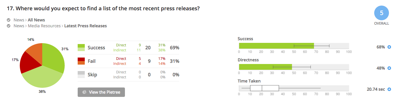
  1. Improving functionality and usability: Although our last site provided functionality we wanted to take the design to the next level and by doing that it ultimately meant that our new website needed better functionality for users. Who doesn't want to drive more traffic to their website? We wanted to improve the user experience on our website and by this I mean we wanted our users to clearly be able to find what they were looking for with ease. If a user is not able to find something easily then more likely then not they will leave your site without thinking twice.
  2. Better visuals: I think imagery is everything. If done correctly, it is easy to tell a story by the power of a picture. While in our beginning phases of the redesign project, we agreed that we wanted fresh, up-to-date visuals as well as colors to compliment the site. We felt that we could tell a more powerful story by using more visuals and guide the user through a story. Changing your visuals is a good way to stay up-to-date with the website trends as well as provide a different look to the site so it doesn't feel stale.
  3. Rebranding: If your company has been going through a rebrand, it is important to keep your website up-to-date on the new change but I don’t just mean changing logos and colors, you will need to update the content on your site as well so that it is consistent in the branding process. We wanted fresh, new content;  it's always nice to do a pulse check on the content living on your website- is it old? Outdated? Is the user finding the content helpful to their end needs? You can still use the meat of the old content but spice it up and change the wording to ensure that it doesn't go stale.
  4. Mobile friendly: We were mobile friendly before however we wanted to make sure our redesign was easy to use on the mobile platform. Mobile has grown significantly over the past few years, so much so that mobile searches have surpassed desktop searches. I think I can speak to everyone here, we all need to do more than just keep up with the times, we need to be ready to make those changes to accommodate users no matter the platform they choose to use. Its important to make sure your website can be viewed on a wide variety of devices, including desktops, laptops, tablets, and smartphones. By incorporating a responsive web design, you’ll be assured of reaching a larger audience than you would with a website that’s not mobile-friendly. 

Conducting a redesign on your company website can be challenging, even though we felt like we were checking the boxes on our old design and felt that user experience was high, it felt outdated and it needed a makeover. The important aspect in redesign is taking the things that you were doing well on your old site and make them even better. You can always learn about what you did wrong in a redesign but what about what you did right?


Categories
Author

For Federal Offices of Communication, the act—and art—of balancing websites that both cater to the public and promote the organizational structure and mission of the organization is always top of mind. Accordingly, those partnering with Federal offices must prioritize meeting both needs when designing and building agency sites. On numerous projects, our team has successfully managed to increase usability and deliver user-centric designs while simultaneously building sites that allow our Federal clients to bolster their brand. A sample of results for some clients:

-a swift 4% increase in first-time visitor overall satisfaction
-76% of all mobile users strongly agreeing that the new site made content easier to find
-88% of frequently visiting teens being satisfied with the new site

Below are some of the tools we’ve implemented to achieve success:

Navigation and Information Architecture

Treejack is a great usability testing tool that development teams can wield to test the information architecture and navigation of the site prior to even beginning a design. It is best used to test the findability of topics in a website using different navigational hierarchies. For one of our projects, both internal and external stakeholders were given 46 tasks to perform using a variety of different navigation hierarchies to find the most optimal site organization for both constituent groups.

treejack-information-architecture-software

Usability Testing

For usability testing, our team leverages both Loop11 and Usertesting.com. Using a live, interactive environment, both of these tools allow development teams to gain deep understanding of user behavior by observing users as they complete a series of tasks and questions on the site and/or mobile app in question. Interactions are captured and then analyzed in comprehensive reports. As an added bonus, Usertesting.com provides video footage of the interaction for review:

user-testing-video-footage

http://bit.ly/1rRvEAm

In summary, Federal websites and applications are often designed with too much emphasis on organizational hierarchy and goals, and too little focus on meeting end-users’ needs and expectations. User-Centric Design (UCD) tools can help government agencies buck this trend, however, allowing them to create websites and applications that engage users and maximize their interaction. Ultimately, this results in a sure win-win: Federal agencies’ constituents can experience an efficient, satisfying, and user-friendly design, and—with constituents’ increased engagement—organizations can ensure that their missions and information are communicated effectively. Act balanced.

Categories
Author

Nov 8th brings upon us World Usability Day, now eight years in the running. This year’s major theme is the Usability of Financial Systems, with the event growing larger every year from record participation in international conferences and increasing media coverage.

First of all, let’s all take a moment to say “Go, world!” for anointing a full day to usability. This gives us design nerds yet another excuse to wax poetic about our favorite buzzy terms and hipster-geek out together in giant conference rooms at swanky hotels over our Macs and steaming cups of coffee (locally-sourced beans, of course).

Cheekiness apart, we can agree that this is important. Never before has such attention been paid, by design folks and “normals” alike, to the collision of form, function, visual design and sensory experience in one gigantic meta-ideal we call the “usable”. Apple’s stock price knows no bounds, Steve Jobs is a demi-god, and people somehow keep shopping at IKEA despite swearing they’ll never go back.

The fact is it’s not just about aesthetics anymore (it never was). It’s about “How fast does it load?” and “How smooth are its curves?” It’s about “How heavy is it on my shoulder?” and “Can I find the menu quickly enough?”. It’s about “Can I carry it on the subway?” and “Does this make me feel stupid?”. And even, “Is this inexpensive-yet-stylish enough to be worth my time crouched on the floor hammering together random pieces of wood with the lofty goal of furnishing my apartment?” (clearly, IKEA and I have unresolved issues).

It’s also about creating habits, making users want more, building in “social hooks”, and making it “go viral”. It’s about developing reward systems, demanding user commitment, toying with psychology, and considering disabilities. It’s about touch and smell, hardware and software, bits and bytes, wood and steel, and the air in between.

Usability, in other words, is like a giant dinosaur’s mouth that seems it will swallow you whole--except, when you stop to realize, that at the end of the day it’s all about bringing a smile to the user’s face and having them come back for more.

Simple, when you look at it that way, but certainly not easy. And this brings us to this year’s theme - The Usability of Financial Systems.

I would say it was somewhere around mid-2007 that people stood up and started to take notice about the importance of usability in finance. That’s when Mint.com exploded on the scene, with a drop-dead gorgeous interface showcasing slick, colorful dashboards, and “No way, really?” functionality bringing together personal credit cards, debit cards, bank accounts, student loans, mortgages, and more, into one so-easy-your-grandma-would-get-it, eat-it-like-it’s-cake online software package.

In my view, that’s really when things changed, and they’ve never been the same. Mint has spawned an entire industry of personal finance me-too software products including CakeHealth for managing health insurance and Simple.com as a close competitor. Let’s not forget Mint’s influence on the payments space as well, what with Square, Dwolla, and WePay boasting beauty, simplicity, and powerful functionality all rolled into one.

But things have come a long way since 2007, and usability isn’t a luxury any more--it’s just expected. Finally, it seems, Big Finance is catching on too. Intridea has been proud to develop interfaces for giants like Citi, Bank of America, JPMorgan Chase, Agilysys’ point-of-sale systems. We’re just glad some folks are stepping up to the plate, and that we get to be part of the revolution.

On a separate note, the reason I love this year’s theme so much is because it invites discussion on usability in an area where people least expect it, an area that’s still wide open for disruption. Let’s face it--people expect a designer scarf to be gorgeous, rich in color, featuring complex textures, and soft to the touch. But a bank’s interface? Not so much. Until it is. And you see it. And it all comes together. And everything changes.

This year, it’s incumbent upon everyone--not just the design industry--but Big Finance too, to take the usability of financial products seriously and do something about it. It’s only fair--you shouldn’t be allowed to experience the joy of a BMW test drive, the ripping open of a new iPad package, or the other-worldliness of Disneyland, if what you put out in the world yourself is utter and complete crap. Quid pro quo, I say, quid pro quo. Karma. Do unto others. What goes around comes around. All that jazz.

So there, I said it. Bring it on, World Usability Day. Bring it on, Big Finance. Show me what you’ve got.

Now if you’ll excuse me, I need to get back to my steaming cup of organic Guatemalan coffee.

Categories
Author

Today, Intridea.com got a brand new look and feel. The goal behind the redesign was to improve the user experience with a cleaner and more attractive layout. I'd say the goal was met and exceeded with better organized content, careful use of white space, and a more vibrant color scheme. Visitors will still find all the major menu items and frequently used links in the same place; they just might stand out more and look a little better.

Before and After

Before and After Intridea Website

Key Features:

  • Enhanced Usability
  • Greater User Experience
  • Consumer Focused Interaction Design
  • Warm Balanced Visual Design

New Sections

Services

In this section you'll find a run down of the Intridea process as well as the detailed services we provide to each of our clients. Did you know Intridea holds regular training classes based on cutting edge development practices?

Portfolio

Our new portfolio section showcases a variety of stunning web and mobile applications Intridea has built for clients, products and open source projects. Clicking on any showcase item will reveal a full description of each project. If you like what you see here, contact us and we'll help you bring your next project to life!

Blog

We've paid special attention to our new blog section. With a focus on design and usability our new blog aims to give you the best information in an easy-to-read format. Looking for an old article? No problem. You can easily access old posts directly from the right sidebar.

Contact

Our contact us page has been redesigned to help you get a hold of us quicker. Select any of the options from our contact form and include a short note. One of our helpful client service representatives will follow up with you promptly. If you prefer to reach us by phone, you can call us at 1-888-968-IDEA. We look forward to connecting with you!

About

Intridea would not exist if it wasn't for the talented group of people we have here. We're like family. Each of us are extremely grateful for one another and we hope you'll find this new section helpful for learning more about what we do here at Intridea.

Please let us know what you think about our new look by leaving us a comment below.

Categories
Author
1
Subscribe to Usability