Mobomo webinars-now on demand! | learn more.

Mobomo, LLC Ranks #123 on Inc. Magazine’s List of the Mid-Atlantic Region’s Fastest-Growing Private Companies

Companies on the 2022 Inc. 5000 Regionals Mid-Atlantic list had an average growth rate of 161% percent. 

Vienna, VA, March 15, 2022  Inc. magazine revealed today that Mobomo, LLC is No. 123 on its third annual Inc. 5000 Regionals: Mid-Atlantic list, the most prestigious ranking of the fastest-growing private companies based in Washington, D.C., Delaware, Maryland, North Carolina, Virginia, and West Virginia. Born out of the annual Inc. 5000 franchise, this regional list represents a unique look at the most successful companies within the Mid-Atlantic region economy’s most dynamic segment – its independent small businesses. 

The companies on this list show a remarkable rate of growth across all industries in the Mid-   Atlantic region. Between 2018 and 2020, these 131 private companies had an average growth rate of 161% percent and, in 2020 alone, they added 7,365 jobs and $1.9 billion to the Mid-Atlantic region’s economy. Companies based in the Richmond and Washington, D.C., areas had the highest growth rate overall.    

Complete results of the Inc. 5000 Regionals: Mid-Atlantic, including company profiles and an interactive database that can be sorted by industry, metro area, and other criteria, can be found at inc.com/mid-atlantic starting March 15, 2022.

“This year’s Inc. 5000 Regional winners represent one of the most exceptional and exciting lists of America’s off-the-charts growth companies. They’re disrupters and job creators, and all delivered an outsize impact on the economy. Remember their names and follow their lead. These are the companies you’ll be hearing about for years to come,” says Scott Omelianuk, editor-in-chief of Inc.

Mobomo — a private company headquartered in the D.C. metro area — is a premier provider of web and mobile development services to commercial businesses, government agencies, and non-profit organizations. We combine technology expertise with disciplines in digital strategy, interactive marketing, and branding to create innovative applications and websites. From private sector companies to government agencies, we have amassed deep expertise helping our clients enhance and expand their existing web and mobile suite.

Interested in learning more about Mobomo? Take a tour of our capabilities, our past performance, the team members who make our clients look so fantastic, and feel free to reach out with any questions you might have

More about Inc. and the Inc. 5000 Regionals

Methodology

The 2022 Inc. 5000 Regional are ranked according to percentage revenue growth when comparing 2018 and 2020. To qualify, companies must have been founded and generating revenue by March 31, 2018. They had to be U.S.-based, privately held, for-profit, and independent—not subsidiaries or divisions of other companies—as of December 31, 2019. (Since then, a number of companies on the list have gone public or been acquired.) The minimum revenue required for 2018 is $100,000; the minimum for 2020 is $1 million. As always, Inc. reserves the right to decline applicants for subjective reasons. 

About Inc. Media 

The world’s most trusted business-media brand, Inc. offers entrepreneurs the knowledge, tools, connections, and community to build great companies. Its award-winning multiplatform content reaches more than 50 million people each month across a variety of channels including websites, newsletters, social media, podcasts, and print. Its prestigious Inc. 5000 list, produced every year since 1982, analyzes company data to recognize the fastest-growing privately held businesses in the United States. The global recognition that comes with inclusion in the 5000 gives the founders of the best businesses an opportunity to engage with an exclusive community of their peers and the credibility that helps them drive sales and recruit talent.

The associated Inc. 5000 Conference is part of a highly acclaimed portfolio of bespoke events produced by Inc. For more information, visit www.inc.com

Categories
Author

Good Mobile Experience Changes In Real Time

Since user experience is vital to the success of a web or mobile system, it is critical to establish feedback loops within the system to inform potential changes. There are multiple methods for effective feedback loops, both manual and automated the end result for either is establishing how users felt regarding their experience. 

Although user experience is somewhat subjective as a whole, metrics and analytics are one method that can provide objective feedback and insight into how effective the user experience trends may be. Analytics has traditionally been utilized for marketing purposes, informing strategy, implementations, and trends, however, more and more user-experience implementations are relying on this quantitative data source to aid in project research and design. Modern system analytics are key to tracking the user experience and should be reviewed daily when available. Utilizing the data effectively and efficiently through a well-designed system can successfully change a user’s experience (in some cases real-time) for the better.

This principle in practice:

In order to analyze metrics and data effectively, success objectives must first be established. How do you define success? To begin, here are some example goals for establishing a project’s user experience success:

Initially, one effective strategy to measure success of a project’s designed user experience is to select a few key metrics and focus on them over time. One of the most prominent issues with analytics is that without proper direction, they can become a distraction or just numbers without any context or actionable interpretation. Mobile analytics is data, which can provide valuable information when utilized in the way that furthers an agency's goals. The question then comes down to - what set(s) of analytics data is relevant in the context of the project? Why is the project gathering and tracking metrics to begin with? These are perfectly understandable questions and key to establishing an effective user experience feedback loop across any project.

These are high-level objectives that are established and agreed upon by the project’s organizational stakeholders as measures of success. With established success measures, here are some example categorizations of relevant user experience analytics implementations:

Notifiers provide continuously monitored information hourly, daily, or weekly. The analytics can be used to define specific issues or provide information supporting insight to further guide human behavior. Examples of potential notification analytics:

Identifiers are implemented analytics that are used in conjunction to better understand the overall human behavior and user experience. Identifiers fall under several categories themselves not limited to: traffic issues, technical issues, content related issues, navigation issues, and UI design issues. Some examples are below with their equivalent Google Analytics (GA) implementations as a starting point:

Once a targeted core set of analytics has been implemented and monitored, a basic feedback loop will have been established. The analytics and data can then be utilized by the project team to evaluate opportunities to improve user experience. Does the experience need to change? How should it change? Does the information available warrant additional user testing? Specifically, does it call for A/B testing?


Categories
Author

web-designer-at-computer

Being a designer is a very broad term in which many can misuse and confuse easily. You could be an industrial, print, interior or tech designer, all have different job descriptions in different industries. Speaking in terms of the tech industry there are two commonly used types of web and mobile app designers, UX and UI.

You often hear the terms UX and UI, but what do they actually mean? UX stands for User Experience and UI is User Interface. While they are two distinct concepts and have different actions in the design process they are both closely intertwined to the point one cannot exist without the other.

“User Experience” tends to be used as a broad term and often times different things can be grouped under the larger term but speaking in the realm of digital it is the inception of a product dedicated for a User always defined as the user or group of users and it’s goal is to establish the best form of engagement between the product and it’s user within a designated goal. The UX focuses on all the processes required to build this product which is ruled by purpose.

Once the User Experience is determined, “User Interface” or UI comes into the picture. Since the UX defined the clear goal, and a purpose for the interface, guides the interaction with the user has to be created for the product, it is now time to figure out how the layout will work. This will not be a random array of controls and style choices, but custom made efforts that target the specific needs and behaviors of the user, and will achieve the overall goal and purpose of the product. UI designers are responsible for creating a cohesive style guide, as well as ensuring that a consistent design language is carried out throughout the product. The UI designer must be able to make sure that the screens they are creating communicates clearly to what the UX designer has laid out.

Can one exist without the other? No, UX without UI is a plan, a thought, a strategy. UI on it’s own is just a graphic anecdote that lacks clear purpose. Be sure to check out our design page.

Categories
Author

improving-user-experience

Your website or mobile application is the first impression that you give to a potential customer. Will they get a good or bad impression of their experience? Well, that’s hard to say. It will depend on a few different factors based on user experience. We all know user experience is important in the design process but how can you improve it? Many companies dump money into projects that don’t have a meaningful user experience, UX designers try to uncover the issues but you have to be able to improve those things.

Site speed

Site speed is everything. Who likes visiting a website whenever it is taking forever to load? The answer, no one does. There a multiple things you can do to improve site speed but here are just a few.

Responsive

This is the most important item on how you can improve your user experience. Responsive websites allow for users to view your site in various screen sizes across all devices. Your site will visually appear the same across all platforms. You could lose potential customers if your website isn’t responsive because if they can’t view the same information across all platforms, they'll bounce.

Easy navigation

No one likes going to a website that is difficult to find the information they are looking for - in fact, the user will leave your website and go to another site to find the information they are looking for if they can’t find it easily it on your website. Here are some recommendations to make your site easier to navigate.

Create readable content

If your user can’t understand what they are reading then why have it on your site? Make sure that your content - whether it be your home page, a blog or your services page - is written so that people can easily understand it. Studies show that 81% of users skim the content that they are reading, which means if you don’t have target keywords built into your content chances are they won’t find what they are looking for on your website and they will leave your page.

Categories
Author

designing-user-experience

Have you ever found an amazing tool that looks awesome and it tends to be popular but when you try to use it you have no idea know HOW to use it? Or you get more confused when reading the instructions? This is the perfect example of an amazing design with poor user experience.

Creating an app is no easy task, the designer has to know how the app will work before considering the look and feel of the interface. For all UX designers, the end goal is to provide an effortless experience for the user.

True user experience goes far beyond giving customers what they say they want, or providing checklist features. It is crucial for the designer to use EMPATHY when designing an app. If you put yourself in the end users’ shoes this allows you to move beyond a superficial understanding to a real appreciation of users’ feelings and behaviors, which in the end will avoid any kind of frustration while navigating the app.

User experience designers often ask themselves:

  •         What is the user trying to accomplish while using this app?
  •         How will users feel when they use it?
  •         Will they be confused?
  •         If so, why?
  •         How can I solve this issue in the shortest and easiest way?

Designers are compelled to navigate the app from the beginning to end, trying to find frustrating steps, annoying alerts, or anything that can affect the users’ behavior or feelings. After all, if a product is well-designed, a user shouldn’t even have to think about it they will know the app is there to help them and will not confuse or frustrate them.


Categories
Author

For Federal Offices of Communication, the act—and art—of balancing websites that both cater to the public and promote the organizational structure and mission of the organization is always top of mind. Accordingly, those partnering with Federal offices must prioritize meeting both needs when designing and building agency sites. On numerous projects, our team has successfully managed to increase usability and deliver user-centric designs while simultaneously building sites that allow our Federal clients to bolster their brand. A sample of results for some clients:

-a swift 4% increase in first-time visitor overall satisfaction
-76% of all mobile users strongly agreeing that the new site made content easier to find
-88% of frequently visiting teens being satisfied with the new site

Below are some of the tools we’ve implemented to achieve success:

Navigation and Information Architecture

Treejack is a great usability testing tool that development teams can wield to test the information architecture and navigation of the site prior to even beginning a design. It is best used to test the findability of topics in a website using different navigational hierarchies. For one of our projects, both internal and external stakeholders were given 46 tasks to perform using a variety of different navigation hierarchies to find the most optimal site organization for both constituent groups.

treejack-information-architecture-software

Usability Testing

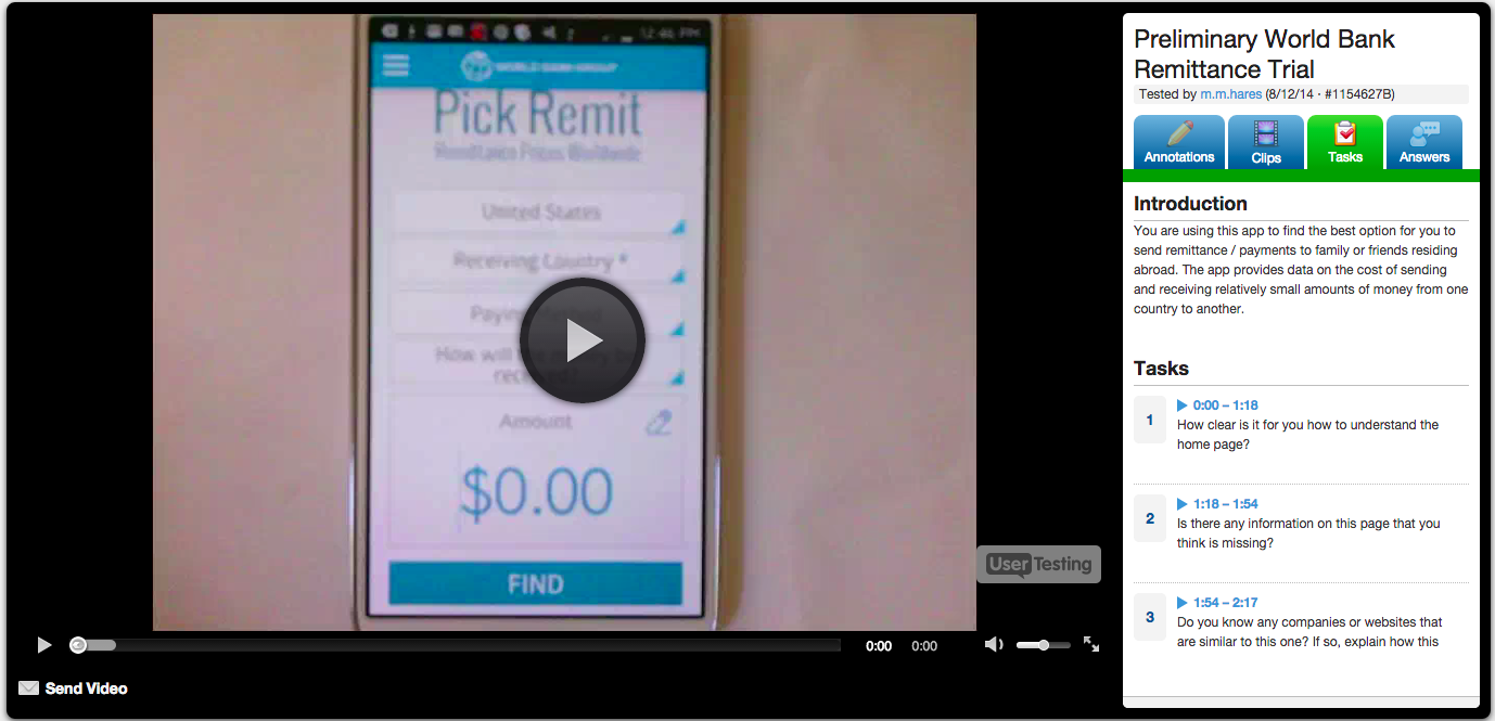
For usability testing, our team leverages both Loop11 and Usertesting.com. Using a live, interactive environment, both of these tools allow development teams to gain deep understanding of user behavior by observing users as they complete a series of tasks and questions on the site and/or mobile app in question. Interactions are captured and then analyzed in comprehensive reports. As an added bonus, Usertesting.com provides video footage of the interaction for review:

user-testing-video-footage

http://bit.ly/1rRvEAm

In summary, Federal websites and applications are often designed with too much emphasis on organizational hierarchy and goals, and too little focus on meeting end-users’ needs and expectations. User-Centric Design (UCD) tools can help government agencies buck this trend, however, allowing them to create websites and applications that engage users and maximize their interaction. Ultimately, this results in a sure win-win: Federal agencies’ constituents can experience an efficient, satisfying, and user-friendly design, and—with constituents’ increased engagement—organizations can ensure that their missions and information are communicated effectively. Act balanced.

Categories
Author

In the spirit of the holidays, we decided put together a list of our favorite things from 2012. As product junkies, we Intrideans are always on the lookout for things that make our lives simpler, smarter, easier, and all round better, and we love to spread the word.

From tech gadgets and software products to functional clothing and quirky books, below are some top picks from our team.

Amelia Saletan

WhatsApp
Text your friends in other countries for free

Foam Rollers
If you do, or don't do, any type of exercise, you need a foam roller. Good for warming up or cooling down the muscles. Or for muscle pain/soreness.

Anthony Nystrom

VueZone Wireless Cams
VueZone wireless cameras allow me to check in with my family no matter where I am and anytime. Makes me feel like I am there when traveling.

Chamberlain Wireless Intercom
Love these units. Simple communication throughout the entire house.

Bioinformatics - The ML Approach
Best book I have read to date on bioinformatics with ML. I am always rereading parts of it.

Ben Markowitz

Thunderbolt Display
I gave up waiting for Apple to refresh their display and bit the bullet on their 27" Thunderbolt Display. It's bright, huge, and has a built in camera, speakers, USB and Firewire ports that I can hook up to my laptop with one cable.

Chris Tate

Corcoran 10 In. Historic Leather Military Brown Jump Boot
They were designed for WWII paratroopers and haven't changed since. They're rugged, super tough looking, and crazy comfortable after broken in. I've had mine for 3 years and hope to rock them for the next 3. My uncle, Al Saguto, is Colonial Williamsburg's master shoemaker and he recommended these to me a few years back.

MacBook Air
My other fav thing is my MBAir. Light, powerful, perfect for what I do—I can't imagine a better laptop. It's been perfect for me while I've been on the road for the last few months. Seriously, amazing, I love it.

Insiya Hussain

AwayFind
This year AwayFind helped me (partially) cure the incessant need to check email every 5 mins. I actually feel like I can step away without missing something important.

Jurgen Altziebler

Romotive
Innovative award from me. Clever, cute, fun.

Evernote
I have to give Evernote a thumbs up - the newest desktop version is great.

Kathleen Selmer

Garmin Forerunner 405CX
This running watch keeps track of mileage, pace, elevation changes and so much more. No more guessing at how far I ran!

Knuckle Lights
So much better than a headlamp! These were really useful on the AT where they worked like "low beams" in the heavy fog.

Maggie Lubberts

Browserstack
Windows. So many people use it, and I DON'T as a rule of thumb. This is great right up until it comes time to test. With Browserstack I don't have to install cumbersome virtual machines in order to test my sites in Windows browsers. Browserstack spins up a machine for me to use in the cloud, and it works perfectly!

Fab
If you don't do fab, you're missing out. We all need things; sunglasses, clothes, bags, cookware, furniture, suitcases. Fab has it. But not ALL the sunglasses, or ALL the luggage, only the slickest. Every item is accepted into the Fab store for being beautifully designed. The iphone app rocks, and I did a large portion of my holiday shopping there (much to my family's delight.)

Marc Garrett

The Lonely Planet Book of Everything
Recognizing animal poop, making your hotel room burglar proof, carrying an injured friend from a remote location, understanding why the TGV is so darn fast: these are critical skills in the daily life of an engineer and the “Book of Everything” covers them all.

Mike Tierney

Palomino Blackwing Pencils
These are incredible pencils, creating a rich dark line without getting nasty and smudgy. They're a revival of the classic pencil of the same name, used by authors and artists like John Steinbeck and Chuck Jones.

Brooks PureConnect Running Shoes
I spend more time thinking about shoes than I care to admit, but when I'm running I want something that's going to take care of my feet and make the experience as enjoyable as possible. Of all the shoes I have tried, the Brooks PureConnect do live up to their marketing up making running a purely enjoyable experience. They're light and have great airflow, but I never feel like my foot is vulnerable (which is remarkable, given how minimal of a running shoe they are); I hardly even realize they're there.

Patti Chan

Sorapot
The only thing I need besides my Macbook to do work, is TEA. And nothing brews tea more beautifully than my Sorapot, a gift I got 5 years ago. Except when I catch myself gazing at it instead of answering emails.

Tom Zeng

FitBit Zip
Great little device to keep me motivated to excise, it has helped me keeping up with the 10k steps/day goal and making me healthier and more productive both at work and home.

Yoshi Maisami

Google Translate
It's been around for a while... but keeps getting better and better.

Categories
Author

Nov 8th brings upon us World Usability Day, now eight years in the running. This year’s major theme is the Usability of Financial Systems, with the event growing larger every year from record participation in international conferences and increasing media coverage.

First of all, let’s all take a moment to say “Go, world!” for anointing a full day to usability. This gives us design nerds yet another excuse to wax poetic about our favorite buzzy terms and hipster-geek out together in giant conference rooms at swanky hotels over our Macs and steaming cups of coffee (locally-sourced beans, of course).

Cheekiness apart, we can agree that this is important. Never before has such attention been paid, by design folks and “normals” alike, to the collision of form, function, visual design and sensory experience in one gigantic meta-ideal we call the “usable”. Apple’s stock price knows no bounds, Steve Jobs is a demi-god, and people somehow keep shopping at IKEA despite swearing they’ll never go back.

The fact is it’s not just about aesthetics anymore (it never was). It’s about “How fast does it load?” and “How smooth are its curves?” It’s about “How heavy is it on my shoulder?” and “Can I find the menu quickly enough?”. It’s about “Can I carry it on the subway?” and “Does this make me feel stupid?”. And even, “Is this inexpensive-yet-stylish enough to be worth my time crouched on the floor hammering together random pieces of wood with the lofty goal of furnishing my apartment?” (clearly, IKEA and I have unresolved issues).

It’s also about creating habits, making users want more, building in “social hooks”, and making it “go viral”. It’s about developing reward systems, demanding user commitment, toying with psychology, and considering disabilities. It’s about touch and smell, hardware and software, bits and bytes, wood and steel, and the air in between.

Usability, in other words, is like a giant dinosaur’s mouth that seems it will swallow you whole--except, when you stop to realize, that at the end of the day it’s all about bringing a smile to the user’s face and having them come back for more.

Simple, when you look at it that way, but certainly not easy. And this brings us to this year’s theme - The Usability of Financial Systems.

I would say it was somewhere around mid-2007 that people stood up and started to take notice about the importance of usability in finance. That’s when Mint.com exploded on the scene, with a drop-dead gorgeous interface showcasing slick, colorful dashboards, and “No way, really?” functionality bringing together personal credit cards, debit cards, bank accounts, student loans, mortgages, and more, into one so-easy-your-grandma-would-get-it, eat-it-like-it’s-cake online software package.

In my view, that’s really when things changed, and they’ve never been the same. Mint has spawned an entire industry of personal finance me-too software products including CakeHealth for managing health insurance and Simple.com as a close competitor. Let’s not forget Mint’s influence on the payments space as well, what with Square, Dwolla, and WePay boasting beauty, simplicity, and powerful functionality all rolled into one.

But things have come a long way since 2007, and usability isn’t a luxury any more--it’s just expected. Finally, it seems, Big Finance is catching on too. Intridea has been proud to develop interfaces for giants like Citi, Bank of America, JPMorgan Chase, Agilysys’ point-of-sale systems. We’re just glad some folks are stepping up to the plate, and that we get to be part of the revolution.

On a separate note, the reason I love this year’s theme so much is because it invites discussion on usability in an area where people least expect it, an area that’s still wide open for disruption. Let’s face it--people expect a designer scarf to be gorgeous, rich in color, featuring complex textures, and soft to the touch. But a bank’s interface? Not so much. Until it is. And you see it. And it all comes together. And everything changes.

This year, it’s incumbent upon everyone--not just the design industry--but Big Finance too, to take the usability of financial products seriously and do something about it. It’s only fair--you shouldn’t be allowed to experience the joy of a BMW test drive, the ripping open of a new iPad package, or the other-worldliness of Disneyland, if what you put out in the world yourself is utter and complete crap. Quid pro quo, I say, quid pro quo. Karma. Do unto others. What goes around comes around. All that jazz.

So there, I said it. Bring it on, World Usability Day. Bring it on, Big Finance. Show me what you’ve got.

Now if you’ll excuse me, I need to get back to my steaming cup of organic Guatemalan coffee.

Categories
Author

I recently had the pleasure of attending the User Interface Engineering Roadshow in Washington, DC. The day was chock-full of insight and wisdom from usability guru Jared Spool, founder of UIE.com. In taking notes during the workshop, I decided to take my first official shot at sketchnoting. The results are as follows:

Overall, I found this experience to be wholly satisfying. Putting key ideas into sketches required an interesting use of my attention span: in addition to listening intently to the ideas being communicated, I was simultaneously forced to employ creative sketching solutions that would properly embody the most important parts of the talks.

Upon returning home from the Roadshow, I was quite surprised to find these sketches spanning 5 full pages of my notebook. Upon scanning the notes and adding a bit of chronological organization, I’m left with a sort of visual map of the workshop (as I experienced it). I hope these notes might be of interest to others who attended.

As for adventures in sketchnoting? I look forward to continued exploration when the proper circumstances arise in the future.

Categories
Author
1
Subscribe to User Experience