Mobomo webinars-now on demand! | learn more.

/iphone-app-store-checklist

Submitting your app to the App store can be confusing and oftentimes a difficult process to navigate. Developers run into obstacles all the time when submitting the app.

Our developers have a basic checklist which has saved many headaches and prepared us for the ultimate app approval:

  1. Company Name* : (If this is your first time uploading an app to the app store, and you enrolled as an individual developer, you'll be asked if you want to set a Company Name. Think carefully about this - once you set it, you can NOT change it without calling Apple and going through their phone support line. If you set a company name then all of your apps will show it.)
  2. Default Language*:
  3. App Name*:
  4. SKU Number: Developer can add this, just a unique combination strings is enough
  5. Availability Date*: (The date your app will become available on the App Store.): Date selector available, we can select current date
  6. Price Tier*: (Free / Tier 1 (0.99) / Tier 2 (1.99) / Tier 3 (2.99) etc)
  7. Discount for Educational Institutions*: (YES/NO)
  8. Custom B2B App*: (YES/NO)
  9. Version Information
  1. Version Number*: By default, initial version will be 1.0
  2. Copyright*:  The name of the person or entity that owns the exclusive rights to the app, preceded by the year the rights were obtained (for example, "2013 Mobomo LLC.").
  3. Primary Category*: (pick a category from the list)
  4. Secondary Category (optional): (pick a category from the list)
    1. Category List
  1. App Rating*:   (For each choose N) none, I) infrequent/mild, or F) frequent / intense)
    • . Cartoon or Fantasy Violence          
  1. Realistic Violence          
  2. Sexual Content or Nudity          
  • Profanity or Crude Humor          
  1. Alcohol, Tobacco, or Drug Use or References          
  2. Mature/Suggestive Themes          
  3. Simulated Gambling          
  • Horror/Fear Themes          
  • Prolonged Graphic or Sadistic Realistic Violence         
  1. Graphic Sexual Content and Nudity
  1. Metadata:
  2. . Description*:

(This is an example of what Gallup submitted)

Stay connected with your clients and manage your coaching sessions with the Gallup Exchange app.

Gallup Exchange is Gallup’s premier online service for executive, business and life coaches to expand their businesses by providing coaching services to a growing marketplace of global CliftonStrengths customers in need of coaching.

Use this app to:

  •       Read and respond to message from current and potential clients.
  •       View upcoming coaching sessions.
  •       Manage coaching sessions by paid and scheduled status.
  •       Review scheduled session details and client information.
  •       Receive notifications for new client inquiries.
  •       Receive notification reminders for upcoming coaching sessions.
  •       Modify Gallup Exchange profile details.

NOTE: You must be a coach on Gallup Exchange to use this app.

For more information, visit gallupexchange.com.

JOIN THE CLIFTONSTRENGTHS MOVEMENT

To date, more than 15 million people have discovered their CliftonStrengths! And thousands more are joining the movement every week.

These managers, leaders, students, teachers, coaches and individuals of every walk of life are uncovering the benefits of living a strengths-based life.

Now you can discover what makes you unique and powerful. Start focusing on what you do well -- your strengths -- instead of fixating on your weaknesses.

Learn more about CliftonStrengths at gallupstrengthscenter.com.

  1. Support Email Address:
  2. Support URL: A URL that provides support for the app you are adding. This will be visible to customers on the App Store.     
  3. Marketing URL (optional): A URL with information about the app you are adding. If provided, this will be visible to customers on the App Store.         
  4. Privacy Policy URL (optional): A URL that links to your company's privacy policy. Privacy policies are recommended for all apps collecting user or device related data, and required for apps that offer auto-renewable or free subscriptions, or as otherwise required by law.           
  1. App Review Information
    • . Contact Information: The person in your organization who should be contacted if the App Review team has any questions or needs additional information.
      1. First Name*
      2. Last Name*
  • Email Address*
  1. Phone Number *
  1. Review Notes (optional): Additional information about your app that can help during the review process. Include information that may be needed to test your app, such as app-specific settings and test registration or account details. The Review Notes field must not exceed 4000 bytes.
  2. Demo Account Information (Optional): The username and password for a full-access account. This account is used during the app review process and must not expire. Details for additional accounts should be included in the Review Notes field.
  1. EULA: If you want to provide your own End User License Agreement (EULA), click here. If you provide a EULA, it must meet these minimum terms. If you do not provide a EULA, the standard EULA will apply to your app.
  2. Images:
    • . Large App Icon: 1024x1024 Icon: A large version of your app icon that will be used on the App Store. It must be at least 72 DPI, in the RGB color space, and 1024 x 1024 pixels (it cannot be scaled up). The file type must be .jpeg, .jpg, .tif, .tiff, or .png. It must be flat artwork without rounded corners.
  1. Screenshots for 3.5” Retina screen: Screenshots for 3.5-inch iPhone and iPod touch Retina display must be 960x640, 960x600, 640x960 or 640x920 pixels, at least 72 DPI, in the RGB color space, and in the JPG or PNG format.
  2. Screenshots for 4” Retina screen: Screenshots for 4-inch iPhone 5 and iPod touch (5th generation) Retina display must be 1136x640, 1136x600, 640x1136 or 640x1096 pixels, at least 72 DPI, in the RGB color space, and in the JPG or PNG format.
  3. iPad Screenshots:iPad Screenshots must be .jpeg, .jpg, .tif, .tiff, or .png file that is 1024x768, 1024x748, 768x1024, 768x1004, 2048x1536, 2048x1496, 1536x2048 or 1536x2008 pixels, at least 72 DPI, and in the RGB color space.

Routing App Coverage File (Optional):Routing app coverage files are .geojson files which specify the geographic regions supported by your app. The file can have only one MultiPolygon element. MultiPolygon elements consist of at least one Polygon. Polygons contain at least four coordinate points. Polygon start and end coordinate points must be the same.


Are you having issues getting your app approved? Get in touch and we can help out!


Categories
Author

designing-user-experience

Have you ever found an amazing tool that looks awesome and it tends to be popular but when you try to use it you have no idea know HOW to use it? Or you get more confused when reading the instructions? This is the perfect example of an amazing design with poor user experience.

Creating an app is no easy task, the designer has to know how the app will work before considering the look and feel of the interface. For all UX designers, the end goal is to provide an effortless experience for the user.

True user experience goes far beyond giving customers what they say they want, or providing checklist features. It is crucial for the designer to use EMPATHY when designing an app. If you put yourself in the end users’ shoes this allows you to move beyond a superficial understanding to a real appreciation of users’ feelings and behaviors, which in the end will avoid any kind of frustration while navigating the app.

User experience designers often ask themselves:

  •         What is the user trying to accomplish while using this app?
  •         How will users feel when they use it?
  •         Will they be confused?
  •         If so, why?
  •         How can I solve this issue in the shortest and easiest way?

Designers are compelled to navigate the app from the beginning to end, trying to find frustrating steps, annoying alerts, or anything that can affect the users’ behavior or feelings. After all, if a product is well-designed, a user shouldn’t even have to think about it they will know the app is there to help them and will not confuse or frustrate them.


Categories
Author

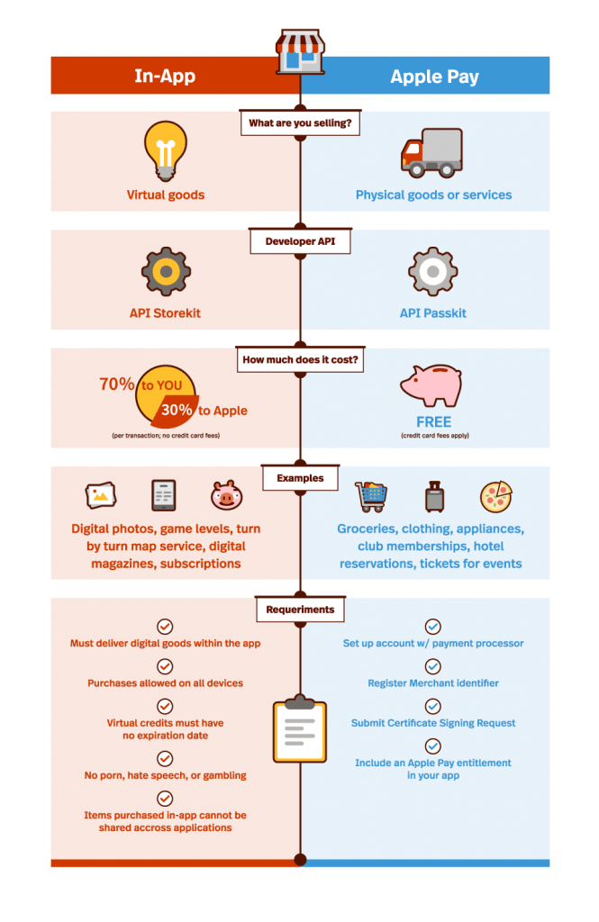
Let’s first start with the question, what IS In-App and Apple Pay purchases?

In-App purchases are extra content and subscriptions that you can buy in the apps on your iOS device or computer. However, not all apps offer in-app purchases. For example with some apps you can buy additional content such as a key that unlocks more features on a free app or a sword that gives you more power in a game.

Apple Pay purchases is a service that enables mobile payments and digital wallet apps that initiate secure payment transactions between contactless payment terminals and Apple iOS devices like the iPhone 6, iPhone 6 Plus and Apple Watch. In other words, you can make purchases at a store without your wallet, just with a simple touch of an app.

Now let’s really dig into the different items that you can purchase using either the In-App OR Apple Pay. Below are a few key differences between which items you can purchase by using either app-

In-App: sells virtual goods such as premium content for your app, and subscriptions for digital content.

Apple Pay: sells physical goods such as groceries, clothing, and appliances.

These days it’s ALL about cost so let’s cover the difference in cost of using the two products?

In-App: 70% of the purchase price of each item you sell within your app is paid to you on a monthly basis- NO credit card fees are applied

Apple Pay: FREE! (Credit card fees do apply)

Make sure to let us know which you find easier to use, In-App OR Apple Pay.

InApp VS Apple Pay

See: iPhone App Store Submission Checklist

Categories
Author

WHO WE ARE

Rebranding for any company is an evolution of itself. It can mean a new logo, name, symbol or design conformed into one new identity. Once known as two separate companies, Intridea and Mobomo officially became a single website & mobile application development company around 5 months ago. Instead of renaming the company we decided to keep the name Mobomo (we liked their name better)!

After the merger was finalized the next step was to develop a new identity for the our newly formed family, we had to figure out “who” we are as an agency. Luckily, we shared the same vision for “who” we wanted to be which made things fairly straightforward, but I know that this isn’t the case for all rebrands. WE are energetic, WE are agile, We ARE MOBOMO!

Any company whether they are rebranding or not should be eager for new changes and ideas that can further propel their brand which ultimately leads to success. A company that is stagnant or doesn't have the drive or push is destined to fail. A key to any rebranding process is taking all your learnings, both internally and externally, and applying them to your new identity. Along with applying your best practices learned through experiences it is important to listen, be open to all ideas and try new concepts, if not change will never occur thus a stagnant company is inevitable.  In this post I’d love to walk you through our REBRANDING process as well as our newest developments to our new brand that makes it what it is today.

OUR LOGO

A logo or icon represents a company's name, when someone sees that logo they immediately associate with a particular company or brand. As a newly formed identity, we decided a new logo was an immediate next step. After weeks of deliberation, our new company logo was decided on- the hummingbird. A hummingbird to us perfectly combines the energy we put into each project, with the gracefulness and agility that comes with a team who is able to rapidly shift to the needs of our clients.
mobomo-humming-bird-logo


The new Mobomo word mark, is a custom typeface that is strong and commands attention. Capable of standing out in an overly crowded space, and infinitely versatile, the Mobomo word mark stands as a strong foundation of who we are.


mobomo-word-logo


Finalizing THE BRAND

Selecting the right font can be detrimental to a new brand and as the first rule of thumb.. it should always compliment the new logo. For our primary font we chose FF Real for it’s simple and elegant, yet strong appearance that translates well across a variety of different mediums. Our secondary font choice is Source Sans Pro, which was selected because it compliments FF Real perfectly and is a great display font.

mobomo-font


The color palette we decided on supports our core beliefs illuminating our agile and energetic spirit towards all of our work.


mobomo-colors


And no redesign is complete without iconography to help tell it’s story. We chose an icon library that works well both on and offline, it is one that’s simple in it’s level of detail but strong in it’s ability to be recognized.

mobomo-icons


Combine all of our efforts and you get our final product...!

mobomo-logo

By: Mike DelGuidice


Categories
Author

work_fam_parents_baby

There are few things more exciting than witnessing a client’s success, and today Mobomo is very excited. Our client, Pacify Health, has just landed $1.1 million in funding! Pacify is a startup which seeks to connect new parents with pediatric professionals (nurses, dietitians, and lactation consultants) through an on-demand, 24/7 videoconferencing platform.

The app will be a portal for only the best service providers, and available on a very affordable subscription basis. And, parents can rest knowing that they're not only connected to highly vetted professionals at an affordable rate, but all of their (and their child’s) private information is highly secured.

This week, investors gave their stamp of approval: Pacify received its million (plus) dollar funding from D.C. accelerator, Acceleprise, as well as a number of area angel investors. The official app will launch in the beginning of April, rolling out to D.C., Maryland, and Virginia to start.

We’re proud to have built the Pacify app which helped in their fundraising, and—as a company passionate about mobile health—excited to see this product take off. Congrats Pacify! Cheers to this success and many, many more.

Categories
Author

Here at Presently we understand that the key to staying connected is mobility so we've been working hard to improve our applications for all of our mobile platforms! In last week's announcement on the new Presently Desktop app, we promised you an update for Presently Android, and we're here to make good on that promise! Starting today you can uninstall the old version and visit the Android App Marketplace to download the new version of Presently.

Improvements

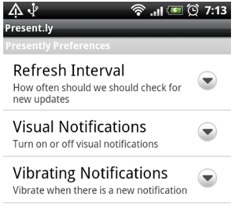
We've made several critical improvements from the previous version, including:

account-settings.png

Preferences.png

Preview

Work Continues

We hope that the new Presently Android app helps you stay connected to your network no matter where you are, and we're confident you'll be happy with the update! Our developers have been busy this year and we're not slowing down. An update to our Blackberry application is on the way, and our iPhone app was updated last week, so be sure to tell your coworkers to grab whichever application suits them! As always, if you have any feedback about the app, or need any help please don't hesitate to shoot an email to support@presently.com or visit and search our knowledgebase for more answers.

What is Presently?

Presently is the perfect microblogging solution for businesses. Communicate and collaborate in real-time, in a secure Twitter-like environment built for the enterprise. If you're not using Presently yet, let me give you a few reasons to check it out:

  • Empower your employees - increase productivity and creativity through collaboration via Presently.
  • Enable your employees to easily share files and media.
  • Easy solution for groups or departments to collaborate on projects.
  • Track ongoing conversations with threaded view and inline reply options.
  • Past information is available in an instant through Presently's search tool.
  • Our Desktop, Mobile, and Web applications give you the flexibility you need to access Presently anytime, anywhere.

So try it out today and see what the power of real-time collaboration and communication can do for your company. You'll wonder how you ever lived without it!

Categories
Author

A lot has been written on the subject of “what makes a *great* native mobile app”. There is plenty of literature on the matter in books, cheat sheets, and well-meaning blog posts. At Intridea we spend a lot of time focusing on what it means to create really great mobile applications; therefore, we want to share some tips on the process. In this post I'm going to focus on what to avoid during mobile development.

Before I dig in to all the bad practices that you should avoid, let me first summarize what you *can* focus on to make your mobile app succeed:

  • Creative/concept: A great app is one that addresses the users’ needs in a truly compelling, unique and elegant way.
  • Business: A great app has a monetization strategy, business model or feedback loop of some sort, which makes it sustainable over the long-term and provides the motivations to maintain it, support it, and improve it over time.
  • Performance: A great app is one that is stable, responsive, reliable and scalable.
  • UI/UX: A great app is one that’s original, aesthetically pleasing, usable and also conforms with the target platform’s standards and guidelines.

We've all heard about how tedious the review process is and how rigorous the iOS reference library and App Store review guidelines are. In this article though, we’ll zoom in on a few common pitfalls that sadly oftentimes prevent would-be “great” apps from ever shipping, or ultimately succeeding in the app store. This article is meant to help those of you app intrapreneurs who work at medium to large organizations and are striving to champion mobile roll-outs. Here are some common mistakes we often see people make in going about their mobile roll-outs and some tips on how to avoid them.

Pitfall #1: Setting out to peg the geek meter

One of the biggest mistakes that people make in designing their mobile apps is trying to utilize every last capability of the device, whether it’s a gyroscope, GPS, camera or a local address book (here’s a good Mobile Device Capabilities list). Many app champions start their mobile quests by asking themselves the wrong question: “How can I build an app that takes advantage of all these cool things?”

There's no question that these hardware features are exciting. I remember when I first experienced augmented reality via Intridea's CarFinder app and Yelp’s Monocle; or when I first watched Ocarina emulating a music instrument using a touch screen and a mic; or the first time I realized it would be possible to compare product prices and reviews with just the scan of a bar code using the phone’s built in camera. Or when I held a Moving Window into the world for the first time. Yeah, that’s all really cool stuff. But be sure that you aim to build an app that serves a clear purpose and meets your company's business goals. Unfortunately, that won't always involve making use of all the exciting brainpower of the device.

Instead, try this: Get in the mind of current users of your product, site, or service in the physical and online world and focus on creating an entirely new user experience that it is best suited for mobile. For example, address issues pertaining to the device's smaller screen, slower Internet connection or lack thereof, and design for the touch screen paradigm. What's going to make or break your app isn’t its cool factor but the extent to which it solves a user’s problem, and does so with an experience that is elegantly and specifically designed for mobile.

Be sure not to try to peg the geek meter just for the sake of it and remember that the hardware capabilities are mere augmentations of the mobile experience. Always keep in mind that your audience isn’t only pundits, bloggers and geeks hunting for cool stuff, but real everyday users looking for a simple, intuitive solution.

Pitfall #2: WTF UIs

An app has to be user friendly and intuitive so that anyone can quickly figure it out without having to read a manual. Avoid making your users have to jump through hoops and out-guess every interaction in the app. A great app is one where every screen, every button, and every pixel behaves exactly how we hoped it would. If it doesn’t, it better blow our mind with something completely new that we hadn’t thought of before.

There is nothing wrong with creating new UI conventions or leading with new multi-touch gestures. In fact, Twitter for iPad introduced a groundbreaking (although controversial) UI comprised of sliding panels, a reverse pinch multi-touch gesture to view profiles, along with some clever animations to confirm that a content layer was dropped. Additional examples include Loren Brichter’s Pull-to-refresh and Instagram’s tab bar camera button.

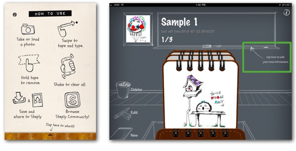
If your app is, by nature, complex and challenging to use, or if it dares to go somewhere nobody has been before (as Twitter’s example above) consider adding a welcome screen or interstitial with some tips and “How To’s” for your product. Give your user a first-run experience. Then, be sure to provide an option to manually turn those off or have the app do that automatically after the user has had a chance to familiarize with the app.

If you already have other apps out there, consistency between desktop and mobile applications is also important. Something we frequently hear from users of Mashable apps (we built those for iPad, Android and Mac) is that they appreciate being able to switch between the phone, tablet, web and desktop applications and find that the content they love is presented in a familiar way across all of them. Make sure that you streamline the user experience and the interface design across all versions of your product.

?

Pitfall #3: The “App-Mahal” Syndrome

Sometimes mobile app creators obsess with building what we at Intridea call taj-mahal-ish 1.0 applications. In other words: apps crammed with tons of content and wishful features, in multiple, concurrent, mobile platforms, 1.0 releases.

It's easy to get carried away when you're building out an application - especially if you've got a great dev team that can take on a lot of responsibility. But when it comes to mobile applications, the more stuff that gets packed on that minimum viable product results in more complexity, higher upfront development costs, and longer time to get to market. And all of that means smaller chances that your app will ever see the light of day.

LinkedIn for iPhone is a good example of an app with carefully chosen functionality that squarely nails down the use case. Early builds of the app (and that is still true today) focus on quick tasks and consumption with an understanding that users will not want to build/edit the profiles on a tiny screen and keyboard. Awesome apps like Facebook, Flipboard, Reeder and even Apple’s Keynote and Pages were not released full-blown; the versions available today are a result of a smart iterative process.

It’s a good idea to research the various mobile platforms and choose one or two that are the best fit. Try to narrow down the scope of your roll out. This will not only make your app more viable, but it will give you a chance to pilot, experiment and learn from your users before using up all your budget allocations on version 1.0.

A good product roadmap is your friend. We like creative briefs and BRDs that strive to nail down the right mobile use case/s on version 1.0 and then set out to grow organically from within, following a realistic, well thought-out roadmap. We encourage our clients to think that way, and believe that those are the apps with the best shot at (a) getting funded (b) shipping and (c) succeeding.

Pitfall #4: Falling for "sexy"

A great native app is one that was naturally meant to be NATIVE. And naturally, not all native apps are. iPhone apps can be sexy, drive buzz for a brand or make a statement. But as much as we love designing beautiful native UIs, multi-platform roll-outs often mean bigger budget requirements and increased complexity (writing apps for iPhone, Android, Blackberry and so forth). Therefore, app creators must carefully weigh the need for a native app against browser-based apps that will serve a broader audience before making a final determination.

Opportunities for increased discoverability and monetization, performance and responsiveness, local storage, lightweight libraries, broader access to the phone’s hardware features, are some examples of reasons why a native app might be a better fit. But there’s also a downside associated with portfolios of multi-platform native apps. Namely, higher development and maintenance costs, multiple codebases, a need for broader programming skills, and risks associated with platform’s changing guidelines, just to name a few.

Just be thorough and methodical about this decision, as it will be one of the single most important determinants of your app’s ROI in the short term and one that will have a huge impact on the scope and costs of your roll out.

Pitfall #5: Enterprise apps - the blind spot

It’s interesting how most people tend to think of mobile applications in terms of what’s available in the app store. If we were to ask a group of random people what the most common uses of mobile phones and tablets are, I bet most of them would name consumer apps like games, music, social networking, etc.  A recent infographic by Microsoft Tag speaks a thousand words. However, there is a huge and fascinating underworld of mobile applications that most people usually don’t think of when ideating with their company’s mobile apps, and which hides enormous potential: enterprise apps.

In fact, most of the applications we’ve built at Intridea and a majority of the mobile implementations we currently have underway are enterprise apps. Enterprise apps are custom mobile solutions that (whether deployed privately via enterprise deployments or publicly via the app store) facilitate business processes, serve as look up and reference tools, help provide training and communication to employees and business partners, assist service and sales personnel in the field, or help access business intelligence. For some inspiration check out these case studies published by Apple.

In Summary

Keep these tips in mind as you think about building a native mobile app or championing a mobile initiative within your organization. In summary:

  • Think of your apps’ roll-out on a timeline continuum.
  • Consider picking a platform (iOS, Android, or mobile web) for piloting your roll-out.
  • Be creative but realistic about the features and functionality for each release - remember that you can add features in future versions once you have a better understanding of what your users want.
  • Use the phone’s capabilities tastefully, being careful not to go overboard.
  • Take a good look at the possibilities for improvements in performance, productivity, motivation, and collaboration within your company through mobile solutions.
  • Always make sure your app conforms to the creative, business, performance, and UI/UX general principles laid out above.

Intridea offers services for application development on all major platforms, which include Mac, iPad, iPhone, Android, Windows Phone 7, BlackBerry, and webOS. If you need help with your mobile application feel free to submit an inquiry. Happy app making!

Categories
Author
1
Subscribe to App