
Mobomo webinars-now on demand! | learn more.

improving-user-experience

Your website or mobile application is the first impression that you give to a potential customer. Will they get a good or bad impression of their experience? Well, that’s hard to say. It will depend on a few different factors based on user experience. We all know user experience is important in the design process but how can you improve it? Many companies dump money into projects that don’t have a meaningful user experience, UX designers try to uncover the issues but you have to be able to improve those things.

Site speed

Site speed is everything. Who likes visiting a website whenever it is taking forever to load? The answer, no one does. There a multiple things you can do to improve site speed but here are just a few.
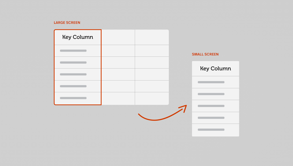
Responsive

This is the most important item on how you can improve your user experience. Responsive websites allow for users to view your site in various screen sizes across all devices. Your site will visually appear the same across all platforms. You could lose potential customers if your website isn’t responsive because if they can’t view the same information across all platforms, they'll bounce.

Easy navigation

No one likes going to a website that is difficult to find the information they are looking for - in fact, the user will leave your website and go to another site to find the information they are looking for if they can’t find it easily it on your website. Here are some recommendations to make your site easier to navigate.

Create readable content

If your user can’t understand what they are reading then why have it on your site? Make sure that your content - whether it be your home page, a blog or your services page - is written so that people can easily understand it. Studies show that 81% of users skim the content that they are reading, which means if you don’t have target keywords built into your content chances are they won’t find what they are looking for on your website and they will leave your page.

Categories
Author

unnamed-4


By nature, tables of data have a rigid structure and capitalize on screen width. When screen size is limited, table data will often not fit on the screen at once. This has been an interesting challenge throughout the brief history of responsive design since a key feature with responsive design eliminates the horizontal scroll factor.


The simplest way to work with tables that exceed the width of small screens is to place them inside a scrolling container. This generally works and it allows the table structure to be maintained. The only drawback is that it results in horizontal scrolling which we are often trying to avoid in responsive design. With that said, the value of simplicity makes this option a great default setting for tables across a site. This is the method employed by popular frameworks like Bootstrap and Foundation.


More complex solutions should be used on a case by case basis for tables that require more attention. You should test the experience of using modified tables at the relevant screen sizes to catch any unexpected issues like text wrapping or overflowing.


If you are seeking to eliminate horizontal scrolling but do not mind a potentially enormous increase in vertical scrolling, the following solution may suit your needs. It is an elegant yet fairly simple solution that stacks every item within the table vertically and cleverly places a label next to each item using some css trickery. The downside to this approach is that it is not easy to scan multiple items in common categories at one time.


An easily scannable solution that also prevents horizontal scroll will require significantly more complexity to strategically hide and reveal portions of data using javascript. Advanced responsive table plugins such as FooTable and DataTable allow developers to choose which columns are hidden at specific breakpoints. A user can then quickly scan through the existing columns to find an entry and reveal the hidden column data for that entry. Once we reach this level of complexity, we gain access to a variety of features like sorting, filtering, and pagination.

Categories
Author

People live longer, are better educated, lead more healthful lives, and are less violent than at any time in human history. How do we know this? Well, after months of collaboration between Intridea and the Cato Institute, that data has come to life! Human Progress is a comprehensive research tool that allows users to explore a wealth of data on human well-being and human development indicators.

Intridea’s Marc Garrett and Maggie Lubberts will be on stage at O'Reilly Strata in London today to discuss how Intridea utilized R, responsive design, and D3.js to create this amazing research tool!

Topics for their talk:

  • How we saved hundreds of hours of effort by using R to build a “correlation quilt” to help us uncover interesting stories in the data.
  • How we used a responsive design and D3.js to let people explore the data sets whether on desktop or mobile.
  • How we put Steven Pinker’s data from “The Better Angles of our Nature” on the web for the first time ever.

Intridea loved bringing Human Progress to life. It's been an amazing opportunity to showcase Intridea's deep expertise in user experience design, Ruby on Rails development, data analysis, and data visualization and we are thrilled to have two of our Intrideans discussing it at O'Reilly Strata in London today!

Categories
Author
1
Subscribe to Responsive Design