
Mobomo webinars-now on demand! | learn more.

We are excited that our team has been selected as one of the 20 Phase 1 winners of @NIOSH’s Respirator Fit Evaluation Challenge! We are thrilled to be recognized for our innovative approach to respirator fit evaluation. Our team has been awarded a prize of $5,000 and we now move on to Phase 2 of the challenge, where we will prototype our solution. To learn more about the challenge and the other winners: bit.ly/3PPdxuW.

To learn more about Mobomo: www.mobomo.com

Author

Mobomo team members are truly passionate about discovering ways in which technology can solve difficult everyday challenges. For over 13 years we have supported Departments and Agencies in the Federal Civilian marketplace, creating elegant solutions to solve complex problems.  Some challenges are more important than others; our work with the Veterans Administration (VA) and the United Service Organizations (USO) has focused our team to find solutions to real-world issues that affect the men and women who have served in the armed forces.

According to a June 2022 article published by the USO, the suicide rates for US military personnel are historically double that of the civilian population. Since record-keeping began following the events of 9/11, suicide rates among active-duty military members are at an all-time high. One of the biggest contributors to mental health is a sense of community and alleviation from feelings of isolation. Transitioning to civilian life is often difficult for many service members.  The loss of mission and feeling a part of something bigger and more important than themselves, even years later they express a feeling of disconnection from their military family. 

We take pride in all our work, especially in support of the VA and in working together with the Veterans who work alongside us here at Mobomo. Our team is acutely aware of the need for active outreach opportunities to promote mental health and reduce stressors, especially when it comes to our Veteran population. Utilizing resources allocated through MobomoLabs, our Engineering team and technical SMEs began a two-year discovery journey that would culminate in the rise of Sentinel, a human-centered mobile platform built with Artificial Intelligence (AI) and Machine Learning (ML) capabilities.

The concept of Sentinel began with the vision of developing an ethical tool that would provide health equity for all, improve access to Veterans Crisis Line Services, allow for interoperability between smartphones, tablets, and web-based devices, aid in the reengagement of the individual, screen for early signs of distress, and be scalable across a broad veteran population. Current published metrics identify that 85% of the U.S. population uses smartphones, 75% own a desktop/laptop, and nearly 50% use tablets.  Therefore, a digital platform was a logical connection point for the community of 1.2 million active duty and 19 million Veterans. Sentinel was designed as an all-inclusive ecosystem, delivered through a simple, intuitive user interface that is accessible across mobile, tablet, and web-based devices. The features within Sentinel were developed to target areas of interest specific to our military members and serve as a conduit for attaining and/or retaining the connection to those unique cultural unifiers that bond and bind service members to each other.

The thoughtful design began by creating an intuitive tool that would engage individuals, creating repeat users, and improving access to Veterans Crisis Services.  The initial release has a landing page that provides access to critical support for service members (VHA, VA locations, the VA Crisis Line, Veteran Community Organizations, Veteran Support Groups, and the individual’s safety plan) prompting them to discover different ways to access support services available to them and their families. Utilizing the AI voice automated screening developed by our partner, Clearspeed, Sentinel could identify early warning signs through our scalable and interoperable risk prevention analytics. Sentinel has infinite scalability and can be expanded as usage and the user network grows, perhaps to encompass resources including but not limited to educational and career resources, geo-fencing to events in the direct vicinity, veteran-based business advertisements, and veteran networking, among other features.

During Sentinel’s development, we focused on the unique attributes of the military culture – honor, loyalty, and commitment. As an experienced VA contractor currently tasked with developing the Mental Health Check Up (MHC) application for the VA, Mobomo utilized our lessons learned, constructing the front-end of the Sentinel platform around activities that fulfill service member needs/desires (specifically a sense of community, purpose, and communication vehicles), providing direct access to support systems should the user require immediate intervention. With the push of a button, an individual could access the Veterans Crisis Hotline or Chat, a self-created safety plan, their support network, local resources available to them (geo-fencing), and the AI-based risk assessment check-in tool.

Sentinel’s Secret Sauce

The risk assessment component within Sentinel uses an AI-driven, voice-based technology from Clearspeed. Clearspeed voice analytics proactively identify potential suicide ideation and risk prior to escalations that could result in self-harm. Clearspeed voice analytics technology has been used successfully across a range of personnel screening applications: risk assessment, insider threat detection, protection of proprietary information, insurance fraud, force protection, resilience screening, and detection of malicious actors. Preemptive identification of suicide ideation requires the verbal answering of 3-4 simple, automated, and non-intrusive questions eliciting “Yes/No” responses. The proliferation of research regarding suicide across the Veteran population confirms that suicide is often precipitated by a culmination of disparate factors that add layers of stress on an individual, eventually becoming unbearable. According to the 2021 National Veteran Suicide Prevention Annual Report, 60% of the Veterans who died by suicide in 2019 did not utilize resources available to them through VHA. Sentinel serves as a “sensor” by proactively identifying those service members developing suicidal thoughts. Sentinel has the capability to detect stressors in the user and direct health care providers to proactively reach out to the user, providing resources and/or engaging in interventions prior to behavioral escalations that could result in harm to themselves or others.

Bringing together Mobomo’s core competencies of User-centered design, rapid prototyping, and application development with a bleeding-edge technology company and innovator, Clearspeed, we built a mobile platform, to include cloud infrastructure, resources, dependencies, compliance checks, and network connections necessary to deliver a scalable, flexible, and reproducible experience. Our team automates every aspect of a product pipeline to ensure 100% reliability on every release. We built fault-tolerant, highly available solutions that heal themselves, which helps eliminate single points of failure. Additionally, we future-proofed our designs by architecting them around containers, micro-servers, and fully managed serverless computing and storage solutions. 

While Sentinel is a mobile application geared to support our service members, the possibility of its application across other groups and for different purposes is limitless; and that is what MobomoLabs is truly about – discovering and designing elegant solutions to even the most seemingly insurmountable challenges. For more information about how Mobomo conceives, builds, and delivers mission-critical products that people love to use, please visit our site or reach out to us directly

Categories
Author
IOS 16 Upgrades the iPhone User Experience with an Overhauled Lockscreen and ID Verification with Apple Wallet

iOS 16 was released with a multitude of new features that change and upgrade the user’s experience while using Apple’s latest iPhone software. A few things to keep in mind for UX designers, as they create new user experiences, are the lock screen’s ability to highlight apps through widgets and live activities, and the continuously increasing capability to allow users to verify identification using Apple Wallet. By revamping the lock screen, users now will be able to access important information more quickly and easily, as they will only have to glance at their screen to find what they are looking for. The new Apple Wallet Identification feature continues the journey of replacing the physical wallet with just your phone. As designers, we need to keep in mind these features that change how a user interacts with their phone, consume products, and complete their day-to-day lives.  

Here is Mobomo's explanation of these new features and how they might benefit the experience of a user. 

New Lock Screen & Focus Mode  

The lock screen was completely revamped by the Apple team with a big focus on personalization. You have access to adding personal colors to your lock screen and are also able to have multiple different lock screen layouts, made by you, and saved to switch between. That includes the photo used as the wallpaper, typefaces, colors, and more. Along with another new feature called Focus, users can switch between lock screens that are tailored to help them during work, their free time, or sleeping. 

Widgets 

More importantly, the lock screen also has two new features that provide users with a new and clean way to view information. Widgets are now available to be placed on your lock screen, as well as a new feature called Live Activities.  

Widgets stay a consistent shape throughout the apple ecosystem, so this is helpful for continuity and provides a helpful user experience. Live Activities take something like basketball game updates, or uber status, and allow them to be displayed in a much cleaner perspective on the lock screen. The motivation behind this feature is to replace apps sending multiple notifications every few seconds or minutes and provide a dashboard for that information instead. We think this is a great upgrade, because notifications will be easier to organize, and users are able to quickly see statuses on their lock screen. 

Apple Wallet  

Verifying identity inside Apple Wallet is possible now with the ability to upload your driver’s license or state ID. This feature is slowly rolling out, with only Arizona and Maryland currently supporting the ID uploads. As of now, you can present your ID from your iPhone or Apple Watch at certain TSA checkpoints in select airports. Another useful feature for id verification is in-app verification. The example given was ordering alcohol on Uber Eats and using your Apple Wallet to verify your age and identity. There is no telling when this will be widely available, but for now, it provides seamless, contactless touch for TSA. While Apple Wallet ID verification is only supported in a very limited number of states and airports, this is one step forward for a contactless user experience, regarding safety and security as a priority. 

The user experience designer also needs to know about some other aspects that have not seen major changes or enhancements. The Touch ID and Face ID have not changed significantly. Apple Login now allows users to share subscriptions with family members, but other features remain the same. 

In conclusion, the lock screen overhaul provides a great opportunity for apps to show status updates through Live Activities or provide widgets to glance at or interact with. They follow a consistent pattern with the Apple Watch in style/functionality and are easily accessible. iOS 16 includes all of these features as defaulting to opt-out, which means that users are not prompted or forced to use any of the new features. This is great for individuals that do not want, or have the time, to learn and use these new features without affecting their old experiences in previous iOS versions. 

Categories
Author

Design Thinking

“Design for the user.”

It seems like a common sense approach. After all, if your website or your custom app aren’t designed with the end user in mind, will it get used?

Common sense notwithstanding, there’s a large gulf between the idea of designing for the user and the actual implementation of it. Plans go astray, different stakeholders have different ideas about what the user would want, and of course, there are always practical considerations like timeline and budget to consider.

Fortunately, design thinking can help project teams establish clear markers that keep them on track toward a seamless, positive user experience.

What Is Design Thinking?

Design thinking goes beyond the surface-level “design for the user” philosophy. It involves a highly tangible, iterative process that allows teams to move past their own viewpoints and levels of understanding in order to gain deep insight into the user’s needs and identify new strategies and solutions that might not have been immediately evident.

In short, design thinking is a process that gives teams concrete steps to help them get out of their own heads and into the user’s, to ensure the team is meeting the user’s genuine needs.

How Does Design Thinking Work With UX?

Most models of design thinking involve five steps:

  1. Empathize: Understand your user’s pain points and greatest wishes.
  2. Define: Figure out what problem the user is experiencing.
  3. Ideate: Let creativity run wild and break down assumptions or traditions.
  4. Prototype: Build a model that you can test with real users.
  5. Test: Learn what works, what doesn’t, and then adjust.

Let’s explore these in more detail, in the context of UX design:

Empathize

The most successful apps and websites are those that were designed with the user firmly in mind. The folks at Interaction Design Foundation agree, saying that UX tasks “can vary greatly from one organization to the next, but they always demand designers to be the users’ advocate and keep the users’ needs at the center of all design and development efforts.”

But to do that, it’s necessary to understand who the user is and what they want and need. It’s also important to recognize if more than one user persona is in the picture.

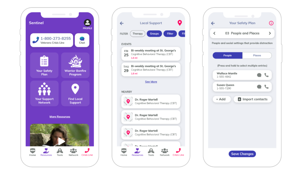
Here’s an example: Let’s say we want to create a video app for children ages 6 to 12, with kid-friendly content.

In this situation, there are two main users that we need to understand: the children, and their parents.

  • The children want intuitive (intuitive for them, not us) navigation, an easy way to binge-watch content from specific creators, and a fun way to interact with the creators and other viewers.
  • The parents? They’re concerned about online predators and inappropriate content and want to make sure they have a way to keep an eye on things without having to constantly watch over their child’s shoulder.

These are fairly basic descriptions of user needs – and to really get a good handle on what each end-user wants from the UX, there’s only one foolproof method: talk to them. There is simply no replacement for sitting down with users and getting a first-hand account of what they need, like, hate, fear, enjoy, and find frustrating.

Define

The main challenge in this step is to clearly articulate the problem that needs to be solved, or the need that must be met.

Ideally, near the end of the Define process, there should be a clear answer to the blanks in the statement, “The user needs to _____________ because ________________.”

From there should arise a problem statement for the team to drive towards, such as “Create an easy and accurate way for both users and parents to filter and find video content.”

To get to this point, it’s vital for teams to take the data they gathered during the Empathize stage and process it in an organized, systematic fashion, unpacking the findings and discussing what they mean. A good practice is to keep asking “why,” digging down past surface-level problems and into the deeper, emotion-driven issues. From there, the data can be used to map out a User Journey, breaking down precisely how the user might interact with the app or site and what they’re looking for.

Ideate

In the ideate stage of design thinking, assumptions and constraints are thrown out the window. This can be much harder than it sounds – as we become more experienced, we often fall into certain patterns or draw on our existing knowledge, making it difficult to look at things from a completely different perspective.

In the ideate stage, “stupid” questions are often the key to unlocking new avenues, because those types of questions tend to disrupt long-accepted, “obvious” practices that should have gone challenged long before.

In the context of UX, the Ideate stage is crucial – it is too easy for teams to fall back into best practices or standard ways of designing the user experience. By applying design thinking, a team opens itself up for those “eureka!” moments that are only possible when the mind is open to every possibility, and it’s those moments that lead to groundbreaking design.

Prototype

This is where the rubber meets the road. Once a team has come up with what they think is the best possible way to design the UX for an app or website, they need to test the feasibility of that idea. And they need to test it with real users.

The prototype step can have multiple stages, from initial sketches, to wireframes, to actual working prototypes, all the way to beta versions that are available for a limited number of public downloads. The team may even create multiple prototypes if they’re not certain which idea will fly with users.

Test

Once the prototype is created, the team must learn — from real users — what works, what doesn’t, and then focus on iteration. To make the most of the testing stage, it’s absolutely crucial for the team to have in place mechanisms to gather and assess feedback. The more detailed the feedback is, the better the chances of fine-tuning any little UX issues that could harm the success of the finished product.

During the testing phase, it’s important that the testers not be coached or steered toward a certain type of feedback. Ideally, the team should refrain from telling testers what the purpose of the site or app is, or how it works. If testers can figure it out easily and accurately without any guidance, the UX is definitely on the right track. On the other hand, if the testers are confused about what the app or site is for, or how to use it, then both the messaging and the UX need some work.

The principles of design thinking can be applied to a multitude of challenges, and these principles truly shine when they’re applied toward the UX design of a website or application. By following a proven process that involves, above all, listening to the user, teams can create a finished product that will be enthusiastically embraced, adopted, and used for years.

Contact us now and find out how Mobomo's approach to design can benefit you.

Categories
Author

 When developing an app, there are a multitude of important decisions to make between “Let’s do this!” and “It’s launch day!”

One of these decisions is the application development approach. Is a native mobile app the right way to go? Or would a cross-platform app be a better fit for your needs and your organization? There is no one-approach-fits-all, so it’s important for organizations to avoid false starts and costly redevelopment time by having a solid understanding of their available options.

Let’s analyze these options.

Native App

A native app is one that has been designed specifically for one mobile platform (i.e. Android, iOS), with engineers leveraging the programming language used by the platform’s own operating system (Java or Kotlin for Android and Swift/Objective-C) for iOS. If you wish to have native apps made for multiple platforms, the developers need to make separate codebases.

Advantages to native app development are plentiful. Because the app’s UX is tailored to that specific platform, the app will deliver strong and smooth performance and can take advantage of the device’s full set of functionalities. This tends to result in much higher ratings and better visibility (read: more revenue) in app stores.

Additionally, if the platform OS is eventually updated (which often means bugs will appear), resolving the specific code for that platform is much more efficient and therefore less costly than needing to fix a centralized code base that will affect all the platforms.

So, while native apps do tend to require more time and resources up front, they can offer considerable savings long-term in maintenance and updating.

The Takeaway: Native apps are an investment, but a worthwhile one if you’re looking long-term with your app. The functionality tends to be much better and maintenance is significantly less complex.

Cross-Platform App

Cross-platform apps are designed more as a one-size-fits-all solution …with modifications. A single codebase is written and can then be shared among the different platforms, either using web technologies or tools such as PhoneGap, Titanium, or React Native.

Cross-platform is a popular option among organizations with a tighter timeframe and lower budget, as it only requires one codeset to be written. This makes cross-platform a reasonable option for simple applications like games or single-purpose apps. Some organizations will specify the devices they want the code to work on, while others will make the app available to all users, whether they’re using an iPhone 3 or a Galaxy M30s.

The downsides of the cross-platform approach, however, can be summarized by the old adage, “Jack of all trades, master of none.” Because cross-platform has to be everything to every platform, its performance tends to be suboptimal. In addition, it can’t take advantage of each type of device’s proprietary features, thus limiting the potential.

Indeed, the Airbnb app initially used a cross-platform approach with React Native. But in June of 2018, they announced they were sunsetting their use of this tool and would be focusing on native app development, citing issues like developer experience, quality, and technical issues. Even the world’s most popular social media app, Facebook, made the switch from cross-platform to native in 2012, with Mark Zuckerberg announcing that “the biggest mistake we’ve made as a company is betting on HTML5 over native.”

The Takeaway: If both time and budget are short, cross-platform app development is a great way to get to market quickly … as long as you don’t mind sacrificing some performance.


A Third Option: No App

While apps are an excellent way to increase customer engagement and improve the user experience, they’re not a cure-all. If the app is providing a service that a user would only need once or twice a year for a limited number of functions, it may be better to focus instead on your mobile website experience. On the other hand, if you anticipate year-round use and wish to provide a rich, multifunctional experience, your users will be happy to have that app take up real estate on their devices.

If you have the time and the budget, native app development can provide you with a highly functional app that is not only tailor-made for the user’s experience and device but can also save you maintenance headaches down the road.

Meanwhile, cross-platform apps provide a viable option for smaller budgets and businesses that want to get a simple app out into the marketplace quickly.

Still not certain? The experts at Mobomo are happy to discuss options and recommend the best approach for you and your organization’s unique needs, so contact us today.

Categories
Author

Mobomo Top 1000 2019

For the second time in a row, Mobomo has been awarded the Clutch Top 1000 Companies in the world! This award highlights only 1% of the companies on the platform and is the most exclusive award offered by Clutch. Companies are ranked based on the quality and recency of verified client reviews, as well as the companies’ market presence and industry leadership.

With passion and expertise in creating cutting-edge, functional, and successful experiences, Mobomo has become one of the top mobile app development companies in the Washington, D.C. area.

In a recent project reviewed on Clutch, Mobomo received 5 stars for developing a custom web portal and Android and iOS apps.

It has been an honor to receive this recognition as 2019 comes to an end. Mobomo is grateful for the support we have from our amazing clients, who have taken the time to provide detailed reviews on Clutch. We are excited to see what 2020 will bring for our team and clients!

About Clutch
Clutch (clutch.co) is a business to business research firm located in Washington, D.C. They are best known for connecting agencies and software solution companies in order to enhance business goals across businesses. Their ratings and reviews platform publishes the most extensive and referenced client reviews in the B2B services market.

Categories
Author
1
Subscribe to Mobile