Mobomo webinars-now on demand! | learn more.

Wireframes

UX and UI are distinct parts of the design process, but they are so closely intertwined that one couldn’t possible exist without the other. Let’s start by defining the two so that we don’t get confused.

“User Experience” is a very broad term, but for the purpose of this discussion, let's define it simply as the engagement between the product and it’s user.  UX in the digital realm is constantly evolving as the user base expands and as technological advancements allow user engagements to become incredibly efficient.  Think of a simple question to lookup:  “When will the next president be elected?”  Not so very long ago, you would search for a website related to politics, and then you would dig through page after page, desperately looking for the answer.  Today, google will give you the answer immediately, and very efficiently, thus providing an amazing “user experience.”  It seems simple, but from a design perspective, maximizing UX is still an incredibly challenging process.  The success of your applications UX is ultimately dependent upon the purpose of the user, and when you have to accommodate a variety of purposes from a variety of users, it can be very difficult to create a slick UX.

Once the User Experience has been determined, then the “User Interface” or UI comes into play.  Lets use an example to understand UI: we are creating a website for a Pizza restaurant.  We want users to come to our website, see our menu and order a pizza.  A clear goal has already been established by the projected UX: we want you to order pizza.  The specific layout of the webpages will be the User’s interface.  In other words, the UI is the medium for ordering pizza, while the UX is how happy you are while using that medium.  Determining an efficient layout for our website is not an easy task; how do we get the user from the home page to successfully clicking the “place pizza order” button?

There are infinitely many control and style choices.  Early design documents are often so laden with features that their websites’ production could take years to complete.  This can happen if you bury yourself in the user interface.  Like the Yin and Yang, an oreo cookie, or whatever metaphor you choose, such is the natural relationship between UI and UX: the best UI design will occur when you are consistently mindful of the UX, that is, mindful of how the user will experience your site.

There are  few essential rules that go into the creation of intuitive applications.  UI designers are responsible for creating a cohesive style guide; they should maintain a consistent design language throughout the product. The pages of your product must communicate clearly with the projected designs of the UX.

Now that we have established the basics, what are the top UX/UI tools being used in the dev industry?

For a pre-test fee, UserTesting is a stress and hassle free tool. It can be utilized for user research and prototype testing.  Testing experts can recruit the target audience for your application, remotely administer user tests, and deliver the results within an hour.  The test records video footage of the user in order to gauge facial expressions and emotional responses to your application.

With Stylify Me you can copy the color hue of any website.  When you enter the URL in the top search menu it reveals the exact HEX values for that site.

With UXPin  you can design a website or app from start to finish. UXPin allows the user to develop lo-fi wireframes into a hi-fi prototype.  UXPin provides drag and drop tools for UX interactivity, creating codeless animations, and for designing UI Patterns.  UXPin works with Photoshop and Sketch so that you can convert static files into interactive prototypes without losing layers.

Sketch has very similar features to Photoshop, but Sketch was specifically designed as an image editor for digital design, while Photoshop has a broader set of tasks.  Sketch uses CSS logic from the start, which makes for an easier transition into development.  Sketch also has an auto-cropping feature and one-click exports into various formats.  Sketch has easy navigation and convenient developer tools.

Photoline is a little less well-known, it’s a little cheaper, but it still offers some useful features like photo manipulation, nondestructive layering, vector editing, and desktop publishing.  It also has multi-layered importing and exporting for EXR.

Optimizely is another tool that provides user testing, but it only does A/B testing.  A/B testing compares usage data from two different versions of your product.  A/B testing can help guide production decisions and early experimentation.

Once you have selected a color scheme, Color Safe helps you select the best contrast balance for readability.  Improving legibility through color contrast is essential for creating an amazing UX.

XMind is a free app that is used for brainstorming.  It uses open-ended “mind mapping” tools for creating diagrams.  Xmind is an excellent task manager for keeping organized.  The visual setup allows for quick comprehension, and for easily customizing your goals.

Mural is a digital whiteboard with efficient tools for collaboratively designing the UX.  Your team can use Mural to brainstorm and organize concepts.  It supports files from Youtube, Vimeo Slideshare, Google Drive, and Evernote.

Google made Resizer to help devs create responsive layouts. Google describes it as an interactive viewer.  Resizer is intended to test for Material Design breakpoints across desktop, mobile, and tablet.  Resizer can populate the website from any URL into a variety of layouts.  Then you can see which layouts work best for each screen size.

What do you think the future of design will look like?


Categories
Author

brainstorming with sticky notes

While agile development methodologies and practices have long been part of common practice in private tech and product companies, many U.S. government agencies are still getting their feet wet with fully embracing the concept and finding ways to make it work within their complex contracting arrangements with private vendors.

Under Mobomo’s contract working with the U.S. Geological Survey (USGS) under our contract with the U.S. Department of Interior (DOI), we’ve been fortunate to work for a client who not only understands agile development, but requires it for the development of the USGS.gov agency website, and the underlying AWS cloud-hosted, Drupal-based content management system (CMS), called Palladium.

We’ve been fortunate to work for U.S. Geological Survey (USGS), a client who not only understands agile development, but requires it for the development process. Having a willing client partnership is key to making our scrum processes successful. It’s an evolving path forward as we work with USGS to continue to improve on our roles of scrum master and development team as well as coach the USGS Web Re-engineering team in their role as product owners. But, the process is working! Not only is it working but we’re able to show how the scrum process is helping us to get closer to continuous development/continuous integration (CD/CI), allow us to deliver new features on a regular and frequent basis, and is saving the government money and time.

Our Path to Agile at USGS: Transparency and Building Trust 

When we first started this project, the only real semblance of agile processes was the Jira ticketing system. It served as a backlog, but there was no process in place to identify which tickets would be included in an upcoming release and no definition of what a sprint and release process looked like within the project scope. It was difficult to comprehend, there was a huge rush to get the first version of the CMS and the new rebrand of USGS.gov up and running - but it was also a bit unmanageable given the system that was in place.

First, we worked out a sprint cycle which has evolved from a sprint every two weeks to a schedule where we have two, two-week sprints that overlap. This allows for ongoing development during code freezes and more QA time. The schedule flows like this:


Monday Tuesday Wednesday Thursday Friday
Sprint A: Product Owner Planning Spring A: Team Planning

Sprint A development begins

Sprint A: Development/Test Sprint A: Development/Test Sprint A: Development/Test Sprint A: Development/Test Sprint A: Development/Test
Sprint A: Development/Test Sprint A: Development/Test Sprint A: Development/Test Sprint A: Development/Test

Code Freeze
Sprint B: Client Planning

Sprint A: Deploy to Stage/Test on Stage
Sprint B: Team planningSprint B development begins
Sprint A: Test on Stage

Send failed tickets back for rework

Dev on failed tickets

Sprint A: Test on Stage/Test on Stage with Client

Send failed tickets back for rework

Dev on failed tickets

Deploy fixed tickets to Stage

Sprint A: Dev on failed tickets/Test fixed tickets Sprint A: Dev on failed tickets/Test fixed tickets

Sprint A: Deploy to Production/Test on Production

Sprint A: Client confirms on Prod

The next step was to improve our communication requirements with our product owners. We were all onboard with using Jira as our ticketing system, reviewing tickets from the backlog to move them into sprints, and then pushing releases based on the completed tickets. But, too often, we found that tickets had to be re-opened after the release. The problem boiled down to communication. We needed a consistent format for how bugs and features were being communicated to us, so that we were fixing the right problems and building features based on user needs.

To solve this, we created templates for how a bug would be entered as a ticket in Jira. A sample format of questions would be as follows:

What is the URL?

How is it behaving now?

Steps to reproduce this issue.

How should it behave?

This was a huge improvement! But, we were still not where we wanted be on our releases. Next, we tackled how QA fits into our process, we revised our workflow to make QA an integral part of the process from the time a ticket is self-assigned by one of our developers, and we built out our Jira workflow to represent this new process.

Do you use agile scrum development? If you do, tell us what you think about our process!

[contact-form-7 id="12689" destination-link="https://mobomo.s3.amazonaws.com/uploads/2016/11/mobomo_brandbook_.pdf"]


Categories
Tags
Author

/are-you-getting-the-most-out-of-your-website A website can wear multiple hats for a company it can be your brand, your online presence, your salesperson, the first impression with a user or a potential customer and much more. There is no doubt that your website can play various roles that’s why it’s important to understand if your company website is effective, and if not, maybe it’s time to redesign your website.
Here’s a checklist of items you should consider to find out if you are getting the most out of your website.

Define your website goal:

Let’s start by discussing the importance of a website goal. Website goals can be used to tell what’s working and what’s not working. Knowing what you want to achieve out of each page of your website can help you in determining quite a few things such as what content you should prioritize, what the best organizational structure for content, what call to action should be pushed to users, and the overall purpose of your website.

All of these questions, revolve around your website goals, so how do you discover your website goals? Start with organizational goals, your website serves as some benefit to your organization in some way- so list out the ways that your website benefits your organization. Some examples of organizational goals for a website are:

Define success:

What does success mean to your website? How do you define success? Whatever metric that may be, be sure to define it and know how you want to measure it. Is it the amount of queries that come to your homepage? Or a specific landing page?  Make sure you have some sort of goal that can be measured so that you can check on that goal over a certain period of time, this will tell you if the content and goals you have in place are working

Define your audience:

Who are you trying to reach and sell your product or service to?

Each person on your target demographic list has a pain point that keeps them up at night- the challenge is getting to know what those pain points are. Start with your previous clients, what were some challenges that they faced? Why did they choose your company over another? Understanding previous clients or customers can give insight into what your target user may be looking for- throughout this process always keep in mind, what drives your target audience?

Articulate to your target audience what benefit your product or service does for them. Which benefits of your product or service would be most valuable to your target audience?

Who does your audience trust? Whether it be a more visible brand, a celebrity, industry experts- the more connected your brand is with those influencers the more your audience trusts your brand which means the more credibility you will receive to build your own brand awareness.

Define your obstacles:

So what makes your web design plan a reality? Getting through those initial obstacles. Here are some examples of obstacles that you will need to overcome to get your website design complete:

Next Steps:

Now that you have a strategy in place, how are you going to implement this strategy to get the results that you are hoping for? If you realize that you are not getting the most out of your website, reach out to us, we love working with new people.

Categories
Author

What is the Features module?

The Features module does have a purpose.. But what exactly, do you need it, what is the structure? All valid questions surrounding Drupal's module. The primary purpose of the module is to copy configuration setups from one Drupal site to another. The Features module offers a well-known method of bundling configuration in a new module that can be installed on other sites--a feature. See the full Drupal 8 configuration setup.

The Features module is an important tool to use on any Drupal 7 or prior projects. To put it simply, Features allows for configurations to be packaged as a reusable component from one environment to another. It might seem like a hassle to add yet another module to your development process, but you will find Features very handy and rewarding as your site grows in size.

Do I need it?

The main advantage of using Features is being able to have configurations in code so it can be tracked under version control. Since everything in Drupal 7 is stored in the database, configurations changes such as Content Types or Views needs to be moved upstream some way. Creating those changes manually is not such a big issue when your site is small and there’s only one developer working on it. However, when there are several developers working at once on a large scaled site, having to manually create config changes on all the environments is extremely inefficient and time consuming not to mention the possibility of human error. Using Features decreases the amount of inconsistencies across the board. By having configurations in files, the deployment process is also simplified.

Features Structural Organization

There are many different ways to organize the components within Features. You can categorize them based on the kind of Drupal entities (Views, Content Types, Blocks, etc). The downside to that is you might end up with a very long list of Features that makes it hard to keep track of, or Features that are not broken down specific enough and resulting in merge conflicts every time changes occur. One approach is to group feature around Content Types and Pages. It’s much easier to identify what Feature to export if you know that a certain Block for staffs will be under the staff profile Content Type. There may also be components that does not necessarily fit into one place. For example, fields that are used in several different Content Types can be moved to a feature for shared components.

Other Tips

Make sure to revert Features once your code has been pushed up. Also, you should go and double check everything is at the state you want. I have encountered times when Features did not import something properly even though all the correct components were selected. It is also wise to name your features with something identifiable to your project as the base name and place them all in a Features folder in modules for easy access.

Drupal 8 comes with content management system in core so there won’t be a need for Features in the future. However, Drupal 7 is here to stay for awhile and it is definitely an essential module for development.

Categories
Tags
Author

Visuals of data

Let’s start with the basics.  Big data refers to complex sets of data that are too large for analysis by traditional analytical applications.

For a business it can be difficult to accurately learn from the data gathered on consumers. Capturing efficient data is challenging, and then you have to analyze that data which can sometimes be even more challenging. So the big question here is how do you use data to predict user trends and user behavior, and how do you ascertain value from the acquired data?

What makes big data challenging is the tremendous size of the data, the speed at which you can analyze so much data, and trying to zoom in on which data is meaningful, given the wide variety of data being recorded. Managing to accurately interpret your big data can ensure efficiency in your consumer strategy, and reduce risk for your company’s investments.  You should perform diagnostics on how effectively you are interacting with your data.  Ideally, if you can accurately read consumer trends, then it should be easier to make a successful business decision based on that data.

There are a few different methods for visually representing your collected data. But which visualizations will show us the consumer trends that we don’t expect to see?  Think about a few standard website analytics: page-views, clicks, bounce-rate.  Using a line graph, you can visualize and compare these numbers across a few days, weeks and months.  But, how do you interact with those numbers to make smart investments?

One method for interacting with big data is to let that data permeate your company, or the 50 monkeys on 50 typewriters technique.  If your entire staff has hands-on tools for interacting with your big data analytics, then they can all problem-solve and innovate with that data.  One of the best practices for extracting value from your big data is to invest in an environment for visualizing your data.  You can have data analytics for every single human thought, but if you don’t organize it into a logical environment, then the data is useless. Given the complexity of big data, it is easily distorted.  Establishing an accurate data representation is the most important thing that you can do to help guide your company's investments.  

Innovation will develop from cross-referencing, and combining various, and what may appear to be disconnected data values.  It is challenging to integrate disparate data sets, but integration is essential to understanding the relationship between your business and the consumer.  Let’s look at an example.  IBM and The Weather Channel partnered in an attempt to counteract the economic effects of weather, which costs billions of dollars for businesses across the US.  The partnership intends to forecast the weather by collecting over 10 billion data points from phones, vehicles and other sensors.  Businesses can use the data to adjust staffing and other expenses.  Upfront this is an expensive and challenging venture, but it will likely save an exponential amount in the future.  When you look at massive amounts of data holistically, then you can make intelligent investments.  However, if you were just looking at individual segments of data those logical investment choices might not be visible.

Successfully incorporating big data into business strategies is mostly a mystery.  The recent development of virtual reality in the data analysis field has the potential to transform.  Your brain absorbs information in three dimensions- if we can develop smart data representations in 3D then our understanding of the data will be much more efficient.  Two dimensional data representations are ubiquitous right now. Biologically speaking, humans are poorly designed for comprehending the complexity and multidimensionality of big data.  2D visualizations reduce their data sets so that we can understand them.  If we could visualize multidimensional data sets and simultaneously have the ability to separate that data into individual parts, it would be much easier to understand data patterns.  Virtual reality has the potential to create these nuanced representations.

VR technology is being incorporated into big data analysis in small increments.  We are still waiting on the first major VR data visualization for goal oriented data discoveries. The recent VR trend in video game development has provided rapid advancement for this technology.  Google's VR software has been open sourced and Oculus Rift is a popular VR technology owned by Facebook.  Software development for VR games has a niche market right now, but VR games compared to their predecessors are like sound cinema to silent film.  It is only a matter of time before VR is ubiquitous for game technology and before it transcends games.  VR will be used for all types of data interactions.  I predict that the proliferation of VR hardware in the coming years will equate to the transformation of PC’s in the 80’s to their ubiquity today.  The tech is becoming more powerful, affordable and more convenient.

Currently, our best 2D data projections consist of complex data sets built into digital environments that allow the viewer to manipulate the model.  Within a 3D VR projection the user can navigate their data from any angle they choose.  Scaling for the point of view of the user is difficult in 2D modeling.  Scaling can be particularly challenging when you have varied data sets, and want to find a specific  value.  Smaller details tend to get lost in 2D abstractions, while trying to represent big picture analytical comparisons.  The interactive capability of VR will solve for this problem.  Accounting for individual bits of data within a mass is an essential building block for 3D visualizations.  Depth of detail will ultimately be dependent on the specific VR environment, but 3D has the capability of incredibly deep representations, while 2D does not.  Imagine that you are looking at a city that is 4 square miles.  Now imagine trying to understand that city by looking at it in a profile view, and only seeing 2 miles.  From that perspective, you can stack the buildings on top of each other or line them up in one long line.  Using that profile, or 2D visualization to calculate the average living space per person can be accomplished.

But, imagine trying to calculate the average daily walking distance for each person, or the average distance from a house to a store, or other specific data.  These calculations can be made with the 2D visualization, but they are much more complex and challenging to comprehend. Now imagine a scalable 3D interactive simulation of that same city.  You can walk around the city and you have interactive tools for breaking it into individual parts.  The calculations, though complex, are much easier to wrap your mind around.  Your brain absorbs a story faster than it can internalize a raw data set and the digital visualizations create visual storytelling. Without the right framework you will not recognize important patterns in your data.  With enough people studying your data you will get insights, the same is true for crowdsourcing any problem.

The best way to maximize our big data integration is to establish a good interactive environment with that data. We don’t yet have great tools for big data analysis but there are a number of tools available.  Right now, we are trying to find where the secrets of big data are hidden, and all we have is a compass. We are trying to reach the point where we can locate those secrets with Google maps.  It is a large gap. The newest innovation is big data analysis with virtual reality.

So the question remains, where will big data visualizations on VR lead us, and how successful will they be?  Time will tell.


Categories
Author

drupal-government-sites

Over the last ten years, the government has been gradually migrating to Drupal as their primary content management system, but for what reason? Well there are a few but lets talk through what Drupal is as well as the systems that were used prior.

Drupal is a free, open source software that can be used by individuals or groups of users, even those who may lack technical skills are still able to use-- it is easy to create and easier to manage. The application includes a content management system as well as a development framework. It's flexibility and scalability has made Drupal an industry go to- not to mention, its one of the most secure platforms that exist.

Before Drupal, government websites were all over the map in terms of the technologies and proprietary software that they used. Although there isn’t an official log of government website platforms over time, it is well known that there was never one single content management systems (CMSs) to rule them all.

A quick rundown of some of the past CMSs used by the government include the following:

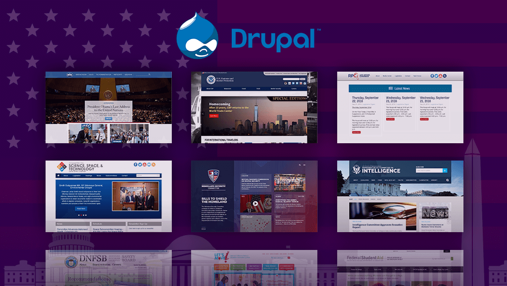
In 2009, WhiteHouse.gov launched it’s new website powered by Drupal CMS scoring a huge win for the open source community and open source advocacy groups. Of course Drupal was well known before the White House made the switch from what may have been Expression Engine. But with such a high profile website being powered by a community driven, open source platform, other government agencies starting paying attention.  

With each passing year, the list of Drupal government sites grows longer and longer. Not only is the federal government using Drupal, but local and state governments have also turned to this powerful open source software to fulfill their needs.

So what makes Drupal attractive for government agencies? Why is an open source platform, such as Drupal, a good option for high level, high security websites? Here are a few reasons why the government has been making their shift from other content management systems to Drupal.

Financially Attractive

Proprietary software will definitely become a drain of project dollars faster than you think. When you factor in the updates to the core software, support charges, security patches, modules or plugin updates, Drupal looks very attractive. It’s free and can be maintained for a fraction of the price of comparable proprietary software. For a government entity, this is likely the single most appealing factor.

Support

The open source community for Drupal is second to none. With so many Drupal developers around the world tackling a wide variety of tasks, it’s very easy to find a post in the Drupal.org forum that may point you in the right direction. And if you can’t find the solution, the community is fantastic at helping others find a solution. The more developers that address a problem, the stronger and more well developed the software becomes.

You own the code

Proprietary software is mostly closed and the code is simply not open for all to see. This makes the ability to audit the code virtually impossible. At this point, you’d have no choice but to trust the software provider’s word on their products solid security. Drupal’s code is open and can be viewed and audited. It’s yours. You own it.

Flexibility

Drupal can handle all kinds of projects ranging from large scale, resource intensive projects such as a documents database to intranets or individual personal websites. It can be exactly what you want it to be. Out of the box, you have the capability to create content types and add fields of your choosing. And with the ability to extend modules and themes, the possibilities are endless. Proprietary software is not expandable or flexible without cost.

Reliability

Drupal’s software is peer reviewed and community driven. Modules are documented and reviewed prior to them being listed on Drupal.org’s module list. Open source software such as Linux and Apache have proven themselves to be hardened and reliable in demanding situations. 

We have migrated a few government websites to Drupal, check out the work we have done for NASA and USGS.

Categories
Author

sketch


The short answer, yes, Sketch is becoming a popular choice for interface design. Two years ago a new race commenced when designers started looking for a faster and cheaper alternative to Photoshop, which at the time was the market leader- I don’t think anyone is doubting that Photoshop is still the most commonly used tool in the market but Sketch entered the race and has made quite a positive impact for another designer tool option.

What is sketch?

Sketch is a development tool for UX and UI designers - it is vector based tool entirely focused on the user interface design.

Sketch identified a gap in the market and started to capitalize on items that Photoshop seemed to be missing. Aspiring to be an icon company of the 21st century and a customer engagement champion at heart, Sketch successfully transformed into one of the most usable tools for UI designers. Sketch was perceptive to the needs and behavior of their clients. They understood how to cross all barriers we assumed were set in stone.

Here are some basic differences between the two:

  • Speed: Sketch seems to be much faster and works smoother than Photoshop. It’s a fast application which is intentionally minimal in its offerings. The result is less time thinking about how slow the software is and more time designing. This makes it way easier when working with complex workflows. Sketch is only 45MB compared to Photoshop CS6 and its 4GB.
  • Sketch Mirror: Another cool feature that comes with Sketch is the possibility to mirror your artboard directly in your iOS device. So you can easily test it and see how the designed screen will look without having it implemented in the application.

Sketch really outdid themselves when they came into the market- this allowed designers to use another program that may cater to their needs more specifically than Photoshop, and at a cheaper price.

Which program do you use? Photoshop, Sketch or both?

Categories
Author

NASA and team have unrolled a new website re-design for a new and improved science.nasa.gov and ciencia.nasa.gov, and it looks awesome! The website is a fully responsive design, meaning that science.nasa.gov can be accessed on any mobile or tablet device at the touch of a fingertip. This engaging new look and feel encourages users to explore NASA science through a rich new interface and search capability. Congrats to NASA and team on another successful launch, the new site is out of this world. Check out the before and after of the redesign-

Before: 

nasa-web-design


After: 

nasa-responsive-web-design


Categories
Author

woman-writing

Relationships are hard, whether it be with friends, your family, or a working relationship with a client. An incredible amount of work goes into making them successful, let alone last for an extended period of time. Let’s focus on the client-designer(s) relationship, one that we’ve had many years of experience with, and how the two parties need to establish clear goals for each other in order to be successful.

As with any partnership, the one between a web design agency and their client is no different. Establishing clear goals helps to set the foundation of the rest of your time together. But what should those goals be? Should they be solely focused on the product? Should they be set only for the design team? Should your client have goals set for them as well? Simply put, YES. All of those actions need to happen to ensure that both the design team and client are happy and successful.

I thought this might be a great time to share some of the goals/objectives that our web design team created in order to make our lives easier on projects

Communication:

Communication might not seem like a “goal”, but it could be argued that it might be the most important goal any design team and client can set for each other. Establishing clear communication patterns - like daily or weekly check-ins - is a great way to build trust and to show progress. From our experience, nothing shows a client you care like over communicating and keeping them in the know.


Milestones:

Setting up finite and clear deadlines for work - whether it be a check in, a project deliverable, or a status meeting - is another great way to establish trust. These milestones not only show that you care about a project, but they’ll help to keep both parties accountable and sane.


Constructive Feedback:

Feedback is easy to give, anyone can say they like something (or even easier, pick out the things they don’t like). What takes effort is explaining why you don’t like something and offering potential solutions to fix the issue at hand. Whether it’s client feedback on work you’ve done, or a design team pushing back on feedback they’ve received, having a clear, thought out rationale for the reasoning and explanation against doing something is more likely be accepted.


Transparency:

Transparency could potentially be a subset of communication because, at it’s core, it is a specific type of communication. I personally have learned through the years to be as straightforward and honest with not only my design team, but also our clients. If you’re not going to make a deadline, if you don’t agree with something, if you don’t understand something…SAY SO. Never hold back something if it has the potential to 1.) Derail a project, or 2.) Make that project better. Nothing can turn off a client or coworker more than hiding issues or concerns you may have. When in doubt, be as transparent as possible.


Trust:

Everything I’ve mentioned previously has led up to trust. Without trust from both parties a project is doomed from the start. Like any relationship trust is the glue that holds the project together. If your design team can’t trust you or the client, then regardless of how great your work may be there will always be uncertainty. If your client can’t or doesn’t trust you then continuing on the project is an exercise in failure. So the big question is how do ensure that you can establish a trusting relationship? Communicate, set milestones, give constructive feedback, and be transparent. It’s not difficult, but it takes work and time.

I can wholeheartedly say that if you and your web design agency start your next project with these goals in mind you will have a much more enjoyable experience. I’d love to hear of your team’s successes and other goals that you set for yourselves. Tweet us @MobomoApps or shoot us a note at hello@mobomo.com so we can hear your success stories.


Categories
Author

The dashboard is a critical part of all web applications. It's the first thing users will see when they visit your website and often times there is some sort of information within the dashboard that the user may be looking for - dashboard web design does not have to be difficult, but I will admit it can be tricky. Here are 5 common pitfalls I see frequently, hopefully this will help you build your next dashboard.

Mistake #1) Believing There Is One Type Of User Dashboard

web-dashboards

The dashboard is a critical part of all web applications. It's the first thing users will see when they visit your website and often times there is some sort of information within the dashboard that the user may be looking for- designing a dashboard does not have to be difficult, but I will admit it can be tricky. Here are 5 common pitfalls I see frequently, hopefully this will help you build your next dashboard.

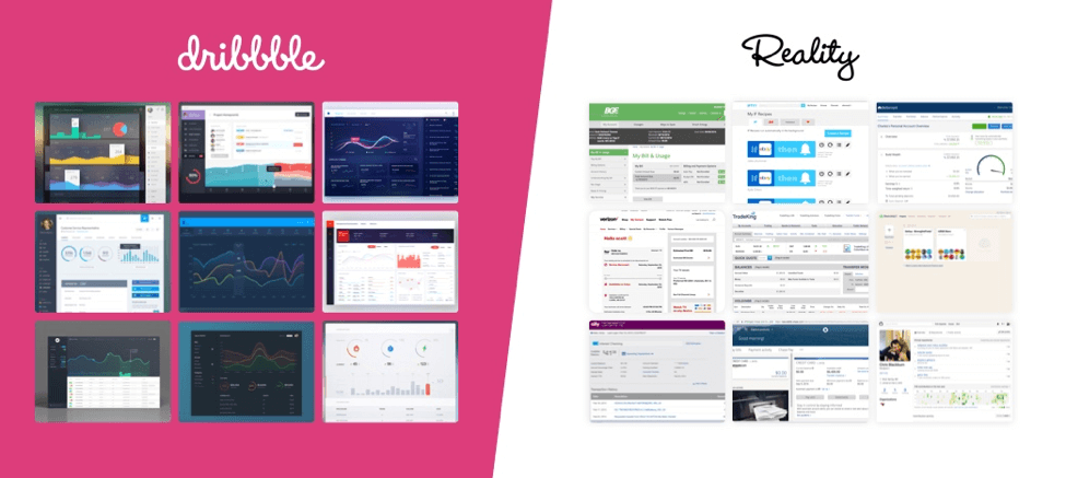
Since the evolution of applications and products, dashboards are no longer a cookie cutter visual experience. We need to use visuals sparingly and focus on actions. Look at the products you use in your everyday life. Next time you log in at your bank or pay for your credit card, pay your cable/electrical bill, or even log into Facebook, do you see a sea of large visual charts telling you about everything? No. All you care about is paying that bill you forgot about. Therefore, stop looking at Dribble for inspiration to create your dashboard concepts because it's going to lead you down the wrong path. Start looking at real life applications around you or the problems you are trying to solve.


Mistake #2) Assuming You Know What Your Users Wants

dilbet-user-testing

With dashboard web design, your object is to create a forgotten experience when completing their tasks. Why forgettable? Because then we are not asking the user to think. Users only remember bad experiences, a more complicated dashboard equals a bad experience which equals an unhappy user. In order to avoid this, we need to figure out their routines and what information is most important to them. Why are they logging in? How often are they logging in? What types of information are they constantly looking to get? What is working and what isn't? All of these questions help construct a dashboard that users will love and forget they are using while in the moment. However we answer all these questions in conference rooms and not directly with our user.

Your second mistake is thinking you know your users habits. Analytics are fantastic, frankly, I am not sure what we did before they existed, yes you can get user information from analytics but unfortunately, those metrics won’t take you far enough. Before building any product you will need to sit down with your users/target audience and listen. It’s a simple task that companies are sometimes afraid to do before they invest thousands of dollars, which is foolish. If time is of the essence in kicking off your project and the user experience is the hold up, there are simple ways to gain user feedback from your existing user base. Reach out to your newsletter directory and ask them to take a quick 5 min online survey. Showcase a sticky call on your dashboard asking for feedback. These two steps alone can lead to quick and simple feedback in a short period of time that provides more value than before. By knowing what you your user needs and what their habits are will help you towards building an amazing “forgotten” experience.

Mistake #3) Believing That Design Will Solve All Your Problems

dilbert-product-design

There will always be projects that feel like everything is broken. Especially when dealing with a dashboard that hasn’t been recently updated. Our first instinct as a designer is “oh we can make this better, so much better with a modern design!” This is very true, a simple way to refresh your ascetics. We can easily fix the hierarchy and make it feel light and trendy. Also another true statement. However, if we are not solving any user or technical problems in the process there is no point.

This causes your third mistake, believing that we can rely on design to make our product and dashboard amazing. It's easy to make something look modern, but it's hard to make it work seamlessly. In order to accomplish this, we need to know what the user problems and habits from Mistake #2. Simple things like monitoring your dashboard analytics will easily tell you what links are getting clicked and viewing page load times to see what areas are lagging and how you can refactor the system to speed up the results. All these aspects will help you build a beautiful dashboard that solve the user problems.

Mistake #4) Thinking that User Feedback Comes Only After Launch

dilbet-cartoon

Talk, design, build, test, and launch. It's a traditional process that companies and design firms use to build your project. Once the product launches, we may get slight feedback, on what works or doesn’t, but will not know for user. An iterative process that is a perfect way to always improve your dashboard. However, when time, resources, or reputation is valued, you can’t always afford to drop the ball for these long feedback loops.

Your fourth mistake is thinking we can wait until a product launches to get actual user feedback on the dashboard. It is a big risk to invest 3-12 months to build an application to find out you drop the ball on the first page. Especially when we can easily obtain feedback at every step of process from concept to final product.

Wireframes and flat designs are not difficult to test with today’s web applications like Invision App which is an interactive prototyping application that brings flat designs to life. Within minutes your designer will have a clickable prototype for you to test your dashboard to your users. Remember, it takes fewer calories to make changes earlier than later after everything is coded. As a result, we're able to launch a proven dash dashboard that you know solves your users problems.

Mistake #5) Ignoring Your First Time User

greatest-engineer

When designing our minds always focus on designing for the active state. We start laying the components and solutions when data charts are full, graphs have data, users have messages, and receive notifications. It makes sense that we want to showcase all the possible functionality of our dashboard to meet the user needs.

This leads to our final mistake when creating a dashboard, we forget about designing for the first time user. This is the most important because it sets the tone for the rest the application. If the dashboard is empty it will confuse the user on what to do next. We immediately set them up for failure. As a result, people will not stop using your application.

A dashboard should always guide the user to accomplish a task even if it’s empty or a first time user. In order do this, we have to design for the first time user’s vision of your dashboard. What will it look like when it's empty? What task(s) does the user need to complete in order to show information. How can we unobtrusively guide the user around. Simple solutions could be creating a task list for them to complete or even a welcome message at the top with common actions that want to complete. Designing for the first time user will aid usability of your product, but will also help user retention.

Let’s Recap

Creating an amazing dashboard isn’t hard, but isn’t straightforward either. Your application is unique, and your dashboard should be as well. Talk to your users and see what their habits are in addition to their needs. Read between the words to see what they really need and build solutions around that. Remember to also test these assumptions we have made to ensure they are right. And lastly remember your first time users because they will dictate if your product is a success. Check out some of our dashboards that we have done for clients such as: World Bank, Great Minds, and Spark Post.
What design needs are causing you to stay up at night? Get in touch for a free consultation!  

Categories
Author
Subscribe to