
Mobomo webinars-now on demand! | learn more.

User design The first time someone comes across the term “User Centric Design” there might be confusion because isn’t all design user centric??? Arguably yes, but…

User centric design is a fairly new design concept which involves real users throughout the design process. User centric design also known as (USD)is an interface design methodology that is based on the research and the participation of the final users of the interface.

Before we dive into the advantages of user centric design lets look at the design concept that was used prior to UCD, linear design. Prior to UX and UI becoming a household concept, design projects were normally in “linear design” which meant the center of the design thought process was based on the client or stakeholder. Typically, during the design phase there are multiple teams involved which could include the client, the designer, the developer and the project manager. The only issue was each person involved had different opinions on how the design should and maybe should not look. As you can imagine not all opinions align which creates conflict between all teams. Aside from the difference of opinions, each member involved was missing what was most important- the end user!

End users are so important because that’s the whole point of creating the design to being with, right? You want to make sure that the end user’s “needs” so to speak are addressed in the design process so that the end user has the best experience possible. The problem with the linear approach is that it tends to produce products that are out of touch with the end user. Thankfully, user centric design made its debut in the design process.

User centered design (UCD) establishes a unified program of needs and goals based off of research (and not vague ideas from the team involved). The client's business and user goals are still very important in the design process however they are addressed in the strategy phase so that designers, developers and project managers know how to best guide the project based off of the goals of the client. The purpose of this approach is to create products that are based on real needs and expectations of the end user.

To outline things further, we have created a chart (below) which gives you a better understanding.

Chart on linear design versus user centered design It’s always good to have a pulse check on your design to make sure its still meeting the needs of your target audience. If you are questioning the effectiveness of your design, get in touch, we are happy to chat! In the mean time, be sure to check out our UCD design process.


Categories
Author

Magnifying glass over Google search bar

A few tweaks and modules later, Drupal has easy to build SEO friendly websites. To achieve it, there are two sides involved:

Below are a few things you can do to improve SEO on your website just by working with content (texts, images, files).

Text content

Title

When you create a page on a website, the page title you decide on is used in several different places so it's important to get it right and make sure it's clear and useful.

Page title will appear:

All of above are picked up by search engines, so it's important to include relevant keywords in your titles.

Page titles should be clear and descriptive. If titles are too long to fit into a menu, or if you want to have a different menu link then the page title you could use the 'menu link title' field to display.

Drupal has a feature that allows you to specify a 'menu link title', you can find this at the bottom of the edit page form in the “menu settings” tab > “Menu link title”.

Please note, spaces in titles will be converted into dashes in the url, so do not use  dashes in titles. Maybe you could replace dashes with a colon to avoid “double dashed” urls.

Meta description tag

The meta description is the excerpt that displays under the page title and site name on the search engine's results page. If it's not filled in, the body copy will be used instead. This may lead to a cut off excerpt, but you could manually fill the ‘meta description’, or use the ‘summary’ field to avoid it.

In Drupal, the body text field on a page is accompanied by a summary field. It is important to fill this in. Sometimes, it's used on the site as a teaser to promote users to click the page and read the full copy.  Remember, it will be picked up as the meta description for the page if no meta description was manually added.

Headings

When adding or editing content to the Body, in the WYSIWYG toolbar at the top of the text field, you'll see a dropdown with a few headings options. Commonly, you will have a choice of heading 2, heading 3, heading 4, and normal/paragraph.

When starting a new section on a page, use one of the headings defined in the dropdown. Headings are picked up by search engines and will contribute to your search rank.

Besides helping out with SEO, headings are designed to draw the reader's eye so that they are able to find what they were looking for much easier. They are also useful for good content structure if the copy is long.

For SEO purposes you should only have the h1 tag used once on a page. H1 is commonly the page title.

Anchor Texts

This is the text that links to something else. For example, if I would like to point you to the about us page, then the anchor text is the (commonly) blue text you see.

Search engines compare the text written in the anchor to the link “behind” it. So if they anchor text includes keywords or phrases that will add value over time.

Anchor text is read by screen readers so it plays an important role in complain with accessibility requirements.

Please make sure that your anchor text is also descriptive.

Length

As a general rule the copy should be as long as it needs to be. Online content is not read in the same way as printed content, so keep things concise, clear and straightforward bearing in mind the user experience, not only the SEO.

As a reference, some SEO advisers recommend around 200 words as a minimum for page copy.

Files (Images, documents)

Filenames

Filenames should follow the following convention to eliminate technical problems and to improve SEO.

Filenames should be also descriptive.

Some good examples are: mobomo-logo-red.jpg, partnership-agreement-2017.pdf

Reference: https://support.google.com/webmasters/answer/114016?hl=en

Alt Text

This is a descriptive text that appears if an image cannot be loaded and is also used by screen readers. So here SEO is directly implicated with Accessibility. It's especially important if the image also acts as a link.

This text should clearly describe the image.

Filesize

Main thing you should know about files in web: Large file sizes slow down page load.

Users tends to abandon pages if the load time is greater than 3 seconds. So search engines “don’t like” to direct users to slow sites.

So, you can help to keep the page speed to a minimum by making sure the files you add are light.

A general rule is to try to keep images filesize below 70k, this sometimes is hard especially with large images (banners for example), so let’s say images should not ever be larger than 600k.  

Format

All images should be saved in jpeg format.

Documents should be saved as pdf or doc (for editable documents).

Other

404 and 403 pages

We are going to set up these pages for you, but it’s important that you fill them with accurate content given your audience. For example, you could add a link to your Homepage here or to an Archive / Search page to help your audience finding what they were looking for.

Please note these points listed above are changes you can apply without any tech support, they are just Content edits you can apply by yourself when adding / updating content for your website.

Here’s a few SEO related Drupal modules that makes developers lives easier.

Categories
Tags
Author

Dog

Okay, okay -- we don't actually have it in for Fido here at Mobomo. In fact, we're quite the puppy- and kitty-loving group. But when it comes to building infrastructure to support your web or mobile application in today's cloud-based environment, it has never been more important to forget everything you ever knew about caring for pets, and instead, start thinking of yourself as a cattle rancher.

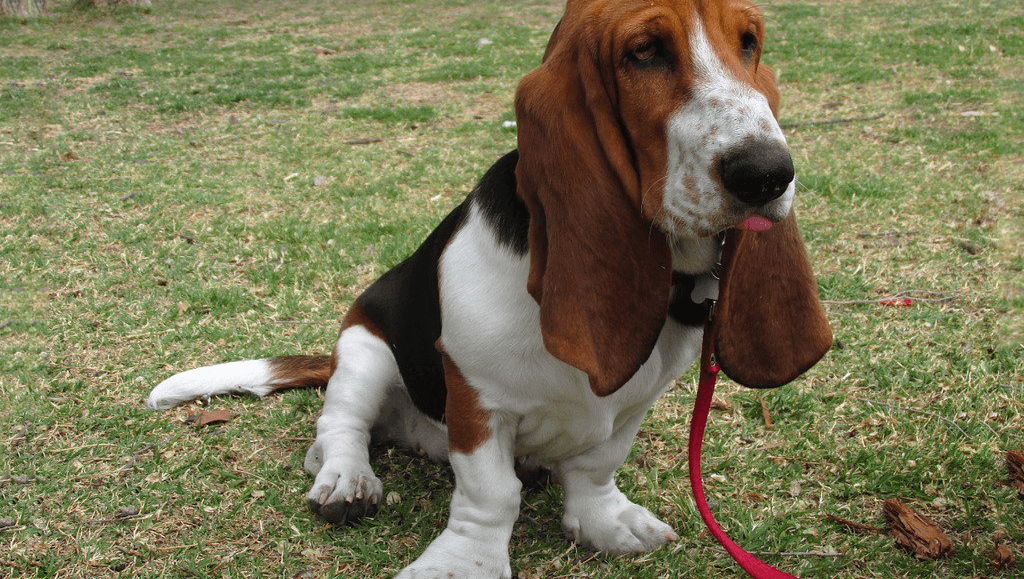
Pets, in a word, are unique. Aren't yours? They're cuddly, quirky, and require lots of tender loving care. And while that's delightful if your pet is a Basset hound or a Maine Coon, it's generally not the best model to follow if your pet is a server.

In the old, dark days before virtualization and cloud services, all servers were pets -- physical boxes screwed onto a rack in a data center (or worse, sitting underneath Larry's desk in the office server closet; careful with that Big Gulp, Larry!). Each one was named, crafted by hand, and given copious attention by a neck-bearded SysAdmin who came to love his servers as much or more than his children. Pets are indispensable and irreplaceable, and when they get sick, it's a BIG deal. After all, what self-respecting pet-parent wouldn't drop everything to nurse his/her little furbaby back to health?

But in the rough-and-tumble world of application development, that's a big problem. Time spent troubleshooting machine-specific problems is a deadweight loss for every project's bottom line. To say nothing of that desperate feeling when the CEO's pet project is suddenly unresponsive, and Larry's the only one who knows anything about the machine it's running on, and Larry's not answering his pager...

Clinton2
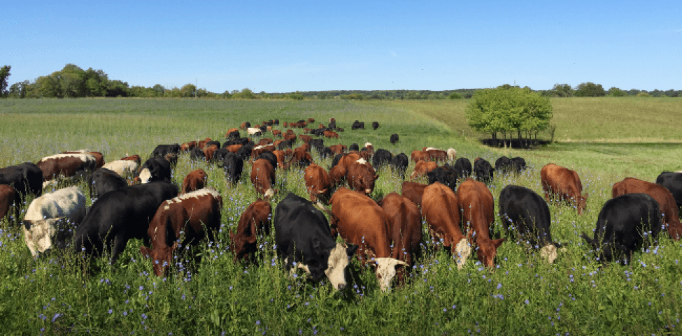
Cattle, on the other hand, aren't like pets. They're typically given numbers instead of names. They're expendable and (with apologies to vegetarians everywhere) disposable. Rather than being cared for individually, they are completely managed by repeatable and documented processes. If there's a problem with one cow, the herd is unaffected. The sick cow is, shall we say, simply removed from the herd and life goes on.

The advent of virtualization, cloud computing, and provisioning tools like Chef and Puppet have combined to allow technical architects to think of their resources as cattle instead of pets. This thought -- that systems are not hand-crafted masterpieces but cogs in a machine managed by repeatable rules -- is at the core of the DevOps philosophy. While there is a great deal of spirited debate over what DevOps precisely means, at Mobomo it boils down to three rules:

Infrastructure is Code

Larry's not going to like this, but he'd be a lot better at his job if he thought more like a developer. All those manual processes he goes through to create and maintain infrastructure, all those one-liner shell scripts StackExchange hacks he's committed to memory, mean he's introduced a non-automated factor into the project's critical path: himself.

But fortunately (or not) for Larry, machine provisioning tools like Ansible and Chef, along with cloud resource templating systems like CloudFormation and Terraform, mean that it is now possible to remove all manual interaction from the process and allow an application's infrastructure to be defined by code, right beside the application source itself. This way it can be version-controlled, peer-reviewed, and easily tested in non-production environments, eliminating the incongruities that come with different sets of environmental variables. Beyond that, the code functions as de-facto documentation of your environment's structure, which tends to be way more reliable than whatever is lurking in the nether regions of Larry's memory.

Bottom line: if your entire application infrastructure can't be rebuilt with the push of a button (or the running of a single shell script), then it's not in code, and therefore your servers are pets, not cattle.

Infrastructure is immutable

Related to the above is the idea that infrastructure should be immutable -- that is, never altered on the fly once it has been created. This rule prevents Larry from, say, noticing a bug and updating a configuration file on a running server, thus causing headaches the next time the application is deployed or has to scale-out. If all running resources are treated as inaccessible black boxes, this means code changes can only be made via the version-controlled provisioning scripts and templates, thus ensuring that each deployment or scale-out of the application will be running on identical servers.

Furthermore, treating infrastructure as immutable allows us to think about deployments themselves differently. Rather than deploying an application by pushing an update to run servers, crossing our fingers and hoping it works then desperately rushing to revert manually if a bug is discovered, at Mobomo we employ a Blue/Green deployment methodology.

When a production stack needs to be updated, it is deployed from scratch with new infrastructure (the "Green" instance) created from code each time. That allows QA testers (using a combination of automated and manual tests; more on the relationship between automated testing and Blue/Green deployments in a future post!) to verify the functionality of the new environment before it is made live. Then, production traffic is simply switched (by changing a DNS record or similar) onto the new/"Green" stack. If a problem is then detected with the newly deployed app, it is a simple matter to switch back to the old production "Blue" instance painlessly without the risk of extended production downtime. Once all stakeholders are satisfied, the old "Blue" stack can simply be destroyed.

Embrace the chaos monkey

Cattle-oriented infrastructure means coming to terms with the idea that failure is ubiquitous and constant, and rather than something to be feared, should be embraced. This means specifically designing your application infrastructure with the certainty that it will fail, and testing that failure constantly, in production.

We've recently been playing with a tool called Chaos Monkey created by the development team at Netflix. Chaos Monkey does one job and does it very well -- it runs in your production environment and randomly kills running server instances.

Let that sink in for a moment: if your infrastructure cannot tolerate the random, arbitrary death of machines, then you are treating your servers like pets instead of cattle.

Using techniques like load balancing, auto-scaling, and high-availability proxies, it has never been easier to embrace the Chaos Monkey. Failure should be assumed and automated procedures put in place (spinning up new machines, altering DNS and load balancer configuration) to handle that failure without any human involvement. Furthermore, with cloud services like AWS and Azure continuing to build hosted solutions that take the guesswork out of planning for scalability, we find ourselves in a brave new world in which most undifferentiated heavy lifting has been eliminated and we can focus on what we do best: building great applications.

So by all means, adopt a pet or three and care for them like family. But when it comes to supporting your Internet applications, it's long since time to start thinking like a rancher.


Categories
Author

It's important to understand some of the advantages of JIRA as well as how storypoints and estimations relate and the best way to estimate how long it can take a team to work through different aspects of a project.

Why JIRA:

Stories vs Tasks

User stories are in the product backlog which is a ranked list of product backlog items also known as (PBIs). Stories represent the scope of the product and are identified during the kickoff with the client. Tasks can be identified during sprint planning and become part of the sprint backlog.

A user story is typically a functionality that will be visible to end users. Developing a user story will usually involve a programmer and tester, perhaps a user interface designer or analyst, perhaps a database designer, or others..

A task on the other hand, is typically something such as a code assignment, a design task, creation of test data for such-and-such, automate that, and so on. These tend to be things done by one person.

Bottom Line: A task must be written by the team and it should represent a piece of a story. I suggest we leave the tasks creation to the person who will be working on it. If this is the case we have to request to whom created the task to relate it with the story that is created. If a story was estimated in 8 hours the related task should not last more than 8 hours.

Now that we know the difference between a story point and a task let’s dive into the story points and how to estimate time using story points versus tasks.

Advantages of estimating with story points:

Why should we estimate with hours?Jira story sizes

How to measure the story points in JIRA:

If we followed the above steps we could have the following in JIRA:

Screen shot of JIRA


Velocity Chart:

A velocity chart is a graphic representation of what the team was committed to do and what was actually completed along sprints.

Velocity chart

After a few sprints the velocity of a scrum team will most likely be predictable and will show the accurate estimation of the time needed until all entries in the scrum product backlog will be completed. If the velocity of a scrum team is e.g. 50 story points and the total amount of remaining work is 220, we can predict that we need about 5 sprints to complete all stories in the backlog.

Tip: See how the Story Points and Completed Stories get increased in time. This is because the team is going through a learning curve satisfactorily. In this case the dev team completion average is 40 Story Points.

What does a velocity chart represent?

The velocity chart shows how the team is performing during the project. What we expected is exactly what the graphics shows above in an ideal scenario. Therefore we can notice which team performs better than others and who individually inside the project is not performing as much we want.

Scrum Burndown Chart:

The scrum burndown chart is a visual measurement tool that shows the completed work per day against the projected rate of completion for the current project release.

Burndown chart

Its purpose is to enable that the project is on the track to deliver the expected solution within the desired schedule. As a definition of this chart we can way that the burndown chart displays the remaining effort for a given period of time.

General breakdown of the burndown chart should consist of:

  • X axis to display working days
  • Y axis to display remaining effort
  • Ideal effort as a guideline
  • Real progress of effort


Weighing points and hours
The biggest lesson we have learned is that you should not equate story points to hours in JIRA. Even though you know that a story point is closely tied to effort and effort equals time. It is important to realize that you should not equal the two.


Categories
Author

Compass

Including Offshore Teams in Your Workforce

Over the last decade, more and more U.S. based organizations have been working with offshore teams. The pricing for offshore development is very compelling, however, sometimes delivery, and consistency can oftentimes be an issue. Here at Mobomo, we have solved this issue by presenting clients with the option of working with a hybrid team versus strictly offshore or strictly onshore.

Mobomo has a top of the line onshore project management team- these folks are versed with leadership qualities as well as project management skills that can ensure on time deliverables. Some of the benefits of a hybrid team is that your project is being worked on around the clock, which ensures a quicker delivery date. Having U.S. based staff in these leadership roles helps the coordination of the project between the client as well as the development team.

Our project managers sync daily with off shore resources to ensure that items on the to do list are being accomplished as well as to make sure that everyone is on the same page. Going over tasks completed yesterday, what they are planning to do for the day as well as if there are any questions or blockers. When project managers connect with our development teams this is the time that ensures that there is no miscommunication.

Below are a few things that we incorporate into our framework of working with our offshore team.

Sprint Planning

  • This occurs the first day of sprint and could take an hour. Typically, we conduct sprint planning with our development team to ensure our deliverables match with our timeline. We use JIRA to review desired tickets to complete, and estimate the level of effort to ensure we have enough time to complete all tickets in the sprint. The team self-manages who will work on what throughout the sprint.

Daily Scrums

  • We hold a 15 minute conversation to review the prior day’s completed tasks, which tasks need to be completed that day, and any blockers or questions the team may have. The team self-manages who will work on what task each day. We also review any additional agenda items as needed based on the project such as updates or questions from the client, scope changes, etc.

Review Daily Status Reports

  • Our offshore team sends an end of day update (morning U.S. time) which consists of a daily summary of tasks that are ready for review, as well as tasks that are still in progress. We download the latest build and test the updates daily, provide feedback as needed, and/or close out completed tickets.

Sprint Review: last day of sprint (~1 hour)

  • It’s important to review a completed project or sprint as a team once that sprint is completed. Some of the bigger questions in this review are understanding what worked well, what should the team do differently next time. We call these meetings retrospectives. Our teams find it useful to do a scrum retrospective so that we can find ways to improve based on what went well and what needs to be reviewed for the next sprint and or project. You can see a full analysis of how we run a sprint review here

Aside from the framework of how to work with an offshore team, it's important that the project manager has the ability to communicate well with the client as well as the offshore team. Internally, our project managers use Zoom, Google Hangouts, and GChat to have direct conversations with our offshore team to walk through all assigned tasks as needed. Direct communication with all team members ensures everyone is on the same page and opens the floor for immediate resolution of any questions the team may have.

Categories
Author

Desktop apple computers

It's crazy to think that 2016 is coming to a close, the question is what will 2017 bring? At Mobomo, we strive to think ahead and implement cutting edge trends so that we are always ahead of the time. Now the question is what is the “next big thing?.” Unfortunately, as far as we know there is not a way that anyone can truly predict the future, but what we can do is look at current trends, as well as past trends to get a sense of what the next year may hold. Below we have listed out some of the design trends that we predict to see in 2017. This list is by no means a definitive one, but our design team is keeping a close eye on these as we ring in the New Year.

DESIGN TECHNIQUES

Minimal/Flat Design - This one is not going anywhere, and as far I as I can tell it’s really only getting stronger. It does make a lot of sense that this approach to solving a creative problem used quite frequently. We are bombarded on a minute by minute basis with new content and information to the point that we literally can’t digest it all. By handling your content in a “minimalistic” way you’re helping the people that use your product by removing any clutter. There are no extraneous steps they have to wade through.

Soft drop shadows - Another technique that has only been getting stronger is the use of “pillowy” drop shadows on web and app components. For me, again this makes a lot of sense, if used appropriately it doesn’t take away from the “minimal” look of your site, but rather adds a layer of depth to it. Adding depth to your product can do several things, A.) It can show hierarchy in your content by literally elevating it above other items, B.) It can be used to show hover or active states of your content, and C.) Depth adds a level of visual interest that helps to break up the flow of the page, make the content more digestible.

Non traditional/breaking the grid - Breaking the design grid has always been a strong technique when implemented correctly. What it does is break up otherwise static content into interesting visual cues. It’s one of the best ways to “surprise & delight” the people using your product, to unexpectedly alter the layout in a manner that makes them stop and absorb what they are looking at.

Organic shapes - The use of non rigid, more fluid shapes within a product or site helps to break away from the pack. By slightly altering a button, or header graphic to something softer than a square, you begin to give your layout a completely different feeling, something much more approachable.

Large Text  - Large, powerful, font choices will continue to increase. Especially as the amount the content grows, there’s has to be a way for copy and text blocks to stand out. Gone are the days when a 12pt font is an acceptable choice for web copy. With the increase concern of accessibility and usability becoming the primary business goal of product owners, larger fonts equal easier digestion of content.

Bright colors- As the need to standout becomes more necessary, the more we will see websites and applications use bold, bright colors do that. The use of strong colors helps to create the type of visual tension that people like when using your product. It helps to quickly reinforce key information and page components like buttons.

Experimental prototypes - While designers continue to push the limits of devices and people's expectations, there will always be a place for experimenting. While these might not be quite ready for the mainstream public, they do show where the future of applications and websites are headed.

Futuristic interfaces - If the demand for products like Nest and Tesla continue to climb, so will the interfaces that accompany them. Some of these might still be experimental in their perceived execution, but again they show where consumer based interfaces are heading.

Web forms

As peoples attention is increasingly being pulled in many directions, the way we expect them to enter data and communicate on the web has to accommodate that. There has recently been a surge in “bot” based communication on the web and in apps, where people communicate back and forth with the product in a very natural, conversational way. I think 2017 will only see this new form of interaction increase and become more adapted.

Beyond design techniques, I think we should be on the look for more applications like Adobe XD and Figma that allow multiple users to work across a single project without the need to handoff project files. We can see 2017 being the year of collaboration based tools, where teams begin to work more fluid across several projects with several designers helping out.

Let us know what you think 2017 has in store for designers!

Categories
Author

sharpies As a designer, there is nothing like the energy that comes from an initial kickoff with a new client. Clients visions can be overwhelming yet exciting as they eagerly spill out their advantageous ideas during that first meeting. Our job as designers is not to just create a beautiful product, but a practical one as well. You don’t know how many times I want to build the client their sexy transformer Ferrari, however, there are a few factors at play: time, money, and user needs. User story mapping is a method that our designers at Mobomo have been implementing on projects, we rely on this method in order to best organize and prioritize our client’s ideas and features.

What is User Story Mapping and its Benefits?

User story mapping is a collaborative and hands on technique; organizing and grouping user tasks on post-it notes. It’s a cheap activity that helps showcase the bigger picture of your product. It is fun to get all parties involved rather than being lost in words, documents, or spreadsheets. Moreover, everyone get’s a vision and expectations are on the same page - win win.

The goal of user story mapping is to discover your core tasks and functionalities needed to achieve the user's objectives. You will be able to see what areas you are missing as you go through the tasks. As you go through your tasks this is when you work with your team and stakeholders to prioritize your functionalities from “must have” to “nice have”. From working with your internal team to figuring out difficult and time management for each sub-task and break them later into phases to build out your roadmap. Once the site is mapped out all parties will have a better sense how the product works and set anticipation on what is expected for delivery.

It’s never too late to start

I completed my first user story map in the middle of a project because it was hard to see the bigger picture of the product. We tried screenshots, feature priority spreadsheets, Trello boards, and requirement documents. However, they all failed because no one was able to see the bigger picture. I was fed up of digging into documents, so I ordered post-its and painted three walls with post-it notes. As a result, everyone on the team could see how all the competes flow together, we were able to prioritize, backlog, and plan toward a better MVP.

How to Get Started

Step 1: Gather Your Materials

3in x 5in Post-It Notes in multiple colors - $7.30 @ Amazon
First you will need some post-it notes, preferable larger ones. I suggest getting the multiple colored 3x5 post-it's to give you more space to write larger and mix colors for categories and functionality. However, if you can only get your hands on the standard size ones that okay.

Chisel Tip Sharpie Markers - $4.99 @ Amazon
Next, you will need a nice dark thick marker. I recommend the sharpie chisel tips because it of the thicker lines make it easier to view from a distance. The cheapest sharpie set is the multiple colored pack of 4 markers for $5. For some reason a set of two black sharpies are over $5.. I don’t understand their pricing logic.

Blue Painters Tape - $3.59 @ staples (Optional)
An optional material that you might want is any time of painters tape. This will help you create rows to build out roll out phases. Painters tape will not damage your walls and more for giving to move around. Also, it gives helps tape up any stubborn post-it notes that will not stick.

A large wall or window
Last, you will need a large area(s) to start stick(ing) all the tasks you need. I suggest selecting an area from your or client's office that you can leave up for a long period of time. You might need multiple walls depending how large your project.

Step 2: List Out Your User Tasks & Features

After you gather your materials, spend 5 to 10 minutes writing out as many core user tasks and functionalities you can on each post-it. Think of it this way, you are more or less putting ideas to paper. Depending on what part of the process you are in, this knowledge is taken from proposals and ideas collected from your kick off, or anything you discussed in wireframes or designs. Don’t worry about trying to think of everything at once, this is just a quick brainstorming session. You will quickly see some missing features that were not discussed. Many times on boarding or logging is overlooked.

Example:
Say you are building an email application. You would start writing down all the basic and core functionality. Some post its might be straightforward while others might be very specific functionality or just wild ideas.

Read a message
Reply to message
Forward a message
Sign In
Create an Account
Search for key message
Snooze functionality
Creating folders
Sent a Message
Delete a message
Add an attachment
See what's been reviewed
Receive a notification

Step 3: Group Your Tasks/Functionality

After you have all your ideas into post-its it’s time to organize them into similar groups/themes. To do this, start placing your ideas on your wall into various groups. The benefit of sticky notes is that they can easily be moved around. Some functionality/tasks might overlap, which is fine. Just create another post-it and place it in each category. Don’t worry about it being perfect at this point. Some groups might be on their own, while others will be full of functionality, which is fine. When it comes down to groups, this will eventually become the pages that you will need to design.

Example:
Let’s use the same example as above with our email application, I start grouping the tasks by the actions that will be taking place. Anything that dealt with reading or replying to a message would be involved in viewing your inbox page. In past experiences, I learned it is better to split creating an account from signing in. Mainly because you don’t know just yet what information a user will need to set up an account and how to get them started. Therefore, you will have an area dedicated for that section.

Sign In

Receive a notification

See what's been reviewed
Read a message

Delete the message
Reply to message
Forward a message
Snooze functionality
Send a message
Add an attachment
Create an Account

Search for key message

Step 4: Label The Categories

After you categorized them in unique groups, use another color post-it to label each group by the theme. You can label it as simple as the name of the or tasks you are trying to complete.
Example:
Using the example of our email application, group similar tasks and functionally together. I group all the actions of responding to an email together. I also separated creating an account and login because from previous experience, creating an account can be multiple steps, which you don’t know what’s involved.

Onboarding
Create an Account

Login
Sign In

Managing Your Inbox (Inbox)
See what's been reviewed
Read the message

Notifications
Receive a notification

Taking Action to a Message (Message)
Send a message
Add an attachment
Delete the message
Reply to message
Forward a message
Snooze functionality

Searching
Search for key message

Step 5: Organize it into a story

After you determine the names of your categories, it’s time to order them into a story of how a user will use your site. To do this, order each category left to right on your wall on by path a user would use them. I always talk out loud as I walk through how a user enters the product to complete the primary task to completing subentry tasks like settings. For the email example, I would start with creating an account to, viewing your inbox, to receive notification, to taking action on that message, to later search for that message.

Step 6: Prioritize It

  • At this point you start to realize your ideas for the project are big and you only have a short time and   money to complete all these.
  • Under each category prioritized what you and the stakeholders feel it's necessary to nice to have. The top being a must have for the project to function out of the gate to nice to have. The goal of this it to ride the phrase “well it's all important”-
  • There might be some features and pages you know are “nice to have”
  • After you have this organized and mapped out on your wall it’s time to break some of the features into phases. I always like to bring the technology team in to bring insight on some of the functionality you want. Some ideas might be simpler then originally thought or more complex. They will help you gage what is doable in a your time line.
  • I like to bring out the painters tape and draw 2 parallel lines under the categories, and mark each rows as MVP, phase 2, and backlog.
  • From there as a team, you organize what is necessary and build a simple product to launch a deliverable where we can roll in additional features into phases.
  • As a result you create a product roadmap! Now your project managers know what’s ahead, your developers already have a sense of what is coming so they can start planning it, designers know what you expect from the beginning of the project, and know what you need to ask users about features if it's necessary or not.

Step 7: Maintain it and Reference It

Learn More About Story Mapping
I had personally never heard of user story mapping until this book “User Story Mapping” it definitely helped me understand and organize the chaos of building a project.

We are experts in design and strategy, get in touch and let's talk about your project.

Categories
Author

JustSeen dashboard

Have you heard about the newest social platform? JustSeen is a social sharing platform that allows users to create photo and video albums of their most memorable moments and invite friends and family to contribute to those albums using an app for iOS devices. It’s visual storytelling… together!

JustSeen’s primary service is social engagement; it allows users to share photos and videos through interconnected albums and, in turn, tell stories to the world.  

JustSeen partnered with Mobomo to make design and technical improvements to its existing iOS application. These improvements focused around enhanced workflows, page-by-page redesigns, and added features. They were hoping to enhance the workflow and add unique features not seen in other social sharing applications to ensure a competitive edge in the marketplace.

We proposed a Ruby on Rails backend application to handle the architecture, roles, and indexing of the application. Mobomo proposed a native iOS application.

Phase 1 consisted of:

Some of the technical and UX improvements we implemented include:

When a user logs into the application, they’ll be greeted by a visual tutorial outlining how to use specific features and workflows within the app. The icon-centric menu provides easy access to the newsfeed, search mechanism, camera, notifications, and profile sections.

Within the camera pages, a user can upload existing assets, or create new ones by allowing JustSeen to access their camera. Once a photo or video is selected, a user can create a new album, or add that asset to an existing album. Users can also add friends to contribute, add a comment, and / or share the location of the given asset.

What sets this product apart from other social sharing applications is that it empowers users to collectively contribute to the same story or album. Where other applications let users share rich stories with photos and videos, JustSeen let’s users create an immersive, inclusive experience by building rich visual experiences together, with friends.

Users benefit from this platform as they’re able to build relationships and be apart of a larger, more interconnected community - download it today and let us know what you think! 

Categories
Tags
Author

Fonts

Spoiler alert, this blog post will favor the use of custom picked typefaces, as opposed to resorting to default fonts. In fact, webfont services are widely adopted and it doesn’t appear to be a trend or something that will go away anytime soon. With that said, we have to face the fact that the vast majority of users probably will not notice any difference if a site they visit fails to load its carefully-chosen, brand-values-conveyor text font and just displays Times instead. Or, let me rephrase: they won’t consciously notice. There are reasons to support this, and I will advocate for the custom web fonts.

Language

Typefaces are basically drawings. A group of drawings (a system of shapes) representing structures that make the pieces of a code we all share. This code is the graphic form of our language. Language is engraved in our heads that when we are in front of these shapes, we cannot help to automatically decode letters, words and paragraphs. 

If we can understand the language it is typed in, there’s no way we can override the “meaning” detector. We don’t see drawings, we see words. And even if we do not know the language it will still use the Latin alphabet as the base so we will recognize the glyphs. Moreover, with other scripts we will still get the sense that “those are letters.. this is probably text”.

But this experience of getting further away from the language you know does help to prove the point: if you look at cyrillic script (e.g. Russian), you will recognize some glyphs as the letters you know, but others start to look weird, they might as well be icons (is that a chair maybe?). Let alone logographic scripts, like Kanji.

Style

So all of the above can hint at the fact that even if language and meaning come first (and that’s even a policy we can adopt for text display when developing), the perceived shapes, their style, page layout and block layouts all leave an impression on the page and in our minds. This is more obvious in the case of pictures or illustrations, as they are not hard-linked to language like the alphabet; Fonts are more ornate or illustrated type (usually for display sizes). When we look at those, the effect of the style becomes more apparent: it could be antique, retro, industrial, geometric,modern, hand-made vs. machine or digital.

In the case of text typefaces, there’s a sense of heritage that comes from their design. There’s a standard classification of type that groups the different styles by their characteristics, and often these groups represent a time in which their first specimens were created. This means you have the legacy of 15th thru 20th centuries, with all of the different stages within them.

This classification also reveals the differences that arise from the technological medium by which they were designed, and the closest or farthest they are to some original calligraphic form.

(refer to more fonts here

Hands-on

Now that we’ve come this far, I hope you won’t take the decisions that go behind a copy layout and its effects on your site or app so lightly! Remember that despite all webfonts being produced digitally, they are still mimicking the way they were produced back in the day, and they follow the tradition of typographers. New type designs with any number of features are coming out of the digital type foundries as you read this. But when it comes to text fonts they will all fall into some of the categories of the classification.

Bear in mind that text layout, in terms of leading (vertical space between lines of text), tracking (space between letters), and overall the type size and extension chosen will also affect the impression the block gives in addition to the type design itself.

So, let’s not miss the opportunity - utilize this huge toolset and let’s add a layer of meaning behind the literality.

Categories
Tags
Author

AWS logo

Mobomo, headquartered in Washington, D.C., is a premier, mobile-first web and mobile application design and engineering company that has extensive experience in working with both federal agencies and commercial enterprises. Mobomo has been recognized as a leader in cloud infrastructure and has joined the AWS Public Sector Partner Program in the Government category, launching at the 2016 re:Invent conference.

The AWS Public Sector Partner Program recognizes AWS software developers that have proven their expertise in developing solutions for government, education, and nonprofit customer missions around the world. Mobomo is proud to be one of the first companies to join this new program. We have been working with government agencies for years, helping to enable technologies and improve the way they serve and engage users.

Mobomo is unique partner in this sector because we combine web, cloud, and mobile expertise with disciplines in business strategy, interactive marketing, and systems engineering to create some of the most innovative solutions for government and commercial customers. Some work we have done, in coordination with AWS in the federal sector, include design, development, and deployment of web and mobile cloud based solutions for NASA, USGS, the U.S. Navy, the Department of State, and FDIC. See our full list here.

“We are very pleased to part of the AWS Public Sector Partner Program.  We are huge supporters of the AWS community. For years, Mobomo has utilized this platform to build, deploy and support major Federal agencies in their digital initiatives. We are excited about our partnership and look forward to building bigger and better things on AWS,” says Ken Fang, President of Mobomo.

Categories
Author
Subscribe to General