
Mobomo webinars-now on demand! | learn more.

Fonts

Spoiler alert, this blog post will favor the use of custom picked typefaces, as opposed to resorting to default fonts. In fact, webfont services are widely adopted and it doesn’t appear to be a trend or something that will go away anytime soon. With that said, we have to face the fact that the vast majority of users probably will not notice any difference if a site they visit fails to load its carefully-chosen, brand-values-conveyor text font and just displays Times instead. Or, let me rephrase: they won’t consciously notice. There are reasons to support this, and I will advocate for the custom web fonts.

Language

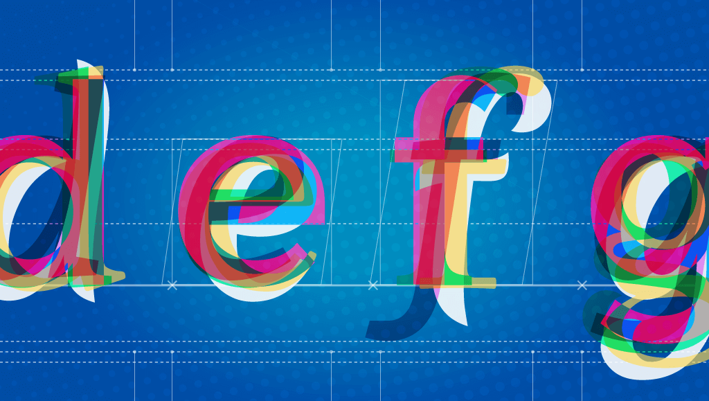
Typefaces are basically drawings. A group of drawings (a system of shapes) representing structures that make the pieces of a code we all share. This code is the graphic form of our language. Language is engraved in our heads that when we are in front of these shapes, we cannot help to automatically decode letters, words and paragraphs. 

If we can understand the language it is typed in, there’s no way we can override the “meaning” detector. We don’t see drawings, we see words. And even if we do not know the language it will still use the Latin alphabet as the base so we will recognize the glyphs. Moreover, with other scripts we will still get the sense that “those are letters.. this is probably text”.

But this experience of getting further away from the language you know does help to prove the point: if you look at cyrillic script (e.g. Russian), you will recognize some glyphs as the letters you know, but others start to look weird, they might as well be icons (is that a chair maybe?). Let alone logographic scripts, like Kanji.

Style

So all of the above can hint at the fact that even if language and meaning come first (and that’s even a policy we can adopt for text display when developing), the perceived shapes, their style, page layout and block layouts all leave an impression on the page and in our minds. This is more obvious in the case of pictures or illustrations, as they are not hard-linked to language like the alphabet; Fonts are more ornate or illustrated type (usually for display sizes). When we look at those, the effect of the style becomes more apparent: it could be antique, retro, industrial, geometric,modern, hand-made vs. machine or digital.

In the case of text typefaces, there’s a sense of heritage that comes from their design. There’s a standard classification of type that groups the different styles by their characteristics, and often these groups represent a time in which their first specimens were created. This means you have the legacy of 15th thru 20th centuries, with all of the different stages within them.

This classification also reveals the differences that arise from the technological medium by which they were designed, and the closest or farthest they are to some original calligraphic form.

(refer to more fonts here

Hands-on

Now that we’ve come this far, I hope you won’t take the decisions that go behind a copy layout and its effects on your site or app so lightly! Remember that despite all webfonts being produced digitally, they are still mimicking the way they were produced back in the day, and they follow the tradition of typographers. New type designs with any number of features are coming out of the digital type foundries as you read this. But when it comes to text fonts they will all fall into some of the categories of the classification.

Bear in mind that text layout, in terms of leading (vertical space between lines of text), tracking (space between letters), and overall the type size and extension chosen will also affect the impression the block gives in addition to the type design itself.

So, let’s not miss the opportunity - utilize this huge toolset and let’s add a layer of meaning behind the literality.

Categories
Tags
Author

With the advent of high resolution “retina” displays, keeping bitmap images sharp and crisp on the web has meant using larger and thus more bandwidth-hungry images. At the same time, more and more people are browsing on mobile devices where bandwidth is at a premium.

One solution to this problem is scalable vector graphics (SVG) since they scale infinitely while keeping the file size low. However, now that web fonts are widely supported, symbol fonts like Dingbats or WebDings provide another option for tack sharp symbols used in icons or buttons. Fonts are also very flexible. For example, using CSS you can easily change the size, color, add drop shadows or other text effects.

But what happens when symbol typefaces don’t have the symbols you need? Well, make your own of course! Today I am going to show you how make your own symbol font using some freely available software and tools, which you can then easily embed in a web page and use in your design comps.

Here are a few things you will need before we get started:

  • Some SVG files - you will need some SVG symbols to embed in your font. I’ve included a zip file here with a few symbols to get you started. If you need more, the noun project is a great resource.
  • Adobe Illustrator - for preparing your SVG files (if you grab the ones I have included above, you can skip this step)
  • Inkscape - this is an open source vector drawing tool. It’s available for Windows or OS X. This tutorial will be showing the Mac version, but the Windows steps are almost identical.
  • The starter font file - download this blank font file from Github to use as your starting point.

Step 0: Prepare your SVG files in Illustrator

If you grabbed my sample SVG files you can skip this step, but if you are using your own vector images you will probably need to run them through Illustrator first. First, open your vector image and select it. Then from the menu select Object -> Compound Path -> Make. Finally, select File -> Save As for format select SVG (svg) and then save it somewhere you can easily find it. An SVG Options window will popup, just leave the default options and click OK.

Step 1: Get Inkscape ready

Open the starter font file in Inkscape. Go ahead and save it with a new name, I’m calling mine awesomesauce.svg. Next, from the Text menu, select SVG Font Editor. This will enable the font editor pallet on the right side. Your window should look like this:

Step 2: Font family name

In the SVG Font Editor on the right hand side of the window click on font 1 so it is highlighted. Then, in the Family Name text box, give your font family a name. Again, I’m using awesomesauce.

Step 3: Import a symbol

Now it’s time to add the first symbol to our font. From the File menu, select Import. Select the svg file you want to add to your font. I’m going to select intridea.svg (what symbol font would be complete without the Intridea logo?).

Step 4: Size the symbol

Now we need to size the symbol. It’s good to keep all your glyphs a similar size. Experimenting has shown me that keeping them about 750px high in Inkscape will keep them roughly the same height as a capital letter. In the top tool bar, click the Lock icon to lock the aspect ratio and manually enter the hight as 750px.

Step 5: Position your symbol

Positioning the symbol is also very important. Move the symbol to the bottom of the work area. You can do this easily by entering 0px in the Y box on the toolbar. Then, center the symbol (you should see a centered guide line to help you, and you can use the arrow keys for minute adjustments). Once you have it sized and positioned properly, it should look like this:

Step 6: Add a symbol

Now it’s time to add the symbol to your font. Make sure the symbol is selected by clicking on it (it should have a box around it). Over in the SVG Font Editor palette, click on font 1 then click the Glyphs tab. Then, select glyph 1 a so it is highlighted and finally, click the Get Curves from selection button. This will assign that shape to the selected glyph. In this example, the lower case a.

Step 7: Test your font

You can test if it worked by entering a lower case a into the Preview Text window. If it worked, you should see the Intridea logo in the preview area!

Step 8: Rinse and Repeat

If you are happy with your symbol you added, delete it from your work area and repeat steps 3 through 7 adding each symbol to a different glyph. When you are done, save your file and head to step 9.

Step 9: Convert to a TrueType Font

Next we need to convert this to a usable font. So head to http://www.freefontconverter.com/. Click the Chose File button and browse for your file you saved in step 8. From the Select a format to convert to: select ttf(TrueType) and click the Convert button. Your browser should download your new font file.

Step 10: Generate a @font-face kit

In this step we will generate a font-face kit that is compatible with almost all browsers. The downloadable kit features great instructions on using your font on the web. Head on over to the Font Squirrel font-face generator. Click the Add fonts button and select your TrueType font from step 9. Select the Optimal setting, agree to their terms and click Download Your Kit.

You did it!

Open up the folder you downloaded in step 10. In the folder, you should see a .ttf TrueType font. In my case, it’s called awesomesauce-webfont.ttf. Double click it to open the font and install it. Now your font is available anywhere in your OS to use in your design comps!

In the folder you will find an HTML demo file from Font Squirrel. In my example, it is called awesomesauceRegular-demo.html. Open this file in a browser. It will show your font as well as provide instructions on embedding your font in a web page. Also, be sure to check out Pictos for some more info on using icon fonts.

Categories
Author
1
Subscribe to Fonts