
Mobomo webinars-now on demand! | learn more.

argument-open-source

The Vega Digital Awards has released their 2020 Season 2 winners and Mobomo has proudly won three different awards:

  • Centauri Award for NOAA Fisheries under the Science Website category
  • Arcturus for NOAA Fisheries under the Government Website category
  • Arcturus for the PRAC Pandemic Oversight work under the Government Website category

The Vega Digital Awards recognizes and honors digital content creators worldwide for their exemplary talents and creative minds. These awards are open to all, no matter the affiliations or experience of the creators. To evaluate the entries, a panel of experienced judges evaluates and critiques each entry, providing a rating on a scale of 100.

Mobomo is honored and proud to receive these three awards. We know how hard the two teams have worked from researching, designing and developing both the fisheries.noaa.gov and pandemicoversight.gov sites. Our hats go off to them and thank each and every team member for their dedication to the project and to the clients’ overall happiness with the work we’re conducting.


More about these projects:  
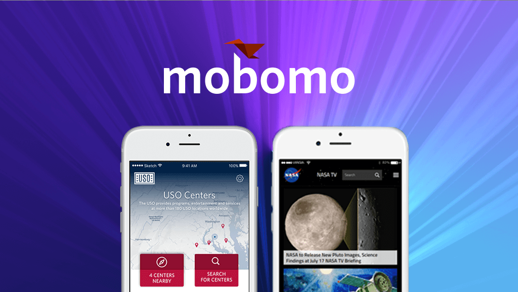
NOAA Fisheries:

The National Oceanic and Atmospheric Administration (NOAA) Fisheries, also known as the NOAA National Marine Fisheries Service (NMFS), is a federal agency responsible for the stewardship of the nation’s ocean resources and their habitat. Their services include: conservation and management of U.S. waters to promote prevention of overfishing, declining species, and degraded habitats. NOAA Fisheries manages five coastal regions broken down by department, fisheries management, science centers, and labs. Each office ran their own independent site creating inconsistency and overlap in content and design as each isolated digital property.

Mobomo partnered with NOAA Fisheries to assist in restructuring and redesigning their digital presence. Merging all their core web properties into one Drupal site allowed users to go to one destination to find and discover information they need. Mobomo focused on improving content efficiency, design consistency, and unifying NOAA Fisheries voice. Mobomo followed a user-centered approach that consisted of discovery, research, design, and validation phases to deliver a comprehensive, documented and validated user-centered design and information architecture that unified the 16 previously disparate web properties into one site.

Within one year, we launched the framework for their next generation site.

The NOAA Fisheries site is more than a conveyor of marine life information and research. It offers a large variety of information; from summaries of upcoming rules, permits, funding opportunities, to various types of helpful resources. Each section had its own challenges for the Mobomo team to learn and develop automated solutions around. The goal was to automate and simplify the content for users to locate, as well as for editors to post and manage.


The PRAC:

In 2020 the Coronavirus reached the United States calling for the development and passing of the Coronavirus Aid, Relief and Economic Security Act (CARES Act). To help inform the public of the spending provided by the CARES Act, the PRAC (Pandemic Response Accountability Committee) and Mobomo teams launched PandemicOversight.gov. The overarching goal of this site is to promote transparency for the government’s spending in response to COVID-19 by displaying the details of who received the $2.6 trillion relief and how they will be spending it. The site also provides helpful resources for reporting fraud and funding abuse.

Mobomo’s objective was to redesign, develop and deploy a new website for the PRAC built using a Drupal content management system (CMS) and deployed into the Microsoft Azure cloud. The website needed to support displaying interactive graphics for showcasing Coronavirus relief funding, as well as various government reports surrounding pandemic response and instances of fraud, abuse and mismanagement of relief funding. Due to resource circumstances, the new website had only a 5-week timeframe for redesign, develop and deployment of the new website.

Within the tight turnaround, Mobomo successfully launched the new site. The layout was designed using Mobomo’s human-centered design process. This resulted in a modern and clean look that is easy for viewers to use and understand the data and funding information provided.

Categories
Author

The 13th Annual W3 Awards were just announced and two Mobomo projects were selected by The Academy of Interactive and Visual Arts as Silver winners! We are honored that The USO was selected in the mobile app category and www.NASA.gov was selected as a government winner in the web category. These awards celebrate digital excellence by honoring outstanding Websites, Web Marketing, Video, Mobile Sites/Apps & Social content created by some of the best interactive agencies, designers, and creators worldwide. These awards are also the first major competition that is accessible to companies of all sizes, from Fortune 500 companies to small startups.

The USO

Mobomo was able to recognize the USO and the mobile application that we partnered with them to create. This application fosters greater discoverability of locations where USO provides services and programs offered by the USO through its distributed locations and online. Prior to the discovery phase, USO was seeking to design, develop, and deploy a cross-platform mobile application that introduced an additional channel for the United States military service members and their families to better engage with USO centers and programs. Currently, there are 200+ USO locations that all create their own content. We were able to pull the CMS data and integrate it into the app so that the service member receives the content from the service center that they are physically at or that is most adjacent to them.

NASA

In addition, Mobomo also entered www.NASA.gov under the government category. In 2013, our team migrated www.NASA.gov —a site with over 250,000+ pages, 1.4 million assets, and 3 TBs of data—from a proprietary data center and content management system (CMS) to Amazon Cloud and Drupal 7 without downtime or service interruption. This was a colossal task: Mobomo completed the entire effort in just 13 weeks. The results were so colossal, in fact, that www.NASA.gov has won a multiple, highly coveted Webby Awards. Mobomo has continued to work with NASA in order to create a dynamic, user-centric, mobile-first site that simplifies the experience for every visitor. We can’t wait to see what the future holds for www.NASA.gov!

Categories
Author

Orion_Service_Module

At 7:05am EST today, the world watched as NASA released its unmanned spacecraft, Orion, into the ether. With Captain Kirk (in doll form) at the helm, the massive capsule soared from Cape Canaveral with countless hopes attached. This new spaceship was built with one goal in mind: deep space exploration.

Orion’s 4.5 hour flight test was a critical step toward eventual near-Earth asteroid excursions, trips around the moon, and--most significantly--manned missions to Mars. That's right: with the success of Orion's launch would come “the beginning of the Mars era,” as NASA Administrator, Charles Bolden, remarked before blastoff.

And succeed it did! Completing two orbits and going farther than all rockets designed to carry astronauts have in the past four decades, Orion passed with flying colors, and landed in the Pacific Ocean at 11:29 this morning. Our biggest congratulations to NASA on an incredibly successful flight test! Mobomo is proud to be part of the team supporting NASA.gov.

Categories
Author

As someone who deals with the digital presentation layer from day-to-day, being limited to the screen creatively can be…well… limiting. Don't get me wrong, I love designing apps and interfaces but sometimes it feels good to make something with your hands, ya know? To feel the fruit of your labors in your hands, to interact with them, share them, and most importantly to learn from the process of making them. Which brings me here, the open-source backpack—a simple sewing pattern that can be used as a springboard for making your own kick-ass rucksack.

Over the coming months I'll be travelling quite a bit and need a good bag. If all goes as planned, I'll be visiting family, attending the Smashing Magazine conference in Germany, co-working with friends in San Francisco, seeing the American Northwest and blogging along the way. That in mind, having something sturdy, comfortable, and stylish to carry my life in is so necessary. Rather than purchasing another Air Force-1 by DQM x SAGLIFE, I decided to make one using the skills I developed in the sewing classes I took this summer.

Sewing you say? Wait, aren't you a UI designer? Yes, yes I am and I can whip up a pair of trousers, hem a shirt and make backpacks. Okay, neato, so then why are you posting this on a blog that's typically focused on tech? Simple—because I want to share how I was able to produce this using techiniques I've honed as a UI designer. I'm also sharing it because I believe it's important for "creatives" to work in mediums that are vastly different from one another. Being proficient in multiple areas not only allows you to make some pretty neat stuff, it also gives you the ability to solve problems from a varieity of directions.

OS Bag - Alpha

Like any good designer, I started by defining some base requirements:

  • Capable of carrying at least a week's worth of clothing
  • A built-in pocket for my laptop
  • Side access zipper to easily access stuff
  • Comfort, durable and stylish (of course)

Once my requirements had been established, I did a bit of competitive analysis to see what others were doing. Since I already had a good idea of what I wanted, something similar to my old bag, the Air Force-1, I was able to just pick the things I liked and drop that which was out of my ability or scope in order to achieve the MVP (minimum viable product).

Next came some napkin sketches so I opened up Paper, the kick-ass iPad drawing app, and threw down some very rough ideas.

Afterwards it was time to come up with the architecture for the bag or it's wireframe. Rather than creating a traditional pattern, which I don't really know how to do, I laid out a template with all the pieces as if I were putting it together in the same way that we do with our high-fidelity wireframes. Pockets on top of panels, straps next to back supports—this really helped me to visualize the end product and think about how to approach the construction of the components, such as the laptop pocket, the interior pockets, side zipper, and straps.

Then it was onto building my first prototype. In a very agile fashion, I built in sprints and tackled each part of the bag individually, starting with the straps because they were the most complicated. The alpha was produced using an inexpensive material, muslin, which allowed me to quickly and efficiently try things out without concern for budget—tactile throw-away code.

With the alpha complete, I shared it with friends for user feedback and found that my dimensions didn't accomodate all users, particularly those who were shorther than me. The solution would have been to revisit the measurements and strap placement, which, given my schedule wasn't feasible. So I opted for a more custom experience and decided to factor these users in at a later date.

OS Bag - Beta

With my alpha complete it was time to get real and build a production version. I began by gathering all the materials, assembling them into components, attaching the components to their parent structures, and finally tying it all together in a final build.

It wasn't all ponies and rainbows—I broke a lot of needles, stitched through my finger and struggled with a machine that wasn't quite strong enough in some situations. But I made due, sacrificed when I needed to and finished with a complete working product in the end.

It's striking how similar the design and production process of the backpack was to designing and producing web applications. I was able to apply many of the practices I use every day at Intridea - like rapid prototyping, agile design and iterative development.


Categories
Author

Velocity Conf knocked my socks off. This was my first O’Reilly conference and I can really see what the hub-bub is all about. Velocity was host to many top industry pioneers like the dudes from Etsy who created StatsD, Mitchell Hashimoto who works on Vagrant, and reps from Opera, Mozilla, and Google, among other big names.

The conference was split into a venn-diagram of operations, development, and devops, so it was easy to experience talks that were on the fringes of most attendees’ skillsets. Being mostly into development and UX, the web performance track was my home turf. However, I did learn some operations stuff that helps me level up beyond just being able to scale up my meager home NAS server. Many of the pure operations talks had to do with visualization of systems; it was nice to hear the discussion involve many HCI principles that we use on the Intridea UX team on a day to day basis.

There was so much material on the web performance side of things that I could go on for days about it, but I’ll just share a few of my favorite tips from Velocity for this debriefing. I often see front-end developers and engineers struggle with exactly how to measure and address web performance issues, and many of the Velocity presenters covered ways to effectively optimize page load; and yes, image compression was one of those things mentioned.

DOMinate the Document Object Model

Ok, so let’s think about DOM render, it happens serially right? That means that we have to make sure we don’t structure our markup in a way that would severely block the “thread” when loading. Modern browsers have implemented work-arounds like "speculative loading” to download resources while still parsing the rest of the DOM. This is all well and good, but speculative loading will still fail if we have any inline script tags that use document.write() to append markup to the document. This would be a sure-fire way to block the DOM. Not all document.write() is entirely evil, but one should definitely be wary of it.

Something cool that Chrome for Android is doing is spinning up multiple processes when loading a document so it’s likely that true concurrent DOM render is probably coming in the near future. The faster a user sees browser paint (elements on the screen), the faster they will believe the page is loading. You never want to give them the “white screen of death”.

Optimization for Mobile

With responsive design all the rage (and with good reason), there are special considerations to make to optimize for multiple devices. Jason Grigsby drilled down into this at Velocity in his talk “Performance Implications of Responsive Design”. We obviously want to limit the size of any asset on a mobile device if necessary, but the W3C spec still needs to catch up with an image tag that allows multiple sources for multiple breakpoints. Until then, we have this:

Picturefill, a JS lib that allows us to specify multiple images with data attributes. In my opinion, the current landscape of responsive design feels very much like back when CSS and semantic markup had become en vogue. Browsers and W3C spec will need to catch up, and until then we will have to put some hacks in place to heighten the UX.

Tools

Now for the tools…

The W3C now has a couple of recommendations in the works for Timing APIs to measure a slew of attributes surrounding page speed. They are super easy to use too, all you need to do to leverage is:

window.performance

…and BAMMO, you’ve got yourself an interface in which you can piece together just about any metric for page load, memory allocation, etc. that you want.

If you just want to get a good rundown of these metrics, but don’t want to build it yourself, then use the PageSpeed Critical Path tool, a project headed by Bryan McQuade at Google. Bryan, Patrick Meenan, Dallas Marlow, and Steven Souders went over the tool in depth at Velocity, and you can see their presentation here.

A Stronger, Faster Web

Velocity’s theme is centered around “Building a Faster and Stronger Web.” What amazes me is that after leaving the conference I already feel more confident in my ability to begin building a faster, strong web.

Velocity was a conference that didn’t disappoint. It wasn’t a dull offering of overdone presentation topics and speakers – it actually offered interesting panels and presentations on a variety of really engaging topics, all centered around that single theme. I’m looking forward to heading back next year and learning what it will be like building the web in 2013!

Categories
Author

With the advent of high resolution “retina” displays, keeping bitmap images sharp and crisp on the web has meant using larger and thus more bandwidth-hungry images. At the same time, more and more people are browsing on mobile devices where bandwidth is at a premium.

One solution to this problem is scalable vector graphics (SVG) since they scale infinitely while keeping the file size low. However, now that web fonts are widely supported, symbol fonts like Dingbats or WebDings provide another option for tack sharp symbols used in icons or buttons. Fonts are also very flexible. For example, using CSS you can easily change the size, color, add drop shadows or other text effects.

But what happens when symbol typefaces don’t have the symbols you need? Well, make your own of course! Today I am going to show you how make your own symbol font using some freely available software and tools, which you can then easily embed in a web page and use in your design comps.

Here are a few things you will need before we get started:

  • Some SVG files - you will need some SVG symbols to embed in your font. I’ve included a zip file here with a few symbols to get you started. If you need more, the noun project is a great resource.
  • Adobe Illustrator - for preparing your SVG files (if you grab the ones I have included above, you can skip this step)
  • Inkscape - this is an open source vector drawing tool. It’s available for Windows or OS X. This tutorial will be showing the Mac version, but the Windows steps are almost identical.
  • The starter font file - download this blank font file from Github to use as your starting point.

Step 0: Prepare your SVG files in Illustrator

If you grabbed my sample SVG files you can skip this step, but if you are using your own vector images you will probably need to run them through Illustrator first. First, open your vector image and select it. Then from the menu select Object -> Compound Path -> Make. Finally, select File -> Save As for format select SVG (svg) and then save it somewhere you can easily find it. An SVG Options window will popup, just leave the default options and click OK.

Step 1: Get Inkscape ready

Open the starter font file in Inkscape. Go ahead and save it with a new name, I’m calling mine awesomesauce.svg. Next, from the Text menu, select SVG Font Editor. This will enable the font editor pallet on the right side. Your window should look like this:

Step 2: Font family name

In the SVG Font Editor on the right hand side of the window click on font 1 so it is highlighted. Then, in the Family Name text box, give your font family a name. Again, I’m using awesomesauce.

Step 3: Import a symbol

Now it’s time to add the first symbol to our font. From the File menu, select Import. Select the svg file you want to add to your font. I’m going to select intridea.svg (what symbol font would be complete without the Intridea logo?).

Step 4: Size the symbol

Now we need to size the symbol. It’s good to keep all your glyphs a similar size. Experimenting has shown me that keeping them about 750px high in Inkscape will keep them roughly the same height as a capital letter. In the top tool bar, click the Lock icon to lock the aspect ratio and manually enter the hight as 750px.

Step 5: Position your symbol

Positioning the symbol is also very important. Move the symbol to the bottom of the work area. You can do this easily by entering 0px in the Y box on the toolbar. Then, center the symbol (you should see a centered guide line to help you, and you can use the arrow keys for minute adjustments). Once you have it sized and positioned properly, it should look like this:

Step 6: Add a symbol

Now it’s time to add the symbol to your font. Make sure the symbol is selected by clicking on it (it should have a box around it). Over in the SVG Font Editor palette, click on font 1 then click the Glyphs tab. Then, select glyph 1 a so it is highlighted and finally, click the Get Curves from selection button. This will assign that shape to the selected glyph. In this example, the lower case a.

Step 7: Test your font

You can test if it worked by entering a lower case a into the Preview Text window. If it worked, you should see the Intridea logo in the preview area!

Step 8: Rinse and Repeat

If you are happy with your symbol you added, delete it from your work area and repeat steps 3 through 7 adding each symbol to a different glyph. When you are done, save your file and head to step 9.

Step 9: Convert to a TrueType Font

Next we need to convert this to a usable font. So head to http://www.freefontconverter.com/. Click the Chose File button and browse for your file you saved in step 8. From the Select a format to convert to: select ttf(TrueType) and click the Convert button. Your browser should download your new font file.

Step 10: Generate a @font-face kit

In this step we will generate a font-face kit that is compatible with almost all browsers. The downloadable kit features great instructions on using your font on the web. Head on over to the Font Squirrel font-face generator. Click the Add fonts button and select your TrueType font from step 9. Select the Optimal setting, agree to their terms and click Download Your Kit.

You did it!

Open up the folder you downloaded in step 10. In the folder, you should see a .ttf TrueType font. In my case, it’s called awesomesauce-webfont.ttf. Double click it to open the font and install it. Now your font is available anywhere in your OS to use in your design comps!

In the folder you will find an HTML demo file from Font Squirrel. In my example, it is called awesomesauceRegular-demo.html. Open this file in a browser. It will show your font as well as provide instructions on embedding your font in a web page. Also, be sure to check out Pictos for some more info on using icon fonts.

Categories
Author

Neil McAllister recently wrote a piece on InfoWorld entitled The Case Against Web Apps. In it, he outlines “Five reasons why Web-based development might not be the best choice for your enterprise.” Obviously, as an employee of a web application services and products company, I disagree strongly with that opinion.

Web applications are not a “trend” in enterprise software development. They represent a fundamental shift in how software is developed, implemented and used in today’s technological climate. But to be specific, let’s go point-by-point through the “case against web apps.”

“It’s client-server all over again”

It certainly is. The difference is, we’re not living in a mainframe, dumb-terminal world anymore. Server infrastructure is cheap and scalable, and as more enterprises push their IT infrastructure to the cloud (see another article from InfoWorld: IT needs to get over its cloud denial, or management will get over IT) the need for on-site datacenters will shrink and, for many companies, eventually disappear.

Web applications require no client deployment, no versioning, no installation and no machine-by-machine support. There’s no massive rollout procedure for a new version and no back-breaking process if there’s a small but important glitch in a major release.

“Web UIs are a mess”

When each project has specific and individual user experience needs, isn’t it good to reinvent the wheel a little bit? Having a blank canvas means having the chance to build exactly what is right for this application, not shoehorning an application into pre-defined constraints.

Bad web sites and bad desktop application interfaces are equally impenetrable to the average user. The success of the user experience lies not in the hands of the chosen deployment platform but in the hands of a developer with an eye for user experience. I don’t think it’s a stretch to posit that the majority of such developers work either on web applications or for Apple. When was the last time you saw a beautiful Visual Basic application interface?

“Browser technologies are too limiting.”

“User interface code written in such languages as C++, Objective C, or Python can often be both more efficient and more maintainable than code written for the Web paradigm.” This statement rings false to me; when was the last time you saw a graphic designer who could pop open his trusty Visual Studio 2008 and recompile a project to tweak the user interface? The fundamental advantage of HTML/CSS/Javascript based interface development is that is accessible to a wholly different set of people, people who understand how users think and want to behave but don’t necessarily have the programming chops to implement the actual code.

The proliferation of Flash, Quicktime, and Silverlight can pretty much all be explained by one fact: HTML doesn’t support embedded video. Few web developers turn to Flash or other technologies for much outside of rich multimedia playing. You also can’t consider such a tool a liability when it is available for more than 99% of all web users.

This also brings up a fundamental flaw in “the case against web apps”: if this is an article talking about using web applications for enterprise business applications, how are any of the concerns about browser compatibility valid? Don’t most enterprises have control over what browsers get used by their employees? The refusal of Internet Explorer 6 to kick the bucket certainly seems to indicate that companies have a great deal of control over how employees access the internet.

“The big vendors call the shots.”

Is this untrue of any development platform short of Linux? Companies are at the whim of Microsoft when they released an in-many-cases incompatible, largely disparaged upgrade to their operating system with Vista. That’s much more of a moving target than the web standards, which with the exception of Internet Explorer (another Microsoft project) make writing cross-browser, cross-operating system applications a relative ease.

“Should every employee have a browser?”

You know what? Lots of people e-mail jokes to their families from their work accounts, let’s not allow people to write e-mails anymore. I heard that sometimes people make personal calls from the office, so let’s get rid of the phones, too. Not only is this point inherently distrustful of the work ethic and general competency of most employees, it doesn’t even hold water: browsers can be used to access internal applications even if all outside internet access is restricted.

In the end, I may have spent too much time here refuting his arguments without making the real case for web applications. So, very briefly, here’s it is:

  1. Massively Agile: Web applications can be built, deployed, and put into general use in a matter of weeks, not months or years. New features can be rolled out on a continuous basis rather than waiting a year for a new “point release.”
  2. Massively Accessible: Web applications can be accessed from any device that can access the internet, regardless of operating system or system requirements. As mobile phones become more web capable this becomes even more apparent and necessary. Desktop applications require completely separate development efforts.
  3. The Local Data Problem: There’s no need for “shared” folders and collision control on documents in a web application. Everything is on the server, everything is up-to-date as soon as it is accessed.
  4. Web is the new Desktop: Technologies such as Adobe AIR and site-specific browsers have made it so that web applications are becoming more and more like desktop applications, bringing the ease of development and deployment with them.
  5. Collaboration is King: Web applications, due to their centralized nature, can naturally encourage less isolated, more collaborative work between employees.

Web applications aren’t the solution to every problem a business faces. If you need graphically intense 3D visualizations for your buciness, web applications probably aren’t the way to go for you. But for most businesses, most of the time, web applications will be more cost-effective, more useful and more agile than the alternative.

Categories
Author
1
Subscribe to Web