Mobomo webinars-now on demand! | learn more.

There is nothing more annoying or frustrating when you are a tourist or behind a tourist using our unbeloved, outdated ticket machines. This mammoth pay station from the 70’s is far from simple, don’t let the 3 “simple” steps fool you. When you have a moment, watch people straining to read the fares, attempting to read the screen or even guess where to start when trying to get a metro pass. This machine is not friendly to small individuals, handicap, or people that speak English as their second or third language.

Unlike DC, today's global cities like Paris, New Dehli, Rome, Tokyo, London, and New York all use touch screen vending machines to purchase metro tickets. This allows the person to push updates easier, target machine issues, accommodate different languages, and provide a familiar use of the digital generation.

Why didn’t we already do this? Instead of rolling out new machines that are up-to-date with the digital era we live in, the DC Metro has been forcing their new technology into a past old broken systems. As a result, you are waiting behind a lost tourist, a local tweeting about a broken machine, or missing your train because you can’t load your card fast enough... It's time to unsuck our ticket vending machine.
Question is.. Who Rides the Metro?

Locals
These are the 658,000 D.C. residents that are using the metro as a way of travel to get around the city. They are constantly reloading their SmartTrip cards since they take the bus as well and more likely to purchase a monthly pass.

Daily Commuters These are the 129,000 commuters that come from the DMV area Monday through Friday. They are using the metro as their primary travel going to and from work. They are reloading their cards with large values in hopes of not needing to reload their cards as frequently. This group of metro riders are interested in monthly passes.


Occasional Riders
This group is a mixture of DMV commuters and visitors that have taken the metro on special occasions. They are not likely to know what the balance is on their card, or placing just enough money needed.

Tourists These are the 20 million domestic and international travelers that come to visit Washington, D.C. each year. These visitors are using the metro for one trip, round trip, one day, or even one week. They care more about where they are going and how much but this is for the short term since they are visiting versus the folks that live in the area.

How Might We:
Create a faster reload time for the daily commuter?
Check your balance quickly with no hassle?
Allow to purchase daily, weekly, and monthly passes?
Make the checkout process quicker?
Able it to translate into different languages?
Help tourist figure out the value they need on their card?
Build a machine that is handicap assessable?
Make the payment process easier to understand?

Seeking inspiration from around the world... any suggestions??? 


Categories
Author

womenCode - Article image

A mobile strategy is no longer a “nice to have”, while laptops and desktops are the most common device used to search the Internet mobile has proven that it is quickly closing that gap. Did you know that the majority of Americans will use a mobile phone for search next year and that phones will overtake desktop and laptop use for search within two years.

In case you missed it.. We were given the opportunity to speak on mobile strategy for the AddThis webinar. Be sure to watch our mobile strategy webinar to know how to best develop your mobile strategy.

Categories
Author

womenCode - Article image

It is no secret that the tech industry is heavily saturated with males. It has been fascinating to read recent studies on females in the industry as well as the success females have had coding. It is common to see female presence as graphic designers but not necessarily as developers, I never grew up aspiring to be a developer, it just happened over time.

Since I was a kid I remember my art teachers saying that I should pursue a career in visual arts, more specifically they told me to follow more of a commercial career. I loved to write, mostly poetry, so graphic design for me was a perfect combination of words + graphics, both things I truly love. I pursued my passion and graduated college as a graphic designer, and since then I've "converted" into a front-end developer.

I was not trained to be a front-end developer but I started to code my own projects because it was tiring as a designer to have developers change the vision I had of my layouts. I have been coding for the past 15 years and wouldn’t imagine going back to a designers position. I just prayed that the programming would respect the original look and feel... Which wasn't the case very often! I think my success has been in part due to my attention to detail, or at least that's what my bosses over the years have told me. I think it's by human nature that women have a sense of detail that most of the male population do not have, nor do they pay attention to it, that is why female developers have high success writing code.

What are your thoughts on women who code?

Categories
Author

mobileStrat - Article image

As the advancements of technology continue to change, communication is always evolving into different platforms. The first cell phone call was made on April 3, 1973, over the course of the past forty years the amount of technological advancements that have been made to improve how we communicate make 1973 feel like the Roman Empire. To put things into perspective, the first mobile phone was sold in the U.S in 1983 for almost $4,000 each.  As history has proven, technological developments have rapidly occurred and it doesn't seem to be slowing down anytime in the near future.

Everyone seems to be on their phone, it is a singular point where everyone can gather information as well as communicate in a more convenient way, who wouldn't use the mobile platform?There is no question that mobile is taking over, people are more likely to use their mobile device first because it has become them most convenient way to communicate and find information. Nowadays who do you know that doesn’t have a mobile device? Statistics show that mobile has outgrown PC usage which shows how quickly the market has changed over the past ten years let alone forty years. I think almost everyone can relate, people use their phones to communicate and it seems like verbal communication is a thing of the past.

Enough about market change through the years. So what does this mean for businesses trying to attract the mobile customer? It means that you have to have a mobile strategy. We will be going over the how’s and why’s as to your mobile strategy this Thursday make sure to RSVP and join us at the following link  Mobile Strategy AddThis Webinar.

Categories
Author

rapid-app-ux-prototyping-development

Establishing Need

For the purposes of this post we will be focusing on a new native mobile app development project.

At the beginning of many projects, the customer often is looking for a new user experience (UX) for their application, but often truly don’t know exactly what they may be looking for. That’s why there are many tools and processes utilized in combination during what we often call the kickoff phase of a new project. These include, but certainly not limited to:

All of these tools and processes help the product owner and engineers establish direction for UX and UI design. From here UX flows, stories, and wireframes are created based on the established needs. Communicating this flow to clients and/or designers, however, can be challenging in some cases. Creating UX flow diagrams, documents stepping through wireframe screens, and manual walkthroughs can be effective, but also at times fall short of truly communicating the experience intended by the team. This is a critical comprehension needed for the long-term success and perceived user happiness with the project.

This is where rapid prototyping can assist.

Purpose

The ability to actively see and engage with a mock application can potentially be invaluable. Think of it like a window into the future of the application that a user can engage. Rapid prototyping provides several benefits to the communication and comprehension of a designed application UX. This engagement can provide solutions to questions not even discovered yet or equally uncover weaknesses and strengths of the design.

The experience of creating the links or interactions between the screens and elements following the designed UX flow can also be an exploratory session for the designer/engineer. It can help clear up issues such as form fatigue, menu fatigue, form handling, menus buried, etc. The value of this exercise can be invaluable in time-savings and quality assurance of the UX.

Tools Utilized

There are a plethora of tools available out there in the world of design for wireframing, design, and prototyping. For this post we’ll focus on two of these tools.

Sketchup 3

Sketchup is a powerful design application for Mac OS. It offers a host of streamlined features supporting initial wireframe development all the way through hi-fidelity design mockups. Honestly Sketchup is a whole topic in itself so we will just hone in on the features applicable to image creation.

InvisionApp

Invision is a simple, straightforward web-based prototyping application that has a free option for anyone to use. The interface is clean, well-organized with drag and drop features to create and navigate rapid prototypes. These prototypes can be simple or complex in their animations and organization. The important features here include:

Content Creation

To create screens for a prototype, simply select an artboard from the left hand menu in the interface. Once highlighted, export options are available from the right interface menu at the bottom to export as a single PNG. This will create a screen to be used in the prototype.

A prototype in Invision can also now utilize overlays and elements. This means that things like menus, dropdowns, overlays, help bubbles, etc. can be utilized in the prototype to enhance and communicate the UX. To create an element in Sketch, all layers need be organized into a group. Highlighting the group, the user can follow the same steps above in creating a PNG, or other format, image to be used in the prototype.

Once all screens and elements have been exported into a folder, they can then be uploaded into InvisionApp.

Prototype Setup

Once Invision has been accessed, the user can create a new project. For this post again we’ll be focusing on a mobile platform. From here the user can then import images by drag-and-drop into Invision. Organize the order of the screens however designed and click on the first to begin editing.

Tutorials are available in Invision on how to create interface interactions, where they link to or their function, and transitions desired between all of these screens/elements. The complexity or simplicity of this UX being created in the prototype really depends on the current stage of the project and fidelity of the intended experience. For early prototypes we like to focus on simple transitions to not distract from the UX flow. Rapid prototypes are now possible in a short amount of time.

Once the prototype is established and reviewed by the team, it can then be shared with the intended user(s), whether stakeholders, designers, and/or product owner.

Utilization

Invision provides a very useful feature set with a link to the prototype. For mobile, the link is prompted to be saved to the user’s dashboard as a mock app. This allows the user to open the prototype as the UX of the application intends in most cases. From here the app prototype will respond to input from the user, who now has a functioning UX/UI combination at their fingertips.

The user then has a window into the actual flow of the application being designed.

Summary

Categories
Author


javascript-graphicJavaScript is a real language and it was during my first job as a Salesforce Developer that I was able to start learning the “language.” I remember adding a script on a visual force page and selecting elements while using classes. Not the best practice... but it was my first encounter with the language and I knew that it would take time to truly understand the fundamentals. At the time I didn't imagine the capabilities of the technology and how it was going to evolve and improve the way that we surf the web.
In the sense of paradigms I would say that I started writing JS code in the Imperative way, just defining functions and encapsulating logic to then use all those gears on a single purpose: fire a function onclick to show a modal window. Wow! Really impressive right? Just kidding.

[javascript]function sayMyName() {
alert(“You’re Heisenberg”);
}
document.getElementById("my_button").onclick = sayMyName;[/javascript]

At the same time during my first job I started attending classes at the university and in one of my classes, “Programming 2” we started to learn the famous: Object Oriented Programming, and then I started to implement this knowledge in my daily front-end work. I was able to think more on the responsibility that an object needs to have and the context where that object is going to hangout.

(function() {
"use strict";
var Heisenberg = function() {
this.name = ‘Heisenberg’;
}
Heisenberg.prototype.sayMyName = function() {
alert(“You’re ” + this.name);
};
document.getElementById("my_button").addEventListener("click", function(e) {
var heisenberg = new Heisenberg();
heisenberg.sayMyName();
});
}());

Of course the object-oriented paradigm is much easier to understand than the imperative one, and it’s also more modular.

But then I discovered a new way of thinking about my JS code: the functional way. This doesn’t mean that object-oriented is better or worse, but it’s another way of tackle situations. Let's see:


This solution looks shorter, because I am only using two functions (besides I have added a static return value on the getName function). You don’t need to forget everything you know to take advantage of the functional paradigm. I would say think more on the dependencies of the functions in the context in which they are called in order to know how to structure all the code.

Categories
Author


Drupal 8

With over 200 new features, Drupal 8 is officially here! Drupal is one of the world’s favorite open source content management platform.. and it just got even better. Here are some of the ways that Drupal 8 will benefit various groups of people.

Developers:

Content Editors:

End Users:

Accessibility and Languages - Drupal 8 now has extensive support for accessibility standards including the adoption of many WAI-ARIA practices.  This will make content structures easier to understand for people with disabilities.  In addition to the accessibility improvements Drupal 8 now has multi-lingual support included.  Drupal 8 has the capability to reach more users than any previous version of Drupal.

Categories
Author

struggling-use-computer

The other night my wife was browsing the GAP(gap.com) website, itching to spend her “gap bucks”. She asked if I needed anything and as I browsed through the site looking at clothes I didn’t need, but maybe wanted, I found a constant, frustrating theme throughout…this site was not designed for anyone to actually use. Let me clarify below…

In The Beginning…

Let’s start at the beginning of any website, the homepage. It seems that on many large retail sites immediately upon landing you are bombarded with the latest trends in e-commerce sites, a full page interstitial takeover, begging you sign up for their newsletter for an extra XX% off your purchase.


gap-interstitial

After dismissing the popup you are able to actually land on the homepage, though almost wishing the popup would return, so there was a clear message or action to take. The sheer amount of available options is overwhelming. I wasn’t sure when looking at the homepage, if GAP wanted me to:

gap-homepage

Since I am a professional designer but also a user, when I go to a clothing site to purchase something, that’s all I want to do…purchase that item. I hope that retailer websites such as GAP improves their site so it's easier to navigate, because who doesn't love a good sweater or pair or pants from GAP?

On the flip side I do understand the need from a marketing perspective to answer consumer needs and questions that may relate to the aforementioned list. But surely there is an alternative approach to providing people that info.

Perhaps as someone goes through the shopping experience you can lay these bits of content out in appropriate spots. How about when I add an item to my cart? Why not present me with a coupon option then. Or maybe offer me recommendations of other brand items I might like after the checkout process, perhaps on a thank you screen or in my email confirmation. Crafting a breadcrumb trail like this, and targeting people to take action at the right time, could inevitably lead to more e-commerce sales.

Ultimately it doesn’t matter though, because design at it’s core is about solving problems. And if GAP has found that the way their site is structured solves the problems of their users, that’s all that matters.

Categories
Author

nav-feature@2x

I know what you’re thinking from the title, ”Ugh, another hamburger menu debate”, but you’d be wrong...mostly. While this post will include everyone’s favorite icon to hate, this is more of an open discussion. About what the most appropriate navigation style is when viewing your content on a tablet. Also for the sake of argument in this post let’s assume tablet = a regular iPad.

I was talking with a friend of mine the other day and he asked me this very question. He was working on some tablet wireframes and asked “What are your thoughts on tablet navigation? Should it stick with typical desktop or jump right into mobile”? Now the “right” answer of course is let your navigation/content dictate the best way for it to be displayed, but maybe that’s too simple. My first reaction was just this, if you’re viewing a site or app in a landscape orientation on your tablet then the navigation pattern should probably remain in tact in its desktop style. The tablet display has the available space to represent the full navigation in a horizontal position, and Luke Wroblewski (http://www.lukew.com/ff/entry.asp?1945) has shown us that if we want engagement then we need to display our nav.

This is where things got a little interesting though, I told him that if someone made the switch from holding the tablet horizontally(landscape), to vertically(portrait) then it might make more sense at that point to switch over to a mobile navigation pattern. Chances are that when you flip your tablet vertically the viewable area is going to be too small to properly display the navigation you spent hours crafting. My friend was very adamant that the navigation pattern should remain constant on the device you’re viewing it on. He was also concerned that a typical desktop nav wouldn’t work as well as it should on a tablet. He brings up a very valid concern about consistency, should the navigation, regardless of the orientation of a device be consistent even if that means sacrificing a little usability?

So I’ll pose the question to you the reader, what is the right answer, is there a right approach? Or is this problem like every other, and should be considered on a case by case basis?


Categories
Author

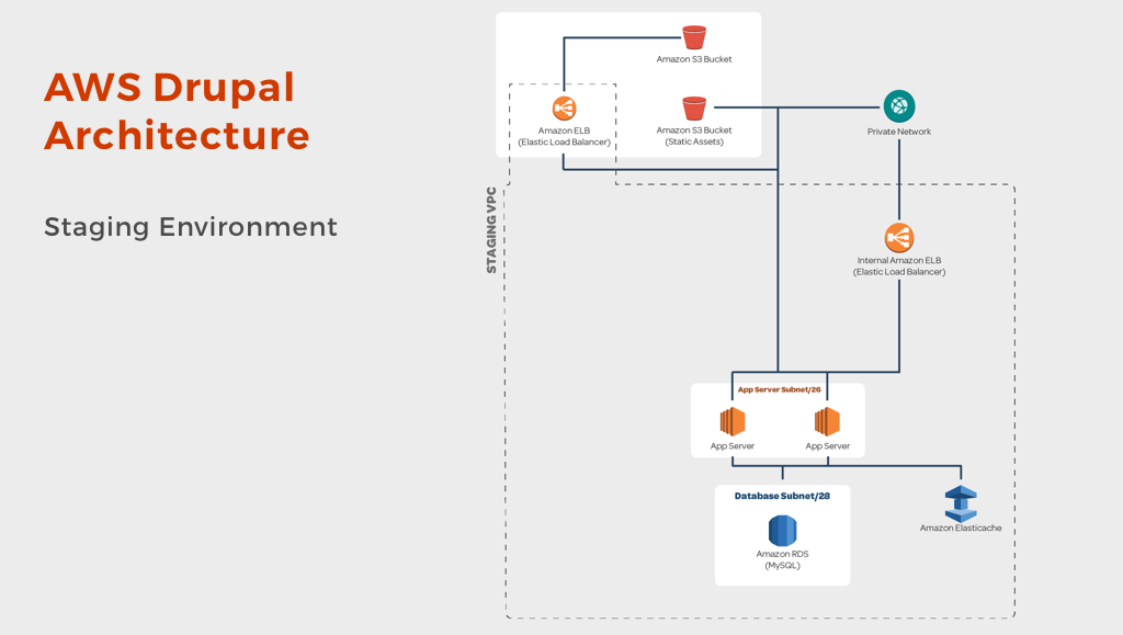
amazon-web-services-drupal-architecture

Mobomo believes in partnering. Over the years we have partnered with Amazon, IBM, Tracx, and a number of other companies and organizations. We are pleased to announce our recent partnership with the Drupal Association (https://assoc.drupal.org), Drupal has been a major contributor in the community for many years. 

Drupal is an open-source content management system framework used to make many of the websites and applications that you use every day. Drupal has great standard features like easy content authoring, reliable performance, and excellent security. But what sets Drupal apart from other solutions is its flexibility and extensibility; modularity is one of its core principles. Drupal allows you to build the versatile, structured content that is needed for engaging and dynamic web experiences.

We are very pleased to be a part of the Drupal community, since we have developed Drupal solutions for major Federal Government websites in the past this partnership only makes sense. We are excited about our partnerships and look forward to building bigger and better things as a supporting partner of Drupal.org. Be sure to visit our Drupal page.


Categories
Author
Subscribe to General