
Mobomo webinars-now on demand! | learn more.

The Use of Color in Design

Often when designers think about the heavy use of color with interfaces, the mind will usually travel to beautiful eye-candy posts from a variety of portfolio resources, such as Dribbble and Behance. These designs range from playful experimentation to serious concepts; most being incredibly pleasant to the eye of the viewer. However, one question is ever-present: are these artfully-crafted interfaces friendly and easy to use for all users? Color is much more than a shiny palette, it is a powerful tool in user experience design. Color is not only eye candy, but also about accessibility.

User Centered Design

Inherently, User Centered Design (UCD) for software is ultimately about communicating information between people. Even within very specific user types there are many considerations that good design must account for; non-the-least accessibility and usability of the graphical user interface (GUI) with most modern computer / communication devices. UCD is an inclusive design process generally, not exclusive. The Americans with Disabilities Act (ADA) Section 508 is a required consideration for all publicly accessible government Information Technology in the United States:

”...is a civil rights law that prohibits discrimination against individuals with disabilities in all areas of public life, including jobs, schools, transportation, and all public and private places that are open to the general public. The purpose of the law is to make sure that people with disabilities have the same rights and opportunities as everyone else.”

In the context of our discussion here, there will always be a sizable percentage of any user base that suffers from some form of color vision deficiency. As designers, we have the responsibility to ensure as much as we can that any use of color in designs accounts for accessibility considerations of this subset of any user base.

Considering Color and Accessibility

In reality, not every single user’s accessibility needs with a product or interface can be completely addressed, even when that is the goal. However, there are many steps and considerations to take that can be applied to our work to ensure designs are as inclusive as possible. Though designs will require compliance with a variety of requirements like Section 508 of the ADA, they can still retain a high level of aesthetics; remaining an engaging experience and visually appealing to all users.

Color, in particular, is one such opportunity as a vehicle for communicating information, with the cultural background as one influence to its perception. Questions can arise such as: How does one apply color in a design system? Does it’s use align more with usability or just aesthetics? What happens if the user has a visual impairment and cannot read a color codification? The resultant communicated information of such a system could be compromised, leading to a frustrating, even inaccessible user experience. This is not an intention or result desired with any good design.

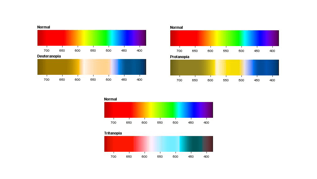
Regarding color-specific visual disabilities, there are different types of Dichromacy (two out of the usual three light cones are available to process light):

One finds it difficult to distinguish between blue and green or red and green because of defective long-wavelength cones or L-cones missing at all.

One lacks the medium wavelength sensitive cones which are green, then merges red and green and is unable to differentiate between the two colors.

This affects the short-wavelength cone (S-cone) making it confusing to distinguish between blue and green or yellow and violet.


color


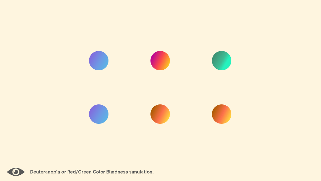
The most common form of color vision deficiency in most populations is Red/Green color blindness, or Protanopia. Users with Protanopia and Tritanopia may have trouble while trying to collect visual information to interact so one should consider color as insufficient to establish the state as information (or buttons: enable/disable). For example, if our digital product has one red field for the error message and a green field for success, with no contextual wording or icons helping to decode, a user with Deuteranopia might not pick up on a status codification.

There is Support!

To ensure accessibility and inclusiveness in designs and interfaces, we can rely on the Web Content Accessibility Guidelines (WCAG 2.1) provided by the World Wide Web Consortium (W3C). This will guide our work in terms of accessibility. US Federal agencies need to adhere to ADA Section 508 Compliance, ensuring electronic and information technology remains accessible to users among a wide range of special needs. The Revised 508 Standard requires conformance with WCAG 2.0 level AA.

If you work outside the US you can check Laws and Policies by Country here.

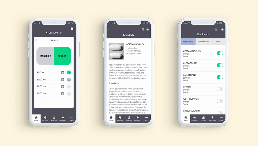
When Mobomo worked on the redesign of the Effective Interventions website and the Every Day Every Dose Mobile App, we applied the accessibility guidelines thus creating 508 compliant products. It's necessary to incorporate periodic checks of compliance in the design process. (checking color contrast here or another kind of simulations here).

Mobile App

Color is important in UX and it is a lot more than having great shiny palettes.  It is about using color as a relevant layer of communication that helps the user understand context, functionality and interaction.  One should remember that not everyone will see or read the same way, so inclusive thought is of the utmost importance and the essence of User Centered Design.

If you're a student interested in user experience and interfaces, it’s advisable (relevant to present and future direction of your skill sets but would also classify) to incorporate this knowledge and these considerations. If you're already a professional designing interface or involved a digital product project right now, you may start looking at this if you didn't before. If you're a great designer that already knows all this, you can pin and share this article to have the information gathered in one place!


Categories
Author

Navy Mutual

Navy Mutual's Mobile App

Navy Mutual Aid Association provides life insurance and annuity products to military families. In our previous blog, we discussed how an association’s struggle to face the challenge that investing in technology can pose.

 Navy Mutual Aid Association chose to face this challenge head-on and Mobomo helped usher Navy Mutual Aid Association through their first foray into mobile with the launch of their Survivor Benefits app.

The Navy Mutual Aid Association has a focus on educating members on their legally entitled government benefits, as well as on matters of financial security.  

In creating this app, Navy Mutual is now able to put appropriate resources directly in the hands of their members in an overall effort to increase awareness of government benefits.

It also allows Navy Mutual to more directly reach members through a new channel and increase its footprint in members’ lives.

Incorporating Legal Resources

One of Navy Mutual’s goals is to ensure veterans and veteran’s families fully understand their legal rights and benefits.  While the Navy Mutual website housed many valuable resources, the team wanted a tool optimized for, and easily accessible from a mobile device.

Throughout the process, the Mobomo team worked collaboratively with the Navy Mutual team, as well as their existing brand guidelines.  During all creative discussions, Navy Mutual ensured that the app would meet member needs and fulfill their mission.

We led them through the design, development, and launch of iOS and Android mobile apps. In order to meet these goals, we created various palettes to finalize a look and feel for the mobile app’s overall User Experience.   

For maintainability purposes, Navy Mutual opted to move forward with a React Native cross-platform application in order to create both iOS and Android apps from a single codebase.

The Benefit Calculator

One of the key features of the mobile app is a set of Benefit Calculators, which are on the website as well. These are for users to estimate survivor benefits and entitlements.

The calculators are processed through a legacy, internal backend database that did not have an optimized interface for plugging in new systems.

In order to make the backend accessible to the mobile apps, our team had to create new APIs for the apps to submit user inputs and retrieve the appropriate output to be displayed.

All of the tools that were created for use in the Survivor Benefits app are user-friendly as well as engage members throughout their experience.  

As discussed previously, members believe that the investment in technology was critical, but associations want their investment to last longer than the latest trend.  

The Navy Mutual Aid Association ensured that this app, not only was a financially sound investment but would meet their member needs long term.

Categories
Author

Only 1 in 10

In 2018, there is an association for everything, and many people are involved with at least one of these organizations. While associations are created to serve member needs, there is one area that many are falling behind in: technology. According to ASAE’s article, “Tech Success for Associations,” only 1 in 10 associations are managing technology and tech integration in ways that can be considered innovative. Of those polled by ASAE, 60% consider access to digital documents through the association website to be critical. The poll also found that members would like access to registration for conferences and events online and that this was essential to member satisfaction. Resolving the disconnect between what associations are doing and what members want could be the key to member engagement. How associations manage technology could change the nonprofit industry for the better.  

Facing the Budget

Associations often face an uphill battle to meet members' needs. The most difficult challenge is budget; new technology can be a huge investment and a risk, which associations tend to want to avoid. Members' needs are also constantly changing, which makes investing in technology a nerve-wracking process. In addition, to justify the expense, any technology investment needs to also support the organization's mission. Imagine you are shooting at a moving target and that target suddenly shrinks—that is how associations feel when trying to decide on technology to improve their members’ experience.

Navy Mutual Aid Association

How do we solve this? Let’s take a shallow dive into a project Mobomo recently launched with the Navy Mutual Aid Association. One of Navy Mutual’s main goals was educating members on the government benefits they were legally entitled to. To achieve this, they enlisted Mobomo to create their Survivor Benefits app, enabling Navy Mutual to put appropriate resources directly in the hands of their members and grow awareness of government benefits. The app achieved their initial objective while simultaneously allowing Navy Mutual to reach members directly through a new channel and increase its footprint in members’ lives. In this case, Navy Mutual found a way to invest in technology that supported immediate member needs and their overall mission—providing an excellent example of how associations can utilize technology to ensure continuing success.

Categories
Author

Mobomo's UI Kit

This freebie is designed to provide inspiration for your projects while guiding smart interactions: Simple and striking. Our process has been designed to turn your ideas into awesome products! 

The package is made up of editable elements so that it can be easily manipulated with smart objects. Replacing the contents of a Smart Object is very simple. All you need to do is to double-click on the thumbnail of the layer and edit the source file, especially useful to apply your branding and styles across the screens.

You can add your own content in a few simple steps:

The package contains

  • 5 Screens that cover the flow of login for any app.
  • Canvas Size 320 x 560 for iPhone
  • Canvas Size 768X1024 for IPad
  • Changeable background
  • Changeable colors
  • Drag and drop to create own composition

Splash screen

A splash screen is a graphical control element consisting of a window containing an image. It is used while the app is being launched.

Walkthrough

Screen revealing functionality to a user, changeable background and content

Login, Sign Up and Forget Password screens

Corresponding to to help you get started quickly design and build login flows.

Fonts

Montserrat

https://fonts.google.com/specimen/Montserrat

Format: PSD file

Size: 1.5 MB

Categories
Tags
Author

Cloud Trends

As cloud technologies become an ever-more-critical part of the IT landscape, advancement in the DevOps and infrastructure space doesn’t look likely to slow down in 2018. We have outlined four trends that we expect to continue disrupting the ever-changing cloud ecosystem this year. 

Google and Microsoft Close Gap with Amazon

Over the years, Amazon Web Services has been the only leader in cloud services thus monopolizing the cloud market share and setting the pace of innovation. This year we expect Google and Microsoft to close the gap and begin to position themselves as true competitors to AWS.

As the number of fully-managed AWS services has grown -- now including multiple machine learning PaaS offerings, hosted graph database and “serverless” relational databases, as well as on-demand deep-learning-enabled video analysis -- Azure and Google Cloud have quietly been catching up in the market for core cloud services (storage and compute) which are core decision drivers for large enterprises.

Google has recently announced the lofty goal of building its cloud-services revenue to match what the company makes in advertising sales by 2020, an ambition which should leave Amazon wary given the Alphabet family’s ability to vertically integrate with its other robust brands.

At Mobomo, we have also noticed a pattern of customers wanting to build out parallel infrastructure in Azure or GCS, or even downsize AWS footprints to meet increasingly complex cloud posture requirements. 

Multi-Cloud is the New Hybrid Cloud

As market share in the public cloud space becomes less monopolized, “multi-cloud” will become the buzzword in 2018 that “hybrid cloud” was in years past.

More and more, the three major providers will compete on cost in mostly-commoditized markets like on-demand compute and short-term storage. This means the ability to bundle out workloads among the major public cloud providers will be at a premium.

Open-source tools like Terraform, which uses a lowest-common-denominator approach to allow architects to define cloud-agnostic infrastructure-as-code and deploy resources across multiple providers according to arbitrary metrics (resource cost per time unit, network latency to target, desired redundancy level or SLA requirements, etc).

The clear benefit of these open-source tools is the ability to avoid provider lock-in by using cloud-specific offerings like Amazon’s CloudFormation to define architecture.

If another public cloud offers better metrics for a particular workload, transferring those resources becomes a simple matter of lift-and-shift rather than a laborious re-architecture process.

One toolset that will continue to grow exponentially are microservice and container orchestration technologies, especially those based on the Kubernetes ecosystem.

With Amazon’s announcement of server-less ECS and Fargate in 2017, and competitor technologies from Azure and GCS there is no doubt containerization of workloads will be the most straightforward path to a true multi-cloud architecture.

Look for the microservice/container space to become even hotter in 2018, and for cloud consultancies to build practices around the Kubernetes ecosystem to enable true multi-cloud cost arbitrage.

Internet-of-Everything Brings Compute to the Edge

The story of cloud to date has been about decoupling compute power from physical hardware, enabling on-demand workloads to access arbitrary amounts of processing capacity.

Yet this model has retained the classic client-server architecture inherent in the previous generation’s paradigm: cloud compute exists in the cloud, and packets must make the full round-trip to cloud provider data centers in order for inputs to be transformed to outputs.

The year ahead looks to finally disrupt this last redoubt of traditional IT thinking. With the rise of ubiquitous Internet-of-Things devices and cloud-aware microcontroller hardware such as Amazon GreenGrass (not to mention extremely latency-sensitive applications like self-driving cars which need to communicate in real-time with other physically-adjacent devices without making an Internet roundtrip), compute capacity will move much closer to the edge in 2018.

Devices will intelligently determine which portions of compute workloads to process locally or offload to the cloud, based on factors like network availability and latency, output priority, compute market price, and application-level metrics.

Machine Learning Advances Insights-as-a-Service

As more deep learning compute moves to edge devices that push ever-increasing amounts of data into cloud storage, AI will find itself at a crossroads in 2018, with organizations of all sizes clamoring to implement machine learning algorithms to draw insights from larger and larger datasets.

At the same time, ML is moving further and further from the “metal”, as seen by 2017’s rapid advance from deep-learning IaaS solutions (such as hosted Apache MXNet) toward fully-managed ML PaaS services like Amazon SageMaker.

That means 2018 is the year machine learning takes another great leap toward the business intelligence user, becoming a key vertical in the turnkey SaaS market -- or, more accurately, enabling a new Insights-as-a-Service (iNaaS) solutions space in which cloud analytics platforms compete to combine multiple data streams, structured and unstructured (such as from sensors and IoT devices in addition to traditional application metrics and logs), and extract actionable conclusions for organizations.

The shift from machine learning PaaS to iNaaS will unlock artificial intelligence solutions for businesses at any scale, and all without the undifferentiated heavy lifting of building Big Data infrastructure and algorithmic compute platforms.

What is your cloud adoption strategy for 2018? Are you thinking about migrating to the cloud? Take our cloud readiness assessment to see how you compare in the market or speak with one of our cloud engineers to determine how these trends will impact your business objectives!

Categories
Tags
Author

On December 27, 2017, Mobomo, LLC, was awarded a Professional Services Schedule (PSS) contract from the U.S. General Services Administration (GSA).

The Professional Services Schedule (PSS), formerly Mission Oriented Business Integrated Services (MOBIS) Schedule 874, program is a Government-wide Multiple Award Schedule (MAS) contract offering a full range of management and consulting services that can improve a federal agency’s performance.

Through Mobomo’s PSS Contract # 47QRAA18D002U, federal agencies can procure Mobomo’s world-class capabilities for SIN 541-3 Web Based Marketing Services, and 541-4F Commercial Art and Graphic Design Services.

Categories
Tags
Author

/Design-trends-to-expect-in-2018

Trends for 2018

In recent years we have moved from Skeuomorphism to Flat Design, in 2017 shadows and gradients made a comeback and we have also seen typography being used as a design element and color taking over our art boards. So what design trends should we expect to see in 2018 for website and app design? We believe this is going to be an eclectic year regarding trends, we’ll see influences from the late 80’s, 90’s and 00’s, bold colors and playful typography - elements from the periods of de-constructivism and brutalism will also be seen in 2018. Now, let's check out some examples of what we should expect in 2018! 

1. Bolder Color

Brands are using vivid, vibrant colors to stand out more, examples of this can be seen in Youtube’s and Spotify’s rebranding in 2017. We should expect to see other brands following suit, changing their colors and probably new brands stepping away from pastels - this is a clear example of the 80’s and 90’s influence in design making its comeback. 

2. Creative Typography

Typography is a great way to convey emotions to an audience and for presenting important information. In 2017 we saw typography used more and more as a graphic piece, it’s bolder and bigger. This year we will see some of the same but it will follow different approaches, for example, font as illustrations, liquid effects, sliced texts, brighter colors, photomasking.

Liquid Effect

Typography as Illustration

3. Photo Masking

Photo masking is the use of shapes/text elements/ to mask part of a photo in an interesting way, it can be used in different pieces such as, posters, websites, covers. The first image below shows pictures within letters for a magazine cover, the second image shows an array of images that make up the shape of Bill Murray's head. 

4. Organic Shapes

Since the release of iOS 11 we’ve seen more and more rounded corners in app designs, even rounder fonts used, to convey user friendliness and for brands to appear more approachable to their users.

5. Gradients and Gradient Mapping

“A Gradient Map matches Light Levels to different colors. It analyzes the Highlights, mid-tones, and Shadows in your image and maps them to different Colors. The original colors in a photo will be replaced with the Colors in the Gradient Map”. One thing we’ll definitely see more and more this year are gradients in app design and gradient mapping on photography, this will also influence poster design, websites, branding and more!

Categories
Tags
Author

Diversity

Comparably's Top Workplaces for Diversity

USA Today released Comparably's list for top workplaces for diversity in the United States. This list reflects answers to questions about salary and benefits, work-life balance, work environment, relationships with managers and coworkers, and other workplace issues from employees who classify themselves as African American, Hispanic or Latino, Asian or Pacific Islander, Native American, or other.

They broke the list up by the size of business, large companies are organizations with 500 or more employees.  Small-to-medium companies are organizations with fewer than 500 employees.

There were 50 total companies listed, Mobomo ranked in the top 25 for small-mid sized businesses.

"Mobomo is honored to be named one of the Best Companies for Diversity. Our success as a company hinges on diversity and inclusion, and it is our belief that diversity brings creativity, innovation, a fantastic culture, and ultimately better products and services to our customers,” says Ken Fang, president of Mobomo.

Check out the full list!

Categories
Author

CSBA

Transformation Of CSBA's Strategic Choices Tool

Mobomo was selected by CSBA to build the new version (3.0) of its proprietary Strategic Choices Tool. The tool is used by CSBA's clients to modify the President's national defense budget request by simulating military budget spending (investments/divestments) in a custom exercise and dataset.

The goal is for the tool to allow teams to understand tradeoffs between platforms, R&D, and personnel all under different budget scenarios.

The existing version of the tool was extremely out-dated and on a codebase that was difficult to maintain, with low-security standards. It lacked many important features and a modern, user-friendly interface. The new tool was expected to automate calculations and improve data quality, increase capacity to build datasets for exercises, and improve the user experience.

Strategy

Given the substandard code quality and security of the existing tool, we re-architected the entire system for the new Strategic Choices Tool from the ground up, using a Ruby on Rails backend and React front-end. We first met with the CSBA team for initial strategy and on-boarding sessions in order to better understand the existing issues, frustrations, and needs.

Our UX Design then team redesigned the interface to modernize and simplify the user flow on both the Administrator side, as well as the end User's side.

The first phase was an iterative, agile development phase to build out version 1 of the new tool.

We completed version 1 of the new Strategic Choices Tool in time for a live exercise with one of CSBA's clients. The CSBA team was able to utilize the new, improved tool for the first time and received increased interest for additional exercises.

Due to the new tool's improved capabilities and streamlined/automated workflow for creating new exercise datasets, CSBA was able to accept additional exercise contracts for the upcoming year -- something that would not have been possible with the old tool due to the amount of (previously) manual calculations needed to create a dataset.

Phase 2 was a major update and included the addition of many complex enhancements to push the new product past the existing platform’s feature set. Most significantly, this included the incorporation and automation of 20 formula models - all previously executed manually by the CSBA team.

Additionally, dozens of enhancements were made to streamline and simplify the exercise creation and management process, which vastly increased the speed at which the CSBA team can build databases and conduct additional exercises.

How does the user interact with the product?

On the new Admin portal, administrators are presented with a clear dashboard of all existing exercises. They can jump into each exercise to see/edit high-level exercise data as well as the minute details of all Categories, Force Structures, Parent Options, and Child Options available in an exercise.

Admin can also access Summary data for all Teams to analyze their selections made, overall adds/cuts in spending, and force structure inventory changes.

On the User/Team side, a cleaner interface with intuitive navigation allows for a more seamless experience working through an exercise. A constant view of total spend and force structure inventory levels allows the user to better understand how each of their selections affect their end result, while interactive graphs and tables provide deeper insight in real-time.


Categories
Tags
Author

/Blockchain

Blockchain, a buzzword that everyone seems to be saying but many don't know much about. So what is blockchain exactly and what does it do?

What is Blockchain?

Blockchain is a continuously growing list of records, called blocks, which are linked and secured using cryptocurrency. The records could be physical assets or monetary based.  Blockchain is the world’s leading software platform for digital assets. Blockchain eliminates third parties allowing users to transact directly and is transforming every industry resulting in businesses to be more transparent.

Why is Blockchain beneficial?

Blockchains can be used to permanently store data and verify the integrity of the data indefinitely. Inputs and outputs can be monitored and controlled, but not removed, leaving an audit trail and traceability through all transactions and records. This introduces a system of trustless ledgering. All parties control the blockchain and no single party can control the blockchain, so no transaction is vulnerable to manipulation.

What industries are currently adopting Blockchain? How are they finding benefit?

Any industry with the need to store records could benefit from a blockchain. These records could be things such as healthcare (for keeping a patient's permanent record and sharing between entities) or financial. Transactions (additions of points onto the blockchain ledger system) can be open to all, restricted, or controlled and enforced through a system of rules programmed into the blockchain itself. Just as the integrity of the transactions is kept by the cryptographic signature checking of each member hosting the blockchain, the rules that govern how these transactions are recorded are equally verifiable.

Categories
Tags
Author
Subscribe to Mobomo