
Mobomo webinars-now on demand! | learn more.

mobile app

In today’s world everyone is connected with their mobile device. Many companies incorporate a mobile app into their digital strategy in order to stay connected with their users.

We have talked about why your company should have a mobile app, the benefits are endless but what about the cost to design and develop a mobile app? Each app is different which means that the price points vary based on what the client found as a priority.

We outlined some important factors that may increase the cost of your mobile app - these certainly are not the only things that can impact a budget.

Categories
Author

Cloud migration There are so many benefits of migrating to the cloud, many want to reduce cost while others want to improve their efficiencies. We get a lot of questions surrounding cloud migration so we decided to do a short Q & A - we know there are tons of questions that could be answered but this was our shortlist.

Why are so many businesses moving communications to the cloud?

Cloud infrastructure provides tools and reporting capabilities that need to be implemented as a central service to manage and report on software inventory and costing. Cost savings is a key benefit of cloud computing. Being able to dynamically inventory provisioned resources and services and match them with costing formulas, ensures continual insight into cloud expenses and continued ability to lower total cost of ownership.

What are the pain points that cloud adoption can address for cost-conscious, efficiency-minded IT and Ops teams?

Moving to the cloud requires a cost accounting model that can support charging for on-demand, dynamic infrastructure, as opposed to one that is based on purchasing dedicated hardware and depreciating it. Cloud infrastructure provides tools and reporting capabilities that need to be implemented as a central service to manage and report on software inventory and costing.

What is the tipping point for a business (your business) to make the move to the cloud?

Looks like you have done a thorough analysis of cloud environments in conjunction with physical data center options, matching application requirements and migration strategies to the appropriate environment capabilities. In addition, each application has a migration roadmap with pros, cons, and risks analyzed. That is a fantastic start to ensure a successful migration to the cloud. Prior to migration, your organization should perform a competitive analysis of various cloud options vs. physical data centers. Identify the risks and costs of migration and determine the migration strategy for each application: re-host, re-platform, repurchase, refactor / re-architect, retire, retain

What ramifications does this move have for IT/Ops/the organization?

To take full advantage of the cloud, both leadership and operational staff need to be trained in cloud best practices, communication transparency, and metric based accountability. The organization should have a plan to hire to cover any gaps. Your organization's deep understanding of cloud operations and the new skills needed to successfully maximize the value of new cloud environments will ensure success. Having already started training existing staff and recruiting new leaders is a good sign.

How does it impact end users and employees?

To take full advantage of the cloud, both leadership and operational staff need to be trained in cloud best practices, communication transparency, and metric based accountability. The organization should have a plan to hire to cover any gaps.Incentives for employees facing dramatic role changes should be implemented to ensure the organization embraces the training required for the new cloud capabilities. A strategy should be developed to identify alternate positions for resistant employees to prevent time and money costs. Moving to the cloud requires a cost accounting model that can support charging for on-demand, dynamic infrastructure, as opposed to one that is based on purchasing dedicated hardware and depreciating it. If you have questions that weren't answered, get in touch.

Categories
Author

DevOps

Transitioning from Agile to DevOps 

Some ask if transitioning from Agile to DevOps principles requires a new consideration of deployment and hosting infrastructure. Many have been asking the question of "what are some best practices for companies that want to address the concern of how cloud computing companies transition from Agile to DevOp principles?" In actuality Agile and DevOps can be combined versus having to choose one methodology over another.

Check out the below Q & A to learn how they these two methodologies can complement each other. 

How can cloud companies best address the concerns of Agile and DevOps?

It is a misconception that Agile and DevOps principles have tension with each other. Rather, they each encompass a separate set of principles that apply to different parts of the software development life cycle.

Agile and DevOps principles can be successfully blended to ensure reliable, rapid and on-time deployments of working software.

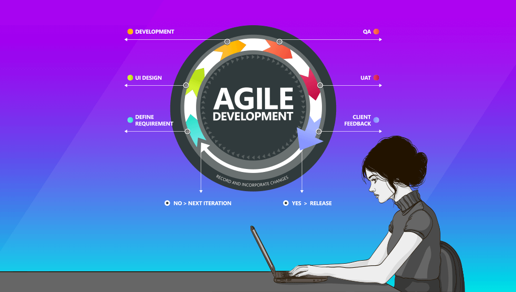
Agile methodology stresses the immediacy of working software over comprehensive documentation, and embraces constant change pursued through short, rapid iterations of software development rather than well-defined "final" products.

DevOps, on the other hand, governs how the resulting software is tested, secured, deployed, and maintained as seamlessly as possible. DevOps is not an alternative or a response to Agile, but is best seen as a complement to Agile, which allows rapid release cycles that are secure, reliable and error-free.

What are the best practices and key advice for progressive IT teams?

Implementing DevOps often requires constructing a toolset based on cloud computing models, in that it advocates automation and repeatability of every aspect of the deployment process from the moment new code is committed to a project.

Continuous integration workflows are then constructed, using a variety of scripts and automation tools like Jenkins, which build the cloud components necessary to serve the application, configured from a central repository (using a configuration management suite like Ansible, Chef or Puppet) ensuring each deployment is identical, therefore minimizing the potential for human error.

Automated testing is another critical ingredient in the DevOps toolkit. From unit tests which confirm the functionality of individual snippets of code, to functional and integration tests, which verify that functional requirements are satisfied by the latest release without regressions.

DevOps thinking ensures that every deployment is as error-free as possible, all without the heavy workload of constant manual testing.

This focus on testing and infrastructure-as-code can align well with Agile's focus on rapid deployment in that it automates the most time-consuming portions of the software release process and allows developers to spend less time worrying about bug fixes and environmental differences, and more time implementing new features.

Simultaneously, it allows product owners to be confident in deployments, knowing that automated test cases are constantly checking for regressions, and CI/CD (continuous integration / continuous deployment) processes will reject a build that contains errors.

The fact that the cloud infrastructure is created from code at the time of the deployment is an important check that applications will function identically in test/development, staging/QA and production environments.

How can a new DevOps structure be best adapted for developers who have been using Agile for a while?

From a developer's perspective, implementing DevOps requires little change in workflow from an existing Agile mindset. The same focus on rapid deployment exists and work can be broken into Agile sprints or scrum periods according to the needs of the team and product owner.

The additional expectations that DevOps places on developers is that all committed code will be automatically tested for unit (functional and integration performance before being automatically deployed) and rejected if it does not pass all regression tests.

Thus, developers may need time to embrace a TDD (test-driven development) approach and write tests as a prerequisite to building the code that satisfies them.

Should there be an overlapping period of Agile and DevOps and if so, how long should the overlap be?

Since Agile and DevOps are not mutually exclusive, they can be blended together over time, with more DevOps thinking added onto a functioning Agile workflow to continue to narrow the gap between development and operations.

Both approaches stress communication within the team, although there are cultural disagreements about the level of specialization (Agile stresses that each member of the team be a jack-of-all-trades while DevOps tends to allow for more specialized roles such as systems architect, security expert, etc.) and the best way to schedule work: Agile favors dividing into short, rapidly repeated time chunks while DevOps focuses more on stability over the long term.

Again, these approaches are not contradictory but can be blended to ensure that software is delivered as rapidly and reliably as possible.

The level of automation involved in a DevOps workflow may be unfamiliar to developers who are new to the methodology, but it soon becomes apparent that all of the automated testing, code verification, and deployment processes can ultimately free developers up to do what they do best, which is build new features for the product owner.

What tools do you use or software solutions?

Mobomo works with both Amazon Web Services (AWS) and Microsoft Azure as our primary providers of cloud services. We utilize our deep experience in open-source technology to deliver DevOps toolsets based on Linux with Ansible code-based provisioning, and orchestration with Jenkins.

Automated functional testing is done with Selenium coupled with Gherkin-based test frameworks such as Behat and Lettuce. We rely heavily on scripting languages like Python, Ruby and Bash to connect these toolsets together and provide a robust DevOps workflow to deploy code seamlessly and reliably, on a velocity that is fully compatible with Agile best practices.

What are your yardsticks for success?

Time of release from code commit to production readiness; client acceptance of new features; number of bugs caught by automated testing frameworks for each release; number of bugs missed by automated testing and reported after the fact; total downtime, service interruptions and other SLA violations resulting from unanticipated infrastructure issues, either deployment-related or due to poor planning; etc.

How long do you pursue a DevOps strategy before calling it off as a failure and moving back to Agile? Is there no turning back?

Given that Agile and DevOps are not mutually exclusive, there is no need to "call off" a DevOps transition and go "back" to Agile. Rather, they can be combined in ways that reinforce each other, with Agile functioning as the development team's methodology while DevOps provides the backbone for the cloud deployment, security, networking and testing aspects of the engineering process. Thus, disruptions are minimized by DevOps which allow Agile to provide rapid iterations of working software.


Categories
Tags
Author

Earlier this month, Apple held its September event and announced some exciting things involving releases of their new software and hardware! We knew the iOS 11 update was going to launch September 19th but what has the software update meant for apps in the App Store? According to Tech Insider, more than 180,000 iPhone apps are not compatible with the iOS 11 update and it is possible that Apple will stop supporting up to 200,000 apps.  If your company has an app that is currently in the App Store - contact us for a free analysis to ensure that your mobile app is compatible with the new updates. Regardless if your users or target audience has an older version of the iPhone and downloaded the iOS 11 update or if they purchase the new iPhone X or iPhone 8 there’s a good chance that your mobile app will still need to be updated in order to comply with App Store regulations. We talked about the preparations you should take for the release of iOS 11, but now that it has launched, what’s the real impact?

64 Bit Processors

Apple did give fair warning, they made it clear that they will no longer be supporting 32-bit apps within the App Store long before the iOS 11 release. Eliminating apps that are 32-bit seems to have been the most significant change because they will be eliminated from the App Store all together. In 2013, Apple started using the 64 bit processor and encouraged developers to run apps on this faster technology but it was by no means required in order for an app to exist in the App Store. The 64-bit is safer even though it seems more complicated. When searching in the new app store, you will not find 32-bit apps. This means that all apps running on 32-bits have to be updated.

App Optimization

App Names   The name of your app is critical because this is how users will find you - app names have a 30 character limit versus 50. However, Apple did add a short subtitle field that appears directly below the app name - this is a 30 character limit but will allow you to highlight features of your app.   App Description Up until now, Apple allowed developers to change an app’s description at any time. In the new App Store, you can only change the description when you’re submitting a new version of your app. It’s vital that your app description conveys the message accurately and concisely to persuade users to download the app. It is unclear as to when you can update your app description once your app has been submitted to the app store. A new addition to this is a new promotional text field, it appears at the top of the app description and is limited to 170 characters. The promotional text should highlight the latest news about your app, which you can update without having to submit an entirely new version of your app. App Reviews In iOS 11, Apple will disallow custom review prompts in all apps and instead provide its own API that you can add to your app. This will allow the user to submit their review within the app but the developers are only allowed to prompt a user for a review three times per year.  Aside from custom review prompts, users can open their settings and opt out of receiving these rating prompts for all apps they have installed. It could be time for you to consider another option in order to tell who really likes your app.

App Design

Apps will no longer scale as perfectly as they used to - especially when an app is viewed on the iPhone 8 or X. Design tweaks may be needed to ensure your app has the best look and feel for users on this new platform, some of the biggest changes are the following:

What do these releases mean for companies that have an app in the App Store? For starters, make sure that your app is meeting App Store requirements. If you have an app in the App Store and you are not sure if it meets Apple’s new standards, you should have your app evaluated to make sure it is compliant with the new App Store enhancements. 

Categories
Tags
Author

CSS Grid

Replicate Bootstrap 3 Grid Using CSS Grid

The past few years have seen a wide variety of methods for creating web page layouts. CSS Grid is one of the newest and most game-changing tools at our disposal. If you haven’t started tinkering with it yet, now is the time. It is a wildly different way of thinking about positioning content, and it currently has nearly full support across all common web browsers.

In order to replicate the majority of the features of the Bootstrap 3 grid system, we only require a small portion of the features that CSS Grid has to offer.

The key concept introduced in the Bootstrap 3 grid system which we will be replicating is the ability to explicitly define a grid container’s proportions for each responsive breakpoint. In comparison, Bootstrap 2 only defined the proportions for desktop, and any viewport smaller than 767px would render all grid items at full width, stacked vertically, in a single column.

1. Define our class names similar to those used in Bootstrap 3.

.row for a grid container

.col-[screenSize]-[numColumns] for a grid item where [screenSize] is one of our size abbreviations (xs,sm,md,lg,xl) and [numColumns] is a number from 1 to 12.

To use the CSS Grid, we simply apply display: grid; to our row class

.row {
  display: grid;
}

2. Define the number of columns in our grid and the size of the gutters (the space between items/columns).

Bootstrap uses 12 columns with 15px gutters.

.row{
  display: grid;
  grid-template-columns: repeat(12, 1fr);
  grid-gap: 15px;
}

repeat(12, 1fr) is a shorthand for “1fr, 1fr, 1fr, 1fr, 1fr, 1fr, 1fr, 1fr, 1fr, 1fr, 1fr, 1fr” where ‘fr’ is a fractional unit. Setting all 12 of our columns to 1fr means they will all be the same width. By changing these values, we could easily create a grid with a different number of columns or with columns of varying widths.

3. Define the grid items that will go into it.

To do so we need only set the grid-column-end property for each variation of the grid item. Setting it to a value of ‘span 1’ would make the item one column wide. ‘Span 6’ would make it 6 columns wide, half of our 12 column grid.

There is much more that we could achieve with this property or with similar properties and shorthands for these properties. I encourage you to explore the possibilities and understand that we are only scratching the surface in this demo. https://css-tricks.com/snippets/css/complete-guide-grid/

4. Fill out all the different span sizes at all the different breakpoints.

This is the most complex task we have to  The pattern is as follows:

@media (min-width: 0) {
  .col-xs-1 {
    grid-column-end: span 1;
  }
  .col-xs-2 {
    grid-column-end: span 2;
  }
  .col-xs-3 {
    grid-column-end: span 3;
  }
  // ...up to .col-sm-12
}
@media (min-width: 768px) {
  .col-sm-1 {
    grid-column-end: span 1;
  }
  .col-sm-2 {
    grid-column-end: span 2;
  }
  .col-sm-3 {
    grid-column-end: span 3;
  }
  //...up to .col-sm-12
}

...repeat for ‘md’ at 992px and ‘lg’ at 1200px

5. Build the pattern with a nested loop in Sass (once we understand the pattern) like so:

// Loop through responsive breakpoints
@each $size, $abbr in (0,xs),(768px,sm),(992px,md),(1200px,lg){
  @media (min-width: $size){
    // Loop through col classes
    @for $i from 1 through 12{
      .col-#{$abbr}-#{$i}{
        grid-column-end: span $i;
      }
    }
  }
}

6. Set a full width default for situations where the width is not defined.

For example, a grid item with the classes “col-md-4, col-sm-6” does not have a width defined when the viewport is smaller than 768px (the sm breakpoint).

However, it is defined for viewports larger than 992px (the md breakpoint) because the media query will continue applying the width for all viewports wider than 992px unless it is overridden by defining the lg width.

Rather than requiring devs to assign xs width for every item, we can safely make it full width as a default that the user can override if they choose to.

[class^=col-]{
  grid-column-end: span 12;
}

This style rule will apply to any element with a class that begins with “col-” and set a 12 column width. The rule will be placed above our nested loop to ensure that the other grid styles override it.

See it in action. (Open in Codepen and change the viewer size)

[codepen_embed height="265" theme_id="dark" slug_hash="MpxQmW" default_tab="css,result" user="mobomo"]See the Pen Bootstrap 3 Grid with CSS Grid by Mobomo LLC (@mobomo) on CodePen.[/codepen_embed]


This implementation has several advantages over Bootstrap 3’s grid:

Categories
Tags
Author

Apple watch interface

Interfaces are intrinsic to technology 

Each piece of technology that is used by a user has an interface. Computers date back from the first half of 20th century, their physical appearance… well let’s just say, we have come a long way with the look.  Nevertheless, those big pieces of machinery were designed for users to operate them. The user physically had to get their hands on the hardware of the machine to operate.

Technology is constantly changing

Companies like Apple and Samsung are bringing new devices to the market with capacity and intelligence that definitively surpasses all of NASA’s computing power 50 years ago. This level of sophistication begins to explain the user experience, being further from the manual tweaking or direct manipulation of the technology itself. The user experience was the connector or rather the middleman between the user and the physical machine. The user needed to find value in the user experience in order to satisfy the purpose the user had in using the machine in the first place.  If we extrapolate this idea, we can predict the next trend should be about reducing physical stress from the user interaction. This notion has already been seen with each iteration of smartphones-  with the transition towards chamfered edges, bluelight/night screen filters, and each generation becoming a little more ‘wireless’ (whether it be wireless charging or wireless earbuds).

The hypothetical extreme of this will be not having to physically move your body but instead just thinking of the action that is needed, resulting in a response from the machine (creepy sci-fi, right?). Ergonomics is playing a much more prominent role now that technology has reached the point of where it is at today. Comfort and reliability are key aspects that allow the general public to reach and utilize these interfaces on a daily basis.

Voice Technology 

At one time, speech recognition was a concept that seemed like something of the distant future, machine speech recognition has now made its way to be the reality. Most smartphones and online chatbots allow for full-fledged conversations in various languages. Consistent upgrades and machines are being pushed out to implement this field and technology into the home as “Amazon’s Alexa” and “Google Home”. Of course, it is still not perfect and its application as a user interface tool is in its infancy but the technology has already pushed past many fundamental checkpoints. As a result, the artificial intelligence behind it has outperformed.

Bridging the Gap

Besides this race towards smoothness and fluidity, there is also the issue of merging with the environment. Many of the current interface prototypes are intending to bridge the gap between flat, two-dimensional screens and our 3D space. For example, we already know about augmented reality - having some form of visualization tool overlaying graphical elements and information over real world objects (be it a phone screen using the camera, a VR helmet, or special glasses). Yet developers are also leaning towards a more immersive augmented reality, whether that means aligning alongside virtual reality or somehow bridging the two to find a middle ground. Virtual reality has also began to make its mark in the market with larger companies such as HTC, Google, and Samsung paving the way with their higher end VR headsets and constantly updated software for it. Virtual reality’s claim for computer simulated, three-dimensional environments is a clear step into the more immersive and interactive interface space.

The real challenge designers and engineers are facing is to make 3D space be the interface. Ideas and prototypes of kinect-like applications, where items are accessed and arranged back and forth through air gestures are in development. The actual ‘things’ being manipulated are graphical elements projected either to or from a flat surface. There is certainly the ability to ‘read’ or track gestures in space but creating digital imagery that appears in that space as if it were an organic entity is not here...yet. However, prototypes where physical objects are manipulated around space in order to interact with technology are being developed.

There is another possible route ahead for the future of interfaces related to biotechnology, or the implant of synthetic materials/technology into the body. Research is advancing in this field, mainly for repairing body functions, leveling body chemistry, and gathering information. At the moment, common products in this area consist of synthetic body parts. Interfaces have become integral in our daily lives, ranging from the slabs of glass in our pockets we call cell phones to screens in our cars that help us navigate- there is no chance of backtracking to a simpler time without them.

So now it is time to think of a future where these goals are met and we can trigger events with our body so that we can feel and see things beyond our natural perception.

Categories
Author

The 2017 list has been released

Each year, Washington Technology ranks the fastest growing small businesses in the government market. The rankings are determined by the annual growth rate based on five years of federal customer revenue. This year, Mobomo made the list!

Mobomo has successfully led federal agencies and government entities such as NASA, USGS, and NOAA NMFS to effective platforms that has saved the federal government millions of dollars. We have prime contracts at agencies including USGS, NOAA, and GSA and hold subcontracts at NASA, VA, and Department of State.

For NASA, our team the continues to operate, maintain, and development www.nasa.gov and science.nasa.gov. www.nasa.gov just broke the record of website visitors with more than a million simultaneous users on the site during the August 2017 solar eclipse. science.nasa.gov was developed in both English and Spanish for the Science Mission Directorate (SMD). Mobomo drove the development team, oversaw the training of SMD staff, and ensured the the goals of mission directorate were achieved: increasing the ease of public access and volume of public access to NASA material. Both nasa.gov and science.nasa.gov are actively running in AWS as true scalable, native cloud offerings. Our design at NASA.gov has won the Webby Award in 2014, 2016, and 2017.

Our federal team also oversaw the digital transformation of the USGS agency web site, a responsively designed site that provides access to over 300 USGS component programs. Our team directed the successful launch of the responsive redesign of the USGS Store map purchasing web property, featuring integration with a SAP inventory management and billing system. Analytics show that traffic to the post- launched USGS Store has spiked in July, going from 60,000 page views to peak 600,000+ page views a day, with increased Store purchase volume going from 900 to 9800 at peak, averaging an 8x increase in traffic and a 5.5x increase in sales across the month. The USGS agency site runs in AWS, while the Store offering will be migrating to the cloud from USGS data centers over the next quarter.

Mobomo is working with the NOAA National Marine Fisheries Service on a multi-year consolidation of 17 web properties across 5 regions, 7 science centers, and 5 headquarters based programs. Built on a FedRAMP accredited PAAS service, the consolidated web property will be publicly launched in September 2017. The site has been constructed to support the ongoing migration of the first 7 of the 17 web properties representing 10 of thousands of pages and documents.

Finally, at GSA, Mobomo supported the teams operating, maintaining, and developing usa.gov, sites.usa.gov, and challenge.gov.

Congratulations to all of this years Fast 50 - be sure to see the full list!

Categories
Author

Did you know the first website was created only 27 years ago? We tend to forget how young the internet actually is - it has made tremendous advancements since the first website was launched. We are now living in an age where websites have to be responsive, dynamic, and user-centric, all these things we will continue to see enhancements as the years go on.

Let’s walk through the history of the website designer and the evolution of the role, shedding some insight into what led to the death of the web designer and how specialist dominated the industry.

When Webmasters Ruled the Web (1991-1997)

The first website went live on August 6, 1991 - while very few had access to the internet it opened a new world of possibilities. In the mid-90’s, only 30-70 million had access compared to today's 3.1 billion.

At the time, web design did not even exist because a website consisted of just text and links. Webmasters (aka the developers of those days) dominated this new world wide web since graphics were limited. A web designer was not a common position that you would see on someone’s staff and “digital design” was more often associated with software. Moveover, design tools like Adobe Photoshop 2.0 were on the rise to popularity and Macromedia Flash didn’t appear until 1996. It wasn’t until 1998 when the design industry began to see its golden era.

Freedom of Design (1998-2004)

The internet became more accessible to the public in the late 90’s as 100 million new users started using the internet each year. Everyone wanted to carve out their own space on this strange new medium known as the ‘web’. Site builders like Geocities, Tripod, Angel fire were some of the first in the market to create basic website templates, anyone who wanted to create a website could - no designer or developer needed. During this timeframe, the amount of websites grew 438%, as websites were created and launched - more and more users flooded to the internet, supporting the correlation of website growth meant more internet users.

From kids to adults, everyone at the time seemed to be a webmaster and a designer. The web started to become a visual medium as images, music, animations started to scatter the internet. Macromedia Flash grew in popularity giving designers the freedom to be truly original on the web. No longer were the days that website designers were limited to table base layouts, more creative freedom was finally insight.

It was common to see agencies such as 2Advanced who solely focused on web design- they were able to gain an early footprint in this unknown market. At this point, graphic designers were listing web design as one of their many abilities. However, the largest limitation during this era was the fact that dynamic content did not yet exist. It wasn’t until the creation of PHP and MySql to mark a new era of the Web 2.0 and how we would start building and designing a website.

The Rise of the PSD Templates (2004-2007)

The turning point of modern web design was the introduction of server-side scripting and database management. This gave the perfect entryway to content management systems like Wordpress, Joomla, Drupal, and Brogger. It was apparent at the time the industry needed talent who understood the ‘new’ web, this was a defining point because web design started to become a stand alone profession.

Through the mid 2000’s the web as a whole was moving to an organized standardization. As this standardization was becoming known, designers had a new role which was to create template based layouts for dynamic content. By implementing this new role, this shifted the design process from building unique static pages to creating uniformed dynamic templates with CSS. Adobe Photoshop finally became the dominate design tool after Adobe purchased Macromedia. Google Analytics made its introduction in 2005 to better monitor site traffic and behavior.

Even though designers had new responsibilities within their roles - web design best practices didn’t really exist even though the web was becoming more advanced. The web was full of images of fonts, shadows, and large textures. CSS did not exist - there were no shadows, web fonts, and gradients until 2010. Flash still made up 25% of all sites on the web until its fall in 2013.

No one really knew what the future of the web would be especially as mobile and tablets were advancing, it was clear that designing and building for the web would be difficult because of the different screen sizes that would start to evolve in the coming years.  

On January 9, 2007, Steve Jobs announced the launch of the iPhone which would turn the world upside down. From that point on, web design was no longer seen as a single device solution. At the time, the web was built for users to access via desktop which was a problem because the iPhone had launched -- this was the point where everyone needed to rethink how to design and develop for not just desktop but for mobile as well.

Designers had to start thinking outside of their monitors. Fluid grid systems such as 960.gs provided an organizational structure that didn’t really exist in designs in the past. Other solutions aside from the fluid grid systems were created to build a dedicated mobile site separate from the desktop. It wasn’t until 2008 when the concept of responsive design started to surface. Even though this term was starting to become a “buzz” word, it didn’t become a dominant solution until 2010 because of CSS3 advancements with breakpoints, webfonts, and mobile browsers. Moreover, with the introduction of the iPad there was proof that there was need for an adaptive solution.

All of these advances helped to pave the way for the beginning of UI frameworks, like Bootstrap, in 2011. A new design strategy of focusing on mobile first emerged, prioritizing mobile context when creating user experiences and then working up to desktop layouts. A new Adobe competitor was released in 2010 called Sketch; that’s when a lot of UX startup services began to appear. The terms ‘user experience’ and ‘user interfaces’ were soon re-introduced into our vocabulary in 2009.

As a result of these new programs and terms coming back to light, this is when the designer who had specialization started to become relevant replacing the general profession of web design.

In 2011, everyone seemed to have a website but just having a website was no longer good enough. The focus began to shift from “mobile first” to prioritizing the user first in the overall design strategy. By prioritizing the user, this opened up more responsibilities in the role of web design - it was now the ‘user experience designer.’

The ‘user experience designer’ was certainly a known position in software design but it has slowly become an essential part of web design. As a result of user experience designers being thrown in the mix, new processes of wireframing, user personas, user research, information architecture, and prototyping were added when building a site. All this placed more focus on strategy than aesthetics, which created a need for new talent/role. Better design tools emerged like Invision, Optional Workshop, and UserTesting.com, providing designers with the right tools to test and create a better more usable web.

In 2012, a designer named Brad Frost helped rethink the design process by introducing the concept of Atomic Design. No longer is design seen as templates locked into a PSD, but rather it’s made up of similar elements that build modules compared to just simple pages. User interface designers no longer have to color in wireframes but are able to build pattern libraries of elements that make up the wireframes. Matched with the popularity of agile methodology, websites were no longer seen as a static solution which makes the web not only user friendly, but even more standardized and efficient.

The Next Era of Web Designers

Web design will continue to specialize as time goes on especially as new technologies and thinking evolves - designers will need to be agile in order to adapt these challenges. Designers will not be lumped into one broad job title, as specializations are made known designers will be able to blend across many job roles that may have different specifications. A designer's role is no longer building out photoshop templates, we are living in an era that needs constant continuation in order to stay up-to-date. These are the elements that help create a better, more friendly web.

Categories
Author

NASA and partners surpass eclipse expectations

On a day where millions experienced a once in a lifetime total solar eclipse, NASA’s tireless efforts to provide the public with a seamless livestreaming experience of eclipse feeds from across the country resulted in one of the largest web-based events in U.S. government history. NASA’s coverage of the eclipse was a home run in the IT world and is a testament to the Agency’s commitment to technological excellence in everything they do in support of both their scientific endeavors and their duty to share their experiences with the world, showing that IT collaboration and partnership in the federal government is not only possible but wildly successful.

On Monday, Aug. 21, NASA surpassed expectations, streaming 18 live feeds from across the country, including high altitude balloon feeds, telescope views and shots from various aircraft situated along the path of totality from Oregon to South Carolina. Just as impressive as the content being served was the amount of web traffic NASA.gov received, recording over 30 million visitors over its 6 hours of coverage, resulting in over 80 million page views and at peak levels, sustained over 1.5 million concurrent users – all of which are record-shattering statistics for the Agency. Visitors to the site stayed an average of 3 minutes per session.

Livestreaming is no easy feat

An architecture supporting millions who are livestreaming is even harder. Not being able to accurately guess or predict just how many viewers would tune in and then planning for an architecture to support an unknown amount is daunting.

“We were in uncharted territory. We predicted that this would be our most watched event, but we didn’t really know to what level,” Nagaraja said. “Mobomo had the arduous task of testing [the site] to the limits that they possibly could and then being able to build something that could scale to the level above that depending on what happened on eclipse day.”

Crucial to the success of the eclipse coverage was ensuring that NASA.gov sustained high-performance levels while millions of users visited the website, which required significant planning and collaboration between NASA and members of the WESTPrime contract team, who manage both application development and the backend cloud-based infrastructure.

Mobomo, a Vienna-based software development company, serves on the WESTPrime team as a subcontractor to InfoZen and provides core web-developers that manage development efforts for NASA.gov and were tasked with constructing the eclipse live webpage.

“Providing this unprecedented access to the public required a sophisticated cloud infrastructure along with multiple backup plans and redundancies. This allowed NASA to rapidly scale delivery in proportion to viewership and segregate their live streams of the eclipse while incorporating autoscaling caches and other services to accommodate intense public interest,” said Sandeep Shilawat, Cloud Program Manager, InfoZen.

In addition to developing the main eclipselive page and an interactive solar eclipse map tracker, which allowed users to view the real-time progression of the eclipse across the continent, we were also tasked with stress-testing the website and its backend infrastructure to ensure it would perform at a high level under significant increases in user traffic. It was impossible to know just how many users would tune in to watch the event which made it very difficult to test.

Mobomo was responsible for building the back end of the web page and created the interactive graphic that tracked the eclipse in real time which enabled people to find the best viewing time for their geographic location. The biggest unknown was user testing. We were able to bring on a consultant to run a stress test on the site and simulate millions of people using the site at once. At the same time the consultant ran the test, Mobomo team had a few people head to the site to see how it felt. He didn’t tell them that at that very moment about over a million users were also on the site doing the same thing.

Huge win for Federal IT

NASA is the only known federal agency to use the cloud for such a large viewing event. The cloud was optimal in this case because of its elastic scalability and due to the amount of unknown users - we didn't have to change the infrastructure because its elastic and can scale automatically. Another advantage of the cloud in this case was the fact that we didn't have hardware to coordinate and manage - which ultimately results in cost savings. Pre- cloud, an agency would have to purchase hardware, software and services.

Overall impact?

An event such as the eclipse is ideally suited for the cloud, provides a pay-for-what-you-use model, and makes the scaling of infrastructure cost effective for federal agencies. NASA has set the bar for other agencies to follow when a mission requires reach and scale for citizen engagement.

Categories
Author
Subscribe to