
Mobomo webinars-now on demand! | learn more.

Rx

Your healthcare organization has a lot to juggle: patient care, revenue, administrative efficiency, and a million other things.

Is your website helping your efforts … or hindering them?

The good news is that 52% of consumers search medical providers online before engaging with hospitals. The bad news? Multiple studies have shown that healthcare websites are confusing, hard to navigate, and have a reading level well above that of the average adult in the United States (and the level recommended by the American Medical Association and the National Institutes of Health.)

A website that is informative, accessible, easy to navigate, and authoritative is key to establishing your organization as a go-to, trusted resource — the kind of place where people will choose to spend their healthcare dollars. (And that spending doesn’t seem to be going down anytime soon. U.S. health care spending grew 4.6% in 2018, reaching $3.6 trillion or $11,172 per person. In 2018, health spending accounted for 17.7% of the US economy.)

What this means for your healthcare organization is opportunity, and plenty of it.

So, how do you make sure your healthcare website stands head and shoulders above the rest? Here are 12 best practices to keep in mind.

1. Focus on the Patient

A customer-centric or patient-centric approach to website should be a driving force behind your work. Healthcare website design should include designing for clarity – and emotion. A hospital website needs to be designed in such a way that users immediately feel that they are in good hands. The website copy, design, and navigation need to meet the needs of the user, helping them find the information they seek as simply and easily as possible.

2. A Mobile-Friendly Interface

These days a mobile-friendly website design is a must.

Sixty-two percent of smartphone users use their device to look up health information, and that’s just the beginning. An in-depth Google survey of how people choose health providers revealed some powerful information:

  • 77% have used their smartphones to find local health services in the past six months.
  • Almost half (43%) of health service customers wish more businesses had mobile-optimized sites.
  • "Near me" searches for health-related services have doubled since 2015.

Mobile-friendly sites are a product of responsive design, which allows sites to adjust to display as intended on any browser or device. Investing in responsive design ensures that a hospital’s site provides a consistent experience to all visitors.

3. Fast Load Times

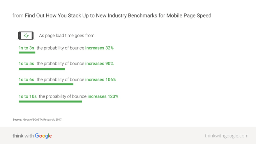
Potential patients have little time for online delays and expect your website to load fast. Fifty-three percent of mobile site visits will leave a page that takes longer than three seconds to load.

If your site loads too slowly, they’ll simply look elsewhere.
Page Speed - healthcare site design

4. Simple Navigation

Site navigation is one of the most important aspects of a healthcare website. It must be clear and easy to understand. In healthcare, it’s safe to assume most visitors are in a hurry and possibly a little stressed out. If a visitor can’t easily find the information they need, they’re gone – taking their business with them.

Clear organization keeps visitors engaged with your content and encourages them to spend more time on your website. This can reduce your bounce rate, or the percentage of all sessions on your site in which users viewed only a single page. A high bounce rate (especially if users click on many other similar sites after leaving yours) can send signals to search engines that your site is not satisfying users’ search intent – which can send you plummeting down the search rankings.

If you’re looking for inspiration, number 7 on our list of top 10 Drupal websites provides an excellent example of beautifully clean and intuitive navigation.

5. Clear Hours, Location and Contact Information

Some people just want to know where you are, when you’re open, and how to reach you. And if they can’t find that information quickly and easily, they’ll look elsewhere. While it may seem obvious that hours, location, and contact information should be front and center, it’s surprising how many websites have this information buried on their About Us page or in the footer of the site

Remember your visitors’ state of mind. Anything you can do to simplify and streamline their experience is worth consideration.

6. Comply with ADA Regulations

The Americans with Disabilities Act (ADA) protects individuals with disabilities from discrimination. In 2010, the ADA issued a series of regulations about website accessibility, turning up the pressure on site designers to create user experiences that live up to minimum standards of accessibility.

The ADA uses the Web Content Accessibility Guidelines to determine whether a site is compliant. These guidelines have very specific recommendations for various aspects affecting the user experience of a digital property.

Creating a compliant website design for hospitals is more than an exercise in fair play. It can also improve your SEO as Google rewards website owners that make efforts to meet compliance standards.

7. Website Typography

Well-designed typography is very important on healthcare websites, particularly in places where content is dense or lengthy. Screen after screen of text can strain visitors’ eyes and make it difficult to find specific information. A well thought out typographic design can minimize both issues and give users a better experience.

However, don’t rely solely on typography: Make sure your copy has plenty of paragraph breaks, white space, and imagery to break things up and make the page easier on the eyes.

8. The Right Website Color Palette

Most healthcare websites use a cool or muted color palette. That’s because cool or subdued tones help users stay calm and help limit the sense of excitement, panic or urgency that warmer colors might evoke. Typically, blue and white are popular colors for healthcare websites, as they evoke trust and cleanliness, respectively. However, keep your organization’s branding at the forefront. A children’s hospital, for example, may want to use more vivid tones, while a palliative care center may be better served by a more subdued palette.

9. Healthcare Site Design Imagery

Is a picture worth a thousand words? When it comes to images on healthcare websites, absolutely. The use of positive or calming photography can introduce some comfort into the user experience and create a positive impression of the brand.

But it’s important to keep imagery accurate. Forget stock photos of models dressed as medical pros smiling knowingly or holding their chins while listening intently to each other. Instead, consider investing in the services of a professional photographer to capture real people in real settings – actual medical professionals interacting with patients and each other, posing in front of the facility or working together. Photos of real patients providing testimonials makes a powerful impression, giving visitors a sense of the care they can expect when they become patients.

10. Smart Use of Video

As with your site photography, professionally shot and edited videos go a long way in establishing a positive impression of a healthcare facility. Tours of the hospital and specific units and informal, conversational interviews with doctors and staff give potential patients both a clear picture of the facility and the welcoming environment that awaits them. It also provides an excellent way for site visitors with lower literacy levels or visual impairment to access important information.

Some ideas for videos include:

  • Educational pieces on commonly asked questions or medical conditions
  • Patient reviews
  • Physician profiles
  • Procedure and treatment overviews

11. Content that Promotes the Brand

You may have a beautifully designed website, but to become the provider of choice, the site needs to answer this question: What makes your organization or facility different?

A healthcare facility’s website should tell the brand’s story and highlight what makes its staff and services stand out from the crowd.

Share highlights like specialized procedures, award-winning staff, community-based projects, and other points of pride that potential patients would find appealing. This will help you stand out in their minds and position you as the provider of choice.

Other areas that highlight authority and expertise include the following:

  • Affiliations
  • Associations
  • Awards
  • Links to research papers and studies
  • Notable achievements
  • Rankings in professional and consumer publications
  • Testimonials

One caveat: Your home page is not the place to list every achievement or bit of news. Remember that the primary goal of the website is to serve the patient. Instead, a small news feed or helpful link can make it easy for visitors to find that information if they choose, without being overwhelmed on the home page by the digital equivalent of a trophy case.

12. Customized Patient Portals

As Millennials and Gen Zers comprise a larger share of your potential healthcare consumers, you need to up your digital game to meet the technology expectations of both generations. As digital natives, they want to do business with companies that provide a robust, personalized, one-stop-shop website experience. A CDW Health study found that 98% of patients feel comfortable communicating with providers via online patient portals, while seventy-one percent of Millennials prefer online scheduling.

Additional digital resources to consider include:

  • Commonly used forms
  • Internal search function for doctor or specialist lookups
  • Emergency room wait time trackers
  • Chatbot-based telehealth sessions, with the option to chat with a live practitioner

Designing clear and effective websites for hospitals and healthcare facilities comes down to one simple truism: The better your design appeals to the wants and needs of the patient, the better for everyone – patients, hospital executives and the communities you serve.

Does your healthcare website need a shot in the arm? Contact us today.

Categories
Tags
Author

acquia

Vienna, VA – MARCH 4, 2020 –  Mobomo today announced it has been selected as the recipient of Acquia’s Partner of the Year Award for 2019, given for its superlative performance during the past year. The Acquia Partner Award recognizes outstanding contributions from partners over the course of 2019. 

Acquia has been a long standing and valued partner of Mobomo and we are honored by their recognition. Between our solution expertise and their cutting-edge cloud services, we are glad that our partnership is not only financially successful, but that we can work together to create innovative solutions for federal organizations.

“The Partner of the Year award distinguishes Mobomo as the leader who is committed to customer excellence and partnership,” said Brian Lacey, CEO of Mobomo. “Acquia has been a trusted service that allows us to create out of the box solutions for FedRAMP certified large scale and high-availability projects. We live in an age where everyone is trying to accelerate digital transformation, and Acquia gives us the platform to do so.”

Acquia recognized 15 partners across five global regions based on their overall revenue performance, overall growth with Acquia, and number of new customers secured last year.

“Mobomo is to be commended. 2019 was an incredible year for Acquia and our partners, with demand for our world-class digital experience solutions driving significant growth,” said Joe Wykes, SVP, global channels and sales, at Acquia. “2020 promises to be another amazing year, and together we’ll help our customers set the bar for delivering impactful customer experiences across channels.”

Over the past year, Mobomo has continued to enhance its Acquia implementation for NOAA Fisheries that has leveraged the platform to increase both customer satisfaction and customer traffic. As a result of the partnership with Mobomo and Acquia, NOAA Fisheries has been recognized with a number of industry awards including the 2018 MUSE Creative Award, the Acquia 2018 Public Sector Engage Award, the 2019 Webby Award, and the 2019 W3 Award. Mobomo also deployed a new Drupal platform based on Acquia Cloud Site Factory (ACSF) for Voice of America (VOA) that will provide a foundation for over 40 different language sites. Finally, Mobomo is deploying a similar ACSF platform for the Middle East Broadcasting Network. 

Leaders in digital experience delivery, Acquia partners support the world’s leading brands in facilitating amazing customer experiences. A full list of Acquia Partner Award winners can be seen here

About Mobomo

Mobomo is a world-class developer of high-performance applications and websites which we carefully craft to fit the needs of government agencies. We work hand-in-hand with our clients to deliver mobile, web, and cloud solutions using advanced DevOps techniques, which we integrate with our proven Agile software development methodology. 

About Acquia

Acquia is the open digital experience company. We provide the world’s most ambitious brands with technology that allows them to embrace innovation and create customer moments that matter. At Acquia, we believe in the power of community - giving our customers the freedom to build tomorrow on their terms. To learn more, visit acquia.com.

Categories
Tags
Author

You’re having trouble keeping up with demand and need a more powerful and robust website platform.

As business problems go, that’s a great one to have. Especially for enterprise-grade organizations and government entities. The question is: Which website platform is best?

To help you make informed decisions about your platform choice, we’re sharing a look at what Acquia has to offer. In this post, you’ll learn what Acquia is and how it works, who should consider using the platform and who should not. Then you’ll read our thoughts on what should be top of mind when selecting a platform.

Full disclosure: Mobomo is an Acquia partner organization, meaning we help clients make the most of their Acquia technology and services. Far from being a hard sell, however, this post aims solely to provide expert analysis and an honest assessment of the company and its products.

What Acquia Is and How It Works

Acquia is considered a digital experience platform (DXP), which is a collection or suite of products that work in concert to manage and optimize the user’s digital experience. These products can include a CRM, analytics, commerce applications, content management and more.

In its industry report on DXPs, Magic Quadrant for Digital Experience Platforms, Gartner defines a digital experience platform as “an integrated set of core technologies that support the composition, management, delivery and optimization of contextualized digital experiences…Leaders have ample ability to support a variety of DXP use cases and consistently meet customers’ needs over substantial periods. Leaders have delivered significant product innovation in pursuit of DXP requirements and have been successful in selling to new customers across industries.”

Organizations use DXPs to build, deploy and improve websites, portals, mobile and other digital experiences. They combine and coordinate applications, including content management, search and navigation, personalization, integration and aggregation, collaboration, workflow, analytics, mobile and multichannel support.

Acquia is one of the major players in this space, and the only one designed solely for Drupal.

Acquia co-founder Dries Buytaert was in graduate school in 2000 when he created the first Drupal content management framework. Buytaert and Jay Batson then established Acquia in 2007 to provide infrastructure, support and services to enterprise organizations that use Drupal.

Features and Benefits of Acquia

Acquia initially offered managed cloud hosting and fine-tuned services for Drupal. It has since expanded on its Drupal foundation to offer a complete DXP, including but not limited to:

  • Acquia Cloud: Provides Drupal hosting, development tools, hosting services and enterprise grade security.
  • Acquia Lightning: An open source Drupal 8 distribution with preselected modules and configuration to help developers build sites and run them on Acquia Cloud.
  • Acquia Digital Asset Management: A cloud-based digital asset management tool and central library for Drupal sites.
  • Acquia Commerce Manager: Provides a secure and flexible platform for content-rich experiential commerce.
  • Mautic: A marketing automation platform that enables organizations to send and personalize multi-channel communications at scale.
  • Acquia Journey: An omnichannel tool that allows marketers to listen and learn from customers to craft a sequence of personalized touchpoints and trigger what they will see next.

Additionally, Acquia provides comprehensive logging, performance metrics, security and Drupal application insights, and uptime alerts organizations need to monitor and optimize applications.

The Acquia platform also shines in its security capabilities, supporting strict compliance programs such as FedRAMP, HIPAA, and PCI, among others. Acquia customers can also internally manage teams at scale with advanced teams and permissions capabilities.

And they’re running with the big dogs. Other DXP companies assessed in the Gartner Magic Quadrants report include Adobe, IBM, Salesforce, Liferay, SAP, Adobe, Microsoft and Oracle.

In that report, Gartner cited Acquia’s key strengths as follows:

  • Acquia Experience Cloud offers a wide array of capabilities well-suited to support the B2C use case. Some clients also use it for B2B and B2E use cases.
  • The open-source community behind Acquia, which is the main contributor to the underlying Drupal WCM system, is highly active and well-supported by the vendor.
  • Acquia’s partner ecosystem continues to grow, offering choices to clients looking for expertise in specific verticals and availability in specific regions.

Who Should Consider Acquia

In a nutshell, Acquia is a good fit for enterprise-grade clients and government entities needing a comprehensive and powerful platform that optimizes the entire user experience while integrating data from multiple sources to support decision-making. Organizations that deploy and manage multiple websites will find Acquia particularly helpful.

One glance at Acquia’s customer page crystalizes the scope and scale of organizations they serve. Brands using Acquia include Wendy’s, ConAgra Brands, University of Virginia, City of Rancho Cucamonga in California and Australia’s Department of the Environment and Energy.

According to Website Planet, what sets Acquia apart is their foundation in the open-source Drupal content management framework. Unlike many of their competitors, Acquia allows customers to buy resources and features individually rather than purchasing entire pre-made packages. This can be particularly appealing to organizations who already have a couple of strong individual solutions in place that they want to integrate into their DXP, such as this reviewer in the manufacturing industry:

"A few things drove me to this solution: Decoupled architecture that allowed me to build a completely distributed digital landscape while keeping central control, The Open Platform concept that allowed me to build my own integrations and connect different components of my existing Martech stack without always using the "default" provided options and the comfort/security of relying on a cloud-based solution with full service support on top.

For e-commerce website owners, Acquia’s packages provide a PCI DSS compliant solution that can easily scale to accommodate extensive product catalogs, large transaction volumes and surges in traffic. Acquia’s proprietary e-commerce manager integrates the various content, commerceand user interfaces, allowing you to provide seamless experiences to your customers through a single system."

Who Should Not Consider Acquia

Acquia is best suited for organizations with both the need for such a powerful suite of tools and the development expertise to easily implement and manage it. Beginners and small businesses lacking the requisite knowledge of programming and Drupal are likely better off with a different provider.

For those who develop their website through an agency, you’ll want to double-check that they will provide developers experienced with Drupal 8. If you do develop in-house, make sure your developers have strong familiarity with it.

Additionally, Acquia’s power comes at a price: Its price point may put it out of reach for small-to-medium businesses.

Acquia: Our Takeaway

As with any other significant investment, the best choice for your organization boils down to your wants and needs of you, the consumer. Keep these points in mind assessing how well Acquia matches up with your master list of must-haves.

  • Determine your desired business outcome. Think about what you’re after in terms of improving the business. What does each DXP offer and can you make the most of every feature you’re paying for?
  • Know your stack. Document your current technology architecture: what do you have, who uses it, for what and how is it connected?
  • Determine use cases. Who will use your technology and how will it make them productive?
  • Prepare your people. Your personnel play a massive role in assembling your digital experience technology stack. Don’t set yourself up to spend time and money on a platform that doesn't get adopted or used to its potential.

By conducting a thorough assessment of your organization’s needs, capabilities, and goals, you can readily determine whether Acquia is the best fit to help you provide an amazing digital experience for your audience.

Contact us today and find out how Mobomo can help you make the most of Acquia.

Categories
Tags
Author

Mobile devices make up just over half of all e-commerce traffic … but they’re less than half as likely to convert.

Progressive web applications (PWAs) may change this trend. Notably, several e-commerce giants can thank PWAs for double-digit improvements in conversion rates. Trivago saw a 97% increase in clickouts to hotel offers, George.com (part of ASDA Walmart) enjoyed a 31% increase in mobile conversions, and Alibaba saw a 76% increase in conversions after upgrading their site to a PWA — all improvements that would elicit massive cheers in any e-commerce company’s boardroom.

Wondering if your e-commerce store should get in on the action? In this blog you’ll find the answers to questions like:

  • What is a progressive web application?
  • What are the advantages of PWAs over native apps?
  • Where do PWAs fall short, compared to native apps?
  • Which option is best for your e-commerce business?

Let’s dive in!

What Is a Progressive Web App?

A PWA is a web application (or “app”) that looks and performs like a native app, using the latest and most powerful web capabilities.

First, let’s explore the difference between a web app and a native app:

  • Web apps are any computer program that uses a web browser as its client. Web apps are designed to allow the user to perform specific actions; Google Docs and Trello are two well-known examples. In a web app, the navigation and user experience act more like a native application than a website, but unlike a native app, a web app doesn’t need to be downloaded, installed, or updated – it’s accessed via the user’s web browser.
  • Native apps (or mobile apps) are developed solely for mobile devices, and they live and run on those devices. For this reason, they can take advantage of specific device features and resources, such as the GPS and camera function. In addition, many native apps do not require internet access, making them a great option for things like productivity services or gaming.

PWAs provide the best of both worlds, offering the one-size-fits-all ease of a web app alongside a true native app experience, including capabilities such as the option to appear on a device’s home screen or send push notifications.

The developers at Google have coined an acronym — “FIRE” — to sum up a PWA’s ideal attributes: Fast, Integrated, Reliable, and Engaging. The PWA should load instantly, respond quickly to user interactions, integrate smoothly into the mobile experience, and provide an immersive user experience.

The team at Mozilla has identified 8 ideal characteristics of a PWA:

  • Discoverable, so the contents can be found through search engines.
  • Installable, so it's available on the device's home screen.
  • Linkable, so you can share it by simply sending a URL.
  • Network independent, so it works offline or with a poor network connection.
  • Progressive, so it's still usable on a basic level on older browsers, but fully-functional on the latest ones.
  • Re-engageable, so it's able to send notifications whenever there's new content available.
  • Responsive, so it's usable on any device with a screen and a browser — mobile phones, tablets, laptops, TVs, fridges, etc.
  • Safe, so the connection between you and the app is secured against any third parties trying to get access to your sensitive data.

These characteristics have led to some noteworthy performance for e-commerce businesses. Google’s case studies on progressive web apps reveal a 52% average increase in conversions.

Advantages of Progressive Web Apps

Progressive web apps have an edge over native apps in several important categories:

  • Easy development: PWAs are cheaper, faster and easier to develop than native apps. Businesses balking at the cost and time to build and maintain a website, an Android app, and an iOS app may leap at the chance to only have to manage one PWA.
  • Indexable: They have indexable and shareable URLs, and because everything in the PWA is web-based, it’s all discoverable by search engines. Plus, the fast loading times and high engagement rates are catnip to Google’s search algorithm.
  • Engaging: PWAs offer a native app-like experience and is even accessed in the same way as native apps, making it much easier for consumers to browse and buy.
  • Performance: They load and respond instantly, which is a major advantage considering that 53% of online shoppers would leave a website that fails to load within three seconds. Even with poor network conditions, PWAs work reliably.
  • Better adoption rates: Users don’t need to download anything to use PWAs, greatly reducing friction and improving adoption.
  • Automatic updates: Updates for PWAs are done automatically, negating the need for the end-user to update an app.
  • Independent of app stores: You can launch PWAs on your own, without a third-party review from app stores.

Disadvantages of Progressive Web Apps

While PWAs carry a wide range of advantages, they do lack some important features found on native apps, particularly for iOS devices.

  • No iOS push notifications: Push notifications can be a powerful tool in the battle against cart abandonment. PWA push notifications are available only to Android users, which is unfortunate, as iPhone users spend almost three times as much as Android users when visiting an e-commerce site.
  • No easy iOS install: Installing a PWA for iOS users is one of the biggest challenges, according to jmango360.com. There’s no invitation via a web app banner to the app store. So, the user has to manage to navigate to the PWA URL, then manually press the Share icon and then “Add to Home Screen.”
  • Limited data-storage: When iOS users do install a PWA on their home-screen, offline data is stored for just two weeks. After that, the cache is cleared.
  • Limited features: iOS users miss out on not only push notifications, but also important features for some e-commerce store owners rely on, like Siri integration and geo-fencing. Additionally, if your e-commerce store offers advanced technology like augmented reality, only native apps can truly showcase these features.
  • No consumer data: PWAs typically cannot access consumer data such as contacts and social profiles.

Native App Versus Progressive Web App: What’s Your Best Option?

When choosing between a native app and a progressive web app, the best option is the one that fits your business’s unique needs.

If budget allows, it’s hard to beat the sheer performance and user experience of a native app, especially if the lion’s share of your target market uses iOS.

On the other hand, a PWA can offer a lightning-fast and budget-friendly option that can also help a growing e-commerce business improve its search engine rankings.

In either case, e-commerce businesses can no longer afford to rely solely on a website, no matter how well it performs. To improve conversions and reduce friction, companies must offer consumers a convenient and top-of-mind option that makes it as easy and pleasant as possible for them to browse, add to cart, and buy – not just once, but every time.

Can't decide? Get in touch with Mobomo today. We're here to help!

Categories
Author

cloud services

Where should your business data and processes “live?”

In the cloud? If so, then where in the cloud? Through cloud services such as Amazon Web ServicesGoogle Cloud? Microsoft Azure? Or should you turn to Cloudways brands such as DigitalOcean, Linode, or Vultr?

Or, maybe you should side with the number of businesses that primarily keep data on-premises, using static web technology to minimize exposure and optimize speed.

Then again, perhaps a mix of technologies – including tailored microservices – will help you achieve your objectives.

Read on as we discuss expert predictions on the future of cloud services, what your options are, and how to make the right tech choices for your business

Predictions on the Future of Cloud Services

Writer Nick Hastreiter interviewed a number of tech leaders recently for a piece on cloud services. These leaders, from disruptive startups to big-brand heavyweights, shared their vision on what to expect … and they don’t all agree with where things are heading:

  • Michael Corrado of Hewlett Packard Enterprise thinks cloud computing will likely morph into a hybrid solution, combining cloud-based software and on-premises hardware. Such a solution would balance the scalability and flexibility of the cloud with the security of a private data center.
  • Jeff Fisher of Kemptechnologies agrees, calling the future of cloud computing, “undeniably hybrid.” He predicts organizations will leverage multiple cloud platforms, both private and large-scale public (like Amazon Web Services and Microsoft Azure), helping them avoid locking into a single provider. But, that will introduce additional complexity, as IT staff need to become comfortable operating in more than one cloud platform environment.
  • On the other hand, SwiftType founder Mike Riley thinks by 2030, businesses will be operating mostly from the cloud, enjoying the productivity and efficiency that that platform provides. By then, he said, a major concern will relate to access. “We’re already seeing fragmentation of content and data and it’s posing problems related to organization, search, discovery, and most importantly, collaboration.” Riley predicts that monolithic application suites will be used less and less.
  • David Hartley of UHY LLP takes things even further, predicting that “traditional data centers and the traditional model of delivering IT services will become extinct.” The days of building your own data center, owning your own equipment and installing or updating hardware will leave fade away rapidly, Hartley said. As software-, infrastructure- and platform-as-a-service providers assume a larger role, Hartley says, there will be more space for independent firms to be hired to test processes and controls, develop service organization control analyses, and report financial and IT services and processes to user organizations.

Overcoming the Cloud’s Limits

And what is Mobomo’s take on this?

We think organizations will take a critical approach, picking and choosing what works right for them. And in some cases, what’s “right” may not always be cloud-based.

Simply put, the cloud isn’t great for everything. You don't want to use it for active directory or credential management, for example. Latency precludes putting that large of an asset in the cloud unless you're a large-scale, widely based company. For about 95 percent of use cases, having an active directory or authentication onsite would make more sense than relying on cloud services, and in general, is more cost-effective.


The Resurgence of Static Pages

Another, perhaps surprising trend emerging is the return to static websites, or web pages with fixed content. Unlike dynamic websites, static sites don’t require programming or database design.

Two main drivers are behind this resurgence:

1. Page Speed

Some organizations are eschewing programmatic web pages because programming can slow or disrupt a user experience. The challenge, then, is to create static pages and host them out of an object data store such as Amazon S3. A flat file stored in S3 can serve a lot faster than if Drupal has to reach into a database, gather information, and render it into a page before the user can access it.

2. Security

One way to fend off hackers is to give them nothing to hack. If there's no CMS or programming to compromise, you can't be compromised. But using improperly secured S3, of course, introduces its own security concerns, primarily exposure to data leaks. But if you have S3 properly secured, then there's no way that a hacker can compromise your systems via your site.

Cloud services like S3 are easy to use, inexpensive, and provide static hosting without having to configure anything. You don't have to figure out how to put your data centers in storage partitions onto the web. S3 handles it for you.


The Role of Microservices

While microservices architecture is not exclusively relevant to cloud computing, according to IBM there are a few important reasons they so frequently are discussed together.

First and foremost are the utilization and cost benefits associated with deploying and scaling components individually.

True, these benefits are still present to some extent with on-premises infrastructure. But combining small, independently scalable components with on-demand, pay-per-use infrastructure enables much larger cost optimizations.

Another key advantage of microservices is that each individual component can adopt the stack best suited to its specific job. Cloud services are a boon here, as they can minimize the management challenges with stack proliferation.

Additionally, microservices can improve security. The more you separate out microservices, the more security layers you can wrap around each one. When individual services are able to run only when needed, you can better protect the system as a whole and possibly save money, too.

When it comes to cloud services in 2020, the theme is “right fit.” Organizations should look at the many different options available to them and pick and choose from these options to create customized systems that work best for their needs and their resources.

If you’re not sure what the right fit is, expert consultants (like the ones here at Mobomo) can help you assess the best options for your organization.

Contact us today to learn more.

Categories
Tags
Author

Design Thinking

“Design for the user.”

It seems like a common sense approach. After all, if your website or your custom app aren’t designed with the end user in mind, will it get used?

Common sense notwithstanding, there’s a large gulf between the idea of designing for the user and the actual implementation of it. Plans go astray, different stakeholders have different ideas about what the user would want, and of course, there are always practical considerations like timeline and budget to consider.

Fortunately, design thinking can help project teams establish clear markers that keep them on track toward a seamless, positive user experience.

What Is Design Thinking?

Design thinking goes beyond the surface-level “design for the user” philosophy. It involves a highly tangible, iterative process that allows teams to move past their own viewpoints and levels of understanding in order to gain deep insight into the user’s needs and identify new strategies and solutions that might not have been immediately evident.

In short, design thinking is a process that gives teams concrete steps to help them get out of their own heads and into the user’s, to ensure the team is meeting the user’s genuine needs.

How Does Design Thinking Work With UX?

Most models of design thinking involve five steps:

  1. Empathize: Understand your user’s pain points and greatest wishes.
  2. Define: Figure out what problem the user is experiencing.
  3. Ideate: Let creativity run wild and break down assumptions or traditions.
  4. Prototype: Build a model that you can test with real users.
  5. Test: Learn what works, what doesn’t, and then adjust.

Let’s explore these in more detail, in the context of UX design:

Empathize

The most successful apps and websites are those that were designed with the user firmly in mind. The folks at Interaction Design Foundation agree, saying that UX tasks “can vary greatly from one organization to the next, but they always demand designers to be the users’ advocate and keep the users’ needs at the center of all design and development efforts.”

But to do that, it’s necessary to understand who the user is and what they want and need. It’s also important to recognize if more than one user persona is in the picture.

Here’s an example: Let’s say we want to create a video app for children ages 6 to 12, with kid-friendly content.

In this situation, there are two main users that we need to understand: the children, and their parents.

  • The children want intuitive (intuitive for them, not us) navigation, an easy way to binge-watch content from specific creators, and a fun way to interact with the creators and other viewers.
  • The parents? They’re concerned about online predators and inappropriate content and want to make sure they have a way to keep an eye on things without having to constantly watch over their child’s shoulder.

These are fairly basic descriptions of user needs – and to really get a good handle on what each end-user wants from the UX, there’s only one foolproof method: talk to them. There is simply no replacement for sitting down with users and getting a first-hand account of what they need, like, hate, fear, enjoy, and find frustrating.

Define

The main challenge in this step is to clearly articulate the problem that needs to be solved, or the need that must be met.

Ideally, near the end of the Define process, there should be a clear answer to the blanks in the statement, “The user needs to _____________ because ________________.”

From there should arise a problem statement for the team to drive towards, such as “Create an easy and accurate way for both users and parents to filter and find video content.”

To get to this point, it’s vital for teams to take the data they gathered during the Empathize stage and process it in an organized, systematic fashion, unpacking the findings and discussing what they mean. A good practice is to keep asking “why,” digging down past surface-level problems and into the deeper, emotion-driven issues. From there, the data can be used to map out a User Journey, breaking down precisely how the user might interact with the app or site and what they’re looking for.

Ideate

In the ideate stage of design thinking, assumptions and constraints are thrown out the window. This can be much harder than it sounds – as we become more experienced, we often fall into certain patterns or draw on our existing knowledge, making it difficult to look at things from a completely different perspective.

In the ideate stage, “stupid” questions are often the key to unlocking new avenues, because those types of questions tend to disrupt long-accepted, “obvious” practices that should have gone challenged long before.

In the context of UX, the Ideate stage is crucial – it is too easy for teams to fall back into best practices or standard ways of designing the user experience. By applying design thinking, a team opens itself up for those “eureka!” moments that are only possible when the mind is open to every possibility, and it’s those moments that lead to groundbreaking design.

Prototype

This is where the rubber meets the road. Once a team has come up with what they think is the best possible way to design the UX for an app or website, they need to test the feasibility of that idea. And they need to test it with real users.

The prototype step can have multiple stages, from initial sketches, to wireframes, to actual working prototypes, all the way to beta versions that are available for a limited number of public downloads. The team may even create multiple prototypes if they’re not certain which idea will fly with users.

Test

Once the prototype is created, the team must learn — from real users — what works, what doesn’t, and then focus on iteration. To make the most of the testing stage, it’s absolutely crucial for the team to have in place mechanisms to gather and assess feedback. The more detailed the feedback is, the better the chances of fine-tuning any little UX issues that could harm the success of the finished product.

During the testing phase, it’s important that the testers not be coached or steered toward a certain type of feedback. Ideally, the team should refrain from telling testers what the purpose of the site or app is, or how it works. If testers can figure it out easily and accurately without any guidance, the UX is definitely on the right track. On the other hand, if the testers are confused about what the app or site is for, or how to use it, then both the messaging and the UX need some work.

The principles of design thinking can be applied to a multitude of challenges, and these principles truly shine when they’re applied toward the UX design of a website or application. By following a proven process that involves, above all, listening to the user, teams can create a finished product that will be enthusiastically embraced, adopted, and used for years.

Contact us now and find out how Mobomo's approach to design can benefit you.

Categories
Author

A chef can make a great meal with a few basic ingredients. But when offered a massive pantry full of options, the result can be a work of art.

The same principle applies when it comes to website CMS software. A basic template-style CMS can result in something that hits the spot. But Drupal’s staggering degree of flexibility and modular options has allowed the developers of some of the world’s most prominent websites to create gorgeous and highly functional sites that inspire, inform, and elevate.

Here are our top 10 picks for Drupal websites that we think have raised the bar:

  • Tesla
  • PGAL
  • The University of Texas at Austin
  • Children’s Hospital of Los Angeles
  • Mint
  • National Baseball Hall of Fame
  • The Australian Government
  • Rethinking Picasso’s Guernica
  • The Emmy Awards
  • NASA

Let’s examine these in more detail:

10. TeslaTesla

A rare day passes by without Tesla making headlines. The brand and its founder, Elon Musk, are renowned for big, audacious ideas that have potential to change the world. The beautiful photography and design make every section look like a high-end editorial page in a magazine, while the simple, intuitive navigation and call-to-action features are clean and unobtrusive. It all combines to create a website that’s aspirational yet attainable.

9. PGALPGAL

PGAL is an international design firm focusing on interiors, architecture, planning, and engineering. Their challenge is to show and tell, so that potential clients are dazzled by the site’s visuals while still being able to find enough solid information to want to take the next step. The site, which uses imagery as the gateway to project stories, is a delightful rabbit-hole that we could spend hours exploring. Make sure to check out their Projects page, as it is an excellent example of how to show off a portfolio in a clean but comprehensive way.

8. The University of Texas at AustinUniversity of Texas at Austin 

University websites can often be an overstuffed nightmare to navigate, but the team behind UT Austin’s website got it right: Their menu navigation is clean, well-organized, and enticing. Add to it a home page that evokes the fresh excitement of starting the post-secondary journey, while peppering in well-organized data that invites the reader to learn more, and you have a website that gets students and their families off to the perfect start.

7. Children’s Hospital of Los AngelesChildren’s Hospital of Los Angeles

160,000 visitors go to CHLA.org every month, making it vital for the site to present clear, accurate, easily navigated information in a way that builds and maintains trust. It’s a tall order, but CHLA.org delivers. The design is clean but far from cold, while the most frequently searched information is put front and center instead of being hidden in the navigation bars, making it easy for frazzled parents to find out what they need to know. The sheer volume of information on the “Patients and Families” page could easily be overwhelming but is organized beautifully and intuitively.

6. Mint

Mint’s value statement: “We help you effortlessly manage your finances in one place.” They offer clean and simple financial management, using a clean and simple sentence to describe what they do. A cluttered or complicated website would completely undermine their brand. Fortunately, Mint.com is anything but cluttered or complicated. The simple and soothing colors and minimalist text are reassuring to visitors who want straightforward information, while the navigation and iconography make navigation a breeze.

5. National Baseball Hall of FameNational Baseball Hall of Fame

For any website to be successful, it has to give the end-users what they’re looking for, and the BHoF delivers. After extensive user research, the site was designed to showcase the incredible stories and artifacts in BHoF’s collection, bringing it all to life for the site’s visitors. Fortunately, it also does so in a way that’s easy to navigate, inviting visitors to spend plenty of time exploring.

4. The Australian GovernmentThe Australian Government

As with universities and colleges, government websites can often be an impenetrable labyrinth to navigate. Australia.gov.au does things differently, living up to their header, “Helping you find government information and services.” The site is incredibly well-organized, with virtually no clutter. And even though it has not one photo to speak of, it still manages to be attractive, through a judicious use of color and minimalistic icons.

3. Rethinking Picasso’s GuernicaRethinking Picasso’s Guernica

The Museo Nacional Centro de Arte Reina Sofía created an ambitious project around one of Picasso's most famous works of art, and the results were groundbreaking: The project has been recognized with a Webby as the best 2018 Cultural Institutions Website. The storytelling and imagery on this site are captivating, while the user experience is smooth and unobtrusive.

2.  The Emmy AwardsThe Emmy Awards

The Emmy Awards are splashy and glamorous on the outside, while requiring meticulous planning and organization behind the scenes. Their website is no different. With a plethora of content, rich color choices, and high-quality images, the site is as immersive an experience as the awards show is. But thoughtful, intuitive navigation, exciting features, and well-curated content demonstrate expertise.

1. NASANASA

NASA.gov is a massive resource on space, astronomy, and the universe, offering detailed information on present and past missions, gorgeous photography, educational resources, and information about the organization in general, to name but a few features. Organizing such a wealth of information in a coherent and clear way shows what is possible with Drupal.

Full disclosure: We’re the team behind NASA.gov, so it’s understandable that we might have a soft spot for this site. However, we’re far from alone in loving the finished product. Our friends at Vardot.com call it “a shining example of Drupal CMS used to present stunning information, and elevate the user’s experience,” and NASA.gov has made the top of more than one “Best Drupal Websites” list.

Want to see the possibilities that Drupal can hold for your organization’s website?
Contact us today!

Categories
Tags
Author

Drupal 9 is scheduled for release on June 3, 2020. And as with any highly anticipated release, questions abound: “What will change from Drupal 8 to Drupal 9?” “What do I need to do to prepare before upgrading?” And top-of-mind is the big question: “What will Drupal 9 be like to work with?”

Read on as we share what you’ll need to know … and what might surprise you.

Anybody who’s upgraded from Drupal 7 to Drupal 8 recalls the giant chasm between the two systems. Almost 200 new features were launched including an entirely new page editor, a new theme engine, a new text editor, and new field types, to name but a few.

This gap doesn’t exist between Drupal 8 and Drupal 9. In fact, on the surface, there IS no difference: Drupal 9 has the same code, functions, and feature set as Drupal 8.9.

So why release it then? As it turns out, there are differences — they’re just not front-and-center on the interface.

Time to Clean House

Throughout its development cycle, Drupal 8 has wound up with a lot of code debt: functions that were created programmatically and used for some time but have been rendered redundant by more efficient functions.

These bits of code clutter up Drupal 8 like your old CDs and DVDs clutter up your bookshelf: There’s nothing wrong with them, but you probably don’t need them anymore now that you have something more efficient.

The result of all this extra code is that programmatically, there might be 10 different ways to do one single thing.

What Drupal has done is marked all of those code items in the backend code base as being “deprecated”. When Drupal 9 comes out, the plan is to remove all the deprecated code on this list, leaving only the latest version of whatever that code’s API is. They’ll also be updating third-party dependencies, such as Symfony and Twig. From Drupal’s site:

Will Drupal 9 Be Better?

Yes, but not without some minor risks.

Jettisoning all this deprecated code will result in a much faster, cleaner, and better-operating version of Drupal. However, if you have legacy programs whose modules use some of that deprecated code, you could find yourself with some broken processes.

How to Prepare for Drupal 9

In general, upgrading to Drupal 9 is not an onerous process – it can literally be done via a single command. What will take more time is monitoring and auditing code bases to ensure that none of your functionality is dependent upon deprecated code.

Fortunately, Drupal is well prepared for this, and has indicated that the Drupal 8 branch of the Upgrade Status module can be used  to identify and report on any deprecated code:

In addition, we anticipate that when downloading or updating modules, Drupal will likely advise whether there are compatibility issues due to bad functions. However, that notification system isn’t currently in place (if it indeed happens at all), so your best bet is to work with your development partner, who can audit your code to identify any trouble spots.

Marie Kondo-ing Your Infrastructure

Drupal 9 will be a much faster and more streamlined platform, but it doesn’t exist in a vacuum. If the rest of your operational architecture is similarly full of code debt and redundant processes, updating Drupal 9 will be akin to sending a Lamborghini down a pothole-rutted road: That powerful engine is wasted if the route is slowing it down.

So, going to Drupal 9 is an excellent opportunity to look at your legacy systems, audit them as well, and make sure your entire infrastructure is clean, fast, and free of roadblocks.

The Bottom Line

In general, upgrading to Drupal 9 should not be a complex or lengthy process. By cleaning out the clutter and performing some common dependencies, Drupal is practicing good development hygiene and providing its customers with a more streamlined system that will be faster … but still familiar.

Want to know more? Contact us today!


Categories
Author

 When developing an app, there are a multitude of important decisions to make between “Let’s do this!” and “It’s launch day!”

One of these decisions is the application development approach. Is a native mobile app the right way to go? Or would a cross-platform app be a better fit for your needs and your organization? There is no one-approach-fits-all, so it’s important for organizations to avoid false starts and costly redevelopment time by having a solid understanding of their available options.

Let’s analyze these options.

Native App

A native app is one that has been designed specifically for one mobile platform (i.e. Android, iOS), with engineers leveraging the programming language used by the platform’s own operating system (Java or Kotlin for Android and Swift/Objective-C) for iOS. If you wish to have native apps made for multiple platforms, the developers need to make separate codebases.

Advantages to native app development are plentiful. Because the app’s UX is tailored to that specific platform, the app will deliver strong and smooth performance and can take advantage of the device’s full set of functionalities. This tends to result in much higher ratings and better visibility (read: more revenue) in app stores.

Additionally, if the platform OS is eventually updated (which often means bugs will appear), resolving the specific code for that platform is much more efficient and therefore less costly than needing to fix a centralized code base that will affect all the platforms.

So, while native apps do tend to require more time and resources up front, they can offer considerable savings long-term in maintenance and updating.

The Takeaway: Native apps are an investment, but a worthwhile one if you’re looking long-term with your app. The functionality tends to be much better and maintenance is significantly less complex.

Cross-Platform App

Cross-platform apps are designed more as a one-size-fits-all solution …with modifications. A single codebase is written and can then be shared among the different platforms, either using web technologies or tools such as PhoneGap, Titanium, or React Native.

Cross-platform is a popular option among organizations with a tighter timeframe and lower budget, as it only requires one codeset to be written. This makes cross-platform a reasonable option for simple applications like games or single-purpose apps. Some organizations will specify the devices they want the code to work on, while others will make the app available to all users, whether they’re using an iPhone 3 or a Galaxy M30s.

The downsides of the cross-platform approach, however, can be summarized by the old adage, “Jack of all trades, master of none.” Because cross-platform has to be everything to every platform, its performance tends to be suboptimal. In addition, it can’t take advantage of each type of device’s proprietary features, thus limiting the potential.

Indeed, the Airbnb app initially used a cross-platform approach with React Native. But in June of 2018, they announced they were sunsetting their use of this tool and would be focusing on native app development, citing issues like developer experience, quality, and technical issues. Even the world’s most popular social media app, Facebook, made the switch from cross-platform to native in 2012, with Mark Zuckerberg announcing that “the biggest mistake we’ve made as a company is betting on HTML5 over native.”

The Takeaway: If both time and budget are short, cross-platform app development is a great way to get to market quickly … as long as you don’t mind sacrificing some performance.


A Third Option: No App

While apps are an excellent way to increase customer engagement and improve the user experience, they’re not a cure-all. If the app is providing a service that a user would only need once or twice a year for a limited number of functions, it may be better to focus instead on your mobile website experience. On the other hand, if you anticipate year-round use and wish to provide a rich, multifunctional experience, your users will be happy to have that app take up real estate on their devices.

If you have the time and the budget, native app development can provide you with a highly functional app that is not only tailor-made for the user’s experience and device but can also save you maintenance headaches down the road.

Meanwhile, cross-platform apps provide a viable option for smaller budgets and businesses that want to get a simple app out into the marketplace quickly.

Still not certain? The experts at Mobomo are happy to discuss options and recommend the best approach for you and your organization’s unique needs, so contact us today.

Categories
Author

Mobomo Top 1000 2019

For the second time in a row, Mobomo has been awarded the Clutch Top 1000 Companies in the world! This award highlights only 1% of the companies on the platform and is the most exclusive award offered by Clutch. Companies are ranked based on the quality and recency of verified client reviews, as well as the companies’ market presence and industry leadership.

With passion and expertise in creating cutting-edge, functional, and successful experiences, Mobomo has become one of the top mobile app development companies in the Washington, D.C. area.

In a recent project reviewed on Clutch, Mobomo received 5 stars for developing a custom web portal and Android and iOS apps.

It has been an honor to receive this recognition as 2019 comes to an end. Mobomo is grateful for the support we have from our amazing clients, who have taken the time to provide detailed reviews on Clutch. We are excited to see what 2020 will bring for our team and clients!

About Clutch
Clutch (clutch.co) is a business to business research firm located in Washington, D.C. They are best known for connecting agencies and software solution companies in order to enhance business goals across businesses. Their ratings and reviews platform publishes the most extensive and referenced client reviews in the B2B services market.

Categories
Author
Subscribe to Mobomo