Mobomo webinars-now on demand! | learn more.

Trying to get up to speed with D3 can be a daunting task. A quick google search will reveal hundreds of different starting points, almost all of which involve writing great swaths of code in order to build even the most basic of charts. Don't believe me? Here's the official example for a basic line chart. D3's biggest barrier to entry is its biggest strength - the flexibility that it provides to create nearly any sort of visualization that you can imagine.

In order to help foster good practices (by creating re-usable charts) and to give back to a community that is so willing to share its knowledge, Intridea has released a library that will help you get started much more easily: the D3 Fakebook. With just a few lines of code, you can easily render that same bar chart:

// From the D3 Basic Line Chart example: http://bl.ocks.org/mbostock/3883245 d3.tsv('examples/data/aapl_stock.tsv', function(error, data) {   var chart = new D3Fakebook.TimeScaleLineChart('#singleLine', {     data : data,     valueName : 'close'   });   chart.render(); }); 

Basic line chart

Easy as pie.

Getting Started

There are a few ways you can start using this library today: the first is that you can install it using bower ($ bower install d3-fakebook), which will pull down the dependencies (underscore.js and d3). You can also grab the files directly - there are both compiled JavaScript files as well as CoffeeScript.

Once you have the files loaded in your browser, you can access the different chart types under the D3Fakebook namespace. Each chart type takes a set of options that allows you to configure.

Wait - "Fakebook"? What’s up with the name?

The concept of a "fakebook" comes from Jazz - back in the 1950's, popular Jazz songs (also known as standards) were often compiled in to collections of books. Each song's transcription would have chord changes and the main melody would be written out, but not the whole song, since the musicians would make each their own by improvising on top of the chord changes.

Our goal with the D3 Fakebook is to do precisely that - give you a starting point to make amazing, beautiful visualizations that are purely your own. The Fakebook gives you a starting point and some guidance, but doesn’t force you to follow any specifically set path.

Follow the Changes

This is a living library, something we're using in our own projects (check it out in action on http://humanprogress.org) and though it's a bit rudimentary right now, we'll be adding more charts in the near future. If you want to help out, or if you've found a bug, feel free to submit a pull request on Github, and we'll incorporate it as soon as possible!

A few more roadmap items: we intend to add AMD support, compiled JavaScript modules (in addition to making the existing CoffeeScript files into actual modules), and nicer transitions.
Keep the conversation going! We'd love to hear from you!

Categories
Author

Alt text

Over the last few months, Intridea has worked on several projects revolving around charts, maps, and interactive stats. Learning how to effectively display these aspects, both at a functional and beautiful level, is a challenging task. However, like the old saying goes, necessity is the mother of invention, and these projects taught us some unique ways to streamlining the overlay process...

The Challenge: Effectively display data stats and implement maps with a highlight overlay for maps to draw attention to one and/or a few specific countries.

The Solution: After some research, we chose Mapbox as the base map, enabling easier customization in the shaded area/border/ocean colors, and for the overlay, utilizing d3 to add a highlight layer. Here’s the 4 step process:

Step 1: Initiate Mapbox map on specify div:

var map = L.mapbox.map("country_map", ‘your_mapbox_map_id');  

Step 2: Add a base layer to the map with custom styles:

    var layer = L.geoJson(null, { style: { fillColor: '#c6bbaf', fillOpacity: 0.5, weight: 0, color: '#ffffff', opacity: 1 }})     map.addLayer(layer)  

In order to complete Step 2, we created detailed geojsons for each country, either by generating from a shapefile or creating manually from http://geojson.io.

Step 3: Use d3 to load country geojson and set bounds to country area:

    var json_file = "/assets/" + country_isocode + ".json"     d3.json(json_file, function(error, data){            layer.addData(data.features);            map.fitBounds(layer.getBounds());     } 

Step 4: Add a marker on country capital and create an anchor to correctly position display:

           var latLng = L.latLng(lat, lng);       var pinAnchor = new L.Point(8, 8);       var pinAnchor = new L.Point(8, 8);       var icon = L.icon({         iconUrl: "/assets/icon-star.png",         iconAnchor: pinAnchor       }); 

Resources:

Categories
Author

modevgov

Alright, so your big data infrastructure is up and running. You've collected and analyzed gigabytes, terabytes, maybe even petabytes of data and now you'd like to visualize that data on your desktops, tablets, and smart phones.

How do you go about doing this? Well, at a high level, big data when summarized/aggregated, simply becomes smaller data. The balancing act though is effectively displaying your data while also creating an ideal user experience.

In today’s talk, we’ll discuss the art and science of responsive web app development with HTML5, D3, CoffeeScript/JavaScript, Rails and MongoDB. Based on Intridea’s work with American Bible Society, we’ll show you how to visualize big data on mobile phones and tablets via the hosting site Amazon EC2 and processed using Amazon Elastic Map/Reduce with Apache Hive and Pig. In addition, we’ll showcase the beautiful dashboard developed by our UX team and discuss the architecture, both frontend and backend, behind this exciting project.

Visualizing Big Data on Small Devices will be @ 4 PM today in the Artisphere ballroom. Don't miss out!

Geeking out on big data? Check out the posts below!

  • Big Data, Small Budget
  • Single Page Apps: Popular Client Side MVC Frameworks
  • The Art of Humanizing Big Data
  • Categories
    Author

    Alright, so your big data infrastructure is up and running. You've collected and analyzed gigabytes, terabytes, maybe even petabytes of data and now you'd like to visualize your data on desktop PCs, tablets, and smart phones.

    How do you go about doing this? Well, let me show you. Visualizing big data, in many cases, isn't far from visualizing small data. At a high level, big data when summarized/aggregated, simply becomes smaller data.

    In this post, we'll focus on transforming big data into smaller data for reporting and visualization by discussing the ideal architecture, as well as present a case study.

    Architecture: Frontend (data visualization)

    On the front end, we utilize responsive design with a single code base to support desktop, tablet, and mobile phones. For native mobile apps, we can utilize tools like PhoneGap or Adobe Cordova for responsive design; a process that significantly cuts down cost, shortens time to market, and is a great option for business apps.

    Here are two popular frontend approaches:

    1. Server Side MVC:

    Server side MVC (model view controller) has been the de facto standard for web app development for quite some time. It's mature, has a well established tool set (i.e Ruby on Rails), and is search engine friendly. The only downsides are it's less interactive and less responsive.

    2. Client Side MVC:

    Capitalizing on JavaScript for page rendering, apps developed on Client Side MVC are more responsive and interactive than server versions. At Intridea, we've found this method to be particularly suited for interactive data. In addition, referred to as single page applications, Client Side MVC, have the look and feel of a desktop app. Therefore, creating an ideal user experience that is highly responsive and requires minimal page refreshing.

    Architecture: Backend (data storage and processing)

    Typically 'big data' is collected through some kind of streaming APIs and stored in HDFS, HBase, Cassandra, or S3. Hive, Impala, and CQL can be used to query directly against the data. It's fairly convenient to query big data this way, however not efficient if data has to be queried frequently for reporting purposes.

    In these situations, extracting aggregated data into smaller data may be the better solution. MongoDB, Riak, Postgres, and MySQL are good options for storing smaller data. Big data can be transformed into smaller data, using ETL (Extract, Transform, Load) tools, thus making it more manageable (e.g. realtime data can be aggregated to hourly, daily, or monthly summary data).

    Note: For single page application, a restful API server is needed to access the aggregated data. Our favorite API Server is Ruby on Rails.

    Case Study: American Bible Society

    American Bible Society provides online access to 582 versions of the Bible in 466 languages through partnerships with publishers. With their javascript API generating billions of records every year, ABS needed help making sense of their data. Thus, we partnered with ABS to create ScriptureAnalytics, a site that gives insights into their vast collection of data.

    Access to the Bible translations was provided via JavaScript APIs. The usage of the APIs was tracked at the verse level, along with ip location, timestamp, and duration. The raw usage data was collected through AWS Cloudfront (Apache log files) and stored on EC2 S3 and preprocessing/aggregation of stats was conducted via AWS Elastic Map/Reduce with Apache Pig and Hive.

    ABS receives over 500 million tracking log entries from Cloudfront every year, including several bible verse views per entry. What's this amount to annually? About several billion views each year!

    Intridea was asked to develop public and private dashboards for visualizing Bible readership stats in an interactive and responsive way. The public dashboard, scriptureanalytics.com, was developed for the general public to view summary level status and trends. While the private dashboard was for ABS and publishers to track individual translations, helping them be strategic on a multitude of levels.

    The dashboards were developed as a responsive single page app with Rails/MongoDB as the backend, and Backbone.js, D3, Mapbox as the frontend. The app pulls aggregated hourly/daily stats (generated using Hive and Pig running on Elastic Map/Reduce Hadoop clusters against the raw data stored in S3) in the JSON format from S3 and stores them in MongoDB for fast query access. The dashboards pull data from MongoDB via Rails and use Backbone/D3/Mapbox to visualize the stats. We use MongoDB's aggregation framework to query the data stored in MongoDB.

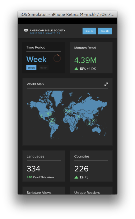
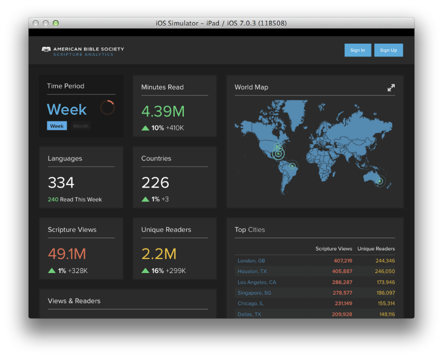
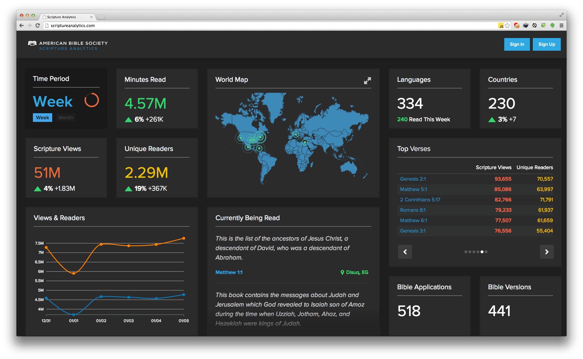
    See screen shots below for iOS, iPad, and desktop PC:

    Smart Phone

    smart phone

    Tablet

    tablet

    Desktop

    desktop

    Got any questions about visualizing big data on a small screen? Let us know!

    Want to learn more? Check out the entire Big Data series below!

    • Big Data, Small Budget
    • Single Page Apps: Popular Client Side MVC Frameworks


    Categories
    Author
    1
    Subscribe to D3