
Mobomo webinars-now on demand! | learn more.

Alright, so your big data infrastructure is up and running. You've collected and analyzed gigabytes, terabytes, maybe even petabytes of data and now you'd like to visualize your data on desktop PCs, tablets, and smart phones.

How do you go about doing this? Well, let me show you. Visualizing big data, in many cases, isn't far from visualizing small data. At a high level, big data when summarized/aggregated, simply becomes smaller data.

In this post, we'll focus on transforming big data into smaller data for reporting and visualization by discussing the ideal architecture, as well as present a case study.

Architecture: Frontend (data visualization)

On the front end, we utilize responsive design with a single code base to support desktop, tablet, and mobile phones. For native mobile apps, we can utilize tools like PhoneGap or Adobe Cordova for responsive design; a process that significantly cuts down cost, shortens time to market, and is a great option for business apps.

Here are two popular frontend approaches:

1. Server Side MVC:

Server side MVC (model view controller) has been the de facto standard for web app development for quite some time. It's mature, has a well established tool set (i.e Ruby on Rails), and is search engine friendly. The only downsides are it's less interactive and less responsive.

2. Client Side MVC:

Capitalizing on JavaScript for page rendering, apps developed on Client Side MVC are more responsive and interactive than server versions. At Intridea, we've found this method to be particularly suited for interactive data. In addition, referred to as single page applications, Client Side MVC, have the look and feel of a desktop app. Therefore, creating an ideal user experience that is highly responsive and requires minimal page refreshing.

Architecture: Backend (data storage and processing)

Typically 'big data' is collected through some kind of streaming APIs and stored in HDFS, HBase, Cassandra, or S3. Hive, Impala, and CQL can be used to query directly against the data. It's fairly convenient to query big data this way, however not efficient if data has to be queried frequently for reporting purposes.

In these situations, extracting aggregated data into smaller data may be the better solution. MongoDB, Riak, Postgres, and MySQL are good options for storing smaller data. Big data can be transformed into smaller data, using ETL (Extract, Transform, Load) tools, thus making it more manageable (e.g. realtime data can be aggregated to hourly, daily, or monthly summary data).

Note: For single page application, a restful API server is needed to access the aggregated data. Our favorite API Server is Ruby on Rails.

Case Study: American Bible Society

American Bible Society provides online access to 582 versions of the Bible in 466 languages through partnerships with publishers. With their javascript API generating billions of records every year, ABS needed help making sense of their data. Thus, we partnered with ABS to create ScriptureAnalytics, a site that gives insights into their vast collection of data.

Access to the Bible translations was provided via JavaScript APIs. The usage of the APIs was tracked at the verse level, along with ip location, timestamp, and duration. The raw usage data was collected through AWS Cloudfront (Apache log files) and stored on EC2 S3 and preprocessing/aggregation of stats was conducted via AWS Elastic Map/Reduce with Apache Pig and Hive.

ABS receives over 500 million tracking log entries from Cloudfront every year, including several bible verse views per entry. What's this amount to annually? About several billion views each year!

Intridea was asked to develop public and private dashboards for visualizing Bible readership stats in an interactive and responsive way. The public dashboard, scriptureanalytics.com, was developed for the general public to view summary level status and trends. While the private dashboard was for ABS and publishers to track individual translations, helping them be strategic on a multitude of levels.

The dashboards were developed as a responsive single page app with Rails/MongoDB as the backend, and Backbone.js, D3, Mapbox as the frontend. The app pulls aggregated hourly/daily stats (generated using Hive and Pig running on Elastic Map/Reduce Hadoop clusters against the raw data stored in S3) in the JSON format from S3 and stores them in MongoDB for fast query access. The dashboards pull data from MongoDB via Rails and use Backbone/D3/Mapbox to visualize the stats. We use MongoDB's aggregation framework to query the data stored in MongoDB.

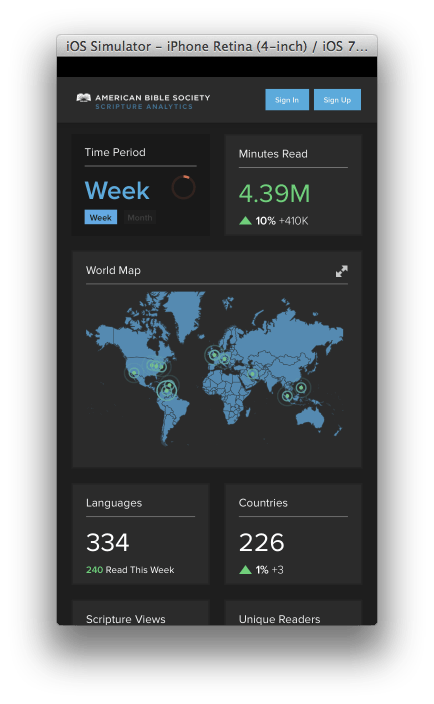
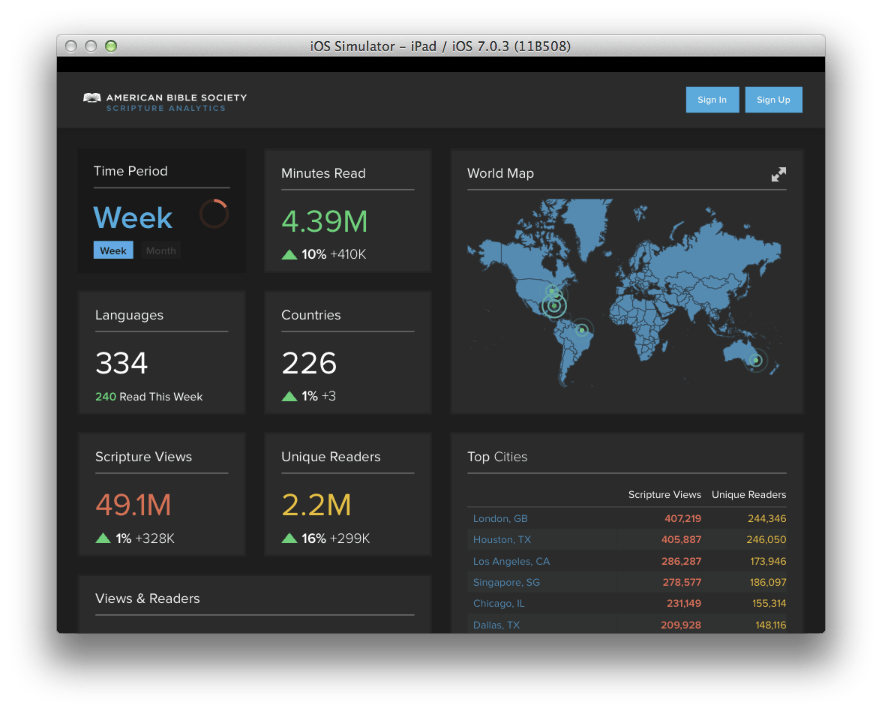
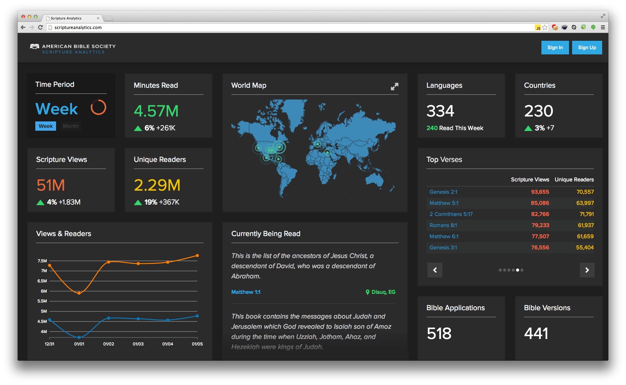
See screen shots below for iOS, iPad, and desktop PC:

Smart Phone

smart phone

Tablet

tablet

Desktop

desktop

Got any questions about visualizing big data on a small screen? Let us know!

Want to learn more? Check out the entire Big Data series below!

  • Big Data, Small Budget
  • Single Page Apps: Popular Client Side MVC Frameworks


Categories
Author

The main function of data visualization is to help us better understand the concept of a data set quickly. When done effectively, data visualization can look organic and beautiful, but the primary goal is to help the viewer to consume and understand the gist of the data quicker than if he/she were looking at the sum of its parts.

Rating systems are a great example of where we could do better with data visualization. As Goodfil.ms mentioned last week in a post about rating systems, 5-star rating systems are broken.

A typical rating system should convey information quickly to a user as they browse through many entities on a screen. The 5-star rating system does do this, but it only shows a mean, not an entire dataset that the mean is derived from. Amazon.com does a breakdown of ratings and shows the context and relationship between all of the ratings for a product but they are too verbose to be put into a browsing view; they simply take up too much space.

The problem: we need to show detailed information of a dataset in a small space in a way that can be understood easily and quickly.

Plenty of research has gone into sparklines, which does exactly this – cram detailed information into a small space. Sparklines have been deemed pretty successful in applications, especially when surrounded by a lot of content. A study published in the IEEE Transactions on Visualization and Computer Graphics in 2010 showed that tag-cloud using sparklines resulted in faster task times, fewer errors, and was more preferred than its stacked-bar and multi-line chart counterparts.

Ok, great, a sparkline visualization meets our needs for space and can be an effective conduit, but how are we going to actually show the data we have?

Typically we think of heatmaps working really well in spatial relationships, but they've also been attributed to working extremely well when reviewing large datasets. Specifically, heatmaps can be used to find clusters and correlations from large datasets to those with only a few data points, such as 5-star ratings.

Heatmaps and sparklines are two good solutions to the problems with displaying rating results. That's why we created heatRate; a jQuery plug-in which takes a simple 1-dimensional array and creates a CSS gradient heatmap that displays the data on any HTML element you'd like.

You can keep the visualization in-line with your other elements but still see details you might otherwise miss on the standard 5-star rating visualization. heatRate has various options you can adjust to change contrast and the overall look of the heatmap gradient altogether. It works by employing HSLa, so you can choose to have values change based on hue, saturation, or lightness.

heatRate would be a good choice for you to use anywhere that you might have varied values in your data, even outside of the scenario of a rating system.

Give it a try and share your feedback with us! We'll be working on new features for this project in the coming weeks. We're obsessed with finding better ways to visualize data.

Categories
Author

When looking at any complex relational system (especially in software, where our diagrams are limited by object scope), how do we see all the connections? How do we see and understand all objects, cases, states and methods (actions) regardless of the entire mutually inclusive and exclusive scope?

The standard method for showing hierarchical relationships, both inclusive and exclusive, is to use multiple diagrams for modeling those relationships between domain objects and related phenomena. The problem with this is that using multiple diagrams to portray a top-level view can lead to confusion and redundancy. Often, it would be extremely helpful to be able to have a single macro view of the data/objects and all relationships, rather than relying on piecing together multiple micro diagrams to achieve the same effect. It requires a higher level of abstraction to view complex data/objects on a macro level, and unfortunately, as we abstract we also lose detail.

What if there was a way to reduce all relational hierarchy to a single diagram without a significant loss in detail?

I have always been fascinated with data/object visualization and reducing the complexity typically present in that field. I find that there are better ways to represent data/objects and the relationships between them. And so I set out to design a method for a single visualization format; the result is an application I call NuGenObjective OCIDML. That's a mouth-full, but I'll explain.

Introducing NuGenObjective OCIDML

OCIDML stands for Objective Case Interaction Diagram Markup Language. NuGenObjective OCIDML is a domain simulation method I created that drastically reduces the redundancy we commonly see in visualizing data/object relationships. This method provides for a single and simple view of all objects within our domain and their subsequent states, actions and interactions.

Take, for example, this diagram, which uses OCIDML to show the objects, cases, states and roles and their dependencies on each other for an entire system:

(clicking any of the images below will give you a larger, more detailed image)

Now examine this diagram, which uses OCIDML to show the (hypothetical) structure of three higher educational universities:

The structure of these organizations is not unique. For example, MPIM is a research institute and has no graduate program. So the part of the diagram corresponding to MPIM has no interactions dedicated to graduate students.

If we were to represent this same relational system with the usual 2D table (Excel or otherwise), we would draw a large 3x3 table with each cell being a 9x9 sub-table (including headlines). In this way we would have a 736-cell table and if every small cell were only 1.5 inches long and 0.5 inches wide (to make the inner text readable), we would have a 41x14 inch wide table, which would only display 54 of the 736 cells. The total space required showing these relationships in the traditional 2D method would exceed the usable space more than 14 times.

Using the OCIDML method we are able to display all necessary objects (with their states, relationships and actions) represented in a single visualization, giving us a macro view for each object, its state’s, actions and interactions with other objects. It allows us the advantage of seeing all dimensions, displayed in a single visual vector, whereby the relationships and their multiple and singular entities are visualized.

Below is an example of building a diagram in the application. While relative to the actual tool, it should give you an idea of how it comes together. A great feature of the tool is the ability to double click on any interaction point. This will then display the specific object, role, state and action.

This is the interaction creation/definition dialog where we define our case for a specific object, role, action and state.

OCIDML for Software Development

When we design software we limit our cases by scope. But OCIDML makes it possible to diagram the entire network of relationships, paths, states and components of an object. This can be extremely useful in the software architecture process, allowing the architect to have a strong sense of the "whole" and all the inter-relational dependencies that need to be accounted for. In turn, software engineers will receive a more solid blueprint, resulting in better software.

Coming Up

In the next post in the series I'll dig into the mathematical theory NuGenObjective OCIDML was built upon and share some of the markup I used to create the diagrams. The application code is open source and I'll be getting it ready to share with you for the next post.

In the third and final post in the series I'll focus on specific use cases and talk about how you can use OCIDML in your software projects. I'm happy to answer any of your questions about this method - feel free to leave questions in the comments below.

Categories
Author
1
Subscribe to Visualization