
Mobomo webinars-now on demand! | learn more.

/Clutch-names-Mobomo-as- leading-website-design-company-in-DC

Yesterday, Clutch released a new report highlighting the best website design companies in the greater D.C. area and Mobomo made their list! Their research was based on a proven record of innovative web designs and client satisfaction. The research report takes into account novel industry data and verified client reviews to rank the top companies in the greater Washington area.

The companies listed in the report were ranked on their ‘ability to deliver’, part of Clutch’s proprietary research methodology. Factors such as client reviews, market presence, and clientele were examined prior to this report. The companies are mapped out in the ‘Leaders Matrix,’ and full profiles and client interviews are published with the research online.

Mobomo is proud to work with some of the best startups, most distinguished enterprises and prominent federal agencies in the U.S. market place. Some of our website design work that has been most notably recognized is NASA, USGS, The Knot and Real Time Cases.

About Clutch

Clutch is a business to business research firm located in Washington, D.C. They are best known for connecting agencies and software solution companies in order to enhance business goals across businesses. Their methodology is unique in the sense that they connect businesses based on consumer reviews, the type of services offered and the quality of work.

Categories
Author

ThreadRobe

The future of folding and organizing clothes is here! Matt Powell, co-founder of ThreadRobe reached out to Mobomo in hopes of turning his futuristic concept into reality. Our teams collaborated around the idea of using digital technology to control an appliance that folds and organizes clothing at the touch of a fingertip. We were able to successfully design and develop the mobile app which is a key functionality in their ThreadRobe. The purpose of the mobile app is to organize and store a user’s wardrobe, but an added bonus - it has the ability to offer outfit recommendations to the user. The app collects data from the garments such as the color, fabric, and pattern that the user adds to their inventory/wardrobe. The app can then conduct outfit recommendations by the use of matching algorithms which are based on color, fabric, pattern, etc. The app then communicates with a smart wardrobe which steams and stores all clothing items, then when the user wants an outfit they use the app which connects to the automated furniture which dispenses the clothing.

Phase One:

During phase one we started the design process, or in better terms- the look and the feel for the mobile app. The challenge we faced during the design phase was creating a custom made solution (the app) for a machine that was not yet built. We wanted to make sure that the design of the app reflected the attributes and establish the right controls and functionalities to correspond with the physical machine. We were able to work closely with the ThreadRobe team to work around the barriers to create a very sleek design that parallels the brand. Once the design phase was complete we moved to the build. We built out the front-end interface and backend server for Android only. For the mobile app, our development team worked directly with ThreadRobe’s IT team to streamline communication between the app (being built by Mobomo) and the wardrobe (being built by their engineers). We worked with their team to integrate the wardrobe API’s so that it would communicate correctly with the ThreadRobe app.

Phase Two:

Phase two consisted of enhancing the mobile app by adding new features. We updated and improved on the first version, integrated the app and its backend with the wardrobe server and designed and developed their website. The main goal of their website is to leverage it for marketing and brand awareness, so during the design phase it was important to find the right balance of fashion and clothing combined with cutting edge technology and innovation.  Even though the mobile app is not yet in the app store, we wanted to give you a quick step-by-step of what the process looks like from a user perspective.

Mobile App:

During phase one and two we used a hybrid team approach-maximizing our resources in different time zones so that their product was being worked on 24/7. Even though the app will not launch in the store until the fall, ThreadRobe’s website is live and we must say - it looks awesome!

Categories
Author

/Designing-With-Developers-in-Mind Nothing in the design process is absolute. I am sure many designers can relate, it is frustrating when you create a design and then when you see the final product (after development) the design looks different than what was intended. It is fair to say not all designs translate in the development process but as a designer we should start designing with developers in mind. In a world that isn’t perfect and where you have little control, designers, it is time to be flexible.  Designer's take pride in layouts, making sure each element has a purpose and it’s own place. Crafting “pixel perfect” designs is an achievement that we strive for after years of hard work and practice. Because of the effort that’s put into designs, we have a tendency to get upset with developers when our layouts haven’t been transformed perfectly.

We should not fault the developer

Recognize that this is a glitch within the design process. Our static, “pixel perfect” comps will only ever truly be that...static comps. Once we bring a design to life through code we have very little control over how someone will view it. What we should be striving for is a deeper and closer connection with developers, working in tandem throughout the process. As designers we must be flexible and think of each composition no longer on the basis of exact measurements, but relative proportions. This applies to things like height and width in relation to other page level elements, i.e. margin and padding. The logic is quite simple, an element with a width of 400px over 1300px of visible area is perfectly reasonable, but on a small screen it will be cropped out.

The Solution

The solution here is either create a mobile based layout that accounts for smaller device sizes, or to ensure that the item being cropped out on smaller screens isn’t pertinent to the use of the site. Which ever route you take a certain level of foresight is necessary to ensure that proper design and development are accomplished. I know it can be frustrating to see developers work in non-absolute units of measure. However abandoning pixels and switching to ems, rems and percentages make for a more flexible and fluid layout. If designers start thinking about these more liquid and dynamic measurements initially, there will be an easier transition from static comp to developed website, allowing everything to remain harmonious and relatively intact on different device sizes.

Color

This adaptable mindset also applies to colors. We can’t predict the calibration of each user screen, something that varies according to style, manufacturer and specific light conditions. Websites and apps can’t be handled like a Pantone catalog on printed paper, making it common for subtle color variants - which may appear too dark, shiny or contrasted.

How do we combat the unknown here?

By selecting a broad range color palette that suits both the device that the product is being viewed on, and also the matches the tone of the business. Learning about the technical characteristics and limitations of a browser is vital in order to avoid unexpected surprises when the product is finished. After interpreting the HTML, CSS and Javascript the browser renders a product according to its capabilities. Sometimes forcing us to think beyond devices, and to start thinking in terms of which browsers. For years IE was the bane of a designers existence, limiting the boundaries that we could push, because it was so far behind technically. Knowing which browser your design has to be supported in will help you determine what and where you can push the limits. So, designers - let’s start working and understanding the development process so that we can all be rockstars when designing for digital media.

Categories
Author

/Pulse-creative-muse-award

Muse Creative Awards Announced

We are honored to be named a gold award winner for the 2017 Muse Creative Awards. This year, we were pleased to submit the Pulse healthcare mobile application. Muse Creative Awards is an international competition for creative professionals who possess the unique ability to inspire with concept, writing or design whether through traditional materials or electronic media. They follow the spark of an inner muse, lighting the path to success with deep knowledge and shining originality.

The Pulse platform works with patients, providers and hospitals to optimize the management of post-operative care for hip and knee replacement patients. The platform connects patients and their doctors through the use of a mobile app. Providers are able to monitor their patients day-to-day activity, conduct virtual check-ins and instruct the patient of other post-care instructions to expedite the recovery process. Patients have the ability to keep their doctors up-to-date on their recovery, ask questions and report their post-op activities at the touch of a finger tip.

Since the application is geared towards healthcare it was vital that we provided a secure backend so that it abided by all HIPPA requirements - the app is available in both iOS and Android.

How the platform works:

  1. Provider is granted access to their own personalized dashboard.
  2. Provider will create new patients via the dashboard; upon creation, the patient will receive an email to download the app and sign up.
  3. Provider will then customize the “Careplan for the Patient” -- tailoring each day’s story, check-in questions, and to-do items directly for that patient.
  4. As a patient, when you login to the app you will see a homepage which contains all of your “stories,” “check-ins,” and “to-do items” for that specific day (each day has a unique set of content tailored to the patient).
  5. As a patient completes their items for the day, the data is transferred and displayed on the provider’s dashboard. The provider will be notified if any of the day’s tasks or questions generated a red flag.
  6. The patient and provider can also communicate via direct messaging between the dashboard and app.

Pulse transforms the entire post-hospital care episode for hip and knee replacement patients. Value-Based Care Initiatives such as the Comprehensive Care for Joint Replacement (“CJR”) model have prompted a long overdue attention shift to the post-acute services and care. With this new post-op healthcare model it allows for better patient management care at the touch of a fingertip, it is available in both iOS and Android. 

Categories
Author

/design-etiquette 
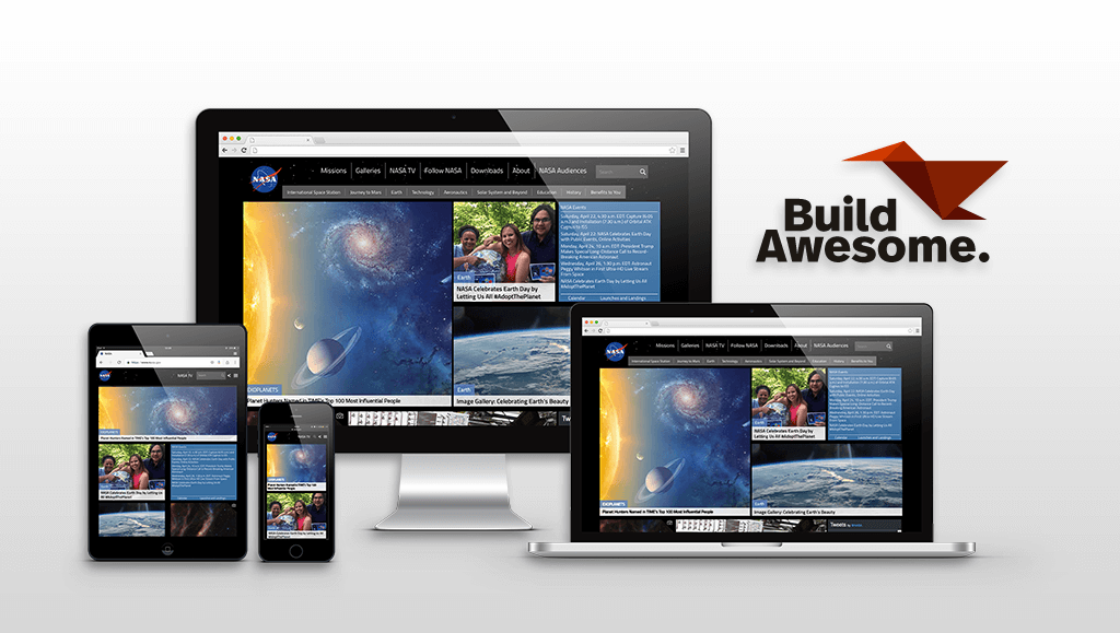
As designers we know that our work is successful when it is not only beautiful but also when it is useful. That’s why when working we should always keep in mind other individuals that might need to access our design files - which means... stay organized! Our files should be structured and organized for easy access. In the end it doesn’t matter which software you are using but for the purpose of this article I will use Photoshop as an example so I’ll mention PSD files and smart objects. We have outline some basic design etiquette rules that should help you to avoid issues when someone like a developer is trying to access your files.

File Handling

It is that time on the project when you have set aside a day or two to organize the files you’ve been working on so they are organized for the asset handoff (most times to the developer). So the first rule is to always have everything accessible and uploaded - set yourself a reminder for the end of the day to remind yourself to upload the latest to your file folder. Let’s start by saying that organizing files for asset handoff shouldn’t be that tedious and hopefully everything is in the cloud server where you and your colleagues saved it and that no one forgot to upload the last piece they were working on. As designers we work with project managers, developers, and clients during the course of the project - as we all know everyone tends to work differently and may be particular about file organization. The folder structure you use is mostly a personal preference especially when working alone but when others are involved it can be helpful to collaborate to find out if there are expectations of the folder structure. During this initial collaboration we find it helpful to discuss pros, cons, ideas as to how everyone expects it to work. Make sure you, as a designer communicate to the team to let them know how you’ll manage the files - and make sure to listen to feedback when deciding on naming conventions and exporting assets. /design-etiquette

File Naming

Choose a convention and stick to it.  When working on a project, decide early on how you’ll name your files and folders. Pick an order for the folders, use dashes or underscores (not both) and never use spaces and decide on using uppercase or lowercase. You should talk with the developers and learn what makes more sense, for example, when working on Android it’s recommended to use underscores. For some, dashes work better than underscores because it’s easier and quicker to edit the name of the file, improves the readability and if it is an exported asset dashes are recommended for SEO optimization. /design-etiquette

Layers

Always name your layers. It can be a group or an individual layer, no one should waste time hiding and unhiding layers to know if that shape “Rectangle 3” is the one you need to export. The last thing you want is to have to go back, rename and delete those unused or dated layers when preparing a file for a client or for a teammate. Don’t be a layer hoarder, there are many useful scripts and plugins that can help you with this task. It’s recommended to arrange everything by section, header, body, aside, footer, etc. It will make it easier to navigate the contents - before closing that file, collapse all layers, so the next person that opens it, can see the structure at first glance. Be smart, use non-destructive edits when working on images, that means use smart objects and masks, and don’t apply the same to 10 different layers optimize your workflow, group them and use just one mask if possible. Globalize common elements, use linked smart objects either to a .psb file or use CC libraries, and symbols in Sketch. Use blend modes carefully and know your strokes - it’s not the same effect if it goes outside, inside or centered. Tip*** be aware of the light source when using blending modes, you want to have a consistent light source it will make the components more realistic. /design-etiquette

Icons and Images

When working on icons, it’s best if you use a shape instead of bitmap or a smart object for a vector file can work as well. The reason being- a bitmap does not scale correctly so you will not get the proper pixelation which leads to poor visual quality. Try not to color them using blend modes, people should be able to get hex values from layer properties and that will make it faster to edit the color as well. When working with images such as stock photos make sure you purchase them especially if the product is ready for production.

Type

Use text-boxes when you’re writing a paragraph and make sure the box is not longer than the actual text. It can make it difficult to select things that are behind it and can lead into frustration and then it becomes a waste of time. Make sure you use proper alignments, headings and lists elements should have their own text-box. Use CC libraries character styles to maintain consistency. Be sure to include all the fonts used in your project that are (or should be) in the assets folder especially when using licensed fonts. These folders should be in the same directory as your design files.

Assets and exporting

Be aware of screen resolution and density. Your images should be optimized either for web, print or wherever your files will be used. When working with web images, they tend to be much larger in size, so image optimization should be a priority. This will allow for faster loading on a desktop, and remove the data concern from mobile users loading an image heavy site. There is online image optimization software but you should know how to get the best image from Photoshop. It is important to keep in mind that 80% of file quality will look closely to the same image at a 100% but the file size will be considerably smaller. As a designer, it is key to keep your files organized. This was only a short list of recommendations - be detail oriented. As mentioned before, it takes discipline but it will make everything faster and easier in the long run for you and others.  


Other sources that we found valuable for a second opinion of design organization are: https://www.smashingmagazine.com/2011/08/the-lost-art-of-design-etiquette/ https://www.photoshopetiquette.com    

Categories
Author

/iphone-app-store-checklist

Submitting your app to the App store can be confusing and oftentimes a difficult process to navigate. Developers run into obstacles all the time when submitting the app.

Our developers have a basic checklist which has saved many headaches and prepared us for the ultimate app approval:

  1. Company Name* : (If this is your first time uploading an app to the app store, and you enrolled as an individual developer, you'll be asked if you want to set a Company Name. Think carefully about this - once you set it, you can NOT change it without calling Apple and going through their phone support line. If you set a company name then all of your apps will show it.)
  2. Default Language*:
  3. App Name*:
  4. SKU Number: Developer can add this, just a unique combination strings is enough
  5. Availability Date*: (The date your app will become available on the App Store.): Date selector available, we can select current date
  6. Price Tier*: (Free / Tier 1 (0.99) / Tier 2 (1.99) / Tier 3 (2.99) etc)
  7. Discount for Educational Institutions*: (YES/NO)
  8. Custom B2B App*: (YES/NO)
  9. Version Information
  1. Version Number*: By default, initial version will be 1.0
  2. Copyright*:  The name of the person or entity that owns the exclusive rights to the app, preceded by the year the rights were obtained (for example, "2013 Mobomo LLC.").
  3. Primary Category*: (pick a category from the list)
  4. Secondary Category (optional): (pick a category from the list)
    1. Category List
  1. App Rating*:   (For each choose N) none, I) infrequent/mild, or F) frequent / intense)
    • . Cartoon or Fantasy Violence          
  1. Realistic Violence          
  2. Sexual Content or Nudity          
  • Profanity or Crude Humor          
  1. Alcohol, Tobacco, or Drug Use or References          
  2. Mature/Suggestive Themes          
  3. Simulated Gambling          
  • Horror/Fear Themes          
  • Prolonged Graphic or Sadistic Realistic Violence         
  1. Graphic Sexual Content and Nudity
  1. Metadata:
  2. . Description*:

(This is an example of what Gallup submitted)

Stay connected with your clients and manage your coaching sessions with the Gallup Exchange app.

Gallup Exchange is Gallup’s premier online service for executive, business and life coaches to expand their businesses by providing coaching services to a growing marketplace of global CliftonStrengths customers in need of coaching.

Use this app to:

  •       Read and respond to message from current and potential clients.
  •       View upcoming coaching sessions.
  •       Manage coaching sessions by paid and scheduled status.
  •       Review scheduled session details and client information.
  •       Receive notifications for new client inquiries.
  •       Receive notification reminders for upcoming coaching sessions.
  •       Modify Gallup Exchange profile details.

NOTE: You must be a coach on Gallup Exchange to use this app.

For more information, visit gallupexchange.com.

JOIN THE CLIFTONSTRENGTHS MOVEMENT

To date, more than 15 million people have discovered their CliftonStrengths! And thousands more are joining the movement every week.

These managers, leaders, students, teachers, coaches and individuals of every walk of life are uncovering the benefits of living a strengths-based life.

Now you can discover what makes you unique and powerful. Start focusing on what you do well -- your strengths -- instead of fixating on your weaknesses.

Learn more about CliftonStrengths at gallupstrengthscenter.com.

  1. Support Email Address:
  2. Support URL: A URL that provides support for the app you are adding. This will be visible to customers on the App Store.     
  3. Marketing URL (optional): A URL with information about the app you are adding. If provided, this will be visible to customers on the App Store.         
  4. Privacy Policy URL (optional): A URL that links to your company's privacy policy. Privacy policies are recommended for all apps collecting user or device related data, and required for apps that offer auto-renewable or free subscriptions, or as otherwise required by law.           
  1. App Review Information
    • . Contact Information: The person in your organization who should be contacted if the App Review team has any questions or needs additional information.
      1. First Name*
      2. Last Name*
  • Email Address*
  1. Phone Number *
  1. Review Notes (optional): Additional information about your app that can help during the review process. Include information that may be needed to test your app, such as app-specific settings and test registration or account details. The Review Notes field must not exceed 4000 bytes.
  2. Demo Account Information (Optional): The username and password for a full-access account. This account is used during the app review process and must not expire. Details for additional accounts should be included in the Review Notes field.
  1. EULA: If you want to provide your own End User License Agreement (EULA), click here. If you provide a EULA, it must meet these minimum terms. If you do not provide a EULA, the standard EULA will apply to your app.
  2. Images:
    • . Large App Icon: 1024x1024 Icon: A large version of your app icon that will be used on the App Store. It must be at least 72 DPI, in the RGB color space, and 1024 x 1024 pixels (it cannot be scaled up). The file type must be .jpeg, .jpg, .tif, .tiff, or .png. It must be flat artwork without rounded corners.
  1. Screenshots for 3.5” Retina screen: Screenshots for 3.5-inch iPhone and iPod touch Retina display must be 960x640, 960x600, 640x960 or 640x920 pixels, at least 72 DPI, in the RGB color space, and in the JPG or PNG format.
  2. Screenshots for 4” Retina screen: Screenshots for 4-inch iPhone 5 and iPod touch (5th generation) Retina display must be 1136x640, 1136x600, 640x1136 or 640x1096 pixels, at least 72 DPI, in the RGB color space, and in the JPG or PNG format.
  3. iPad Screenshots:iPad Screenshots must be .jpeg, .jpg, .tif, .tiff, or .png file that is 1024x768, 1024x748, 768x1024, 768x1004, 2048x1536, 2048x1496, 1536x2048 or 1536x2008 pixels, at least 72 DPI, and in the RGB color space.

Routing App Coverage File (Optional):Routing app coverage files are .geojson files which specify the geographic regions supported by your app. The file can have only one MultiPolygon element. MultiPolygon elements consist of at least one Polygon. Polygons contain at least four coordinate points. Polygon start and end coordinate points must be the same.


Are you having issues getting your app approved? Get in touch and we can help out!


Categories
Author

Keyboard

Descriptive and consistent naming makes software easier to read and understand. We use the Swift naming conventions described in the API Design Guidelines. We find Ray Wenderlich swift style guidelines valuable, below are some of his main takeaways that we incorporate into our work.

Prose

When referring to methods in prose, being unambiguous is critical. To refer to a method name, use the simplest form possible.

For the above example using UIGestureRecognizer, 1 is unambiguous and preferred.

Pro Tip: You can use Xcode's jump bar to lookup methods with argument labels.

AppDelegate

Class Prefixes

Swift types are automatically name spaced by the module that contains them and you should not add a class prefix such as RW. If two names from different modules collide you can disambiguate by prefixing the type name with the module name. However, only specify the module name when there is possibility for confusion which should be rare.

import SomeModule

let myClass = MyModule.UsefulClass()

Delegates

When creating custom delegate methods, an unnamed first parameter should be the delegate source. (UIKit contains numerous examples of this.)

Preferred:

func namePickerView(_ namePickerView: NamePickerView, didSelectName name: String)
func namePickerViewShouldReload(_ namePickerView: NamePickerView) -> Bool

Not Preferred:

func didSelectName(namePicker: NamePickerViewController, name: String)
func namePickerShouldReload() -> Bool

Use Type Inferred Context

Use compiler inferred context to write shorter, clear code. (Also see Type Inference.)

Preferred:

let selector = #selector(viewDidLoad)
view.backgroundColor = .red
let toView = context.view(forKey: .to)
let view = UIView(frame: .zero)

Not Preferred:

let selector = #selector(ViewController.viewDidLoad)
view.backgroundColor = UIColor.red
let toView = context.view(forKey: UITransitionContextViewKey.to)
let view = UIView(frame: CGRect.zero)

Generics

Generic type parameters should be descriptive, upper camel case names. When a type name doesn't have a meaningful relationship or role, use a traditional single uppercase letter such as T, U, or V.

Preferred:

struct Stack<Element> { ... }
func write<Target: OutputStream>(to target: inout Target)
func swap<T>(_ a: inout T, _ b: inout T)

Not Preferred:

struct Stack<T> { ... }
func write<target: OutputStream>(to target: inout target)
func swap<Thing>(_ a: inout Thing, _ b: inout Thing)

Language

Use US English spelling to match Apple's API.

Preferred:

let color = "red"

Not Preferred:

let colour = "red"


Categories
Author

App icon

Some may be familiar with app icons but for those who are not, an app icon is the icon graphically representing an app in your smartphone (for launching it, managing it or previewing it in the store). The artwork has to be a certain size, most of the time it is rendered at a dimension of 1024×1024 to be exact. It is fair to say that a design can determine the success of your product. When you have a design that is not good it will more than likely effect the success of your product. It is super important that you think about some of the design aspects before you launch your app - you want to make sure that your design is perfect and will stand out from the rest of the competition. There are some important aspects we want you to remember when thinking about designing your app icon. Lets focus on characteristics found in the design of an app icon and what you can do to make your app icon stand out from the rest.

Branding

Your brand is the single most important part of your company. Your brand identifies who you are, what your company believes in, the services or products that your company may offer and much more. Often times your logo (the symbol of your company) is used to represent the company in various situations like a letterhead or your social media “default picture”. It is important to remember that your app icon is not your logo. The app icon is the visual representation of your product (what is inside the app) that appears in a tiny space on your screen. We are not saying that the design of the actual app should avoid any of the company’s branding guidelines - you should follow its colors, graphic styles, text styles and even tone in order to best align to the bigger “brand” picture. The best advice we can give is... do not use your company logo for your app icon and make sure the app icon design is consistent with the look and feel of your application.

Be Concise

We have all heard the saying less is more, and this saying can very much so be applied to design as well. As we all know the size of the canvas is restricted and the renderings of the app icon can be as small as the settings panel. It is important to keep the core design elements relevant to the app, leave out excessive detail and do not try to apply two or more different concepts in the same space - your design will look over complicated, too busy and it will be confusing for the user. Think about your favorite app, I am willing to bet that it has good functionality and an appealing design. The app icon is the first impression that the user will have, they will see the app icon before they even open the app. It is important that your design is concise and can tell the user what the app will offer by their design illustration. 

Identity

There is nothing more disappointing than searching for a specific category in the app store to only find a million app icons that look the exact same, you feel like you are looking at the same app over and over again. Any app icon that can stand out in the app store as well as among installed applications will get the attention of the user. If you can catch the eye of the user, you have a better chance of the user downloading your app which then leads to the user engagement. Even though established patterns of navigation and screen flows ease the user experience, having a recognizable and unique appearance is what distinguishes apps from one another. Users would have no trouble identifying the apps they love most if they are presented with just a screenshot of the app icon because the user has a connection with that app and can instantly recognize the app icon as a result. The combination of color, layout, elements on the screen, and function is the main separation of the app identity. Bottom line, there are many elements that go into designing a great app icon for your company. When you are competing in the app store it is especially important to have your app icon stand out from your competitors. We take design very seriously and we understand the importance of your app needing the best in class design in order to succeed. Do you have questions about how your app is performing based on your current design? Get in touch so that we can give you a free design consultation.

Categories
Author

Flat design is no longer a trend but a design language that is best used for user interfaces in the digital realm. For some time interactions with the “black mirror” features a cleaner style that does not need resort to real world metaphors like raised buttons, textures, shadings and shadows. Everyone knows that the touchscreen is meant to be touched and most apps or websites contain certain actions that we as users are supposed to take. Flat design is a step ahead in terms of readability because screens are not always in the highest retina display resolution. It feels natural for the system to find its own graphic language that’s not mimicking physical objects but it has been observed that some users can have a hard time recognizing actionable elements within flat designed interfaces. A radical expression of this style may leave a bunch of users clueless about what they can do within the app or website. Operative systems’ design languages do offer some design elements like shadows in order to imaginarily place elements at different depths of the screen. The challenge of a purely flat interface design is making sure you (the designer) are making the user understand which items are meant for interactions - be deliberate with the shapes, colors, and margins.

How can we tell when something is actionable?

If we are going to keep the design strictly flat we will need color and context. For the most part the content, aside from images or videos, will be dark text over a white (or bright) background. Of course we are keeping it simple here, it could be the other way around (bright text over dark BG) or even color blocks where the text has enough contrast. But typically the first case is the better option for readability. Let's start by talking about buttons. The most clear call to action button is typically words that are on a button that indicate what your user should do by clicking on that button. The call to action is typically a word or short sentence expressing an action - enclosed in a flat colored rectangle shape (no matter how round or square its corners may be). Buttons   
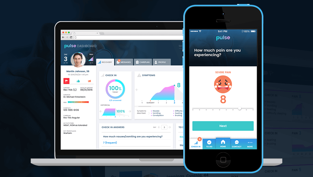
If the button has a strong color accent on the screen, its place as a CTA (call to action) is evident. As seen in the figure above it is possible to have style variations for secondary actions that we don’t want to emphasize, as well as disabled actions (as long as there is something the user can do to enable them). It’s important that the “air” around the word is enough for the element to be recognized as a button, but not that much for it to end up being a huge color patch on the screen (which starts to defeat the original purpose of playing along with content). We can see in figure 2 below that by using the exact same style but minimizing the margins around the word the element loses its button purpose. If it is used that way the call to action still poses an actionable property, maybe as a selectable item with on/off states or an item that is draggable:   Buttons Other buttons that are flat with no words may be useful for some situations even if they are less evident for the user. The trick for those is to have an action related to their context and visually be in the correct position. We can see in the next image below that the same round element can play different roles depending on its placement in relation to the content on the page. Google’s material design guidelines feature the “floating action button” which floats above the content carrying the main action intended for that screen. /user-interface-flat-design Icons have a similar two-face behavior. They can either be an active element to interact with and perform an action or an illustration supporting and decorating a message resulting in no user interaction whatsoever. /user-interface-flat-design Back to my original point, context is everything - once the context is in place, the user experience typically follows as to what action you should or should not take. Through users' past experience with navigating different digital platforms the user will quickly identify the icons on the top and bottom borders of the screen are a means of navigation. Normally icons over a certain size that are placed just above or to the left of a paragraph serve as an illustration element. Other positions and size ratios invite the user to interact as it becomes apparent they represent actions related to the piece of information that precedes. While not always depicted in color, we can see here the contrast color helps to distinguish them as something actionable: /user-interface-flat-design Tabs, fields and dropdowns pose less trouble- they do have a similar style because they have been a part of UIs for a long time. Their typology is strongly installed in users minds however, fields are the most striped down ones of the group, sometimes styled in a really minimalist manner. For example, imagine a line acting as a row with a label above it mentioning the expected input.   A rule of thumb for fields is that the labels should be aligned to the left since we type and read from left to right so the text input is prepared for the content it expects. That would be one of the main aspects that help reveal their function because as we can see in the following deliberately inflated examples the line dividing one type of element from the other can be very thin, coming all down to type style and alignment: /user-interface-flat-design Flat design is the standard today, but as technology evolves devices transform and new type of design interactions are needed. Due to graphic resolutions and computing power growing higher each product generation we are seeing subtle but powerful graphic effects starting to get into the mix. There’s always a learning curve for users, but as designers we should at the very least not stand in their way!

Categories
Author

Collaboration What is DevOps?

DevOps combines cultural philosophies, practices and tools to deliver products at a high velocity. Instead of inverting the traditional functional separation between developers, QA, and operations we enable cross-functional technology teams that promote collaboration rather than tension. By promoting team collaboration it results in valuing the repeatability of processes and eliminating single points of failure. It advocates thinking of infrastructure as part of the application and allows for more rapid and reliable software release cycles.

How does Mobomo do DevOps?

Mobomo extends the same agile, iterative development model we use for design and development into our DevOps architecture services. We embrace a fully automated, repeatable, testable deployment process that allows for rapid integration of code and 100% environmental consistency, mitigating the risk of surprises once your app is in production.

Benefits of DevOps: 

  • Faster time-to-market due to rapid release cycles. DevOps allows multiple releases per day.
  • Infrastructure can be demand-responsive and right-priced using cloud tools like auto-scaling and reserved instances.
    • Full transparency into cost-awareness allows for increased operational intelligence.
  • Dramatically lowers failure rate in production because testing is consistent across environments.

Processes

  • Allows application of Agile/Scrum development methodologies to infrastructure.
  • Continuous Integration/Delivery (CI/CD)
    • Code is deployed incrementally as often as possible using a fully-automated build/test/deploy process.
  • Test-Driven Development (TDD)
    • Developers write automated tests first before the code to satisfy them.
    • All tests are then run on each release to identify functional regressions.
    • Integrates developers more fully into the QA and release process.
  • Microservices and Containerization
    • Each modular component of an application is designed as a standalone service, avoiding the “monolith” approach.
    • Allows functionality to degrade incrementally in the event of a bug rather than the entire application failing.
    • Eliminates “spaghetti code” and makes applications more maintainable and future-proof.
  • Graceful Failure
    • Assume that failures will happen in production, so simulate them as part of application testing.
    • High Availability: Eliminate all single points of failure in infrastructure with load balancing, clustering and other tools. (Horizontal vs. vertical scaling.)
    • Automate disaster recovery so that infrastructure becomes self-healing.

Tools

  • Cloud-agnostic: Multiple engineers certified in Amazon Web Services; also experienced with Azure, Rackspace, and OpenStack.
  • Infrastructure: CloudFormation, Terraform, Docker, Vagrant
  • Provisioning: Ansible, Chef, and Puppet
  • CI/CD: Jenkins, TeamCity and CircleCI
  • Monitoring and Notifications: CloudAware, CloudCheckr, Nagios, DataDog
Categories
Tags
Author
Subscribe to