
Mobomo webinars-now on demand! | learn more.

argument-open-source

It’s hard to believe, but Agile software development has been around for longer than YouTube, Facebook, Twitter and Instagram.

Agile, of course, is an umbrella term for a set of frameworks and practices created in 2001 when 17 technologists drafted the Agile Manifesto. Agile features four major principles for developing better software:

  1. Individuals and interactions over processes and tools
  2. Working software over comprehensive documentation
  3. Customer collaboration over contract negotiation
  4. Responding to change over following a plan

Agile is characterized by incremental development, iterative development and daily face-to-face meetings, and has grown beyond the world of software into general project management, where it is embraced by a variety of industries.

One of these industries is web development and design, where the principles of Agile have been married to marketing and sales data to create something new: growth-driven design.

Say Hello to Growth-Driven Design

Growth-driven design (GDD) takes the principles of Agile software development in general and applies them to website design in particular. Like Agile, GDD involves building in intentional increments. Growth-driven designers make changes and make them often.

argument-open-source

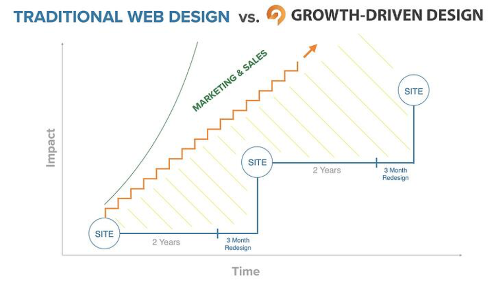
Image source: HubSpot

As you can see from the image above, the blue line represents traditional web design and the orange line represents growth-driven design. In traditional web design, a company launches a website, lets it sit static for two years, then spends three months redesigning the site and bringing it up to date … only to let it sit static for another two years.

The tendency with traditional web design is to agonize over every strategic decision and every design element until the site is ready to go live. Yes, traditional web design might use Agile principles to get the site up and running, but then adopts a “set it and forget it” mindset until the website is due for a refresh.

Growth-driven design, on the other hand, borrows a few chapters from the Agile software development manual by aiming to get a working website up and running as quickly as possible, and then making improvements to the site in the days and weeks that follow.

With GDD, a firm makes continuous adaptations to its website throughout the year, and bases these changes not an arbitrary timetable (a refresh scheduled for every two years, for example), but on data and ongoing audience analysis.

Three Steps to Growth-Driven Design

The GDD methodology brings together many techniques, disciplines, frameworks and methods from the worlds of UX design, Lean, Agile and data analytics and applies them to web design. A typical GDD project involves three steps.

Step 1. Strategy: 10-14 days

You begin with your customer – in this case, your website visitor. Through research, focus groups and other methods, you discover the challenges and problems that your customers face, and then design your website to meet those challenges and solve those problems.

You base your design not on a list of everything you want in your website, but on the top 20% of functionality that will deliver immediate results and a maximum amount of usable data (often referred to in Agile-speak as a “minimum viable product” or “MVP”).

Step 2. Launch Pad: 60-90 days

You rapidly build a website that has the look and functionality you are aiming for. Without sacrificing quality, you quickly deliver a user experience that is better than the one you are delivering now. Your aim is not perfection, but practicality. You are building merely the first draft, not the final product.

Step 3. Continuous Improvement: 14 or 30-day sprints

As soon as your site is live, you start collecting the user data and key performance indicators you need to make improvements. The main principle of GDD is continuous improvement based on facts. This means you start tweaking your site as soon as it goes live.

Most firms who employ GDD make improvements to their websites in “sprints” that last anywhere from 14 days to 30 days at a time. Improvements include things like adding website pages based on SEO metrics, changing call-to-action colors and placement based on heatmap tracking, and rearranging the order and position of design elements and page components to improve engagement.

To inform your design and strategy decisions, you collect both marketing metrics and user experience metrics. These metrics tell you what you need to improve, and why. You then experiment, learn from your experiments and continue improving your website.

argument-open-source

Source: UX Matters

Top Benefits of Growth-Driven Design

As we’ve seen, GDD is a very different way of managing a website design project. But, is it a better way? Here are some particular benefits that come with embracing a GDD approach:

  • Easier budgeting: The initial amount of money you invest is much smaller than with traditional web design. Plus, you spread your entire investment over the course of the launchpad and monthly iterations.
  • Go live sooner: By concentrating your efforts on the core parts of your website that drive value (and not on every bell and whistle on your wish list), you launch your site much sooner than you would by waiting for everything to be perfect before going live.
  • Reduce risk: GDD takes the risk out of web design by starting small and making improvements over time based on data, not hunches or assumptions.

A Word About Growth

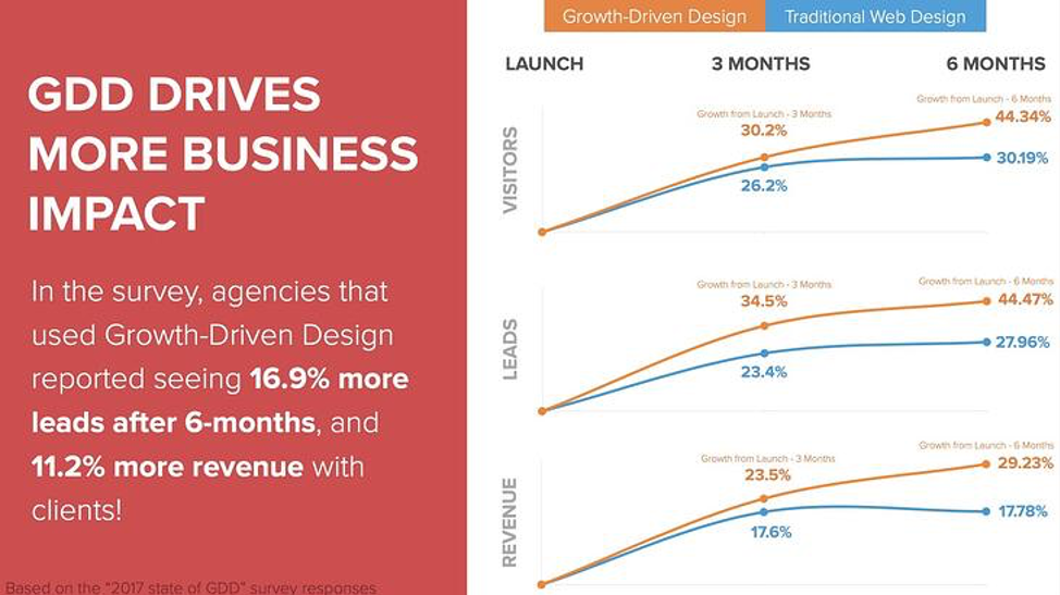
According to the 2017 State of GDD Survey, agencies that use GDD report seeing roughly 17% more leads after six months and 11% more revenue. This is because the operative word in growth-driven design is “growth.” The principle behind GDD is that it should grow your business results.

argument-open-source

Source: www.growthdrivendesign.com

Growth-driven design should boost the number of website visitors you attract, the number of leads your pages generate and the amount of revenue you generate as a result, all because the website is continually getting better at meeting the user’s needs. As you can see from the table above, Growth-Driven Design generates better results than traditional web design methods and generates them sooner.

Is Growth-Driven Design Right for Your Organization?

Growth-driven design doesn’t work for everyone. Because it is agile and iterative, it may not work for your organization if you must go through a lengthy approval process with multiple stakeholders (such as board, management, departments) whenever changes are required.

But if you think GDD looks promising, put it on the agenda the next time your team sits down to discuss refreshing or launching your website. Your website, after all, is your most important marketing asset. It might just be ready for a non-traditional way of presenting your brand to the world.

In the meantime, if you have questions about web design that works, check out our user-centered design services.

Categories
Tags
Author

argument-open-source

Back in 2013, when I first joined Mobomo, we migrated NASA.gov from a proprietary content management system (CMS) to Amazon Cloud and Drupal 7. It goes without saying, but there was a lot riding on getting it right. The NASA site had to handle high traffic and page views each day, without service interruptions, and the new content management system had to accommodate a high volume of content updates each day. In addition to having no room for compromise on performance and availability, the site also had to have a high level of security. 

Maybe the biggest challenge, though, was laying the groundwork to achieve NASA’s vision for a website with greater usability and enhanced user experiences. If NASA’s audience all fell into the same demographic, that goal probably wouldn’t have seemed so intimidating, but NASA’s audience includes space fans who range from scientists to elementary school kids. 

Our mission was to create a mobile-first site that stayed true to NASA’s brand and spoke to all of the diverse members of its audience. A few years later, we relaunched a user-centric site that directed visitors from a dynamic home page to microsites designed specifically for them.

Making Space Seem Not So Far Away

NASA.gov includes data on its missions, past and present. To make this massive amount of data more user-friendly, we worked with NASA to design a site that’s easily searchable, navigable, and enhanced through audio, video, social media feeds, and calendars. Users can find updates on events via features such as the countdown clock to the International Space Station’s 20th anniversary. NASA.gov users can also easily find what they need if they want to research space technology, stream NASA TV, or explore image galleries. 

The NASA.gov site directs its younger visitors to a STEM engagement microsite where students can find activities appropriate for their grade level. The site also includes the NASA Kids’ Club where students can have some fun while they’re learning about exploration. For example, they can try their hands at virtually driving a rover on Mars, play games, and download activities. 

Older students with space-related aspirations can learn about internship and career opportunities, and teachers can access lesson plans and STEM resources.

How to Make it Happen

To successfully achieve NASA’s goals and manage a project this complex, we had to choose the right approach. Some website projects are tailor-made for a simple development plan that moves from a concept to design, construction, testing, and implementation in a structured, linear way. The NASA.gov project, however, wasn’t one of them.

For this website and the vast majority of the sites we develop, our team follows DevOps methodology. With DevOps, you don’t silo development from operations. Our DevOps culture brings together all stakeholders to collaborate throughout the process to achieve:

Faster Deployment

If we had to build the entire site then take it live, it would have taken much longer for NASA and its users to have a new resource. We built the site in stages, validating at every stage. By developing in iterations, and involving the entire team, we also have the ability to address small issues rather than waiting until they create major ones. It also gives us more agility to address changes and keep everyone informed. This prevents errors that could put the brakes on the entire project.

Optimized Design

NASA.gov has several Webby Awards, and award-winning web design takes a team that works together and collaborates with the organization to define the audience (or audiences), optimize the site’s navigation and usability, and strike a balance between the site’s primary purpose and its appeal. 

Mobile-First

Because NASA.gov users may be accessing the site from a PC, laptop, tablet, smartphone, or other device, it was also pivotal to use mobile-first design. Mobile-first starts by designing for the smallest screens first, and then work your way up to larger screens. This approach forces you to build a strong foundation first, then enhance it as screen sizes increase. It basically allows you to ensure user experiences are optimized for any size device. 

Scalability

NASA.gov wasn’t only a goliath website when we migrated it to Amazon Cloud and Drupal. We knew it would continue to grow. Designing the site with microsites that organize content, help visitors find the content that is most relevant to their interests, and enhance usability and UX informed a plan for future growth. 

Efficient Development Processes

DevOps Methodology breaks down barriers between developers and other stakeholders, automates processes, makes coding and review processes more efficient, and enables continuous testing. Even though we work in iterations, our team maintains a big-picture view of projects, such as addressing integrations, during the development process. 

Planned Post-Production

DevOps also helps us cover all the bases to prepare for launch and to build in management tools for ongoing site maintenance. 

What Your Business Can Learn from NASA

You probably never thought about it, but your business or organization has a lot in common with NASA, at least when it comes to your website. Just like NASA, you need a website that gives you the ability to handle a growing digital audience, reliably and securely. You’re probably also looking for the best CMS for your website, one that’s cost-effective and gives you the features you need.

Your website should also be designed to be usable and to provide the user experiences your audience wants. And, with the number of mobile phone users in the world topping 5 billion, you want to make sure their UX is optimized with mobile-first design. 

NASA’s project is also an illustration of how building your website in stages, getting input from all stakeholders, and validating and testing each step of the way can lead to great results. You also need a plan for launching the site with minimal disruption and tools that will make ongoing management and maintenance easier. 

You probably want to know you are doing everything you can to make your content appealing, engaging, and interactive. You may think NASA has an advantage in that department since NASA’s content is inherently exciting to its audience.

But so is yours. Create a website that showcases it. Not sure where to begin? Click here and we’ll point you in the right direction.

Categories
Author

argument-open-source

The headlines were unanimous: The mobile app used for tallying results during the Iowa Democratic Caucus was an unmitigated failure. Not only did it delay the outcome of the vote count, it cast a shadow on the integrity of the voting process.

What went wrong? Could it be, as opined by Vox, that “using an app to tally election results wasn’t such a good idea”?

Or was this simply a case of great idea, poor execution?

In this piece, we’ll examine what went wrong with the Iowa Democratic Party’s app, what a good app would have looked like, and how government agencies, political bodies, and other high-pressure groups can avoid the same mistakes.

How Not to Develop and Deploy an App

The problem surfaced hours after the caucuses ended. The Iowa Democratic Party had not reported results, citing inconsistencies in the reporting data. Officials were quick to say the delay was not caused by a hack or intrusion.

Still, speculation surfaced about possible security problems with technology. On Twitter, stories raising concerns about the caucus app’s vulnerabilities resurfaced. One of the top concerns cited in those pieces centered on the plan for caucus volunteers to download the app directly to their phones, which made it difficult to ensure the safety of the devices.

As the hours ticked by, chaos ensued, with the campaigns of two candidates claiming victory as the field headed east for the New Hampshire Democratic Primary on February 11.

What went wrong? As it turns out, quite a lot:

  • Caucus field staff claimed the app wasn’t working properly. Some could not download the app. Others couldn’t sign into it, and still others complained that the backup method, reporting by phone, wasn’t letting their calls through.
  • Cybersecurity experts and academics said the app was not tested at statewide scale or vetted by the Department of Homeland Security’s cybersecurity agency.
  • And even if the app was working, reports suggest, the roll out of the tool was so badly botched that those responsible for reporting via the app weren’t trained on how to use it.
  • The app was not deployed through traditional app stores or even sideloaded using an enterprise certificate. Instead, it was distributed through mobile testing platforms, including Apple’s TestFlight and a similar platform that services both iOS and Android called TestFairy. App developers and large software makers typically use testing platforms for mobile apps that are still in beta (i.e., not quite finalized). Developers can use the testing platforms to distribute the beta version of the software without having to go through the rigorous App Store and Play Store review processes.
  • The app was distributed using the TestFairy platform’s free tier and not its enterprise one. Developers didn’t even pay for the TestFairy plan that comes with single sign-on authentication, unlimited data retention, and end-to-end encryption. Instead, they used the version of TestFairy anyone can try for free. It deletes any app data after 30 days and limits the number of test users that can access the app to 200.

In short, it appears that the app was rushed into use long before the necessary testing, training, and due diligence had taken place.

Rules of the App Development Road

Hindsight being what it is, it’s easy for observers to shake their heads and say, “We would never do that.”

But, how can they make sure? The key is to know what is required to develop an app the right way:

  1. A rigorous, formal authorization process
  2. A formal risk model
  3. A formal threat model for the application

For example, developers working on federal websites must go through the security authority within their respective agency. That person confirms the application has gone through the FedRAMP certification process for cloud-hosted environments. The process confirms whether apps meet a standard set of 350-450 controls.

Some would argue there ought to be a similar formal process in place when software designed for government or public use is developed by external vendors. Unfortunately, the added work involved in meeting such standards would also add considerable cost to every project.

Fortunately, many developers still use those federal standards to establish clear frameworks while designing and testing their project. Working from the outside in, these developers consider such questions as “What boundary protections does this software need?” and “How does this software interface with other systems?”

Ready to Launch

State primaries and caucuses call for an app that is both secure and able to withstand rigorous load testing (i.e., the process of putting demands on a system and measuring its response). The app may work beautifully during standard testing but collapse completely once thousands of people start to use it.

As an example, Mobomo’s own load-testing procedures proved invaluable during the NASA.gov webcast of the “Great American Eclipse” in 2017. The NASA site typically has 10,000 - 50,000 simultaneous viewers. But on the day of the eclipse, NASA streamed the all-day event, which generated five to six times the streaming traffic of that year’s Super Bowl.

The NASA site performed superbly even under these conditions in part because it was designed to meet the FedRAMP continuity operation planning controls. These controls ensure that if one aspect of the software goes down, backup systems bypass the problem and the software continues to function with minimal interruption to the user.

And that’s the whole point of developing an app for a high-volume, high-pressure task like reporting data from caucus sites or primary voting stations: Using the best technology, the best processes, and the highest levels of expertise to make an app that works so smoothly and accurately, one would never realize the level of complexity and rigor that goes into developing it.

Mobomo develops and deploys secure, high-performance apps and websites for a broad range of civilian federal entities. Want to learn more about our work? Give us a call or contact us today.

Categories
Author

argument-open-source

If you engaged in a word association game, one of the first things people would respond when you say “open source” is that it’s free. If any of those people are in the position of purchasing software licenses for a business or organization, that makes open source (a.k.a., free) definitely a benefit worth exploring. Open source has the potential to save thousands of dollars or more, depending on the software and the size of the organization. 

Even though eliminating a budget line item for licensing costs may be enough to convince some organizations that open source is the way to go, it’s actually only one of several compelling reasons to migrate from proprietary platforms to open-source architecture. 

In a debate on open-source vs. licensed platforms, the affirmative argument will include these four, additional points: 

Development Freedom

When businesses provide workstations for their employees, they choose (often inadvertently) the framework on which their organizations operate. For example, if a business buys Dell computers, it will operate within the Microsoft Windows framework. This isn’t necessarily a bad thing. A business with limited IT and development resources won’t have to worry about how to keep its operating system working or whether business applications or security solutions are available. Microsoft has a line of solutions and partnerships that can provide what they’re looking for. 

With a system built on an open-source platform, on the other hand, it may take more resources and work to keep it running and secure, but it gives developers the freedom to do exactly what the end user needs. You aren’t limited by what a commercial platform enables you to do. 

In some markets, foregoing the status quo for developmental freedom sounds like risk. It’s a major reason that government users lag behind the commercial space in technology. They’re committed to the old systems that they know are robust, secure, and predictable at budget time — even though they’re outdated. When those organizations take a closer look, however, they quickly realize they can negate development costs through greater visibility, efficiency, and productivity that a platform that specifically supports their operations can provide. 

Open-source platforms are also hardware agnostic, giving organizations more latitude when it comes to the computers, mobile devices, and tools they can use, rather than being locked into limited, sometimes expensive, options for hardware. 

Moreover, development freedom delivers more ROI than merely decreasing current costs. Open-source platforms give developers the freedom to customize systems and innovate. If your system enabled you to expand your reach, better control labor costs, and support new revenue streams, what impact could that have on your business?

Interoperability

Enterprises and manufacturers have traditionally guarded their proprietary systems, which gave them an edge in their markets and control over complementary solutions and peripherals end users needed. Those same proprietary systems, however, could now be a business liability. Many markets are moving toward open source to provide greater interoperability, and businesses continuing to use proprietary platforms will increasingly be viewed as less desirable partners. 

Military avionics is a prime example. This industry is migrating to the Future Airborne Capability Environment (FACE) Technical Standard. Administered by the FACE Consortium, this open standard aims to give the U.S. Department of Defense the ability to acquire systems more easily and affordably and to integrate them more quickly and efficiently.  

You’ll also find a preference for open-source architecture in some segments of the tech industry as well, such as robotics. The Robot Operation System (ROS) is a set of open resources of tools, libraries, and conventions that standardizes how robots communicate and share information. ROS simplifies the time-consuming work of creating robotic behaviors, and ROS 2 takes that objective further by giving industrial robot developers support for multirobot systems, safety, and security. 

As Internet of Things (IoT) technology adoption grows, more operations are experiencing roadblocks connecting legacy equipment and enabling the free flow of data — which open-source architecture can overcome. Furthermore, IoT based on open-source components allow networks to expand beyond the four walls of a facility to connect with business partners, the supply chain, and end users. The Linux Foundation’s Zephyr Project, for example, promotes open-source, real-time operating systems (RTOS) that enables developers to build secure, manageable systems more easily and quickly. 

Faster Time to Market

Open source projects can also move more quickly than developing on a proprietary platform. You may be at the mercy of the vendor during the development process if you require assistance, and certifying hardware or applications occur on their timelines. 

That process moves much more quickly in an open source community. Additionally, members of the community share. Some of the best developers in the industry work on these platforms and often make their work available to other developers so they don’t need to start from scratch to include a feature or function their end user requires. A modular system can include components that these developers have created, tested, and proven — and that have fewer bugs than a newly developed prototype. 

Developers, using prebuilt components and leveraging an open source community’s expertise, can help you deploy your next system more quickly than starting from ground zero. 

Business Flexibility

Open-source architecture also gives a business or organization advantages beyond the IT department. With open source, you have more options. The manager of a chain of resorts facing budget cuts, for example, could more easily find ways to decrease operating expenses if her organization’s system runs on an open-source platform. A chain that operates on a commercial platform, however, may have to find other options, such as reducing staff with lay-offs.  

Open source architecture also decreases vendor lock-in. In a world that’s changing at a faster and faster pace, basing your systems open-source architecture gives you options if a vendor’s company is acquired and product quality, customer service, and prices change. It also gives you flexibility if industry standards or regulations require that you add new features or capabilities that your vendor doesn’t provide, decreasing the chances you’ll need to rip and replace your IT system.

The Price of Open Source

To be perfectly honest in the open source vs. commercial platform debate, we have to admit there is a cost associated with using these platforms. They can’t exist without their communities’ contributions of time, talent, and support. 

At Mobomo, for example, we’re an active part of the Drupal open-source content management system (CMS) platform. Our developers are among the more than 1 million members of this community that have contributed more than 30,000 modules. We also take the opportunity to speak at Drupal community events and give back to the community in other ways. 

Regardless of how much we contribute to the community, however, it’s never exceeded the payback. It’s enabled lower total cost of ownership (TCO) for us and our clients, saving millions of dollars in operating expenses. It has ramped up our ability to create and innovate. It’s also allowed us to help build more viable organizations and valuable partnerships. 

The majority of our industry agrees with us. The State of Enterprise Open Source report in 2019 from Red Hat asked nearly 1,000 IT leaders around the world how strategically important open source is to an enterprises’ infrastructure software plans. Among respondents, 69 percent reported that it is extremely important, citing top benefits as lower TCO, access to innovation, security, higher-quality software, support, and the freedom to customize. 

Only 1 percent of survey respondents said it wasn’t important at all. 

Which side of the open-source vs. commercial platforms argument do you come down on?

Contact us to drop us a line and tell us about your project.

Categories
Author

Rx

Your healthcare organization has a lot to juggle: patient care, revenue, administrative efficiency, and a million other things.

Is your website helping your efforts … or hindering them?

The good news is that 52% of consumers search medical providers online before engaging with hospitals. The bad news? Multiple studies have shown that healthcare websites are confusing, hard to navigate, and have a reading level well above that of the average adult in the United States (and the level recommended by the American Medical Association and the National Institutes of Health.)

A website that is informative, accessible, easy to navigate, and authoritative is key to establishing your organization as a go-to, trusted resource — the kind of place where people will choose to spend their healthcare dollars. (And that spending doesn’t seem to be going down anytime soon. U.S. health care spending grew 4.6% in 2018, reaching $3.6 trillion or $11,172 per person. In 2018, health spending accounted for 17.7% of the US economy.)

What this means for your healthcare organization is opportunity, and plenty of it.

So, how do you make sure your healthcare website stands head and shoulders above the rest? Here are 12 best practices to keep in mind.

1. Focus on the Patient

A customer-centric or patient-centric approach to website should be a driving force behind your work. Healthcare website design should include designing for clarity – and emotion. A hospital website needs to be designed in such a way that users immediately feel that they are in good hands. The website copy, design, and navigation need to meet the needs of the user, helping them find the information they seek as simply and easily as possible.

2. A Mobile-Friendly Interface

These days a mobile-friendly website design is a must.

Sixty-two percent of smartphone users use their device to look up health information, and that’s just the beginning. An in-depth Google survey of how people choose health providers revealed some powerful information:

  • 77% have used their smartphones to find local health services in the past six months.
  • Almost half (43%) of health service customers wish more businesses had mobile-optimized sites.
  • "Near me" searches for health-related services have doubled since 2015.

Mobile-friendly sites are a product of responsive design, which allows sites to adjust to display as intended on any browser or device. Investing in responsive design ensures that a hospital’s site provides a consistent experience to all visitors.

3. Fast Load Times

Potential patients have little time for online delays and expect your website to load fast. Fifty-three percent of mobile site visits will leave a page that takes longer than three seconds to load.

If your site loads too slowly, they’ll simply look elsewhere.
Page Speed - healthcare site design

4. Simple Navigation

Site navigation is one of the most important aspects of a healthcare website. It must be clear and easy to understand. In healthcare, it’s safe to assume most visitors are in a hurry and possibly a little stressed out. If a visitor can’t easily find the information they need, they’re gone – taking their business with them.

Clear organization keeps visitors engaged with your content and encourages them to spend more time on your website. This can reduce your bounce rate, or the percentage of all sessions on your site in which users viewed only a single page. A high bounce rate (especially if users click on many other similar sites after leaving yours) can send signals to search engines that your site is not satisfying users’ search intent – which can send you plummeting down the search rankings.

If you’re looking for inspiration, number 7 on our list of top 10 Drupal websites provides an excellent example of beautifully clean and intuitive navigation.

5. Clear Hours, Location and Contact Information

Some people just want to know where you are, when you’re open, and how to reach you. And if they can’t find that information quickly and easily, they’ll look elsewhere. While it may seem obvious that hours, location, and contact information should be front and center, it’s surprising how many websites have this information buried on their About Us page or in the footer of the site

Remember your visitors’ state of mind. Anything you can do to simplify and streamline their experience is worth consideration.

6. Comply with ADA Regulations

The Americans with Disabilities Act (ADA) protects individuals with disabilities from discrimination. In 2010, the ADA issued a series of regulations about website accessibility, turning up the pressure on site designers to create user experiences that live up to minimum standards of accessibility.

The ADA uses the Web Content Accessibility Guidelines to determine whether a site is compliant. These guidelines have very specific recommendations for various aspects affecting the user experience of a digital property.

Creating a compliant website design for hospitals is more than an exercise in fair play. It can also improve your SEO as Google rewards website owners that make efforts to meet compliance standards.

7. Website Typography

Well-designed typography is very important on healthcare websites, particularly in places where content is dense or lengthy. Screen after screen of text can strain visitors’ eyes and make it difficult to find specific information. A well thought out typographic design can minimize both issues and give users a better experience.

However, don’t rely solely on typography: Make sure your copy has plenty of paragraph breaks, white space, and imagery to break things up and make the page easier on the eyes.

8. The Right Website Color Palette

Most healthcare websites use a cool or muted color palette. That’s because cool or subdued tones help users stay calm and help limit the sense of excitement, panic or urgency that warmer colors might evoke. Typically, blue and white are popular colors for healthcare websites, as they evoke trust and cleanliness, respectively. However, keep your organization’s branding at the forefront. A children’s hospital, for example, may want to use more vivid tones, while a palliative care center may be better served by a more subdued palette.

9. Healthcare Site Design Imagery

Is a picture worth a thousand words? When it comes to images on healthcare websites, absolutely. The use of positive or calming photography can introduce some comfort into the user experience and create a positive impression of the brand.

But it’s important to keep imagery accurate. Forget stock photos of models dressed as medical pros smiling knowingly or holding their chins while listening intently to each other. Instead, consider investing in the services of a professional photographer to capture real people in real settings – actual medical professionals interacting with patients and each other, posing in front of the facility or working together. Photos of real patients providing testimonials makes a powerful impression, giving visitors a sense of the care they can expect when they become patients.

10. Smart Use of Video

As with your site photography, professionally shot and edited videos go a long way in establishing a positive impression of a healthcare facility. Tours of the hospital and specific units and informal, conversational interviews with doctors and staff give potential patients both a clear picture of the facility and the welcoming environment that awaits them. It also provides an excellent way for site visitors with lower literacy levels or visual impairment to access important information.

Some ideas for videos include:

  • Educational pieces on commonly asked questions or medical conditions
  • Patient reviews
  • Physician profiles
  • Procedure and treatment overviews

11. Content that Promotes the Brand

You may have a beautifully designed website, but to become the provider of choice, the site needs to answer this question: What makes your organization or facility different?

A healthcare facility’s website should tell the brand’s story and highlight what makes its staff and services stand out from the crowd.

Share highlights like specialized procedures, award-winning staff, community-based projects, and other points of pride that potential patients would find appealing. This will help you stand out in their minds and position you as the provider of choice.

Other areas that highlight authority and expertise include the following:

  • Affiliations
  • Associations
  • Awards
  • Links to research papers and studies
  • Notable achievements
  • Rankings in professional and consumer publications
  • Testimonials

One caveat: Your home page is not the place to list every achievement or bit of news. Remember that the primary goal of the website is to serve the patient. Instead, a small news feed or helpful link can make it easy for visitors to find that information if they choose, without being overwhelmed on the home page by the digital equivalent of a trophy case.

12. Customized Patient Portals

As Millennials and Gen Zers comprise a larger share of your potential healthcare consumers, you need to up your digital game to meet the technology expectations of both generations. As digital natives, they want to do business with companies that provide a robust, personalized, one-stop-shop website experience. A CDW Health study found that 98% of patients feel comfortable communicating with providers via online patient portals, while seventy-one percent of Millennials prefer online scheduling.

Additional digital resources to consider include:

  • Commonly used forms
  • Internal search function for doctor or specialist lookups
  • Emergency room wait time trackers
  • Chatbot-based telehealth sessions, with the option to chat with a live practitioner

Designing clear and effective websites for hospitals and healthcare facilities comes down to one simple truism: The better your design appeals to the wants and needs of the patient, the better for everyone – patients, hospital executives and the communities you serve.

Does your healthcare website need a shot in the arm? Contact us today.

Categories
Tags
Author

acquia

Vienna, VA – MARCH 4, 2020 –  Mobomo today announced it has been selected as the recipient of Acquia’s Partner of the Year Award for 2019, given for its superlative performance during the past year. The Acquia Partner Award recognizes outstanding contributions from partners over the course of 2019. 

Acquia has been a long standing and valued partner of Mobomo and we are honored by their recognition. Between our solution expertise and their cutting-edge cloud services, we are glad that our partnership is not only financially successful, but that we can work together to create innovative solutions for federal organizations.

“The Partner of the Year award distinguishes Mobomo as the leader who is committed to customer excellence and partnership,” said Brian Lacey, CEO of Mobomo. “Acquia has been a trusted service that allows us to create out of the box solutions for FedRAMP certified large scale and high-availability projects. We live in an age where everyone is trying to accelerate digital transformation, and Acquia gives us the platform to do so.”

Acquia recognized 15 partners across five global regions based on their overall revenue performance, overall growth with Acquia, and number of new customers secured last year.

“Mobomo is to be commended. 2019 was an incredible year for Acquia and our partners, with demand for our world-class digital experience solutions driving significant growth,” said Joe Wykes, SVP, global channels and sales, at Acquia. “2020 promises to be another amazing year, and together we’ll help our customers set the bar for delivering impactful customer experiences across channels.”

Over the past year, Mobomo has continued to enhance its Acquia implementation for NOAA Fisheries that has leveraged the platform to increase both customer satisfaction and customer traffic. As a result of the partnership with Mobomo and Acquia, NOAA Fisheries has been recognized with a number of industry awards including the 2018 MUSE Creative Award, the Acquia 2018 Public Sector Engage Award, the 2019 Webby Award, and the 2019 W3 Award. Mobomo also deployed a new Drupal platform based on Acquia Cloud Site Factory (ACSF) for Voice of America (VOA) that will provide a foundation for over 40 different language sites. Finally, Mobomo is deploying a similar ACSF platform for the Middle East Broadcasting Network. 

Leaders in digital experience delivery, Acquia partners support the world’s leading brands in facilitating amazing customer experiences. A full list of Acquia Partner Award winners can be seen here

About Mobomo

Mobomo is a world-class developer of high-performance applications and websites which we carefully craft to fit the needs of government agencies. We work hand-in-hand with our clients to deliver mobile, web, and cloud solutions using advanced DevOps techniques, which we integrate with our proven Agile software development methodology. 

About Acquia

Acquia is the open digital experience company. We provide the world’s most ambitious brands with technology that allows them to embrace innovation and create customer moments that matter. At Acquia, we believe in the power of community - giving our customers the freedom to build tomorrow on their terms. To learn more, visit acquia.com.

Categories
Tags
Author

You’re having trouble keeping up with demand and need a more powerful and robust website platform.

As business problems go, that’s a great one to have. Especially for enterprise-grade organizations and government entities. The question is: Which website platform is best?

To help you make informed decisions about your platform choice, we’re sharing a look at what Acquia has to offer. In this post, you’ll learn what Acquia is and how it works, who should consider using the platform and who should not. Then you’ll read our thoughts on what should be top of mind when selecting a platform.

Full disclosure: Mobomo is an Acquia partner organization, meaning we help clients make the most of their Acquia technology and services. Far from being a hard sell, however, this post aims solely to provide expert analysis and an honest assessment of the company and its products.

What Acquia Is and How It Works

Acquia is considered a digital experience platform (DXP), which is a collection or suite of products that work in concert to manage and optimize the user’s digital experience. These products can include a CRM, analytics, commerce applications, content management and more.

In its industry report on DXPs, Magic Quadrant for Digital Experience Platforms, Gartner defines a digital experience platform as “an integrated set of core technologies that support the composition, management, delivery and optimization of contextualized digital experiences…Leaders have ample ability to support a variety of DXP use cases and consistently meet customers’ needs over substantial periods. Leaders have delivered significant product innovation in pursuit of DXP requirements and have been successful in selling to new customers across industries.”

Organizations use DXPs to build, deploy and improve websites, portals, mobile and other digital experiences. They combine and coordinate applications, including content management, search and navigation, personalization, integration and aggregation, collaboration, workflow, analytics, mobile and multichannel support.

Acquia is one of the major players in this space, and the only one designed solely for Drupal.

Acquia co-founder Dries Buytaert was in graduate school in 2000 when he created the first Drupal content management framework. Buytaert and Jay Batson then established Acquia in 2007 to provide infrastructure, support and services to enterprise organizations that use Drupal.

Features and Benefits of Acquia

Acquia initially offered managed cloud hosting and fine-tuned services for Drupal. It has since expanded on its Drupal foundation to offer a complete DXP, including but not limited to:

  • Acquia Cloud: Provides Drupal hosting, development tools, hosting services and enterprise grade security.
  • Acquia Lightning: An open source Drupal 8 distribution with preselected modules and configuration to help developers build sites and run them on Acquia Cloud.
  • Acquia Digital Asset Management: A cloud-based digital asset management tool and central library for Drupal sites.
  • Acquia Commerce Manager: Provides a secure and flexible platform for content-rich experiential commerce.
  • Mautic: A marketing automation platform that enables organizations to send and personalize multi-channel communications at scale.
  • Acquia Journey: An omnichannel tool that allows marketers to listen and learn from customers to craft a sequence of personalized touchpoints and trigger what they will see next.

Additionally, Acquia provides comprehensive logging, performance metrics, security and Drupal application insights, and uptime alerts organizations need to monitor and optimize applications.

The Acquia platform also shines in its security capabilities, supporting strict compliance programs such as FedRAMP, HIPAA, and PCI, among others. Acquia customers can also internally manage teams at scale with advanced teams and permissions capabilities.

And they’re running with the big dogs. Other DXP companies assessed in the Gartner Magic Quadrants report include Adobe, IBM, Salesforce, Liferay, SAP, Adobe, Microsoft and Oracle.

In that report, Gartner cited Acquia’s key strengths as follows:

  • Acquia Experience Cloud offers a wide array of capabilities well-suited to support the B2C use case. Some clients also use it for B2B and B2E use cases.
  • The open-source community behind Acquia, which is the main contributor to the underlying Drupal WCM system, is highly active and well-supported by the vendor.
  • Acquia’s partner ecosystem continues to grow, offering choices to clients looking for expertise in specific verticals and availability in specific regions.

Who Should Consider Acquia

In a nutshell, Acquia is a good fit for enterprise-grade clients and government entities needing a comprehensive and powerful platform that optimizes the entire user experience while integrating data from multiple sources to support decision-making. Organizations that deploy and manage multiple websites will find Acquia particularly helpful.

One glance at Acquia’s customer page crystalizes the scope and scale of organizations they serve. Brands using Acquia include Wendy’s, ConAgra Brands, University of Virginia, City of Rancho Cucamonga in California and Australia’s Department of the Environment and Energy.

According to Website Planet, what sets Acquia apart is their foundation in the open-source Drupal content management framework. Unlike many of their competitors, Acquia allows customers to buy resources and features individually rather than purchasing entire pre-made packages. This can be particularly appealing to organizations who already have a couple of strong individual solutions in place that they want to integrate into their DXP, such as this reviewer in the manufacturing industry:

"A few things drove me to this solution: Decoupled architecture that allowed me to build a completely distributed digital landscape while keeping central control, The Open Platform concept that allowed me to build my own integrations and connect different components of my existing Martech stack without always using the "default" provided options and the comfort/security of relying on a cloud-based solution with full service support on top.

For e-commerce website owners, Acquia’s packages provide a PCI DSS compliant solution that can easily scale to accommodate extensive product catalogs, large transaction volumes and surges in traffic. Acquia’s proprietary e-commerce manager integrates the various content, commerceand user interfaces, allowing you to provide seamless experiences to your customers through a single system."

Who Should Not Consider Acquia

Acquia is best suited for organizations with both the need for such a powerful suite of tools and the development expertise to easily implement and manage it. Beginners and small businesses lacking the requisite knowledge of programming and Drupal are likely better off with a different provider.

For those who develop their website through an agency, you’ll want to double-check that they will provide developers experienced with Drupal 8. If you do develop in-house, make sure your developers have strong familiarity with it.

Additionally, Acquia’s power comes at a price: Its price point may put it out of reach for small-to-medium businesses.

Acquia: Our Takeaway

As with any other significant investment, the best choice for your organization boils down to your wants and needs of you, the consumer. Keep these points in mind assessing how well Acquia matches up with your master list of must-haves.

  • Determine your desired business outcome. Think about what you’re after in terms of improving the business. What does each DXP offer and can you make the most of every feature you’re paying for?
  • Know your stack. Document your current technology architecture: what do you have, who uses it, for what and how is it connected?
  • Determine use cases. Who will use your technology and how will it make them productive?
  • Prepare your people. Your personnel play a massive role in assembling your digital experience technology stack. Don’t set yourself up to spend time and money on a platform that doesn't get adopted or used to its potential.

By conducting a thorough assessment of your organization’s needs, capabilities, and goals, you can readily determine whether Acquia is the best fit to help you provide an amazing digital experience for your audience.

Contact us today and find out how Mobomo can help you make the most of Acquia.

Categories
Tags
Author

Mobile devices make up just over half of all e-commerce traffic … but they’re less than half as likely to convert.

Progressive web applications (PWAs) may change this trend. Notably, several e-commerce giants can thank PWAs for double-digit improvements in conversion rates. Trivago saw a 97% increase in clickouts to hotel offers, George.com (part of ASDA Walmart) enjoyed a 31% increase in mobile conversions, and Alibaba saw a 76% increase in conversions after upgrading their site to a PWA — all improvements that would elicit massive cheers in any e-commerce company’s boardroom.

Wondering if your e-commerce store should get in on the action? In this blog you’ll find the answers to questions like:

  • What is a progressive web application?
  • What are the advantages of PWAs over native apps?
  • Where do PWAs fall short, compared to native apps?
  • Which option is best for your e-commerce business?

Let’s dive in!

What Is a Progressive Web App?

A PWA is a web application (or “app”) that looks and performs like a native app, using the latest and most powerful web capabilities.

First, let’s explore the difference between a web app and a native app:

  • Web apps are any computer program that uses a web browser as its client. Web apps are designed to allow the user to perform specific actions; Google Docs and Trello are two well-known examples. In a web app, the navigation and user experience act more like a native application than a website, but unlike a native app, a web app doesn’t need to be downloaded, installed, or updated – it’s accessed via the user’s web browser.
  • Native apps (or mobile apps) are developed solely for mobile devices, and they live and run on those devices. For this reason, they can take advantage of specific device features and resources, such as the GPS and camera function. In addition, many native apps do not require internet access, making them a great option for things like productivity services or gaming.

PWAs provide the best of both worlds, offering the one-size-fits-all ease of a web app alongside a true native app experience, including capabilities such as the option to appear on a device’s home screen or send push notifications.

The developers at Google have coined an acronym — “FIRE” — to sum up a PWA’s ideal attributes: Fast, Integrated, Reliable, and Engaging. The PWA should load instantly, respond quickly to user interactions, integrate smoothly into the mobile experience, and provide an immersive user experience.

The team at Mozilla has identified 8 ideal characteristics of a PWA:

  • Discoverable, so the contents can be found through search engines.
  • Installable, so it's available on the device's home screen.
  • Linkable, so you can share it by simply sending a URL.
  • Network independent, so it works offline or with a poor network connection.
  • Progressive, so it's still usable on a basic level on older browsers, but fully-functional on the latest ones.
  • Re-engageable, so it's able to send notifications whenever there's new content available.
  • Responsive, so it's usable on any device with a screen and a browser — mobile phones, tablets, laptops, TVs, fridges, etc.
  • Safe, so the connection between you and the app is secured against any third parties trying to get access to your sensitive data.

These characteristics have led to some noteworthy performance for e-commerce businesses. Google’s case studies on progressive web apps reveal a 52% average increase in conversions.

Advantages of Progressive Web Apps

Progressive web apps have an edge over native apps in several important categories:

  • Easy development: PWAs are cheaper, faster and easier to develop than native apps. Businesses balking at the cost and time to build and maintain a website, an Android app, and an iOS app may leap at the chance to only have to manage one PWA.
  • Indexable: They have indexable and shareable URLs, and because everything in the PWA is web-based, it’s all discoverable by search engines. Plus, the fast loading times and high engagement rates are catnip to Google’s search algorithm.
  • Engaging: PWAs offer a native app-like experience and is even accessed in the same way as native apps, making it much easier for consumers to browse and buy.
  • Performance: They load and respond instantly, which is a major advantage considering that 53% of online shoppers would leave a website that fails to load within three seconds. Even with poor network conditions, PWAs work reliably.
  • Better adoption rates: Users don’t need to download anything to use PWAs, greatly reducing friction and improving adoption.
  • Automatic updates: Updates for PWAs are done automatically, negating the need for the end-user to update an app.
  • Independent of app stores: You can launch PWAs on your own, without a third-party review from app stores.

Disadvantages of Progressive Web Apps

While PWAs carry a wide range of advantages, they do lack some important features found on native apps, particularly for iOS devices.

  • No iOS push notifications: Push notifications can be a powerful tool in the battle against cart abandonment. PWA push notifications are available only to Android users, which is unfortunate, as iPhone users spend almost three times as much as Android users when visiting an e-commerce site.
  • No easy iOS install: Installing a PWA for iOS users is one of the biggest challenges, according to jmango360.com. There’s no invitation via a web app banner to the app store. So, the user has to manage to navigate to the PWA URL, then manually press the Share icon and then “Add to Home Screen.”
  • Limited data-storage: When iOS users do install a PWA on their home-screen, offline data is stored for just two weeks. After that, the cache is cleared.
  • Limited features: iOS users miss out on not only push notifications, but also important features for some e-commerce store owners rely on, like Siri integration and geo-fencing. Additionally, if your e-commerce store offers advanced technology like augmented reality, only native apps can truly showcase these features.
  • No consumer data: PWAs typically cannot access consumer data such as contacts and social profiles.

Native App Versus Progressive Web App: What’s Your Best Option?

When choosing between a native app and a progressive web app, the best option is the one that fits your business’s unique needs.

If budget allows, it’s hard to beat the sheer performance and user experience of a native app, especially if the lion’s share of your target market uses iOS.

On the other hand, a PWA can offer a lightning-fast and budget-friendly option that can also help a growing e-commerce business improve its search engine rankings.

In either case, e-commerce businesses can no longer afford to rely solely on a website, no matter how well it performs. To improve conversions and reduce friction, companies must offer consumers a convenient and top-of-mind option that makes it as easy and pleasant as possible for them to browse, add to cart, and buy – not just once, but every time.

Can't decide? Get in touch with Mobomo today. We're here to help!

Categories
Author

cloud services

Where should your business data and processes “live?”

In the cloud? If so, then where in the cloud? Through cloud services such as Amazon Web ServicesGoogle Cloud? Microsoft Azure? Or should you turn to Cloudways brands such as DigitalOcean, Linode, or Vultr?

Or, maybe you should side with the number of businesses that primarily keep data on-premises, using static web technology to minimize exposure and optimize speed.

Then again, perhaps a mix of technologies – including tailored microservices – will help you achieve your objectives.

Read on as we discuss expert predictions on the future of cloud services, what your options are, and how to make the right tech choices for your business

Predictions on the Future of Cloud Services

Writer Nick Hastreiter interviewed a number of tech leaders recently for a piece on cloud services. These leaders, from disruptive startups to big-brand heavyweights, shared their vision on what to expect … and they don’t all agree with where things are heading:

  • Michael Corrado of Hewlett Packard Enterprise thinks cloud computing will likely morph into a hybrid solution, combining cloud-based software and on-premises hardware. Such a solution would balance the scalability and flexibility of the cloud with the security of a private data center.
  • Jeff Fisher of Kemptechnologies agrees, calling the future of cloud computing, “undeniably hybrid.” He predicts organizations will leverage multiple cloud platforms, both private and large-scale public (like Amazon Web Services and Microsoft Azure), helping them avoid locking into a single provider. But, that will introduce additional complexity, as IT staff need to become comfortable operating in more than one cloud platform environment.
  • On the other hand, SwiftType founder Mike Riley thinks by 2030, businesses will be operating mostly from the cloud, enjoying the productivity and efficiency that that platform provides. By then, he said, a major concern will relate to access. “We’re already seeing fragmentation of content and data and it’s posing problems related to organization, search, discovery, and most importantly, collaboration.” Riley predicts that monolithic application suites will be used less and less.
  • David Hartley of UHY LLP takes things even further, predicting that “traditional data centers and the traditional model of delivering IT services will become extinct.” The days of building your own data center, owning your own equipment and installing or updating hardware will leave fade away rapidly, Hartley said. As software-, infrastructure- and platform-as-a-service providers assume a larger role, Hartley says, there will be more space for independent firms to be hired to test processes and controls, develop service organization control analyses, and report financial and IT services and processes to user organizations.

Overcoming the Cloud’s Limits

And what is Mobomo’s take on this?

We think organizations will take a critical approach, picking and choosing what works right for them. And in some cases, what’s “right” may not always be cloud-based.

Simply put, the cloud isn’t great for everything. You don't want to use it for active directory or credential management, for example. Latency precludes putting that large of an asset in the cloud unless you're a large-scale, widely based company. For about 95 percent of use cases, having an active directory or authentication onsite would make more sense than relying on cloud services, and in general, is more cost-effective.


The Resurgence of Static Pages

Another, perhaps surprising trend emerging is the return to static websites, or web pages with fixed content. Unlike dynamic websites, static sites don’t require programming or database design.

Two main drivers are behind this resurgence:

1. Page Speed

Some organizations are eschewing programmatic web pages because programming can slow or disrupt a user experience. The challenge, then, is to create static pages and host them out of an object data store such as Amazon S3. A flat file stored in S3 can serve a lot faster than if Drupal has to reach into a database, gather information, and render it into a page before the user can access it.

2. Security

One way to fend off hackers is to give them nothing to hack. If there's no CMS or programming to compromise, you can't be compromised. But using improperly secured S3, of course, introduces its own security concerns, primarily exposure to data leaks. But if you have S3 properly secured, then there's no way that a hacker can compromise your systems via your site.

Cloud services like S3 are easy to use, inexpensive, and provide static hosting without having to configure anything. You don't have to figure out how to put your data centers in storage partitions onto the web. S3 handles it for you.


The Role of Microservices

While microservices architecture is not exclusively relevant to cloud computing, according to IBM there are a few important reasons they so frequently are discussed together.

First and foremost are the utilization and cost benefits associated with deploying and scaling components individually.

True, these benefits are still present to some extent with on-premises infrastructure. But combining small, independently scalable components with on-demand, pay-per-use infrastructure enables much larger cost optimizations.

Another key advantage of microservices is that each individual component can adopt the stack best suited to its specific job. Cloud services are a boon here, as they can minimize the management challenges with stack proliferation.

Additionally, microservices can improve security. The more you separate out microservices, the more security layers you can wrap around each one. When individual services are able to run only when needed, you can better protect the system as a whole and possibly save money, too.

When it comes to cloud services in 2020, the theme is “right fit.” Organizations should look at the many different options available to them and pick and choose from these options to create customized systems that work best for their needs and their resources.

If you’re not sure what the right fit is, expert consultants (like the ones here at Mobomo) can help you assess the best options for your organization.

Contact us today to learn more.

Categories
Tags
Author

Design Thinking

“Design for the user.”

It seems like a common sense approach. After all, if your website or your custom app aren’t designed with the end user in mind, will it get used?

Common sense notwithstanding, there’s a large gulf between the idea of designing for the user and the actual implementation of it. Plans go astray, different stakeholders have different ideas about what the user would want, and of course, there are always practical considerations like timeline and budget to consider.

Fortunately, design thinking can help project teams establish clear markers that keep them on track toward a seamless, positive user experience.

What Is Design Thinking?

Design thinking goes beyond the surface-level “design for the user” philosophy. It involves a highly tangible, iterative process that allows teams to move past their own viewpoints and levels of understanding in order to gain deep insight into the user’s needs and identify new strategies and solutions that might not have been immediately evident.

In short, design thinking is a process that gives teams concrete steps to help them get out of their own heads and into the user’s, to ensure the team is meeting the user’s genuine needs.

How Does Design Thinking Work With UX?

Most models of design thinking involve five steps:

  1. Empathize: Understand your user’s pain points and greatest wishes.
  2. Define: Figure out what problem the user is experiencing.
  3. Ideate: Let creativity run wild and break down assumptions or traditions.
  4. Prototype: Build a model that you can test with real users.
  5. Test: Learn what works, what doesn’t, and then adjust.

Let’s explore these in more detail, in the context of UX design:

Empathize

The most successful apps and websites are those that were designed with the user firmly in mind. The folks at Interaction Design Foundation agree, saying that UX tasks “can vary greatly from one organization to the next, but they always demand designers to be the users’ advocate and keep the users’ needs at the center of all design and development efforts.”

But to do that, it’s necessary to understand who the user is and what they want and need. It’s also important to recognize if more than one user persona is in the picture.

Here’s an example: Let’s say we want to create a video app for children ages 6 to 12, with kid-friendly content.

In this situation, there are two main users that we need to understand: the children, and their parents.

  • The children want intuitive (intuitive for them, not us) navigation, an easy way to binge-watch content from specific creators, and a fun way to interact with the creators and other viewers.
  • The parents? They’re concerned about online predators and inappropriate content and want to make sure they have a way to keep an eye on things without having to constantly watch over their child’s shoulder.

These are fairly basic descriptions of user needs – and to really get a good handle on what each end-user wants from the UX, there’s only one foolproof method: talk to them. There is simply no replacement for sitting down with users and getting a first-hand account of what they need, like, hate, fear, enjoy, and find frustrating.

Define

The main challenge in this step is to clearly articulate the problem that needs to be solved, or the need that must be met.

Ideally, near the end of the Define process, there should be a clear answer to the blanks in the statement, “The user needs to _____________ because ________________.”

From there should arise a problem statement for the team to drive towards, such as “Create an easy and accurate way for both users and parents to filter and find video content.”

To get to this point, it’s vital for teams to take the data they gathered during the Empathize stage and process it in an organized, systematic fashion, unpacking the findings and discussing what they mean. A good practice is to keep asking “why,” digging down past surface-level problems and into the deeper, emotion-driven issues. From there, the data can be used to map out a User Journey, breaking down precisely how the user might interact with the app or site and what they’re looking for.

Ideate

In the ideate stage of design thinking, assumptions and constraints are thrown out the window. This can be much harder than it sounds – as we become more experienced, we often fall into certain patterns or draw on our existing knowledge, making it difficult to look at things from a completely different perspective.

In the ideate stage, “stupid” questions are often the key to unlocking new avenues, because those types of questions tend to disrupt long-accepted, “obvious” practices that should have gone challenged long before.

In the context of UX, the Ideate stage is crucial – it is too easy for teams to fall back into best practices or standard ways of designing the user experience. By applying design thinking, a team opens itself up for those “eureka!” moments that are only possible when the mind is open to every possibility, and it’s those moments that lead to groundbreaking design.

Prototype

This is where the rubber meets the road. Once a team has come up with what they think is the best possible way to design the UX for an app or website, they need to test the feasibility of that idea. And they need to test it with real users.

The prototype step can have multiple stages, from initial sketches, to wireframes, to actual working prototypes, all the way to beta versions that are available for a limited number of public downloads. The team may even create multiple prototypes if they’re not certain which idea will fly with users.

Test

Once the prototype is created, the team must learn — from real users — what works, what doesn’t, and then focus on iteration. To make the most of the testing stage, it’s absolutely crucial for the team to have in place mechanisms to gather and assess feedback. The more detailed the feedback is, the better the chances of fine-tuning any little UX issues that could harm the success of the finished product.

During the testing phase, it’s important that the testers not be coached or steered toward a certain type of feedback. Ideally, the team should refrain from telling testers what the purpose of the site or app is, or how it works. If testers can figure it out easily and accurately without any guidance, the UX is definitely on the right track. On the other hand, if the testers are confused about what the app or site is for, or how to use it, then both the messaging and the UX need some work.

The principles of design thinking can be applied to a multitude of challenges, and these principles truly shine when they’re applied toward the UX design of a website or application. By following a proven process that involves, above all, listening to the user, teams can create a finished product that will be enthusiastically embraced, adopted, and used for years.

Contact us now and find out how Mobomo's approach to design can benefit you.

Categories
Author
Subscribe to