Mobomo webinars-now on demand! | learn more.

how-create-new-website-part-two


In our last post on developing a new website, we went over some basic questions that your web and mobile development company should be asking before starting the process of your website redesign. Once those questions are answered your project manager has a better idea of your end goals and how you see the direction of the new site. So what’s next?


Identify:

Identify the key people who will be affected by the project. Start clarifying exactly who the project’s owner is. This may be an internal or external person of the client. Either way, it is essential to know who has the final say and what will be included in the project’s scope and what will not be included.

Once we establish who will be involved on the client side, we set up weekly meetings. During the meetings we set the agenda so that we are not wasting their time or ours. During the weekly meetings we review the ongoing project tasks and reprioritize items if necessary during this time.


Plan:

We start the process of creating a new website by scheduling a meeting with the web designers and developers. During this meeting we clearly communicate what the client expects and the end goals of the project, this makes it easier for us to decipher our weekly sprints. While keeping in mind user experience, visual design, and mobile first design we discuss action items such as mood board work sessions, style tiles, prototype application features, creating visual style guides, data visualization designs, and usability testing.


Build:

This is when we start building prototypes and mockups and establishing a basic application flow. During this process we are keeping constant communication with the client during the project life-cycle. Your website will not only be aligned with your business needs, but users will be able to find the information they need quickly and easily. We implement a responsive design at this point of the project cycle, this is vital because we are in the age of the mobile device, it is almost guaranteed that your website will be accessed from desktop, tablet, and smartphone. Your responsive site will provide the best user experience across devices – and it will be 508 compliant. Visit USA.gov or NASA.gov to see some of our work.


Risks:

Risk is the possibility of an event or condition that if it occurred, would have a negative impact on a project. After a project begins, events that are difficult to anticipate might create new risks. For example, unseasonably rainy weather might threaten the end date of a construction project. Planning for, identifying, and reducing risk at various times during a project can help you to keep the project on schedule and within budget.
Categories
Author

Alt text

As a project manager, you quickly learn no two projects are ever the same. Whether it’s the client, team, or content itself, there’s always some level of unpredictability.

Over the past year, many of Intridea’s projects have revolved around data visualization, with large data tables or many datasets. With their enormous levels of data and unknown variables, data projects can easily be intimidating.

Over the last few weeks though, I've been laying out the basics for data projects; enabling you with the tools and resources to make any project a success.

Last week was all about workin' that data. In the final week of Successful Data Projects, our theme is expecting the unexpected...

Build in a data flex requirement

During the course of development, changes to the data WILL happen. If a country changes their accepted name, accounting has revisions to last year's tax numbers, or the client decides to add data for whooping cranes, the course of development will be effected. Expect these kinds of speed bumps, and “find your zen” in the midst of ‘em.

Even when data changes cost you extra time, see them as opportunities. When speed bumps occur, you learn to anticipate future data-updates. Utilize this knowledge and be proactive. Take these “moments” to stage your site, predict updates, and outwit the changes.

Ultimately though, the key to unexpected data changes is building in a chunk of resources for "data flex". Not only does it give wiggle room for inevitable surprises, but more importantly, it forces transparency between you and the client. It's a great opportunity to discuss the client's plan for data change management, post-development, and sets the expectation that inevitable surprises may require more time and more money.

You’ll need help cleaning the data

Utilize data experts! Data cleaning will go much more smoothly if you enlist the client’s data experts to own it. Having large amounts of data and no real method for managing it can easily become a drowning point for project managers. Thus, utilizing a data expert, fluent in a language like Python or Ruby, is invaluable.

If however, you find yourself in a situation where you don’t have a knowledgable expert, a small amount of training on Google's http://openrefine.org/ to accompany the already helpful tutorial videos, should give even the most non-technical client a leg up on managing data.

In addition, as owner of the data, the client’s team is in the best position to help scrub it for inconsistencies and decide on final data formats. For example, a consistent format for country name, i.e. The United States of America, USA, U.S., United States, may seem tedious and unimportant, but if ignored can seriously mess with the functionality on your site. Large amounts of normalization can be required in this case and empowering your client or data experts with the tools to manage it will be a lifesaver!

Create a testing plan early and update often

Your site is only as strong as a single visualization or in laymen’s terms, first impressions are everything! Without a game plan for catching isolated issues, one bad chart (even if it’s out of 4800 possible charts) may spoil your entire user experience. Therefore, take care to estimate and plan for enough testing time to identify and fix these problems. And if you’ve got time to add buffers before deadlines, even better! As you’ve probably gathered---proactivity---is the underlining theme to thriving in these data projects.

Finally, while you may be an expert in the data, in most cases, the client is best suited for identifying these isolated issues. Thus, ask the client early on to commit to testing and identifying edge cases (you’ll thank me later). In my experience setting the client up with a fool-proof method for providing feedback, such as JIRA’s feedback widget, will save everyone time, confusion, and headaches during issue reporting.

Final Thoughts

With their enormous levels of data and unknown variables, data projects can easily feel intimidating and very overwhelming. Hopefully though, these tips will keep you one step ahead of the game. As long as you stay on top of the risks, strategize, and make honest communication a priority, success is inevitable.

Got any ideas, tips, or resources for managing big data projects? Let us know!

Want to learn more? Check out the entire Successful Data Project series below!

  • Successful Data Projects, Part I: Setting Boundaries
  • Successful Data Projects, Part II: Work that Data
  • Categories
    Author

    Alt text

    As a project manager, you quickly learn no two projects are ever the same. Whether it’s the client, team, or content itself, there’s always some level of unpredictability. Over the past year, many of Intridea’s projects have revolved around data visualization, with large data tables or many datasets.

    With their enormous levels of data and unknown variables, data projects can easily be intimidating. They don't have to be though!

    In the next few weeks, I'll be laying out the basics for data projects; enabling you with the tools and resources to make any project a success.

    Last week was all about defining responsibilities and deadlines. This week, we learn how to "work that data"...

    Work that Data: Participate in Discovery

    Having an in-depth understanding of the data you’re working with is pivotal to grasping the quickest route to effective data visualizations. Clear requirements or not, you have to complete data discovery to ensure data points will support client requests. Completing data discovery before the design phase, allows your team to uncover patterns and reveals knowledge about the data. This discovery step is essential, and directly impacts how the end user will utilize the data.

    Every set of data contains a plethora of answers; the art is in asking the right questions. Data doesn’t naturally highlight the pitfalls ahead or the series requiring extra effort. It doesn’t detail data points or leave a trail of hints about the stories it will illustrate. You have to manipulate the raw data in order to understand how your visualizations will represent it.

    In my experience, there are three key routes to successful discovery. Follow these steps, and the answers you find are guaranteed to inspire and guide your team to the final design...

    Explore data (column by column) to pinpoint outliers and inliers.

    1. Where would this data be displayed? Is it metadata (chart titles, sources, notes) or core data (to be featured in the visualization)?
    2. What is the largest character count entry in this column? Smallest? How could this impact design?
    3. What is the outlier of data for the column? What kinds of gaps do you have separating those outliers from the majority of your data points?

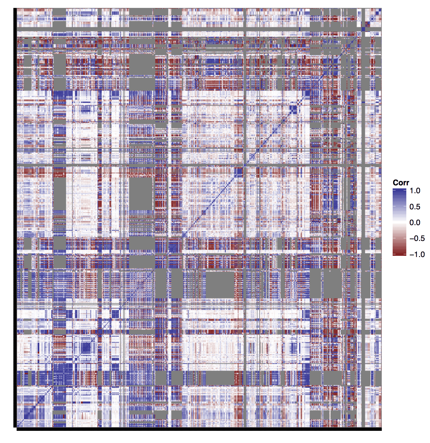
    Create a correlation quilt. It’s helpful to answer the following questions (especially when your site allows data comparison):

    1. Are any groups of data overlapping data points (particular years, countries, or sources)?
    2. Are any parts not overlapping or correlating? Note: edge cases will lie in these areas.
    3. Are there repeat groupings that lend themselves to comparison?

    Example of a correlation quilt: Alt text

    Identify patterns of repeating variables to discover areas for normalization.

    1. If you have a column of years, ensure no decades are listed, and all items are in identical four number year pattern (ex: 1990s).
    2. Notice countries being listed in various ways (abbreviations, older names, olde english spellings, etc)? Make sure to normalize all references, example change “UK” to “United Kingdom”.
    3. Depending on the data type you’re dealing with (number vs long-form-text vs abbreviation) eliminating superfluous punctuations and symbols like “&” can be helpful for future data cleaning and are often easiest in the early stages of programming.

    While barely scraping the surface, these questions are a great place to start. Completing data discovery, before digging into design, will eliminate a lot of backtracking, misunderstanding, and (insert frustration here). It enables your team to find trends, as well as fully understand every aspect of the data. So what are you waiting for? Go work that data, and discover the stories it's waiting to tell!

    Got any ideas, tips, or resources for managing big data projects? Let us know!

    Want to learn more? Check out the entire Successful Data Project series below!

  • Successful Data Projects, Part I: Setting Boundaries
  • Successful Data Projects, Part III: Expect the Unexpected
  • Categories
    Author

    i

    As a project manager, you quickly learn no two projects are ever the same. Whether it’s the client, team, or content itself, there’s always some level of unpredictability. Over the past year, many of Intridea’s projects have revolved around data visualization, with large data tables or many datasets.

    With their enormous levels of data and unknown variables, these projects can easily be intimidating and very overwhelming. However, don’t be discouraged.

    In the next few weeks, I’ll be giving you a few tips and tricks on managing successful data projects. Tools to make you a success in any data project, and maybe even turn that intimidation factor into gasp excitement.
    Define Data Update Responsibility Early On

    Whenever possible, get data responsibility in writing! Depending on the project, data changes or unexpected additions to the data can (read: WILL) be time consuming! Having clearly defined responsibility in case of x, y, or z, from the start, can help eliminate costly delays and prevent confusion or unexpected costs for your client.

    In addition, it's important to discuss and fully disclose the volatility of data and the nature of data visualization development. As data discovery happens, and you learn how the data relates to your front end code, you may have to reset expectations for a particular deliverable. Flexibility is key, and if your client’s expectations are already set to “expect the unexpected” you won’t lose any credibility in their eyes.

    Keep in mind, you may need to define different roles for responsibility - ranging from table updates and query management, to data normalization. Every project is bound to have various tweaks, manipulations, or edits; having a plan laid out for these scenarios will counteract any potential scrambling or wheel spinning.
    Establish Data Deadlines and Stick to Them

    Working with a changing dataset is like hitting a hummingbird with a nail gun; when you pull it off, it's spectacular, but has less to do with nail gun prowess and much more with luck. Establishing data deadlines for both you and the client is one way to increase those chances.

    In a perfect world, full data sets will be available at project kickoff, with no need for changes during development. In reality though, this is rarely the case. Thus, to keep your developers from chasing a moving target, establish early "stop dates" for data changes. Be clear with the client; specifying specific time frames for changes, and that any changes resulting from those updates will fall outside the original scope of work.

    These guidelines make it much easier to box-in and track problems from changing the data, and introduce new edge cases during development. And most importantly, it enables you to track unexpected hours spent from said data changes.
    Got any ideas, tips, or tricks for managing big data projects? Let us know!
    Want to learn more? Check out the entire Successful Data Project series below!

    • Successful Data Projects, Part II: Work that Data
    • Successful Data Projects, Part III: Expect the Unexpected


    Categories
    Author

    placeholder

    For many people big data is still a mysterious word to describe everything and anything. Explaining it can be an art all its own, and in today’s day and age visuals are a necessity. As stated in David Hoffer's, What Does Big Data Look Like? article, “a simple Google image search on “big data” reveals numerous instances of three dimensional ones and zeros, a few explanatory infographics, and even the interface from The Matrix”-leaving you to wonder, just what is big data?

    At Intridea, we’ve had a few opportunities to visually define big data. Our most recent project being, HumanProgress.org; a comprehensive research tool that allows users to explore a wealth of data on human well-being and human development indicators.

    With interactive maps, visually stunning displays, and real time data, Intridea dug deep into the trenches of big data; sifting, managing, and eventually empowering users through data visualization. It was here, as Hoffer states, that big data became “human”. No longer locked in thousands of spreadsheets, Intridea gave life to a tremendous amount of data; making it approachable and interactive.

    Big data can be an ominous word, but it doesn’t have to be. Thanks to data visualization, the abstract isn't so mysterious anymore. And as Hoffer explains, when done right, “big data becomes more malleable, actionable, and, ultimately, more human”...something we all could use a little more of in today’s cyber society.

    Categories
    Author

    With Roger Federer’s recent win of the 2009 French Open, he is now tied with Pete Sampras for holding the most Grand Slam titles — fourteen. Although the two athletes have arrived at the same destination, how do their respective journeys compare with one another? With this question fueling my curiosity, I set out to create a rich visualization of the data to add some depth to this story.

    The final product is available as follows. For additional notes about the techniques used to create these graphs, keep on reading.

    Here are some tips & techniques I employed to put this together.

    Have Your Data Ready

    Before diving into Illustrator (or whatever your tool of choice may be), spend the necessary time finding all of the data you will need for your graph. Go the extra mile to arrange and label everything properly — you may return to the data at a much later time and will be glad you did yourself the favor. Aside from reaping the benefits of good organization, this step is additionally helpful in keeping the grunt work of data-fetching separate from the creative requirements of the task.

    Start with the Simplest Graphs Possible

    An elegant, attractive graph is seldom created from scratch. There are usually a number of tried & tested variations that must be wrestled with before arriving at the final product. With this in mind, a good first step is creating some bare-bones, stripped down graphs to get bird’s eye view of the data. This phase is all about finding the approach that will best server your original vision. Sketches work great in this stage.

    What is the story you want to tell with your data? This is an important question to keep in mind, as different visualization approaches will yield different results. Play around with things. See what looks good as well as which data comparisons are intuitive and interesting. Seek feedback from friends or colleagues who might offer a valuable opinion.

    Using the Grid

    Before long, it will be time to create your final, finished product. At this stage, the very most important thing you can do to keep things looking straight and orderly is use Illustrator’s grid feature. You’ll want to make grids visible (CTRL/CMD + “), as well as enable “Snap to Grid” (CTRL/CMD + SHIFT + “). Additionally, you may want to go into Illustrator’s preferences to customize the grid spacing and subdivision width (which you can modify at any point).

    Another useful tip to keep in mind when using grids extensively is enabling Overprint Preview (CTRL/CMD + ALT + SHIFT + Y). This will have the gridlines appear on top of all objects & paths, allowing you to eliminate any guessing that might otherwise be required in keeping things properly arranged.

    Using Layers Wisely

    Keeping your objects arranged in layers is a huge time-saver when dealing with moderately complex projects in Illustrator. This was especially true in my case of creating four separate graphs, each of which contained separate groups of objects. For example: if I wanted to modify the color of the Roger Federer graph plots, I’d only need to target the layer “Federer” and all plots (on each graph) would become active.

    Layers can also be locked, combined, or temporarily hidden to make document management easier.

    Go Forth and Visualize

    And that’s it! Combined with a simple bit of color and typography, you can transform any crude visualization into an attractive graph. Keep in mind that data in itself can be rather inert; though when arranged in a conscientious manner it can tell an interesting story. Hopefully the techniques above can be of use in recreating your own graphs of a similar nature.

    Categories
    Author
    1
    Subscribe to Data Visualization