
Mobomo webinars-now on demand! | learn more.


Drupal 8

With over 200 new features, Drupal 8 is officially here! Drupal is one of the world’s favorite open source content management platform.. and it just got even better. Here are some of the ways that Drupal 8 will benefit various groups of people.

Developers:

Content Editors:

End Users:

Accessibility and Languages - Drupal 8 now has extensive support for accessibility standards including the adoption of many WAI-ARIA practices.  This will make content structures easier to understand for people with disabilities.  In addition to the accessibility improvements Drupal 8 now has multi-lingual support included.  Drupal 8 has the capability to reach more users than any previous version of Drupal.

Categories
Author

struggling-use-computer

The other night my wife was browsing the GAP(gap.com) website, itching to spend her “gap bucks”. She asked if I needed anything and as I browsed through the site looking at clothes I didn’t need, but maybe wanted, I found a constant, frustrating theme throughout…this site was not designed for anyone to actually use. Let me clarify below…

In The Beginning…

Let’s start at the beginning of any website, the homepage. It seems that on many large retail sites immediately upon landing you are bombarded with the latest trends in e-commerce sites, a full page interstitial takeover, begging you sign up for their newsletter for an extra XX% off your purchase.


gap-interstitial

After dismissing the popup you are able to actually land on the homepage, though almost wishing the popup would return, so there was a clear message or action to take. The sheer amount of available options is overwhelming. I wasn’t sure when looking at the homepage, if GAP wanted me to:

gap-homepage

Since I am a professional designer but also a user, when I go to a clothing site to purchase something, that’s all I want to do…purchase that item. I hope that retailer websites such as GAP improves their site so it's easier to navigate, because who doesn't love a good sweater or pair or pants from GAP?

On the flip side I do understand the need from a marketing perspective to answer consumer needs and questions that may relate to the aforementioned list. But surely there is an alternative approach to providing people that info.

Perhaps as someone goes through the shopping experience you can lay these bits of content out in appropriate spots. How about when I add an item to my cart? Why not present me with a coupon option then. Or maybe offer me recommendations of other brand items I might like after the checkout process, perhaps on a thank you screen or in my email confirmation. Crafting a breadcrumb trail like this, and targeting people to take action at the right time, could inevitably lead to more e-commerce sales.

Ultimately it doesn’t matter though, because design at it’s core is about solving problems. And if GAP has found that the way their site is structured solves the problems of their users, that’s all that matters.

Categories
Author

nav-feature@2x

I know what you’re thinking from the title, ”Ugh, another hamburger menu debate”, but you’d be wrong...mostly. While this post will include everyone’s favorite icon to hate, this is more of an open discussion. About what the most appropriate navigation style is when viewing your content on a tablet. Also for the sake of argument in this post let’s assume tablet = a regular iPad.

I was talking with a friend of mine the other day and he asked me this very question. He was working on some tablet wireframes and asked “What are your thoughts on tablet navigation? Should it stick with typical desktop or jump right into mobile”? Now the “right” answer of course is let your navigation/content dictate the best way for it to be displayed, but maybe that’s too simple. My first reaction was just this, if you’re viewing a site or app in a landscape orientation on your tablet then the navigation pattern should probably remain in tact in its desktop style. The tablet display has the available space to represent the full navigation in a horizontal position, and Luke Wroblewski (http://www.lukew.com/ff/entry.asp?1945) has shown us that if we want engagement then we need to display our nav.

This is where things got a little interesting though, I told him that if someone made the switch from holding the tablet horizontally(landscape), to vertically(portrait) then it might make more sense at that point to switch over to a mobile navigation pattern. Chances are that when you flip your tablet vertically the viewable area is going to be too small to properly display the navigation you spent hours crafting. My friend was very adamant that the navigation pattern should remain constant on the device you’re viewing it on. He was also concerned that a typical desktop nav wouldn’t work as well as it should on a tablet. He brings up a very valid concern about consistency, should the navigation, regardless of the orientation of a device be consistent even if that means sacrificing a little usability?

So I’ll pose the question to you the reader, what is the right answer, is there a right approach? Or is this problem like every other, and should be considered on a case by case basis?


Categories
Author

amazon-web-services-drupal-architecture

Mobomo believes in partnering. Over the years we have partnered with Amazon, IBM, Tracx, and a number of other companies and organizations. We are pleased to announce our recent partnership with the Drupal Association (https://assoc.drupal.org), Drupal has been a major contributor in the community for many years. 

Drupal is an open-source content management system framework used to make many of the websites and applications that you use every day. Drupal has great standard features like easy content authoring, reliable performance, and excellent security. But what sets Drupal apart from other solutions is its flexibility and extensibility; modularity is one of its core principles. Drupal allows you to build the versatile, structured content that is needed for engaging and dynamic web experiences.

We are very pleased to be a part of the Drupal community, since we have developed Drupal solutions for major Federal Government websites in the past this partnership only makes sense. We are excited about our partnerships and look forward to building bigger and better things as a supporting partner of Drupal.org. Be sure to visit our Drupal page.


Categories
Author

graphic-netherlands-embassy-website

Mobomo recently launched the new website NLintheUSA (Netherlands in the USA). The Embassy of Netherlands was looking to improve the cosmetic appearance of their site. They were seeking to make it user friendly and more appealing to the eye, they were hoping these changes would improve the relations between the two countries as well as foster cultural exchange, business opportunities and promote Holland’s leading role in the scientific and technology fields.

There are many aspects that stand out on this site. The colorful palette is probably one of the first things that you notice, we wanted to incorporate vibrant colors as it speaks of the diversity of the Dutch community and their cheerful and polite manner. But the most remarkable feature on their new site is the high-quality custom made infographics and illustrations that accompany the different sections. Aside from adding a creative to appeal to the eye, each infographic specifically illustrates the content that is on the site, making the reading pleasant and swift, and ensuring high memorability of the content.

We created over 54 infographics, and for those of you who are not designers, each infographic could take anywhere from 1-16 hours to create depending on the complexity. Each infographic was tailored to Holland’s landmarks, architectural structures and cities. In the process some infographics were left aside because the client decided to highlight a different aspect of the text, other times new pieces of content replaced old ones. The infographics that we created that aren’t currently on their website are stored in a library resource so that they can be used in the future whenever the site needs to be updated. For now, they can be used in collateral pieces such as brochures, posters, postcards, etc.

Our design team worked closely with Netherlands team every step of the way, through the creation of the infographics to the revisions and now to the launch, we were all committed to the end goal. 

Learn more about our web design & development services!

Categories
Author

unnamed-5

Agile, sprints, scrum - all these words are thrown around endlessly in software development. So, what are they and how do they work? Before embarking on a 10 hour passenger ride to Georgia, I picked up Microsoft’s Agile Project Management with Scrum from our Mobomo library to give a better perspective.

What is Agile and why should I use it?

No secrets here, agile is what it says - agile. Agile is a type of project management different from the traditional waterfall style in which company X is obligated to produce a product for customer Y by a set deadline. Unlike Agile, the waterfall method doesn’t allow much, if any, room for changes within the dedicated timeline. As a Project Manager, I know that customer and business needs change with no regard for your timeline. At Mobomo, we understand that change isn’t bad, it’s awesome so we should make room for it. Agile helps your development team balance changes with your customer and business needs.

Ok, cool - now I know that agile is flexible, but why is it good for business?

Agile saves you time and money. Software development is complex, but it’s predictable in itself. People, on the other hand, are not. Agile allows for this margin of unpredictability with a defined, empirical process called Scrum. Using Scrum, your product can be built with a focus on a minimum viable product. Creating a product with a minimum set of features provides value by testing your business’s concept before continuing development. This iterative approach builds on your highest priority features (i.e. sprints) and saves you time and money by building a product that people want to use and pay for over a product filled with excessive, unvalidated features.

I particularly enjoyed Schaber’s book because it describes real, lessons-learned use cases without having to experience failure first hand.

Tell me more about Scrum!

I love Scrum because it’s intuitive and fact-based. It’s foundation empowers the development team while also putting customers first. Managers love it because its style is rooted in helping others achieve their goals in a common-sense learning process.

Here at Mobomo, we’re always employing Scrum in our Agile Methodology to get our clients the best product possible with value in mind. I could go on and on about Scrum and Agile, but I hope this a valuable insight to our goals and processes at Mobomo!


Categories
Author

We love working with government agencies, with doing so we always abide by the U.S. Government website regulations. Section 508 of the Rehabilitation Act of 1973 requires all federal electronic data to be accessible, this section was added in 1998 to articulate those standards. The law (29 U.S.C. § 794 (d) applies to all Federal agencies when they develop, procure, maintain, or use electronic and information technology. Under Section 508, agencies must give disabled employees and members of the public access to information that is comparable to access available to others.

The following is our checklist of standards that we must check the box on while developing a product for the government:

Sub-Section I – Images

Sub-Section II – Video

Sub-Section III – Visual Contrast

Sub-Section IV – CSS

Sub-Section V – Links

Sub-Section VI - Imagemaps

Sub-Section VII – Tables

Sub-Section VIII – Advanced Tables

Sub-Section IX – Frames/iFrames

Sub-Section X – Flicker/Refresh Rates

Sub-Section XI – Text-only Options

Sub-Section XII – Javascript

Sub-Section XIII - Screen Readers

Sub-Section XIV - Forms

Sub-Section XV – “Skip Links”

Sub-Section XVI - Dynamic Content


508 Checkpoint Criteria Yes
(Pass)
No
(Fail)
N/A
1.1 
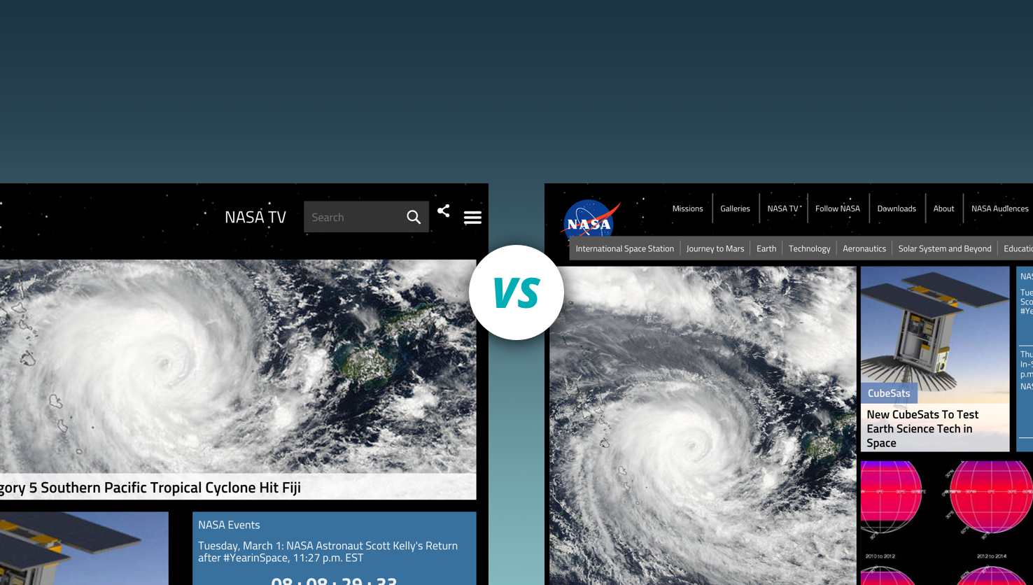
Do images that convey contextual content have equivalent alternative text specified in the alt attribute of the img element?      
1.2 Do images that are purely decorative, and not contextual, have empty, or null, alternative text specified, e.g. alt=""?      
1.3 Does the alternate text convey contextual relevance to the page it is on?      
1.4 Do images that convey complex content have longdesc attributes or equivalent text content available elsewhere on the page?      
1.5 Does text content contained in images disappear when images are not available, i.e. is there text contained in the images?      
1.6 Do image map area elements have the link destination correctly titled? If the title attribute is used, it ought not to duplicate the alt text.      
1.7 Do form non-text controls, e.g. input type image, provide a text alternative that identifies the purpose of the non-text control?      
1.8 Do noframes elements have appropriate equivalent or alternative content for user agents that do not support frames?      
2.1 Is a full text transcript provided for all prerecorded audio?      
2.2 Is a full text transcript provided for all prerecorded video?      
2.3 Are open or closed captions provided for all synchronized video?      
2.4 Is fully synchronized text alternative or sound track provided for all video interaction that is not otherwise described?      
3.1 Is information conveyed by color also conveyed by context, markup, graphic coding, or other means?      
3.2 Does a contrast ratio of at least 4.5:1 exist between text, and images of text, and background behind the text?      
3.3 Is a correct contrast ratio maintained when images are not available?      
3.4 Is a correct contrast ratio maintained when CSS is disabled?      
3.5 Are links distinguished from surrounding text with sufficient color contrast and is additional differentiation provided when the link receives focus, e.g. it becomes underlined?      
4.1 With CSS disabled, is color and font information rendered in the browser's default CSS?      
4.2 With CSS disabled, are headings, paragraphs, and lists obvious and sensible?      
4.3 With CSS disabled, does the order of the page content make sense as read?      
4.4 With CSS disabled, is most text, other than logos and banners, rendered in text rather than images?      
4.5 With CSS disabled, does any content that was invisible before stay invisible?      
4.6 With CSS disabled, is any content or functionality provided by the CSS through mouse action also provided through keyboard-triggered event handlers?      
4.7 When tables are used for layout, does the content linearize properly when layout tables are turned off?      
5.1 Are links in server-side image maps repeated elsewhere in the page that are non-graphical, e.g. a normal list of links?      
6.1 Are client-side image maps used instead of server-side image maps?      
6.2 Do client-side image maps have appropriate alternative text for the image, as well as each hot spot region?      
7.1 For tables containing data, do th elements appropriately define every row and/or every column headers?      
7.2 For tables containing data, do th elements contain the scope attribute for row and/or column headers that are not logically placed, e.g. in the first row and first column as applicable?      
7.3 For tables containing data, is the summary attribute used to explain the meaning of the table if it is not otherwise evident from context?      
7.4 For tables that are used for layout, are the elements or summary, headers, scope, abbr, or axis attributes NOT used at all?      
8.1 For complex tables, do the elements appropriately define row and/or column headers?      
8.2 For complex tables, does each th element contain an id attribute unique to the page and/or does each thelement and any td element that acts as a header for other elements contain a scope attribute of row, col, rowgroup, or colgroup?      
8.3 For complex tables, does any td element that is associated with more than one th element contain a headers attribute that lists the id attribute for all headers associated with that cell?      
8.4 Are the summary attribute and thead and tbody elements used to clarify the table meaning and structure if needed?      
9.1 Does each frame and iframe element have a meaningful title attribute?      
9.2 Does the page have equivalent content in a noframes element for user agents that do not support frames?      
10.1 Does any page element NOT flicker at an unhealthy rate, e.g. less than three flashes per second?      
10.2 Does any page NOT contain the marquee and blink elements?      
11.1 Does a document have a text-only version? If so, does it meet all Section 508 criteria?      
11.2 Does the text-only version contain the same exact information as the original document?      
11.3 Does the text-only version provide the functionality equivalent to that of the original document?      
11.4 Is an alternative provided for components, e.g. plug-ins & scripts, which are not directly accessible?      
12.1 Is any content or functionality provided by JavaScript through mouse action also provided through keyboard-triggered event handlers?      
12.2 Are link-type behaviors created with JavaScript on ONLY focusable elements?      
12.3 If content or functionality provided by JavaScript can not be provided to assistive technology, is equivalent content or functionality provided without JavaScript?      
13.1 Are links provided to any special readers or plug-ins that are required to interpret page content?      
13.2 Do special readers or plug-ins comply with the requirements of Section 508 paragraphs §1194.21(a)-(l)?      
14.1 Does each appropriate input element or form control have an associated and visible label element or title attribute?      
14.2 Are all cues for filling out the form available to users of assistive technology, e.g. mandatory fields, help boxes, error messages?      
14.3 Is the tab order to reach the form and the tab order between form elements logical and consistent with the normal and visual order of entering form data?      
14.4 Are logically-related groups of form elements identified with appropriate fieldset and legend elements?      
 14.5 Is placeholder text, if used, NOT redundant or distracting to users of assistive technology?      
14.6 Do form error messages identify the error(s) to the user and describe them to the user in text?      
15.1 If repetitive navigation links are at the beginning of the source of the HTML page, can a user navigate via a link, the “skip link”, at the top of each page directly to the main content area?      
15.2 If a “skip link” is provided, does the anchor element contain text content that is visible with CSS disabled?      
15.3 If a “skip link” is provided and it is hidden with CSS, is it available to users of assistive technology, e.g. not using the display:none method?      
15.4 Can a user navigate over groups of links, between multiple groups of links, and between sections of the page content by means of section headings or visible and audible local links?      
15.5 Are heading elements used to convey logical hierarchy and denote the beginning of each section of content?      
16.1 Is enough time provided to allow users to read and interact with content?      
16.2 Is the functionality of the content predictable, i.e. will a user experience contextual changes when unbeknownst to them?      
16.3 Does the user have control over the timing of content changes?      
16.4 If a page or application has a time limit, is the user given options to turn off, adjust, or extend that time limit?      
16.5 Can automatically moving, blinking, or scrolling content that lasts longer than 3 seconds be paused, stopped, or hidden by the user?      
16.6 Can automatically updating content be paused, stopped, or hidden by the user or the user can manually control the timing of the updates, e.g. automatically redirecting or refreshing a page, a news ticker, AJAX updated field, a notification alert, etcetera?      
16.7 Can interruptions be postponed or suppressed by the user, e.g. alerts, page updates, etcetera?      
16.8 If an authentication session expires, can the user re-authenticate and continue the activity without losing any data from the current page?      


Categories
Author

One of the main questions I am asked about my job is how I manage to stay productive while working from home, especially since the company that I work for is a group of app developers in DC. I live in  Argentina working as a graphic designer for Mobomo’s Design Team and have been since October 2014. Even though Mobomo is a U.S based company, I can honestly say I have loved working remotely for a company that truly invests in their employees even though they are thousands of miles away. Working remotely is only possible with professional and reliable people. I can admit, working from home is a skill that needs to be developed because it requires knowing how to manage your time without someone supervising you 24/7. It also takes someone that knows how to take calculated risks without asking for permission, and making that solution work.


Even though it’s not your traditional office setting, we have our own ways to stay connected. Our design team meets each morning on Hangouts to discuss what each of us are working on that day and if we need help with something then would be the time to ask. Some would ask ok but how does your team keep your tasks tracked? We use tools like Jira to help us stay organized with our to-do lists and it allows you to know who’s working on what and when it should be completed. When we want to communicate in a more relaxed way with our co-workers, we use Slack as our ‘water cooler’ we share gifs and talk about music or which new game we are playing.


From time to time, we have ‘Mobomo Days’ where we get together and work in an office. Recently we had an end of the year party where we spent a day at a rented country house where we could enjoy a pool and a dinner together. It is great being able to come together as a team to share laughs and jokes even though we don't see one another day in and day out. 


mobomo-design-development-team


I have had an amazing experience working for Mobomo this past year, it has helped me grow professionally in many aspects, and it has given me the opportunity to meet awesome people, not only in the Buenos Aires team, but also in the U.S. I’m really excited to see what 2016 has in store and I’m fully charged to tackle on the new projects that come along.

Categories
Author

body_image_a


It’s been a little while since our last post, but none the less I’m back and ready to talk about the third portion of Forming A Design Team. We covered Structure, and Process so far, and with this post we’ll talk about the tools that will enable you and your team to excel. To me, tools can be sorted into three categories, Wireframing, Interface, and Prototyping, and we’ll cover each one and it associated apps.

I think it’s important point out that not each of these tools will work for every team, and you may already have your tool set established, which is awesome! These are the tools that we have started to use at Mobomo and so far they’re working very well for us...but who knows what the new year will bring. New tools and programs come out every month, so this list could be updated to reflect better ways of working. Below are the categories I mentioned previously, with the tools associated with them.

WIREFRAMEING

INTERFACE

PROTOTYPING


Like I said before, these might not necessarily work for your team and some are bound to change or be updated, but for the moment they are working they have proven to be great for us. It should also be noted that not every tool is right for every job, so make sure when deciding which program to use you let the project dictate that and not your feelings toward it.

Categories
Author

unnamed-4


By nature, tables of data have a rigid structure and capitalize on screen width. When screen size is limited, table data will often not fit on the screen at once. This has been an interesting challenge throughout the brief history of responsive design since a key feature with responsive design eliminates the horizontal scroll factor.


The simplest way to work with tables that exceed the width of small screens is to place them inside a scrolling container. This generally works and it allows the table structure to be maintained. The only drawback is that it results in horizontal scrolling which we are often trying to avoid in responsive design. With that said, the value of simplicity makes this option a great default setting for tables across a site. This is the method employed by popular frameworks like Bootstrap and Foundation.


More complex solutions should be used on a case by case basis for tables that require more attention. You should test the experience of using modified tables at the relevant screen sizes to catch any unexpected issues like text wrapping or overflowing.


If you are seeking to eliminate horizontal scrolling but do not mind a potentially enormous increase in vertical scrolling, the following solution may suit your needs. It is an elegant yet fairly simple solution that stacks every item within the table vertically and cleverly places a label next to each item using some css trickery. The downside to this approach is that it is not easy to scan multiple items in common categories at one time.


An easily scannable solution that also prevents horizontal scroll will require significantly more complexity to strategically hide and reveal portions of data using javascript. Advanced responsive table plugins such as FooTable and DataTable allow developers to choose which columns are hidden at specific breakpoints. A user can then quickly scan through the existing columns to find an entry and reveal the hidden column data for that entry. Once we reach this level of complexity, we gain access to a variety of features like sorting, filtering, and pagination.

Categories
Author
Subscribe to