
Mobomo webinars-now on demand! | learn more.

Whether you're new to css layouts or a ninja css warrior we both share one common enemy: The Box Model.

The box-model is the way we calculate the width and height of an object. The W3C modal calculates the width and height by adding the padding and border to the width you specify ( width + padding + border / height + padding + border ). This is a pain because when we want to specify a width to be 400px wide, we first need to subtract the difference of the padding and border to make a 400px wide box. If we had a border of 10px and a padding of 20px, the width would be 340px wide (400 - 20 - 40 = 340px).

IE6 has a quirk where its box model calculated the width with the border and padding inside. When I started out as a developer I thought this was odd as other browsers calculated differently. This is how the border-box calculates the width. This really comes in handy when used for responsive design and fluid grids!

Box-sizing does take two values. First, the border-box as we have described above where the padding and border are inside. The second value, which is commonly used across browsers is content-box specified by CSS2. The padding and border are included to the width and height.

box-size comparison

Using box-sizing you can have fluid grids and keep all your gutters and borders inside. This makes it easier when starting out with responsive web design. We have begun using the border-box value for the box-size property in our recent Github pages (Omni Auth, Green Onion, Grape). Take a look at them as examples of how simple designs can be responsive with box-sizing: border-box property.

You can also play with sample code at Codepen.io.

Browser Support

  • Firefox 1-3, un-prefixed in current version
  • Safari 3, un-prefixed in current version
  • IE8+

code

  * {   -moz-box-sizing: border-box;   -webkit-box-sizing: border-box;   box-sizing: border-box;   }

By using the * you make all elements on the page use the box-sizing property.

If you have not started using box-sizing, I highly recomend using it in your projects. For the vetrans that know the old box modal this will help you with responsive web design. As mobile takes over, responsive design will become common practice, and the box-sizing property will become your new best friend!

Categories
Author

We’re excited to announce our involvement and sponsorship of Smashing Conference, taking place in beautiful Freiburg, Germany September 17-19th.

This event brings together web designers and developers for three days of intense workshops and engaging presentations from design experts around the world. We’re sponsoring the sold-out event and trekking to Germany for an epic “meeting of the minds.” (And some streusel. And beer. And sausages.)

Are you going to Smashing Conf? Be sure to come say “hallo”! Be on the lookout for these two dapper fellas:

We love talking about design and development and we’d love to hear your stories and share some of our own. If you didn’t get your ticket before the event sold out we’ll be tweeting updates from the event, so be sure to follow us and check back on our blog for a recap of the Smashing Conf highlights when we return!

See you in Germany!

Categories
Author

Don't cry. We've all been there too. Regression issues in the presentation layer make the entire team go crazy. Why can't we have a methodical way of testing the UI to ensure once designs are styled as views, they stay the way they were created?

The first release of GreenOnion is an attempt at just that. It moves from testing code to testing the visual interfaces that designers have envisioned and end-users will interact with. Developed after reading Jeff Kreeftmeijer's post on creating image diffs, GreenOnion brings together both OilyPNG and Capybara to test the UI.

RSpec, MiniTest, Test::Unit all allow devs to create solid code using BDD/TDD, but there has yet to be a good way to make sure bugs are not introduced in HTML and CSS. Sure, we have Watir and Capybara (a dependency of GreenOnion), but these tools are more focused on the functionality of views rather than how they actually look. GreenOnion captures and compares what the user would actually see. There will never be a sure-fire way to fully automate testing something so subjective as visual aesthetic, but GreenOnion should help the designer or developer by highlighting where things might be going wrong.

The GreenOnion workflow

  • Run skin method for the 1st time on a URL (best case would be if the styling of the page was correct)
  • Save skin
  • Run skin method for the 2nd time on a URL
  • Compare 1st skin to the 2nd (fresh) skin

Percent of change

GreenOnion.skin_percentage(url, threshold [optional])

The primary feature of GreenOnion is seeing how much (if at all) a view has changed from one instance to the next, and being alerted when a view has surpassed into an unacceptable threshold.

What do we mean by threshold?

The threshold is the percentage of pixels that are allowed to change from one iteration of a view to the next. This will give the view tolerance of change, and if that tolerance has been surpassed, then the test will alert the developer.

Visual change

GreenOnion.skin_visual(url)

Once you are aware of a issue in the UI, you can also check out where the offending issue may have taken place. You should open your "skins" directory, and check out the files with "_diff.png" at the end of the filename. The pixels will be highlighted and will have the same effect as the Photoshop "difference" filter.

Roadmap

We hope that this is just the beginning of more robust testing in the UI. Here are some areas that we will focus on in the future:

  • Screenshots can either be viewed as a visual diff, or overlayed newest over oldest and viewed as an onion-skin with sliding transparency.
  • Allow for flexibility in picking browsers
  • More robust skinner generator
  • Should allow for testing using fixtures/factories
  • Flexibility in skin filenaming
  • Test with UI events
Categories
Author

They say you can tell a lot about a person just from their bookshelf. Here is an inside look at our design team's current reading lists!

Our UX Designer, Ben Markowitz, draws much of his design inspiration from comic books:

"I enjoy comics for the intricacies in design and layout more than anything. Comics are a form of visual story telling which is much different from most other mediums; the artists (much like web designers) work elegantly within the constraints of the medium to create the most effective and moving experience for readers. Balancing artwork with content, they leverage limitations in usable space by using only the most poignant and effective elements to tell the story.

I approach UX design in a similar manner: define the optimal experience for users using the minimum set of design elements. This isn't minimalism, it's just responsible design. I aim to deliver a defined and powerful experience to the user by removing unnecessary complexity."

You know him as Chris Tate, our Director of UI, but we know him as Batman. His presence is sophisticated, his designs are rad, and his reading list? A thoughtfully cultivated set of inspirational pieces:

Here is Ted O'Meara, our Director of UX, whom we know as Superman (no, really).

As a graduate student at UMBC in the Human-Centered Computing program he focuses on developing software for the cognitively impaired. Ted's reading list is a reflection of his passion for creating accessible software through intelligent design:

  • Generative Art (Matt Pearson)
  • How We Decide (Jonah Leher)
  • Envisioning Information (Tufte)
  • Design Pattern TRABING?: Touchscreen-based Input Technique for People Affected by Intention Tremor (Evaluation, 2010, 267-272)
  • The design of a real-time, multimodal biofeedback system for stroke patient rehabilitation (MULTIMEDIA 2006, 763)
  • ...and Raising Unicorns.

Ask Ted about his tragic unicorn history at his next conference.

Jurgen Altziebler is our Managing Director of UX and he always means business. His seriousness is visible within his designs; nothing less than pixel-perfect will do for this designer.

His reading list might reveal his Austrian-born penchant for modern, light designs balanced with high functionality and subtle beauty.

  • Less and More: The Design Ethos of Dieter Rams (Gestalten)
  • Grid Systems in Graphic Design (Josef Muller Brockmann)
  • Designing Universal Knowledge (Gerlinde Schuller)
  • Ein Handbuch, Gestaltung, Typografie, etc. (Claire & Damien Gautier, Published by Niggli)

Javier Rios, our UI designer, is unambiguous and systematic. Maybe even a little crazy. (Ask him how many times he's been hit by cars while running!)

The practical, heuristic lineup of books in his reading list exemplify his approach to design: functional, clear designs that create a straightforward user flow path.

  • HTML5 for Web Designers (Jeremy Keith)
  • Responsive Web Designer (Ethan Marcotte)
  • Mobile First (Luke Wroblewski)
  • Designing For Emotion (Aarron Walter)

Style: The Main Ingredient

Based on their books alone I would conclude our design team is a group of calculated, discerning, artful design addicts. One thing can't be ignored though - they've got some serious style. It's that style that infuses every design they create, every user experience they develop, every carefully colored pixel on a page. As A Softer World once pointed out in their comic, "Everybody dies. Every single person. So, style counts."

Style counts.

Categories
Author

Last week we sponsored MoDevUX, a mobile conference in Washington, D.C. led by vanguards in the mobile development and design industry. In addition to learning about emerging trends from the diverse crowd of presenters and attendees we also shared a bit of our own "secret sauce".

Anthony Nystrom, our Director of Mobile and Emerging Technologies, shared the stage with Jurgen Altziebler, our Managing Director of UX to tackle the topic of "Development and Design: When the Two Must Act As One".

Through cultivating a culture of quality in both design and development we've gained insights on the formula for success among teams of developers and designers. MoDevUX was an opportunity for us to share those insights with the greater mobile design and development communities.

Designoper, Developer or Designer, the point is that recognizing each other's skills while sharpening your select personal skills is what a team is built upon. Certainly there are stars, however stars don't scale but teams most certainly do! And like any business that is looking to grow, it must rely upon teams that are less interested in their personal prowess and more interested in their unified presence.

Great Products: Under the Hood

If you're building a product you already know that it's important to know your industry, understand your users, define a clear vision and path of execution, and to be bold in your approach. But what role does your team of developers and designers play in the overall viability of your product?

We believe the DNA of any mobile or web product is embedded in the team(s) that are executing on the vision. Ultimately, every product is really just someone's good idea made accessible by teams of programmers and designers. Therefore, the most important factor in the success of your product is the team of experts building it. At Intridea we've been honing the process of creating these teams for years, and with great success! We do it in large part by making sure our teams of developers and designers are working together, not autonomously.

Building a Design & Development Team

Often, design teams work in isolation from development teams and in many cases design is outsourced to other agencies while development is done in-house or vice versa. But there's no doubt about it, a great product experience is the direct result of a good working relationship between the teams building the functionality (the developers) and the teams creating the aesthetic experience on top of that core functionality (the designers).

Of course, simply knowing that designers and developers should work hand-in-hand doesn't mean it's going to be easy. After all, designers and developers are different breeds and both groups work in distinctly mysterious ways. The trick to building solidarity in a product team is to hire the right kind of people in the first place.

While you might be inclined to seek out "rockstars" for your team, keep in mind that superheroes get bored easily, they're hard to find, and they don't scale. We have found that it's more advantageous to focus on hiring specialists who meet these requirements:

  • Have the skills (and attention span) to see a project all the way through (even that last 10%)
  • Are great at a couple of core things but are eager to learn beyond the bounds of their specialty (i.e., beware of "backend" developers who refuse to do "frontend" work)
  • Leave evangelism to theocrats: you want people who aren't afraid to use different technologies (whether they're cutting-edge technologies or older technologies that just happen to be the right tool for the job). Find people who love the challenge of creating something incredible regardless of the tools and processes used to get there.
  • Value form as much as function. It's important to see the inherent value in both a well-architected application and an easy-to-use, beautiful user interface.

In a symbiotic designer/developer relationship, both sides will, at some point, be faced with setting aside ingrained methodologies in order to collaborate effectively. What's actually happening in those cases is something like this: designers are learning something new about practice patterns in development, and developers are learning something new about user flow and experience from designers. When designers and developers work together in such a way, both teams gain something and will be more agile, productive and innovative on future projects.

Setting the Team Up For Success

Managing a product team is generally no easy task. Ask the design team to work in collusion with the programmers and it's sure to get even more challenging. Jurgen shared his strategy for creating a "balanced" team and setting them up for success on any project.

  • Team Building: This is an important first step. Assign an internal project (maybe a redesign of your company's website) to a developer and a designer. In this situation they will have to manage the project together, understand how the other one works, communicate in-depth about scope, features, and blockers on the project, and deliver a finished product.
  • Field Testing: Once you've ensured that the designer and developer can work together, pair them on a mid-sized client project. This adds a bit of necessary pressure because client deadlines are often more strenuous than internal deadlines. Additionally, a client project will introduce more variables for both sides. They'll have to think about things like client expectations, changes in scope and direction for both UI and architecture, and more.
  • Heavy Lifting: Now your designer and developer are battle-hardened and ready to lead the troops. Appoint this dev/design duo as the lead for larger projects that have multiple designers and developers. Their experience will aid them in helping other designers and developers work together, maximizing the results of the process.

But I Just Want A Good Product That Will Be Profitable

You have an idea. You need a product built. It sounds easy enough. Do you really need to spend all this time thoughtfully building the team behind the product?

In short, yes. Great products fail all the time; and not because there wasn't a good idea behind it. They fail because the teams building the products couldn't meet at that magic place - the precipice of awesome. (No, really - amazing things happen when designers and developers work together closely!)

Keep in mind, there isn't a lot of room for failure, especially in the mobile app market where users are educated and discerning and the competition is cutthroat. It's not even that users are "demanding" sexy interfaces and well-built applications - we're beyond that. Today, users just expect it. And if your product doesn't meet expectations your users won't even complain about it - they'll simply move on to another application that does it better.

These are problems that you rarely see when you have a team of designers and developers working closely on a product because simple issues like awkward user flow, unintended behavior within the interface, and architecture miscalculations are caught more frequently and earlier on in the process.

The Secret is in the Sauce

So there you have it - a sampling of our "secret sauce". TLDR: Hire smart people who value quality and aren't afraid to cross the "party lines".

Be sure to go through the complete slide deck from our presentation at MoDevUX, and check out our portfolio where you'll get to see some great examples of recent products and solutions built by our teams of designers and developers! Additionally, the full set of photos from the event is available on our Flickr page.

Do you have insights on helping designers and developers work together on projects? We'd love to hear it. Did you see our presentation at MoDevUX? We want to know what you thought. Leave your feedback below or reach out to us on Twitter.

Categories
Author

Rails. No, really.

The future of web and mobile design is in Rails, Sinatra, Django, and other RESTful web frameworks that can be used to leverage design power across multiple platforms, making it easier and faster (translate: more economical) to design for web, mobile and desktop.

Our UI/UX team was stationed up in NYC for the Future of Web Design conference last week and we were able to chat with some really awesome folks who had innovative and inspiring ideas about web design.

The atmosphere of FOWD was energetic and there were a lot familiar buzzwords being tossed around; “Mobile”, “responsive”, and “HTML5”, were the most prominent. I did hear two presenters (Steve Fisher and Josh Clark) talk briefly about content manipulation and APIs, but I was surprised I didn’t hear more on this topic.

When I took time before FOWD to consider what my own vision of the future of web (and mobile) design was I immediately thought of Rails and other RESTful APIs. In fact, the future of design is tied closely with the future of web development. More and more companies are demanding robust, scalable web applications that have the functionality to manipulate and generate content. And they don’t need just one application, they need several: a desktop app, a web app, an Android app, an iOS app, etc. And yes, they want those applications to be aesthetic and intuitive, but gone are the days when a business needs just a static, well-designed page to reach and engage their audience.

Using a RESTful API for design makes perfect sense. Let’s manipulate data in one defined way, but allow that action to take place over any platform. Obviously an HTML view is not always going to be the perfect experience for every platform, but in using a RESTful API all you have to care about is a connection to transfer data. You can swap out the HTML views for a native iOS or Android interface, and then you just have to think about the data transfer.

And isn’t that what we need with any application that deals with time-sensitive content? New York Times is on board with this idea (developer.nytimes.com), as is Facebook (open graph). As web designers we need to think about how to build our own APIs for our applications so we can more easily and more fluidly design corresponding mobile (and desktop, etc) applications.

But how does Rails play into this? Most people think of Rails as just a means for developing web applications; but what about that RESTful architecture that it’s built on top of? It’s perfect for extending mobile apps as well. You can easily use Rails as an underlying method for serving up CSS and styles for multiple platforms. Why not let Rails be the foundation for web and mobile design? When it comes down to it, Rails is an API right out of the box. You just need to style it as one.

Categories
Author

In just a few weeks, our design team, led by Jurgen Altziebler, our Managing Director of UX, will descend upon Manhattan for three days of intelligent discourse on the future of web (and mobile) design at this year's highly anticipated Future of Web Design (FOWD) event.

We are sponsoring this remarkable event which brings over 500 talented designers together for intimate sessions on the most current topics in web design. Top industry experts will be flown in to lead two days of informative sessions in which attendees will learn about the future of everything from HTML5, CSS3, Compass, Sass, Mobile UX, iOS design, Haml, responsive web design, content management systems, branding, animations, and JavaScript, which will be followed by a day of in-depth workshops.

We're looking forward to connecting with other designers who are interested in the future of this industry and to supporting a future of good design. Be sure to say hello to our team who will be available all three days to share their knowledge and insight gained from designing web and mobile applications for lean startups, enterprise giants, and everyone in between. Follow us on Twitter for updates and announcements leading up to the event. We'll see you in the Future!

Categories
Author

This article focuses on the correlation of UX and brand equity to quantitative measures that we see in market value.

User experience (UX) is a catch-all term that we use in the software industry to describe the overall feeling an end-user gets when using a product. The UX is the attitude that is triggered when using (and subsequently thinking about) a company and their products and services. Since your user's attitude affects their future behavior toward your brand or product, a good user experience is vital to product adoption, engagement and loyalty.

We all enjoy using a product that has been well-designed. But does the design of a product have any impact on stock prices? If it does, would that encourage Product Managers to allocate more resources to UX?

The Stats

In a 2004 study on "The Impact of Design on Stock Market Performance", the Design Council identified 63 companies to be effective users of design and analyzed the performance of them with the other UK FTSE quoted companies over a ten year period. They reported:

The key finding of the study is that a group of 63 companies identified to be effective users of design outperformed the FTSE 100 index over the full period by 200%, and also beat their peers in the recent bull and bear markets.

A number of prior studies have been undertaken around the world but all have been limited in their methodology or scale (see Appendix 1). We believe that this study offers the first conclusive evidence for the relationship between the effective use of design by corporates and an improved share price performance and therefore greater shareholder returns.

In 2006, a design group put together the UX Fund, an experiment to test whether companies that provide good UX see it reflected in their stock prices. They invested close to $50k in companies that had a history of innovation, had loyal customers, and that took care in designing their websites, products and user experience. The results? A year later the UX Fund matured a whopping 39.3% and the companies they invested in often outperformed their closest competitors.

Examples

Despite the (small, but increasing) research linking good design to stock values and despite the vital role UX plays in brand adoption and loyalty, investors and key decision makers of publicly traded companies rarely take UX into account when determining what drives their brand's market value. While a company's stock price is affected by an infinite number of forces, value can be closely related to the overall experience their users and customers derive.

We can spot trends and wild fluctuations in performance between companies that exist in the same market and create similar products but have widely differing approaches to UX/UI. Apple and Microsoft are a perfect (if not entirely overused) example. Apple's users (and even many of Apple's critics) tout that Apple products are better designed and engineered than Microsoft’s counterparts. If you have watched Objectified you know how serious Apple considers the user experience when designing a product. Apple users prefer the way they feel (and look) when using Apple products. The innovative simplicity of the UI creates a satisfying user experience.

Steve Jobs took design more seriously than most of his contemporaries, and saw it as much more than just the final layer over a product:

In most people's vocabularies, design means veneer. It's interior decorating. It's the fabric of the curtains of the sofa. But to me, nothing could be further from the meaning of design. Design is the fundamental soul of a human-made creation that ends up expressing itself in successive outer layers of the product or service. Steve Jobs

The subjective divide in UX between Apple and Microsoft brands can be quantitatively measured in market value; Microsoft’s stock has remained nearly stagnant over the past 10 years, fluctuating between $20-40 per share (despite new product releases and acquisitions), while Apple’s has grown over 3000%.

Myspace is an example of how bad UX can lead to major losses. In a recent UX Magazine article, "Myspace's UX-Induced Death", the author discusses all the ways in which Myspace failed to engage and ultimately retain their users. Many of Myspace's users were initially pleased with the unique customization features of the app, but it was that level of customization that eventually led Myspace to the grave. As Myspace's users grew up and as other companies created the future of usability, Myspace stayed the same. Many of Myspace's users desperately wanted the service to succeed and lingered, hopeful for years that the company would find its way.

News Corp stock only rose 1% over the 6 years they owned MySpace. Compare that with Facebook’s estimated valuation over the same time frame, and you can see that Facebook (with its relentless focus on the user interface) rose upwards of 5000%.

Where Do All The UX Resources Go? To The Creep!

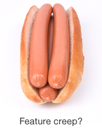
Feature creep, that is. In an article from UXMatters, Ben Werner identifies a common reason many Product Managers overlook UX, and it's not because they don't appreciate good UX - it's because they are won over by the allure of feature creep:

Competent management does realize that the user experience is critical to the long-term health of their company. Unfortunately, when developing software, the temptation to steal from the feature-list cookie jar and try to squeeze just one more feature into the current development cycle by skipping UX work is simply too great for most Product Managers.

He goes on to suggest that the best way to advocate for UX resources is to speak the language of the Product Managers - bring it back to dollars - and outlines a process for measuring the value of UX.

Most Brand Managers do recognize the value of UX. But allocating resources to UX within the complex decision matrix often gets overlooked. Although extra features might score the company more profit in the short-game, a better UX will score more in the long-game.

Bottom Line

So here's the bottom line: brand equity and user experience is measurable in some fashion. In light of how users respond to products based on their user experience, it would make sense to assess feedback about a product's usability and user loyalty right next to quarterly reports as indicators on whether or not to pull the trigger on buying stock. For those investors looking for long term gains, the overall success and temperature of public opinion on the company is key in order to see sustained success - and public opinion is derived, in large part, from the collective user experience.

If you care about how your users perceive your product, your brand, or your application, and if you understand the financial implications of what happens when users do (and do not) perceive it in a good light, then you need to care about UX. Good design isn't just a thin layer over your product; in fact, it's not a separate element at all. Rather, it's woven into every feature, felt in every interaction, and engages the user to the point where they forget about the design altogether, freeing them to just use the application to its potential.

If you don't believe me, then perhaps you can believe Google. Google was one of the first companies to vocally advocate for the user experience above all else, and it has worked out pretty well for them. From their "Ten things we know to be true" list they cite the user experience as the #1 priority:

1. Focus on the user and all else will follow.

Since the beginning, we’ve focused on providing the best user experience possible.

Google's Philosophy

Categories
Author

UI Kits are commonly found in most designer's toolboxes. We use them to bootstrap visual elements of a product before diving into the harder work. They are not as common with developers though, and in the spirit of this weekend's Betascape event of joining Art *and* Technology, I'm here to advocate for UI kits as a simple bridge between the design world and the development world.

Typically, every project goes through three main phases: Discovery, Design and Development. Although each phase defines a distinct position in the process, they do intermix. Generally, development starts as early as the Discovery phase, design continues to happen throughout all phases, and new requirements from the client pop up long after the Discovery phase is complete. This three-phased process is natural and effective but could be kicked up a notch by integrating a UI kit to the discovery phase.

UI Kits are packed with features that enable stylized rapid development. Bootstrap, a UI kit that was recently released by Twitter, is an all-inclusive HTML and CSS style guide that includes forms, alerts, block messages, grid columns, and even flyout menus - many of the elements that are often put off during the initial design and development process of a web app.

Using a UI Kit will completely change and enhance your design and development experience. Here's how:

  • Product Aesthetics: During the initial phase the client usually receives a few rounds of prototypes before the final approach is decided upon. With the aid of a UI kit developers can work with styles before they've even begun to work with their models and controllers, leading to better looking iterations and proofs of concepts. Adding enhanced design elements to otherwise graphically sparse POCs gives the client a better feel for their product before it even becomes a product.
  • Survival: There's a half-serious theory that babies are cute so we won't eat them. Your application, even in its infancy should be something to behold. Applications that are visually pleasing will naturally inspire the creativity of those working on it. UI kits give you style guides that include typography, palette guides, and forms so you can quickly add visual organization and style even during the rapid prototyping stages. Pretty applications are just more fun to work on.
  • Cohesive Teams: Getting a base user interface in place at the beginning of a project opens up communication and collaboration channels between designers and developers. The development team will have an earlier idea of the UI approach and be able to align the engineering of the application more closely with the design vision. Disconnects between architecture and UI will be revealed earlier in the process, allowing greater flexibility for changes and tweaks.
  • Promotes Creativity: With a good UI kit designers can put layouts together with ease and then spend their time pushing the bounds of creativity rather than pushing pixels.

A UI kit is something that should be in every designer *and* developer's tool box; it should especially be a core part of your team's Discovery phase. It allows the product to take visual shape earlier in the process, aiding both designers, developers, and the client. Style guides take care of the heavy lifting on the front-end, enabling the artists and the scientists to collaborate more effectively.

Categories
Author

Inspired by their recent trip to the Wolfram Data Summit, Marc Garrett and Jurgen Altziebler share their thoughts on big data and the missing component.

The Wolfram Data Summit is an invitation-only gathering in Washington, DC which brings together the leaders of the world's largest data repositories. Professors, Chief Privacy Officers, Research Scientists, Chief Technology Officers, Data Architects, and Directors from leading organizations like UCSD, the U.S. Census Bureau, Thomson Reuters, Cornell, and Orbitz (among many others) come to present on the challenges and opportunities they face in the data community and to discuss their work.

The Summit reaches a broad range of innovators from virtually every discipline. The format of the summit promotes collaboration among participants across multiple domains, including medical, scientific, financial, academic and government. Presenters integrate topics with discussion on open government data, data in the media, and linguistics.

Our Motivation

We frequently work with clients that own or manage large data repositories; through our work with them we build applications that allow their users to easily access and learn from the data. Through continued exposure to the world of big data, we've realized that although a few large firms utilize tools like data mining and data analyses to make better business decisions, the information is generally under-used and often not used at all by smaller firms.

Data is Gold

One the most strikingly apparent details that Marc and Jurgen gleaned from the Summit was that data and content owners truly care about the accuracy of their data. All of the presenters conveyed a sanctity toward cultivating quality data.

What results from the work of these scrupulous and discerning leaders is a vast collection of (high-quality and accurate) data that can be used by anyone to make more strategic decisions involving their health, finances, or education, by business owners to learn more about their niche markets and identify trends and potential solutions to common problems. Data repositories are used by groups to predict and release information about everything from natural disasters and disease outbreaks to commute patterns and high-crime neighborhoods. This begs the question, "If data can be so useful to us, why are large organizations cutting funding to data projects such as Census.gov and Data.gov?" (Read this article from WhiteHouse.gov for a look at some of the ways Data.gov has been used in the last three years.)

The Experience Layer of Big Data

Jurgen and Marc identified that one of the solutions to the diminishing use of these repositories lies in the user experience layer of the data. In most cases data repositories offer large data sets in Excel or CSV files and while this format is appropriate for their expert audience, average users don't know how to get valuable information and stories out of plain data sets. On the bright side, this is a problem that's easy enough to fix.

Tell the story, guide the user to discover insights with a user friendly web layer.

Jurgen Altziebler

Data must be easily and intuitively accessible; otherwise, it goes unutilized. There is no question that aggregation and maintenance of data is beneficial for everyone from the CEO of a mutual funds company to the admissions office of a University, to the entrepreneur of a tech startup, to the person choosing between treatment options for an ill loved one.

In the age of Web 2.0 there is no reason for big or little data to be silo'd behind unusable interfaces. Owners of data repositories can work alongside UX/UI experts to launch a new wave of data accessibility. At Intridea, we are obsessed with the user experience, but we also see the whole picture - we build applications to allow users to seamlessly access information they need. Jurgen notes, "A good user experience begins and ends with usable data."

As designers, our job is as much about the aesthetics as it is about the functionality and accessibility to the product or data in question. WolframAlpha.com is a good case study of what's possible when centralized data is made available to the average user through the power of a knowledge engine and intuitive interface. A simple query for "speed of light" or "heart disease risk" returns computational details on a macro and micro level.

What We've Learned

Data truly is gold. But it will waste away in mines if we do not create the appropriate tools for people to harvest and utilize it. If data owners can be encouraged to work with design experts, and if designers can be inspired to assist on these valuable data projects we can bridge the gap between the data and the user and unleash the inherent value in democratized data.

Categories
Author
Subscribe to Ui