
Mobomo webinars-now on demand! | learn more.

When it comes to selling products on a local basis, mobile rules the day. Whenever I travel anywhere, the first thing I do is fire up the Yelp or Google Maps apps to find someplace to eat. Next I check out the websites of those places. If I like what I see, I've found my next meal; if not, I'm moving on to their competitors.

And I'm not the only one...

According to the latest research from The Nielsen Company, 45% of consumers use their mobile device first when searching for local products and services. Ultimately, 53% of mobile users are making their purchases offline or in-store, and a whopping 74% of smartphone users complete their transactions offline.

What does this mean for you?

That means that your customers are searching for your products and services on their smartphones and tablets, and if they like what they see, they're buying. If not, they're heading to your competition.

Mobile Is Not A Choice

Providing a superior mobile experience, be it in the form of a mobile-optimized site, or a mobile application, is no longer a choice, it's a necessity. And with mobile Internet use set to surpass desktop Internet use in 2014, this is a trend that is rolling over companies.

And when I say "mobile-optimized site", I'm not talking about merely taking your entire website and making it mobile. What you need to take into account is how your customers use the mobile Internet, what devices they're using, what they expect when using those devices, and what information they need to move to a decision. This is where user experience design comes in.

To hammer this point home, we've taken the crucial findings of the research and turned into an infographic for you:

Local Buyers Are Mobile

What Do You Think?

Is your experience the same as in the findings? When you're searching locally for products or services, does your mobile experience determine whether or not you visit a store?

Let's talk about it in the comments below.

Categories
Author

This weekend we had Intrideans at four different events we sponsored from DC to Germany, talking about user experience, design, Ruby on Rails, and tablets. Here's a quick rundown of our experience at the events.

MoDevTablet

The first event kicked off early Friday morning. We partnered with GoMoDev to support their MoDevTablet event, and Jurgen, our Managing Director of UX, Christine Nakatani, our Director of Business Development, and Maggie, one of our superbly talented Project Managers spent the day talking with tablet developers and designers.

Jurgen and Maggie delivered a presentation to the MoDevTablet crowd later in the day on "Tablet as a Utility".

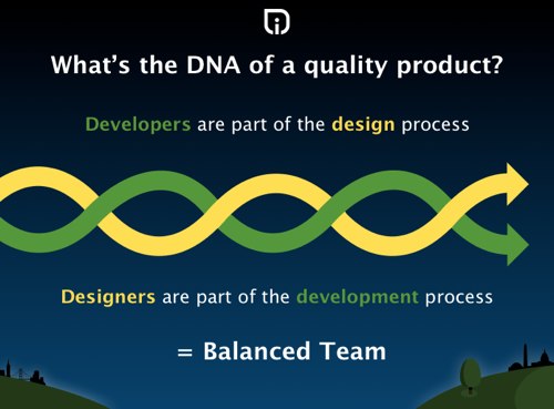
Using case studies from our work with Mitsubishi Electric, Agilysys, and the National Fish and Wildlife Foundation, they were able to speak to the tablet's evolution into a tool for business. Now that businesses are using tablets as kiosks to speak to customers, sales tools to encourage customer purchases, and portable ordering devices for servers in hospitality it has become ever more important that designers pay attention to the user experience.

They iterate that as designers we have to look not only at what the client wants, but what the user-base needs, and how we can create apps that get out of the way and allow the user to accomplish business in an unobtrusive and helpful way. You'll find slides from their presentation on our community page and some photos of the event on our Flickr page.

MobileUXCamp DC

Elena Washington and Jurgen woke up bright and early Saturday morning and headed to the Goethe-Institut for MobileUXCamp.

We sponsor this event annually to help build a more innovative, forward-thinking community of developers and designers by giving mobile enthusiasts a forum for sharing ideas and knowledge. We always enjoy the presentations at this event and this year was no exception.

RailsGirlsDC

While Jurgen and Maggie were wowing the MoDevTablet crowd, Renae was flying from Portland, Maine to DC for the RailsGirlsDC event, which Intridea was sponsoring. We kicked off the event Friday night at the Living Social offices with an "installation party", where delicious and delicate cupcakes were provided, along with beer, wine and a nice spread of appetizers. We ended the party with a "#FridayHug".

Renae spent Saturday in the same office learning the basics of Ruby on Rails alongside 48 other girls. The event, organized by Liz Steininger, was the first of its kind in DC; however, RailsGirls events have been happening all over the world since the first one in Helsinki in 2010 attracted over 100 girls. RailsGirls aims to get more women interested in (and involved in) tech by offering a free, full-day course on Rails, exemplifying how easy it is to get applications up and running.

The attendees got their "Ideas" application off the ground, and for those who were more experienced spent the day adding more complex features to our apps. Renae added a commenting feature, the ability to upload additional pictures for individual ideas, and started adding user authentication. Coding was broken up into reasonable chunks of times, buffered by a fantastic round of lightning talks on everything from REST to SASS to TDD.

The most moving talk was from Maria Gutierrez, a software engineer at Living Social who told us how her love of software drove her to become an engineer. Explaining that software is involved in almost aspect of our lives, she stressed how important it is that more women are more involved in the creation of that software.

Each sponsor for RailsGirlsDC was asked to write a note to be read aloud to the class about why there were supporting the event. Renae felt really proud when Intridea's sponsor message received accolades and cheers from the crowd.

The tech community is one of the most vibrant, avant-garde ecosystems in today's world. And while women play vital roles in tech, we count far too few women among Rails developers. No community can call itself a success without fair representation and participation from the smartest minds across all genders, races, and cultural backgrounds.

That's why Intridea stands with you today in support of women in tech. We know the joy of writing your first line of code. We know the pride in seeing passing unit tests. We know the rush (and sometimes *terror*) one feels when pushing changes to production.

We're working to usher in a new generation of programmers in which men aren't the only dreamers and builders of our online future. Everyone, regardless of gender should have the opportunity to be part of the truly exciting and challenging world of software development.

Women, code on.

Smashing Conf

Chris Tate, our Director of UI and Ted O'Meara, our Director of UX touched down in Germany this weekend for Smashing Magazine's first conference, Smashing Conf.

The event kicked off this morning and brings together web designers and developers for three days of intense workshops and engaging presentations from industry experts around the world.

Chris and Ted are talking strategy with other designers and sending us updates of all the awesome things happening throughout the day. We'll be adding photos from the event to Flickr page and the guys will be sharing some of what they're learning on our blog after the event, so check back here this week for more updates.

If you were at these events or want to know more about the events, leave us a comment below. If you're interested in talking to us about your mobile or web strategy and would like to leverage our expertise in UX/UI design or Rails development, contact us today.

Categories
Author

Last April we sponsored the first MoDevUX event in Washington DC and helped facilitate some important conversations about user experience design and application development with hundreds of industry experts.

We had the opportunity to take the stage to share some of our insight gained from developing beautiful, modern mobile applications over the years. Our presentation garnered a lot of feedback and even landed us a story in InTheCapital, DC's leading online news source for tech and startups.

We're pleased to report MoDev is back in action this September with another mobile-themed conference, MoDevTablet; this round they will focus specifically on keeping pace in the tablet era.

We're excited to sponsor MoDevTablet alongside giants like Adobe, BlackBerry and Microsoft. The conference offers more than 60 workshops and presentations over three days from September 13th-15th.

Once again, Jurgen Altziebler, our Managing Director of UX, and Anthony Nystrom, a Fellow at Intridea as well as our Director of Mobile and Emerging Technology, will take the stage. This time they'll be presenting "Tablet as a Utility", and will share case studies on developing tablet applications for real world, utilitarian cases where the functionality and design of the app has to enable someone to do their job more effectively. They will cover questions like:

  • How does the design of these apps differ from the design of novelty tablet applications?
  • What special cases do you need to take into consideration?
  • How to keep tablet in use without Wifi?
  • How to accommodate for working conditions like changes in light, differences in fingernails, and extended use?

We hope you'll join us for this exciting event in DC next week! Registration is still open. Several Intrideans will be there along with Jurgen and Anthony, so it will be a great time to pick our brains about your design and development strategy. Be sure to follow us on Twitter for updates throughout the event.

Categories
Author

The main function of data visualization is to help us better understand the concept of a data set quickly. When done effectively, data visualization can look organic and beautiful, but the primary goal is to help the viewer to consume and understand the gist of the data quicker than if he/she were looking at the sum of its parts.

Rating systems are a great example of where we could do better with data visualization. As Goodfil.ms mentioned last week in a post about rating systems, 5-star rating systems are broken.

A typical rating system should convey information quickly to a user as they browse through many entities on a screen. The 5-star rating system does do this, but it only shows a mean, not an entire dataset that the mean is derived from. Amazon.com does a breakdown of ratings and shows the context and relationship between all of the ratings for a product but they are too verbose to be put into a browsing view; they simply take up too much space.

The problem: we need to show detailed information of a dataset in a small space in a way that can be understood easily and quickly.

Plenty of research has gone into sparklines, which does exactly this – cram detailed information into a small space. Sparklines have been deemed pretty successful in applications, especially when surrounded by a lot of content. A study published in the IEEE Transactions on Visualization and Computer Graphics in 2010 showed that tag-cloud using sparklines resulted in faster task times, fewer errors, and was more preferred than its stacked-bar and multi-line chart counterparts.

Ok, great, a sparkline visualization meets our needs for space and can be an effective conduit, but how are we going to actually show the data we have?

Typically we think of heatmaps working really well in spatial relationships, but they've also been attributed to working extremely well when reviewing large datasets. Specifically, heatmaps can be used to find clusters and correlations from large datasets to those with only a few data points, such as 5-star ratings.

Heatmaps and sparklines are two good solutions to the problems with displaying rating results. That's why we created heatRate; a jQuery plug-in which takes a simple 1-dimensional array and creates a CSS gradient heatmap that displays the data on any HTML element you'd like.

You can keep the visualization in-line with your other elements but still see details you might otherwise miss on the standard 5-star rating visualization. heatRate has various options you can adjust to change contrast and the overall look of the heatmap gradient altogether. It works by employing HSLa, so you can choose to have values change based on hue, saturation, or lightness.

heatRate would be a good choice for you to use anywhere that you might have varied values in your data, even outside of the scenario of a rating system.

Give it a try and share your feedback with us! We'll be working on new features for this project in the coming weeks. We're obsessed with finding better ways to visualize data.

Categories
Author

Whether you're new to css layouts or a ninja css warrior we both share one common enemy: The Box Model.

The box-model is the way we calculate the width and height of an object. The W3C modal calculates the width and height by adding the padding and border to the width you specify ( width + padding + border / height + padding + border ). This is a pain because when we want to specify a width to be 400px wide, we first need to subtract the difference of the padding and border to make a 400px wide box. If we had a border of 10px and a padding of 20px, the width would be 340px wide (400 - 20 - 40 = 340px).

IE6 has a quirk where its box model calculated the width with the border and padding inside. When I started out as a developer I thought this was odd as other browsers calculated differently. This is how the border-box calculates the width. This really comes in handy when used for responsive design and fluid grids!

Box-sizing does take two values. First, the border-box as we have described above where the padding and border are inside. The second value, which is commonly used across browsers is content-box specified by CSS2. The padding and border are included to the width and height.

box-size comparison

Using box-sizing you can have fluid grids and keep all your gutters and borders inside. This makes it easier when starting out with responsive web design. We have begun using the border-box value for the box-size property in our recent Github pages (Omni Auth, Green Onion, Grape). Take a look at them as examples of how simple designs can be responsive with box-sizing: border-box property.

You can also play with sample code at Codepen.io.

Browser Support

  • Firefox 1-3, un-prefixed in current version
  • Safari 3, un-prefixed in current version
  • IE8+

code

  * {   -moz-box-sizing: border-box;   -webkit-box-sizing: border-box;   box-sizing: border-box;   }

By using the * you make all elements on the page use the box-sizing property.

If you have not started using box-sizing, I highly recomend using it in your projects. For the vetrans that know the old box modal this will help you with responsive web design. As mobile takes over, responsive design will become common practice, and the box-sizing property will become your new best friend!

Categories
Author

We’re excited to announce our involvement and sponsorship of Smashing Conference, taking place in beautiful Freiburg, Germany September 17-19th.

This event brings together web designers and developers for three days of intense workshops and engaging presentations from design experts around the world. We’re sponsoring the sold-out event and trekking to Germany for an epic “meeting of the minds.” (And some streusel. And beer. And sausages.)

Are you going to Smashing Conf? Be sure to come say “hallo”! Be on the lookout for these two dapper fellas:

We love talking about design and development and we’d love to hear your stories and share some of our own. If you didn’t get your ticket before the event sold out we’ll be tweeting updates from the event, so be sure to follow us and check back on our blog for a recap of the Smashing Conf highlights when we return!

See you in Germany!

Categories
Author

Don't cry. We've all been there too. Regression issues in the presentation layer make the entire team go crazy. Why can't we have a methodical way of testing the UI to ensure once designs are styled as views, they stay the way they were created?

The first release of GreenOnion is an attempt at just that. It moves from testing code to testing the visual interfaces that designers have envisioned and end-users will interact with. Developed after reading Jeff Kreeftmeijer's post on creating image diffs, GreenOnion brings together both OilyPNG and Capybara to test the UI.

RSpec, MiniTest, Test::Unit all allow devs to create solid code using BDD/TDD, but there has yet to be a good way to make sure bugs are not introduced in HTML and CSS. Sure, we have Watir and Capybara (a dependency of GreenOnion), but these tools are more focused on the functionality of views rather than how they actually look. GreenOnion captures and compares what the user would actually see. There will never be a sure-fire way to fully automate testing something so subjective as visual aesthetic, but GreenOnion should help the designer or developer by highlighting where things might be going wrong.

The GreenOnion workflow

  • Run skin method for the 1st time on a URL (best case would be if the styling of the page was correct)
  • Save skin
  • Run skin method for the 2nd time on a URL
  • Compare 1st skin to the 2nd (fresh) skin

Percent of change

GreenOnion.skin_percentage(url, threshold [optional])

The primary feature of GreenOnion is seeing how much (if at all) a view has changed from one instance to the next, and being alerted when a view has surpassed into an unacceptable threshold.

What do we mean by threshold?

The threshold is the percentage of pixels that are allowed to change from one iteration of a view to the next. This will give the view tolerance of change, and if that tolerance has been surpassed, then the test will alert the developer.

Visual change

GreenOnion.skin_visual(url)

Once you are aware of a issue in the UI, you can also check out where the offending issue may have taken place. You should open your "skins" directory, and check out the files with "_diff.png" at the end of the filename. The pixels will be highlighted and will have the same effect as the Photoshop "difference" filter.

Roadmap

We hope that this is just the beginning of more robust testing in the UI. Here are some areas that we will focus on in the future:

  • Screenshots can either be viewed as a visual diff, or overlayed newest over oldest and viewed as an onion-skin with sliding transparency.
  • Allow for flexibility in picking browsers
  • More robust skinner generator
  • Should allow for testing using fixtures/factories
  • Flexibility in skin filenaming
  • Test with UI events
Categories
Author

They say you can tell a lot about a person just from their bookshelf. Here is an inside look at our design team's current reading lists!

Our UX Designer, Ben Markowitz, draws much of his design inspiration from comic books:

"I enjoy comics for the intricacies in design and layout more than anything. Comics are a form of visual story telling which is much different from most other mediums; the artists (much like web designers) work elegantly within the constraints of the medium to create the most effective and moving experience for readers. Balancing artwork with content, they leverage limitations in usable space by using only the most poignant and effective elements to tell the story.

I approach UX design in a similar manner: define the optimal experience for users using the minimum set of design elements. This isn't minimalism, it's just responsible design. I aim to deliver a defined and powerful experience to the user by removing unnecessary complexity."

You know him as Chris Tate, our Director of UI, but we know him as Batman. His presence is sophisticated, his designs are rad, and his reading list? A thoughtfully cultivated set of inspirational pieces:

Here is Ted O'Meara, our Director of UX, whom we know as Superman (no, really).

As a graduate student at UMBC in the Human-Centered Computing program he focuses on developing software for the cognitively impaired. Ted's reading list is a reflection of his passion for creating accessible software through intelligent design:

  • Generative Art (Matt Pearson)
  • How We Decide (Jonah Leher)
  • Envisioning Information (Tufte)
  • Design Pattern TRABING?: Touchscreen-based Input Technique for People Affected by Intention Tremor (Evaluation, 2010, 267-272)
  • The design of a real-time, multimodal biofeedback system for stroke patient rehabilitation (MULTIMEDIA 2006, 763)
  • ...and Raising Unicorns.

Ask Ted about his tragic unicorn history at his next conference.

Jurgen Altziebler is our Managing Director of UX and he always means business. His seriousness is visible within his designs; nothing less than pixel-perfect will do for this designer.

His reading list might reveal his Austrian-born penchant for modern, light designs balanced with high functionality and subtle beauty.

  • Less and More: The Design Ethos of Dieter Rams (Gestalten)
  • Grid Systems in Graphic Design (Josef Muller Brockmann)
  • Designing Universal Knowledge (Gerlinde Schuller)
  • Ein Handbuch, Gestaltung, Typografie, etc. (Claire & Damien Gautier, Published by Niggli)

Javier Rios, our UI designer, is unambiguous and systematic. Maybe even a little crazy. (Ask him how many times he's been hit by cars while running!)

The practical, heuristic lineup of books in his reading list exemplify his approach to design: functional, clear designs that create a straightforward user flow path.

  • HTML5 for Web Designers (Jeremy Keith)
  • Responsive Web Designer (Ethan Marcotte)
  • Mobile First (Luke Wroblewski)
  • Designing For Emotion (Aarron Walter)

Style: The Main Ingredient

Based on their books alone I would conclude our design team is a group of calculated, discerning, artful design addicts. One thing can't be ignored though - they've got some serious style. It's that style that infuses every design they create, every user experience they develop, every carefully colored pixel on a page. As A Softer World once pointed out in their comic, "Everybody dies. Every single person. So, style counts."

Style counts.

Categories
Author

Last week we sponsored MoDevUX, a mobile conference in Washington, D.C. led by vanguards in the mobile development and design industry. In addition to learning about emerging trends from the diverse crowd of presenters and attendees we also shared a bit of our own "secret sauce".

Anthony Nystrom, our Director of Mobile and Emerging Technologies, shared the stage with Jurgen Altziebler, our Managing Director of UX to tackle the topic of "Development and Design: When the Two Must Act As One".

Through cultivating a culture of quality in both design and development we've gained insights on the formula for success among teams of developers and designers. MoDevUX was an opportunity for us to share those insights with the greater mobile design and development communities.

Designoper, Developer or Designer, the point is that recognizing each other's skills while sharpening your select personal skills is what a team is built upon. Certainly there are stars, however stars don't scale but teams most certainly do! And like any business that is looking to grow, it must rely upon teams that are less interested in their personal prowess and more interested in their unified presence.

Great Products: Under the Hood

If you're building a product you already know that it's important to know your industry, understand your users, define a clear vision and path of execution, and to be bold in your approach. But what role does your team of developers and designers play in the overall viability of your product?

We believe the DNA of any mobile or web product is embedded in the team(s) that are executing on the vision. Ultimately, every product is really just someone's good idea made accessible by teams of programmers and designers. Therefore, the most important factor in the success of your product is the team of experts building it. At Intridea we've been honing the process of creating these teams for years, and with great success! We do it in large part by making sure our teams of developers and designers are working together, not autonomously.

Building a Design & Development Team

Often, design teams work in isolation from development teams and in many cases design is outsourced to other agencies while development is done in-house or vice versa. But there's no doubt about it, a great product experience is the direct result of a good working relationship between the teams building the functionality (the developers) and the teams creating the aesthetic experience on top of that core functionality (the designers).

Of course, simply knowing that designers and developers should work hand-in-hand doesn't mean it's going to be easy. After all, designers and developers are different breeds and both groups work in distinctly mysterious ways. The trick to building solidarity in a product team is to hire the right kind of people in the first place.

While you might be inclined to seek out "rockstars" for your team, keep in mind that superheroes get bored easily, they're hard to find, and they don't scale. We have found that it's more advantageous to focus on hiring specialists who meet these requirements:

  • Have the skills (and attention span) to see a project all the way through (even that last 10%)
  • Are great at a couple of core things but are eager to learn beyond the bounds of their specialty (i.e., beware of "backend" developers who refuse to do "frontend" work)
  • Leave evangelism to theocrats: you want people who aren't afraid to use different technologies (whether they're cutting-edge technologies or older technologies that just happen to be the right tool for the job). Find people who love the challenge of creating something incredible regardless of the tools and processes used to get there.
  • Value form as much as function. It's important to see the inherent value in both a well-architected application and an easy-to-use, beautiful user interface.

In a symbiotic designer/developer relationship, both sides will, at some point, be faced with setting aside ingrained methodologies in order to collaborate effectively. What's actually happening in those cases is something like this: designers are learning something new about practice patterns in development, and developers are learning something new about user flow and experience from designers. When designers and developers work together in such a way, both teams gain something and will be more agile, productive and innovative on future projects.

Setting the Team Up For Success

Managing a product team is generally no easy task. Ask the design team to work in collusion with the programmers and it's sure to get even more challenging. Jurgen shared his strategy for creating a "balanced" team and setting them up for success on any project.

  • Team Building: This is an important first step. Assign an internal project (maybe a redesign of your company's website) to a developer and a designer. In this situation they will have to manage the project together, understand how the other one works, communicate in-depth about scope, features, and blockers on the project, and deliver a finished product.
  • Field Testing: Once you've ensured that the designer and developer can work together, pair them on a mid-sized client project. This adds a bit of necessary pressure because client deadlines are often more strenuous than internal deadlines. Additionally, a client project will introduce more variables for both sides. They'll have to think about things like client expectations, changes in scope and direction for both UI and architecture, and more.
  • Heavy Lifting: Now your designer and developer are battle-hardened and ready to lead the troops. Appoint this dev/design duo as the lead for larger projects that have multiple designers and developers. Their experience will aid them in helping other designers and developers work together, maximizing the results of the process.

But I Just Want A Good Product That Will Be Profitable

You have an idea. You need a product built. It sounds easy enough. Do you really need to spend all this time thoughtfully building the team behind the product?

In short, yes. Great products fail all the time; and not because there wasn't a good idea behind it. They fail because the teams building the products couldn't meet at that magic place - the precipice of awesome. (No, really - amazing things happen when designers and developers work together closely!)

Keep in mind, there isn't a lot of room for failure, especially in the mobile app market where users are educated and discerning and the competition is cutthroat. It's not even that users are "demanding" sexy interfaces and well-built applications - we're beyond that. Today, users just expect it. And if your product doesn't meet expectations your users won't even complain about it - they'll simply move on to another application that does it better.

These are problems that you rarely see when you have a team of designers and developers working closely on a product because simple issues like awkward user flow, unintended behavior within the interface, and architecture miscalculations are caught more frequently and earlier on in the process.

The Secret is in the Sauce

So there you have it - a sampling of our "secret sauce". TLDR: Hire smart people who value quality and aren't afraid to cross the "party lines".

Be sure to go through the complete slide deck from our presentation at MoDevUX, and check out our portfolio where you'll get to see some great examples of recent products and solutions built by our teams of designers and developers! Additionally, the full set of photos from the event is available on our Flickr page.

Do you have insights on helping designers and developers work together on projects? We'd love to hear it. Did you see our presentation at MoDevUX? We want to know what you thought. Leave your feedback below or reach out to us on Twitter.

Categories
Author

Rails. No, really.

The future of web and mobile design is in Rails, Sinatra, Django, and other RESTful web frameworks that can be used to leverage design power across multiple platforms, making it easier and faster (translate: more economical) to design for web, mobile and desktop.

Our UI/UX team was stationed up in NYC for the Future of Web Design conference last week and we were able to chat with some really awesome folks who had innovative and inspiring ideas about web design.

The atmosphere of FOWD was energetic and there were a lot familiar buzzwords being tossed around; “Mobile”, “responsive”, and “HTML5”, were the most prominent. I did hear two presenters (Steve Fisher and Josh Clark) talk briefly about content manipulation and APIs, but I was surprised I didn’t hear more on this topic.

When I took time before FOWD to consider what my own vision of the future of web (and mobile) design was I immediately thought of Rails and other RESTful APIs. In fact, the future of design is tied closely with the future of web development. More and more companies are demanding robust, scalable web applications that have the functionality to manipulate and generate content. And they don’t need just one application, they need several: a desktop app, a web app, an Android app, an iOS app, etc. And yes, they want those applications to be aesthetic and intuitive, but gone are the days when a business needs just a static, well-designed page to reach and engage their audience.

Using a RESTful API for design makes perfect sense. Let’s manipulate data in one defined way, but allow that action to take place over any platform. Obviously an HTML view is not always going to be the perfect experience for every platform, but in using a RESTful API all you have to care about is a connection to transfer data. You can swap out the HTML views for a native iOS or Android interface, and then you just have to think about the data transfer.

And isn’t that what we need with any application that deals with time-sensitive content? New York Times is on board with this idea (developer.nytimes.com), as is Facebook (open graph). As web designers we need to think about how to build our own APIs for our applications so we can more easily and more fluidly design corresponding mobile (and desktop, etc) applications.

But how does Rails play into this? Most people think of Rails as just a means for developing web applications; but what about that RESTful architecture that it’s built on top of? It’s perfect for extending mobile apps as well. You can easily use Rails as an underlying method for serving up CSS and styles for multiple platforms. Why not let Rails be the foundation for web and mobile design? When it comes down to it, Rails is an API right out of the box. You just need to style it as one.

Categories
Author
Subscribe to Ux