
Mobomo webinars-now on demand! | learn more.

gap.com-redeuxWho doesn't love a shirt or a pair of pants from GAP? GAP has been an American staple for years, and I can personally say I love their quality of clothing. A few months ago I wrote a piece on my frustration with GAP’s website and trying to navigate around it..specifically the home page. So I did what any rational person would…and redesigned it.

As with any feedback I give, in regards to a web & app design, I strive to make sure that it’s constructive, not to be misconstrued as merely being malicious but rather helpful suggestions based off of my professional experiences. However in the case of my previous post I wasn’t able to complete my perceived vision of what GAP.com could be in time and thus broke my rule. Below is my version of what GAP.com could be, with a little run down of the decisions I made and why I made them.

gap.com-redeux

GLOBAL:


TOP NAV:


MAIN NAV:


MASTHEAD:

gap.com-redeux


PAGE SECTIONS:

Hopefully if time permits I’ll have the chance to layout a product page, and take a stab at a mobile layout.

Just to be clear, this is in no way a sanctioned design by GAP, or an official Mobomo piece of work, but rather my take on what e-commerce and specifically what the GAP could be with a little web redesign effort. I’d love any thoughts or comments you guys have, so hit us up on twitter @MobomoApps or email us hello@mobomo.com - we love feedback! 


Categories
Author

agile-software-development

I remember as a kid playing baseball, my coach kept saying, “keep your eye on the ball!” “Mitt on the ground!” “Follow through on your swing!” You could hear him from the dugout. He was right, I hit better when I watched the ball travel from the pitcher’s hand to my bat. Just one grounder through the legs taught me the value of shoving my glove to the dirt. “Follow through on your swing” was less intuitive. I swung. I missed. The ball was already in the catcher's mitt. Why keep swinging? Sometimes I swung, and I hit. Why should I keep swinging when the ball was in play?

Back on the bench after another solid grounder up the line coach sat next to me.
Coach: “Kid, you have a nice swing.”
Me: “Thanks coach”
Coach: “You really could be a great hitter.”
Me: “I just hit a single to right!”
Coach: “Yeah, I saw... You know, if you used all your power that could have been a triple.”
Me: “I swung really hard.”
Coach: “Sure but, you didn’t hit it as hard as you could. You pull your swings short. When you try to stop your swing at the point of contact you’re preparing to stop you’re slowing down before you connect. If you swing through you’ll hit when your power is at it’s strongest.”

Launch day is not the end of a project. My brain keeps thinking about my projects well after I’ve launched a project. If you stop the moment your project is “finished” you’ll be holding back. Sure you put the ball in play but how well did you hit it? Is your swing improving? Will you be better next time?

One method of follow through in terms of completing a project is to review a completed project or sprint as a team. Do you know what worked well? What should your team do differently next time? We call these meetings retrospectives.

A well run retrospective will surface the not so obvious. For example, on our last project a number of new tools and processes were introduced. Was that a good change? Our team said it was but I wouldn’t have been surprised if they said it was too much. We needed to talk as a team to make a real assessment.

Retrospectives can give insight into the depth of known problems. On our last project we knew we had been struggling with work from the client. In our review we found that our initial requirements gathering needed more work. We knew we had a problem but talking as a team allowed us to see how severe the issue was, identify its root cause, and put us on a path to do better.

Running a successful retrospective is hard. Your team may not want to revisit the past and I am sure they have other work to do. If you are going to take the time to do a retrospective(and spend your boss's money paying everyone to be there) you better make it worth everyone’s while. Here are four keys to a successful retrospective.

Preparation:
The first step in “not wasting everyone’s time” is to prepare. You must have a game plan. If you want to lead an engaging follow up I recommend “Agile Retrospectives: Making Good Teams Great”. This great book was recommended to me by my ScrumMaster Trainer Bob Schatz (also pretty great).

Set the Tone:
Once you get everyone together you have to set the tone. Retrospectives are about getting better. They are not about blame. The site “Fun Retrospectives” has a Prime Directive which I find helpful. It states:
Regardless of what we discover, we understand and truly believe that everyone did the best job he or she could, given what was known at the time, his or her skills and abilities, the resources available, and the situation at hand.
You need to create a mood that will allow people to share what they think. If you can get them ready to share and listen you’re doing something right.

Engage your Audience:
Don’t run a poll. To successfully draw thoughts out of your team you need engaging activities. Post-its and white boards are your friends. The book “Agile Retrospectives” offers a catalogue of activities to get your group interacting, talking and sharing.

Follow through on your follow through:
After the meeting you have a responsibility to put your discovered insights into action. What are your next steps? How will you apply this information? This is your chance to get better as a team.

What will happen the next time you step up to the plate?

Categories
Author

responsive-website-mobile-app

Every company should have a mobile strategy but first you need to decide what's right for your business - a mobile application or a responsive website? Sometimes companies have one or the other or they may have both. This is all depending on the company and how they reach their users.

Some businesses have to choose between a mobile website or a mobile app based on their budget, let's discuss the pros and cons so that you can make the most educated decision whenever you're deciding on your mobile strategy. 


Mobile Website

Reach: Probably the biggest  benefit the mobile website has over a mobile app is the amount of reach you have; you’re able to access a much larger audience because of its discoverability and marketing potential, and it has low barriers to entry.

Content Sharing: If your primary goal is content consumption, a mobile website will usually suffice. While apps have the ability to make content sharing easy with a great design, a website can do these things with less overhead.

Ships Fast: Generally, obtaining an model view presenter (MVP) for a website requires less resources than launching a mobile app.

Marketing: Marketing a mobile website is easier and more effective than marketing a mobile application. Two tactics in particular work very well with website: Search Engine Optimization (SEO) and Pay Per Click (PPC).

Some disadvantages are:

Functionality: Products with singular functions are generally better delivered via a mobile application than a mobile website. If you think of calendars or email, Uber or Instagram, you'll likely agree that these functions are more effectively delivered through mobile applications than a mobile website.


Mobile Application

User Experience: The biggest benefit of a mobile app is the rich experience it delivers. Think of the UX on Facebook, Spotify, and some of your other favorite apps. Chances are the experience on the mobile application version is much more satisfying than their website versions.

Stand alone services: Applications are ideal for products that offer stand alone services. Weather, health, and banking apps all provide singular services to the user.

Re-engagement: While marketing an application via App Store Optimization is not very effective, apps offer push notifications. Push notifications are a great way to call the user to act even when they’re not actively engaged with your brand or product.

Some of the disadvantages are:

Storage: There is a limited amount of space on a user’s phone and your app is taking up some of that valuable real estate, I think we can all say we’ve seen the message “Storage Full”. When a user gets that message, they are then forced to decide whether or not to keep the app. Generally, apps get deleted before photos, emails, or other personalized storage.                                                                                                                                                                            

Best of Both Worlds

If you’re unsure which route to take (and you don’t have the budget for two builds), then Progressive Web Apps are a great alternative.

By combining the best of the web and the best of app, Progressive Web Apps maintain a website’s far reach and an app’s exceptional UX. Some of the benefits:

If you have questions about which mobile strategy is right for you, feel free to reach out to us! If you’d like to learn more about some of the mobile strategies we’ve put into place, check out the mobile apps and responsive websites we’ve developed.

Categories
Author

Who feels like they can never keep up with the latest trends? I think we all have that feeling at some point. If you are not within the industry you often feel like you are lagging behind and are considered to live in the dark ages. It seems like each year a new piece of technology is created and is considered to be the cutting edge of technology.

TechCrunch recently released Mary Meekers essential 2016 Internet Trends Report and the findings were very interesting.

  1. Global shipment of smartphones slowed dramatically, with cell phones not making leaps and bounds of improvement from year to year, people feel less inclined to purchase each year to “stay ahead of the curve”.
  1. Android is gaining more market share on iOS but the average price of the Android is dropping drastically. Meaning Android is more of a hot item for web and app developers to use versus phone makers.
  1. Mobile is dominating online advertising, with Facebook growing much faster than Google.
  1. Advertisers are still missing the mark and spending way too much of their budget on traditional media. The focus has now turned to digital, more specifically mobile. Spoiler alert, businesses that go to mobile advertising will be ahead of the curve.
  1. Millennials are not just an age group, rather they are focused on having a healthy work-life balance, self development, and community contribution - it is said that their impact will grow drastically.
  1. The rise of video sharing is driving more usage to visual apps like Snapchat and Instagram versus using text heavy apps like Twitter or LinkedIn.
  1. Video is evolving to control the video-on-demand.
  1. With around 10 billion short video views per day, video creators must make content designed for Facebook and Snapchat.
  1. The U.S could be named the top car industry once again with innovations by Tesla and Google.

What do you think about where the latest trends are headed? Be sure to check out Mary Meekers full report.

Categories
Author

improving-user-experience

Your website or mobile application is the first impression that you give to a potential customer. Will they get a good or bad impression of their experience? Well, that’s hard to say. It will depend on a few different factors based on user experience. We all know user experience is important in the design process but how can you improve it? Many companies dump money into projects that don’t have a meaningful user experience, UX designers try to uncover the issues but you have to be able to improve those things.

Site speed

Site speed is everything. Who likes visiting a website whenever it is taking forever to load? The answer, no one does. There a multiple things you can do to improve site speed but here are just a few.

Responsive

This is the most important item on how you can improve your user experience. Responsive websites allow for users to view your site in various screen sizes across all devices. Your site will visually appear the same across all platforms. You could lose potential customers if your website isn’t responsive because if they can’t view the same information across all platforms, they'll bounce.

Easy navigation

No one likes going to a website that is difficult to find the information they are looking for - in fact, the user will leave your website and go to another site to find the information they are looking for if they can’t find it easily it on your website. Here are some recommendations to make your site easier to navigate.

Create readable content

If your user can’t understand what they are reading then why have it on your site? Make sure that your content - whether it be your home page, a blog or your services page - is written so that people can easily understand it. Studies show that 81% of users skim the content that they are reading, which means if you don’t have target keywords built into your content chances are they won’t find what they are looking for on your website and they will leave your page.

Categories
Author

design-tools

As a mobile app development company, we pride ourselves in our design and implementation of our big ideas. We are constantly trying to push boundaries where we can, and strive to full potential.

Ideas can be like white noise if you don’t listen hard enough or rather if you do not communicate them in way that stands out. Sometimes you just have to grab hold and buckle up to make it happen. That's exactly what I did.

TL;DR

Discovered opportunity for a tool to draw on a whiteboard wall so I took the initiative, and went about iterating designs and prototypes and created what is now called Mobomo’s BIG Stencil.

The Problem

Mobomo project managers are often needed during the user experience and user interface process when starting a new project. There are plenty of creative tools available, but we don’t necessarily have a complete process or set of tools available to streamline the workflow in this area.

We have a large writable wall surface in our office and it has this nice coating to allow whiteboard markers to work with them… AND they still erase. They work great for collaborative sessions at any point during our UX/UI process, the wall is highly visible, can be rapidly iterated with, can be left up for long periods of time as reference or input, and most importantly provides a little insight into our collective thought process. We often utilize this wall-space to iterate on IA, user-flows, wireframes, and initial designs. It is a fantastic way to write your ideas together as a group, and sometimes we leave designs up for others to view and contemplate and provide feedback or input. We also work with clients in rapid ideation and iteration. However, there is one particular issue I encountered, despite years of experience with pen+paper and digital design, my whiteboard drawing skills are still awful. Not sure what is about those dry-erase markers...

What I’ve found is that I am horrible at drawing free-hand geometry with a dry-erase marker. No, seriously it’s bad. Consequently I was finding all sorts of items around the office to assist my creations: paper plates and coffee mugs for circles, boxes for straight edges, and business cards for rectangles as just some examples. What I wouldn’t do for a big stencil!

I was thinking.. What if we had a big stencil to assist us in rapidly producing these ideas on this large surface? Could it aid me in producing wireframes I’m not embarrassed to display or show to a client? This brought me to searching around for one that we could use. There are several useful products related from a few nice companies, but nothing that I felt really embodied what I had in mind. I decided at that point that if I wasn’t going to find what I needed, I would design and make it myself.

I started with basic elements, sizing, and geometry all related to mobile interfaces. Adding in every element and icon to be included in a mobile design: everything under the sun. It was a mess… This is where I encountered my next set of hurdles: too many specialized elements that were targeting the incorrect end goal. The goal was to have a tool to aid in initial wire framing and ideation, not high fidelity mockups. One of my favorite design quotes touches on this:

“...perfection is finally attained not when there is no longer anything to add, but when there is no longer anything to take away…” (Terre des Hommes, 1939, translation by Lewis Galantière).

So I started weeding out the unnecessary, while trying to keep the essentials. Comparing what was designed to comparative tools on the market, while also running the design by peers to get their input. I would love to say it was super methodical and loads of user interviews/tests were conducted, but that is not the case; at the time it was for my own professional use for as soon as I could get it made. This design became the first prototype of The BIG Stencil. It was awesome! Others finally understood the vision, and the general sentiment was that we were on to something.

design-tools

The next steps were a series of design iterations based on prototype user feedback from everyone actively using it for various purposes. What they liked, thoughts on what could be included, and ideas about how to simplify. We also managed to physically break it in a couple areas (hang it on the wall to keep it safe?! Whaaat? Crazy talk…), leading to specifying different physical requirements as well. The result was The BIG Stencil - V1. It is more refined, sturdy, and hopefully dynamically useful to be used during our design process. 

Creating a tool which simplifies the problem by combining the existing process and creating a common communication and design medium can often be a challenge. The resulting content is not constrained by the tool, but rather is enhanced in its simplified communication of underlying ideas and intentions; it provides readily available structure and elements allowing the user to focus more on the ideation rather than focusing on creating legible geometry.

design-tools

This final product is called The BIG Stencil and it is a specialized tool to make large whiteboard wire framing possible. It is a multi-purpose stencil that summarizes elements, geometry, and real-world constraints that we, as digital media creators work within. This tool allows our BIG ideas to emerge and take off.

I want to continue to improve this tool, hoping that my experiences and client interactions will make this tool a project manager's dream.

Categories
Author

bootstrap-web-design-development

Over the past few weeks, I’ve heard a great deal of pushback around Bootstrap. The first argument is focused around general feedback that Bootstrap isn’t suitable for production, and the second is that using frameworks like Bootstrap is limited from a design perspective. I’d like to offer a few insights into the practice of implementing Bootstrap in an optimized fashion.

At a recent An Event Apart in Nashville, there was a panel discussion with Jeffrey Zeldman, Eric Meyer, Rachel Andrew, and Jen Simmons. During this discussion, Bootstrap came up a few times:

“If people want to use Bootstrap, or anything, whatever it is, as long as you don’t release it to the public that way.” - Jeffrey Zeldman

"There were back to back presenters today who talked about how we really feel like people should stop using Bootstrap. And you were saying Jeffrey, that it’s great for prototypes, and I’ve heard a lot of people say that, Karen McGrane said that on the show not long ago, “Oh, Bootstrap’s great for prototypes”. - Jen Simmons

Before I demonstrate a few implementation methods, I first think it’s prudent for us to remember that, as in many cases in web development, it’s not the tool’s fault, but the implementation. A shining example of this is when smartphones first appeared, we had developers who had been building desktop sites for decades, who for the first time were being presented with the mobile form factor. Using methods that worked on powerful desktop machines with broadband had to be reassessed, and for a while, the idea that the web is slow on mobile was very popular. This was not the fault of the web, the mobile web, smartphones, or anything in between. This was (and still is to some degree), the fault of developers sending desktop content to mobile devices, among other implementation challenges.

In the case of Bootstrap, the biggest culprit of negative performance impact comes from site authors who include the entirety of Bootstrap’s CSS or JS files. With both, we must always include only the modules used in our app or site.

When implementing Bootstrap’s CSS, this is accomplished by making a copy of the Bootstrap manifest file that imports each individual Bootstrap module. This is placed with your app’s CSS modules. It is typically imported before everything else:

Bootstrap-CSS

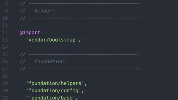
Start by commenting out every module in this master Bootstrap manifest. As you work on your site, only uncomment the modules you’re using:

Bootstrap-CSS

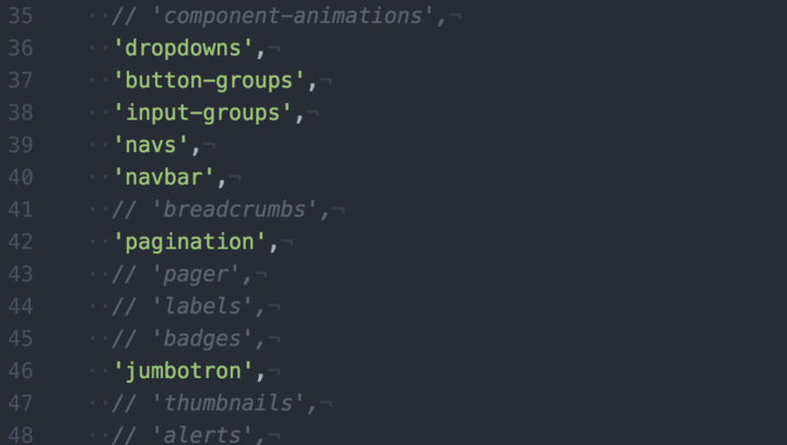
This allows for a completely customized Bootstrap CSS file, without having to depend on a generator or tool to build a custom version of Bootstrap for you, and ensures that you have the most optimized version of Bootstrap CSS possible running in your app, because you’re only enabling modules as needed.

The same method can be applied with Bootstrap’s JS. In Rails, it’s very easy to include individual Bootstrap JS modules in your app’s application.js file:

Bootstrap-CSS

Your implementation may differ, but the idea stays the same: only include CSS & JS modules that are being used.

With an optimized implementation of Bootstrap, you can be confident that your performance won’t suffer as a result of using the framework.

The other popular sentiment is that Bootstrap limits our design, a sentiment echoed at the same An Event Apart conference:

“I feel like if you use it as a prototype then you’ve just, right from the first brushstroke, set yourself up to stay within a very small box. Now, it used to be a very small box inside a of a just slightly larger box, but now it’s a very small box inside of a box that’s about to get really huge, and I want to be in the rest of the box.” - Jen Simmons

Using the same CSS architecture described above, we can easily add variables in our Bootstrap manifest that override the Bootstrap defaults, effectively giving us the flexibility to design & build anything we want:

Bootstrap-CSS

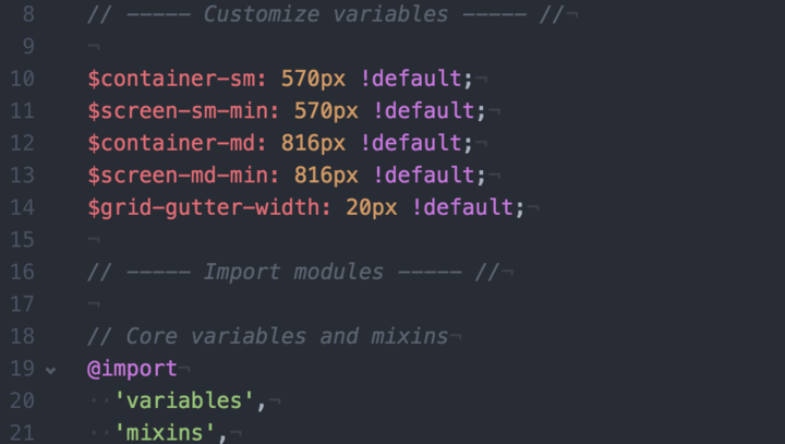
These are only a few examples, but they will have a big impact on the site layout. You can customize any variable provided by Bootstrap. The options in Bootstrap’s variables file are virtually limitless.

While Bootstrap allows designers & developers to customize design & layout to their heart’s content, it’s also worth noting that design patterns exist for a reason. Users have certain expectations, and in many cases, breaking those expectations can cause confusion. This is best demonstrated with the Ionic hybrid app framework. Ionic offers a set of components that adapt to iOS, Android and Windows platforms. With Bootstrap’s components, you get a base set of components that users are familiar with, but also the flexibility to customize them.

It may be true that the defaults for Bootstrap make it too easy for developers to implement a bloated or cookie-cutter version of the framework. But, with the methods described in this post, you can easily break outside that box, and ensure your work is delivered in an optimized fashion to your users.
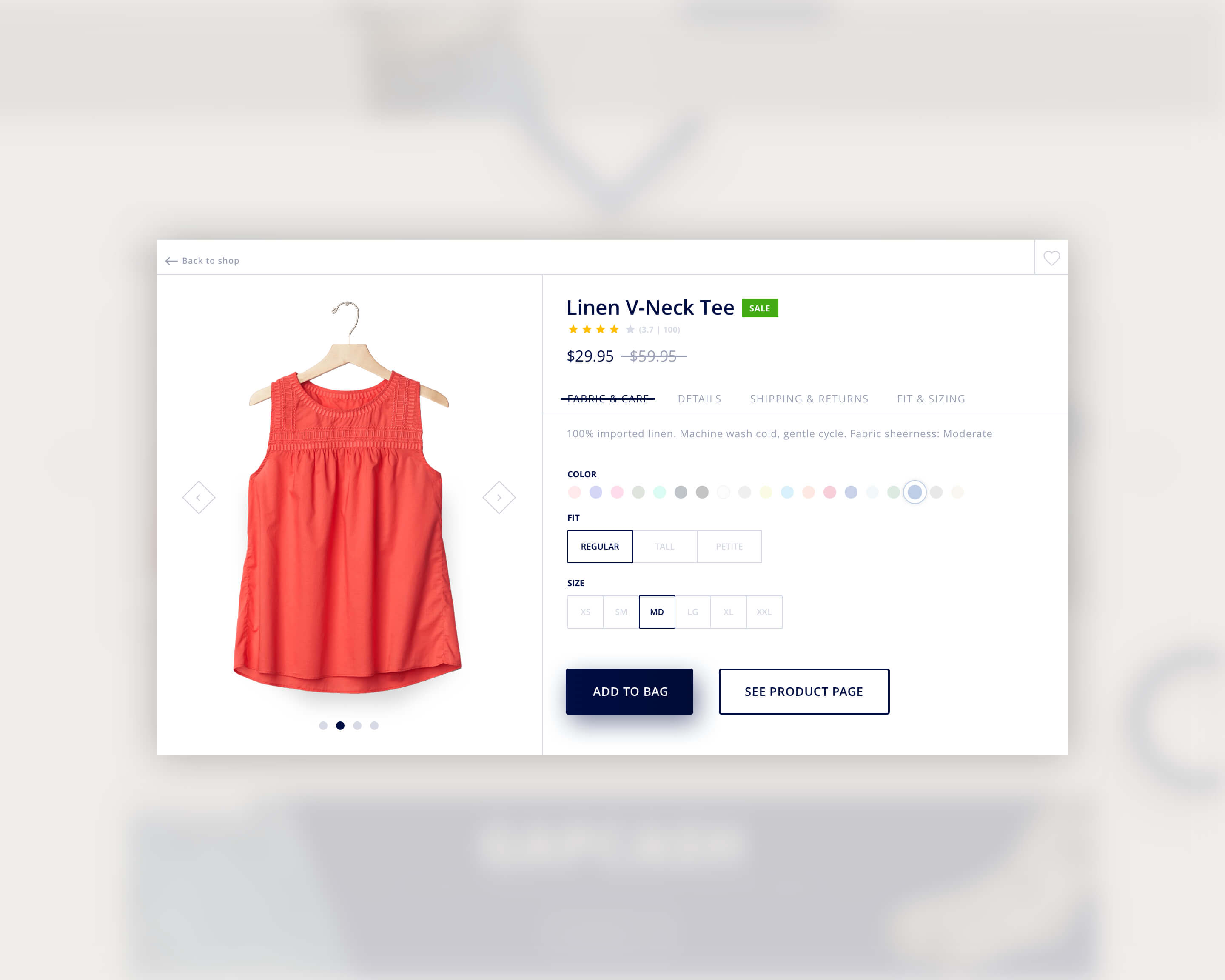
Categories
Author

designing-user-experience

Have you ever found an amazing tool that looks awesome and it tends to be popular but when you try to use it you have no idea know HOW to use it? Or you get more confused when reading the instructions? This is the perfect example of an amazing design with poor user experience.

Creating an app is no easy task, the designer has to know how the app will work before considering the look and feel of the interface. For all UX designers, the end goal is to provide an effortless experience for the user.

True user experience goes far beyond giving customers what they say they want, or providing checklist features. It is crucial for the designer to use EMPATHY when designing an app. If you put yourself in the end users’ shoes this allows you to move beyond a superficial understanding to a real appreciation of users’ feelings and behaviors, which in the end will avoid any kind of frustration while navigating the app.

User experience designers often ask themselves:

  •         What is the user trying to accomplish while using this app?
  •         How will users feel when they use it?
  •         Will they be confused?
  •         If so, why?
  •         How can I solve this issue in the shortest and easiest way?

Designers are compelled to navigate the app from the beginning to end, trying to find frustrating steps, annoying alerts, or anything that can affect the users’ behavior or feelings. After all, if a product is well-designed, a user shouldn’t even have to think about it they will know the app is there to help them and will not confuse or frustrate them.


Categories
Author

Mobomo-Named-2016-Muse-Award-Winner

We are honored to be named a platinum award winner for the 2016 Muse Awards. We submitted Game Time Pressure Mobile Application that we built for the Baseball Factory. Muse Creative Awards is an international competition for creative professionals who possess the unique ability to inspire with concept, writing or design whether through traditional materials or electronic media. More than paychecks drive a creative people to perfect their craft. They follow the spark of an inner muse, lighting the path to success with deep knowledge and shining originality.

Recognized as the leader in player development for the past 21 years, Baseball Factory provides world-class instruction, life-changing experiences and new opportunities to help student-athletes achieve their dream of playing college baseball.

Seeking ways to help players reach their full potential through science and innovation, Baseball Factory conducted a series of studies over several years narrowing in on five key categories of stress that interfere with the ability of a player to maximize his talents on the field: performance pressure, competitive demands, time pressure, task load, and noise.

Armed with these findings, the Mobomo team developed Baseball Factory's signature Game Time Pressure Training and Simulation Program - a premier strategy for helping athletes overcome game-time stressors. The program has been successfully implemented in both live game and simulated environments, but always in an in-person, hands-on setting.


Categories
Author

Gulp is a tool to help web developers automate various tasks. Like Grunt before it, Gulp makes repetitive tedious tasks bearable through automation. Remember: if you have to do it more than once, you've already done it too many times.

Today we are going to to set up a very basic Gulp workflow and only focus on building and optimizing your CSS from SCSS. In later posts we will have Gulp do more like compile and optimize you JS.

Prerequisites

Gulp, grunt, and other automation tools rely on Nodejs, so if you don't already have nodejs installed you can get it here. Nodejs will come with NPM, (node package manager) which will give you easy access to download all sorts of things such as gulp itself.

When you're done installing Nodejs it's time to install gulp. Open your terminal of choice and enter the following command:

sudo npm install gulp -g


This command will install gulp globally on your machine. Note, installing packages with sudo is potentially dangerous, this post goes into more detail and precautions to take.

Setting up your project

Now we need to create a project directory. We are going to create a dirt simple project for this example. So create a folder named "myproject", and inside that folder create another directory called "dev".


In your terminal, navigate over to your project directory where we can set up our project by creating a package.json file which will define information about our project and also lists project dependencies that Gulp relies on. We don't have to do this manually, run the following command to set up the file:

npm init

This will create the package.json file and will look something like:

{
 "name": "project",
 "version": "1.0.0",
 "description": "this is a demo project",
 "main": "index.js",
 "scripts": {
 "test": "echo \"Error: no test specified\" && exit 1"
 },
 "author": "your name",
 "license": "ISC"
}

In this example, I only set the name, description and author. I chose the defaults for everything else.  Now we are going to use more than just Gulp for our workflow, so add a comma to that last line ("license":"ISC") and at the following new line:

"devDependencies": {}

This is where we will list our dependencies as comma separated key/value pairs (standon JSON).

Dependencies


Categories
Author
Subscribe to General