
Mobomo webinars-now on demand! | learn more.

Desktop apple computers

It's crazy to think that 2016 is coming to a close, the question is what will 2017 bring? At Mobomo, we strive to think ahead and implement cutting edge trends so that we are always ahead of the time. Now the question is what is the “next big thing?.” Unfortunately, as far as we know there is not a way that anyone can truly predict the future, but what we can do is look at current trends, as well as past trends to get a sense of what the next year may hold. Below we have listed out some of the design trends that we predict to see in 2017. This list is by no means a definitive one, but our design team is keeping a close eye on these as we ring in the New Year.

DESIGN TECHNIQUES

Minimal/Flat Design - This one is not going anywhere, and as far I as I can tell it’s really only getting stronger. It does make a lot of sense that this approach to solving a creative problem used quite frequently. We are bombarded on a minute by minute basis with new content and information to the point that we literally can’t digest it all. By handling your content in a “minimalistic” way you’re helping the people that use your product by removing any clutter. There are no extraneous steps they have to wade through.

Soft drop shadows - Another technique that has only been getting stronger is the use of “pillowy” drop shadows on web and app components. For me, again this makes a lot of sense, if used appropriately it doesn’t take away from the “minimal” look of your site, but rather adds a layer of depth to it. Adding depth to your product can do several things, A.) It can show hierarchy in your content by literally elevating it above other items, B.) It can be used to show hover or active states of your content, and C.) Depth adds a level of visual interest that helps to break up the flow of the page, make the content more digestible.

Non traditional/breaking the grid - Breaking the design grid has always been a strong technique when implemented correctly. What it does is break up otherwise static content into interesting visual cues. It’s one of the best ways to “surprise & delight” the people using your product, to unexpectedly alter the layout in a manner that makes them stop and absorb what they are looking at.

Organic shapes - The use of non rigid, more fluid shapes within a product or site helps to break away from the pack. By slightly altering a button, or header graphic to something softer than a square, you begin to give your layout a completely different feeling, something much more approachable.

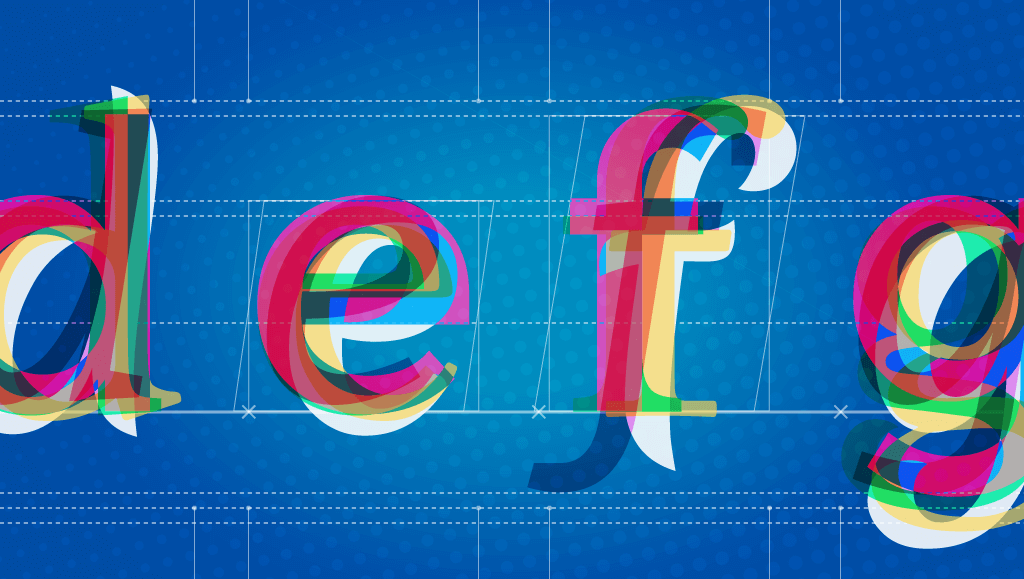
Large Text  - Large, powerful, font choices will continue to increase. Especially as the amount the content grows, there’s has to be a way for copy and text blocks to stand out. Gone are the days when a 12pt font is an acceptable choice for web copy. With the increase concern of accessibility and usability becoming the primary business goal of product owners, larger fonts equal easier digestion of content.

Bright colors- As the need to standout becomes more necessary, the more we will see websites and applications use bold, bright colors do that. The use of strong colors helps to create the type of visual tension that people like when using your product. It helps to quickly reinforce key information and page components like buttons.

Experimental prototypes - While designers continue to push the limits of devices and people's expectations, there will always be a place for experimenting. While these might not be quite ready for the mainstream public, they do show where the future of applications and websites are headed.

Futuristic interfaces - If the demand for products like Nest and Tesla continue to climb, so will the interfaces that accompany them. Some of these might still be experimental in their perceived execution, but again they show where consumer based interfaces are heading.

Web forms

As peoples attention is increasingly being pulled in many directions, the way we expect them to enter data and communicate on the web has to accommodate that. There has recently been a surge in “bot” based communication on the web and in apps, where people communicate back and forth with the product in a very natural, conversational way. I think 2017 will only see this new form of interaction increase and become more adapted.

Beyond design techniques, I think we should be on the look for more applications like Adobe XD and Figma that allow multiple users to work across a single project without the need to handoff project files. We can see 2017 being the year of collaboration based tools, where teams begin to work more fluid across several projects with several designers helping out.

Let us know what you think 2017 has in store for designers!

Categories
Author

Fonts

Spoiler alert, this blog post will favor the use of custom picked typefaces, as opposed to resorting to default fonts. In fact, webfont services are widely adopted and it doesn’t appear to be a trend or something that will go away anytime soon. With that said, we have to face the fact that the vast majority of users probably will not notice any difference if a site they visit fails to load its carefully-chosen, brand-values-conveyor text font and just displays Times instead. Or, let me rephrase: they won’t consciously notice. There are reasons to support this, and I will advocate for the custom web fonts.

Language

Typefaces are basically drawings. A group of drawings (a system of shapes) representing structures that make the pieces of a code we all share. This code is the graphic form of our language. Language is engraved in our heads that when we are in front of these shapes, we cannot help to automatically decode letters, words and paragraphs. 

If we can understand the language it is typed in, there’s no way we can override the “meaning” detector. We don’t see drawings, we see words. And even if we do not know the language it will still use the Latin alphabet as the base so we will recognize the glyphs. Moreover, with other scripts we will still get the sense that “those are letters.. this is probably text”.

But this experience of getting further away from the language you know does help to prove the point: if you look at cyrillic script (e.g. Russian), you will recognize some glyphs as the letters you know, but others start to look weird, they might as well be icons (is that a chair maybe?). Let alone logographic scripts, like Kanji.

Style

So all of the above can hint at the fact that even if language and meaning come first (and that’s even a policy we can adopt for text display when developing), the perceived shapes, their style, page layout and block layouts all leave an impression on the page and in our minds. This is more obvious in the case of pictures or illustrations, as they are not hard-linked to language like the alphabet; Fonts are more ornate or illustrated type (usually for display sizes). When we look at those, the effect of the style becomes more apparent: it could be antique, retro, industrial, geometric,modern, hand-made vs. machine or digital.

In the case of text typefaces, there’s a sense of heritage that comes from their design. There’s a standard classification of type that groups the different styles by their characteristics, and often these groups represent a time in which their first specimens were created. This means you have the legacy of 15th thru 20th centuries, with all of the different stages within them.

This classification also reveals the differences that arise from the technological medium by which they were designed, and the closest or farthest they are to some original calligraphic form.

(refer to more fonts here

Hands-on

Now that we’ve come this far, I hope you won’t take the decisions that go behind a copy layout and its effects on your site or app so lightly! Remember that despite all webfonts being produced digitally, they are still mimicking the way they were produced back in the day, and they follow the tradition of typographers. New type designs with any number of features are coming out of the digital type foundries as you read this. But when it comes to text fonts they will all fall into some of the categories of the classification.

Bear in mind that text layout, in terms of leading (vertical space between lines of text), tracking (space between letters), and overall the type size and extension chosen will also affect the impression the block gives in addition to the type design itself.

So, let’s not miss the opportunity - utilize this huge toolset and let’s add a layer of meaning behind the literality.

Categories
Tags
Author

Wireframes

UX and UI are distinct parts of the design process, but they are so closely intertwined that one couldn’t possible exist without the other. Let’s start by defining the two so that we don’t get confused.

“User Experience” is a very broad term, but for the purpose of this discussion, let's define it simply as the engagement between the product and it’s user.  UX in the digital realm is constantly evolving as the user base expands and as technological advancements allow user engagements to become incredibly efficient.  Think of a simple question to lookup:  “When will the next president be elected?”  Not so very long ago, you would search for a website related to politics, and then you would dig through page after page, desperately looking for the answer.  Today, google will give you the answer immediately, and very efficiently, thus providing an amazing “user experience.”  It seems simple, but from a design perspective, maximizing UX is still an incredibly challenging process.  The success of your applications UX is ultimately dependent upon the purpose of the user, and when you have to accommodate a variety of purposes from a variety of users, it can be very difficult to create a slick UX.

Once the User Experience has been determined, then the “User Interface” or UI comes into play.  Lets use an example to understand UI: we are creating a website for a Pizza restaurant.  We want users to come to our website, see our menu and order a pizza.  A clear goal has already been established by the projected UX: we want you to order pizza.  The specific layout of the webpages will be the User’s interface.  In other words, the UI is the medium for ordering pizza, while the UX is how happy you are while using that medium.  Determining an efficient layout for our website is not an easy task; how do we get the user from the home page to successfully clicking the “place pizza order” button?

There are infinitely many control and style choices.  Early design documents are often so laden with features that their websites’ production could take years to complete.  This can happen if you bury yourself in the user interface.  Like the Yin and Yang, an oreo cookie, or whatever metaphor you choose, such is the natural relationship between UI and UX: the best UI design will occur when you are consistently mindful of the UX, that is, mindful of how the user will experience your site.

There are  few essential rules that go into the creation of intuitive applications.  UI designers are responsible for creating a cohesive style guide; they should maintain a consistent design language throughout the product. The pages of your product must communicate clearly with the projected designs of the UX.

Now that we have established the basics, what are the top UX/UI tools being used in the dev industry?

For a pre-test fee, UserTesting is a stress and hassle free tool. It can be utilized for user research and prototype testing.  Testing experts can recruit the target audience for your application, remotely administer user tests, and deliver the results within an hour.  The test records video footage of the user in order to gauge facial expressions and emotional responses to your application.

With Stylify Me you can copy the color hue of any website.  When you enter the URL in the top search menu it reveals the exact HEX values for that site.

With UXPin  you can design a website or app from start to finish. UXPin allows the user to develop lo-fi wireframes into a hi-fi prototype.  UXPin provides drag and drop tools for UX interactivity, creating codeless animations, and for designing UI Patterns.  UXPin works with Photoshop and Sketch so that you can convert static files into interactive prototypes without losing layers.

Sketch has very similar features to Photoshop, but Sketch was specifically designed as an image editor for digital design, while Photoshop has a broader set of tasks.  Sketch uses CSS logic from the start, which makes for an easier transition into development.  Sketch also has an auto-cropping feature and one-click exports into various formats.  Sketch has easy navigation and convenient developer tools.

Photoline is a little less well-known, it’s a little cheaper, but it still offers some useful features like photo manipulation, nondestructive layering, vector editing, and desktop publishing.  It also has multi-layered importing and exporting for EXR.

Optimizely is another tool that provides user testing, but it only does A/B testing.  A/B testing compares usage data from two different versions of your product.  A/B testing can help guide production decisions and early experimentation.

Once you have selected a color scheme, Color Safe helps you select the best contrast balance for readability.  Improving legibility through color contrast is essential for creating an amazing UX.

XMind is a free app that is used for brainstorming.  It uses open-ended “mind mapping” tools for creating diagrams.  Xmind is an excellent task manager for keeping organized.  The visual setup allows for quick comprehension, and for easily customizing your goals.

Mural is a digital whiteboard with efficient tools for collaboratively designing the UX.  Your team can use Mural to brainstorm and organize concepts.  It supports files from Youtube, Vimeo Slideshare, Google Drive, and Evernote.

Google made Resizer to help devs create responsive layouts. Google describes it as an interactive viewer.  Resizer is intended to test for Material Design breakpoints across desktop, mobile, and tablet.  Resizer can populate the website from any URL into a variety of layouts.  Then you can see which layouts work best for each screen size.

What do you think the future of design will look like?


Categories
Author

how-create-new-website-part-two


In our last post on developing a new website, we went over some basic questions that your web and mobile development company should be asking before starting the process of your website redesign. Once those questions are answered your project manager has a better idea of your end goals and how you see the direction of the new site. So what’s next?


Identify:

Identify the key people who will be affected by the project. Start clarifying exactly who the project’s owner is. This may be an internal or external person of the client. Either way, it is essential to know who has the final say and what will be included in the project’s scope and what will not be included.

Once we establish who will be involved on the client side, we set up weekly meetings. During the meetings we set the agenda so that we are not wasting their time or ours. During the weekly meetings we review the ongoing project tasks and reprioritize items if necessary during this time.


Plan:

We start the process of creating a new website by scheduling a meeting with the web designers and developers. During this meeting we clearly communicate what the client expects and the end goals of the project, this makes it easier for us to decipher our weekly sprints. While keeping in mind user experience, visual design, and mobile first design we discuss action items such as mood board work sessions, style tiles, prototype application features, creating visual style guides, data visualization designs, and usability testing.


Build:

This is when we start building prototypes and mockups and establishing a basic application flow. During this process we are keeping constant communication with the client during the project life-cycle. Your website will not only be aligned with your business needs, but users will be able to find the information they need quickly and easily. We implement a responsive design at this point of the project cycle, this is vital because we are in the age of the mobile device, it is almost guaranteed that your website will be accessed from desktop, tablet, and smartphone. Your responsive site will provide the best user experience across devices – and it will be 508 compliant. Visit USA.gov or NASA.gov to see some of our work.


Risks:

Risk is the possibility of an event or condition that if it occurred, would have a negative impact on a project. After a project begins, events that are difficult to anticipate might create new risks. For example, unseasonably rainy weather might threaten the end date of a construction project. Planning for, identifying, and reducing risk at various times during a project can help you to keep the project on schedule and within budget.

Categories
Author

body_image_a


It’s been a little while since our last post, but none the less I’m back and ready to talk about the third portion of Forming A Design Team. We covered Structure, and Process so far, and with this post we’ll talk about the tools that will enable you and your team to excel. To me, tools can be sorted into three categories, Wireframing, Interface, and Prototyping, and we’ll cover each one and it associated apps.

I think it’s important point out that not each of these tools will work for every team, and you may already have your tool set established, which is awesome! These are the tools that we have started to use at Mobomo and so far they’re working very well for us...but who knows what the new year will bring. New tools and programs come out every month, so this list could be updated to reflect better ways of working. Below are the categories I mentioned previously, with the tools associated with them.

WIREFRAMEING

INTERFACE

PROTOTYPING


Like I said before, these might not necessarily work for your team and some are bound to change or be updated, but for the moment they are working they have proven to be great for us. It should also be noted that not every tool is right for every job, so make sure when deciding which program to use you let the project dictate that and not your feelings toward it.

Categories
Author

structure-forming-design-team
For the last eight years, I’ve been doing the design thang, working with companies ranging from a two person team to a large open floor creative group. Adjusting to these various structures was second nature, and not something I ever gave much thought to until now.

With the recent merger of our two design teams - Intridea and Mobomo - a unique opportunity to assist in the restructure and building of our teams was brought to the table. I know this isn’t an isolated situation and the process is in no way easy!

Thus, for the greater of mankind, I will chronicle our journey; the highs, the lows, and everything in between! I’m shooting for a four part series, breaking each post into specific topics: structure, process, tools, and culture.

Structure

I went bananas scouring articles on best practices, must haves, and shit you never do! Everyone has their own “right way” to structure a team - some work, most don’t. And while the ways to structure a team are extensive, the golden ticket wasn’t really structure but specific traits that differentiated a successful from a “meh” team.

Now, like anything, if you don’t establish a solid platform - that jenga tower is gonna fall! So let’s ask a few questions:

  1. What are the key roles?
  2. What kind of team do you want? Singular focus, multi disciplined, elusive unicorn?
  3. What is the goal of your team?

What Are the Key Roles?

As mentioned above, I’ve worked in an array of team structures, but what’s been most effective, not only in my career, but in my research, was that of a “traditional” formation. One involving directors at the top, followed by senior leaders who then oversee the junior level folks. Why does this approach work? There’s a funnel, a singular route of communication, and a cascading approach to mentorship.

Directors drive their team to ask the tough questions; pushing them to think in a different direction, from a different angle. You know never know if the problem you’re solving is the right one, until you ask “why”.

Senior designers are your battle hardened troops, the ones who can articulate and defend their position on a specific choice with facts and rationale. They’ll choose right, over right now, and will fight for what’s correct. They’ll also help mentor and develop junior designers, guiding them to make smart choices and back up their own decisions.

Junior designers will eventually take over the reigns for their senior counterparts, so it’s vital that they learn and develop the key attributes that will make them good mentors one day. Find people with the qualities your company values: hire slowly - fire quickly.

What Kind of Team Do You Want?

team
Now that we’ve figured out who to hire, we need to establish what kind of team we want. Should our team of designers also know code? Eat and breath exceptional design, and only design? Or should we focus on a strictly UI design team?

What I’ve seen, and what I’ve read, all seem to point to the same thing, diversity! Find folks who bring different strengths to the table and push one another to do amazing things. Though, I should say, there are some must have skills each designer needs:

  • Be a problem solver, and enjoy it
  • Possess a great sense of visual design
  • Able to identify great work
  • Able to take creative feedback without taking it personally (still a struggle for me)


Most of the other attributes can be taught or learned as they progress.

What is the Goal of Your Team?

Finally, what’s the goal of your team? What are you trying to achieve? For fear of sounding like a cop out, I’d like to revisit this question in the next post. This is a new venture for all of us, and seeing as we don’t really have a team yet, I can’t say what our goal is. I do know that it will involve creating amazing work, with amazing people, but as for concrete and tangible goals: TBD.

Got any insight on team restructures? Let us know!

Categories
Author

For Federal Offices of Communication, the act—and art—of balancing websites that both cater to the public and promote the organizational structure and mission of the organization is always top of mind. Accordingly, those partnering with Federal offices must prioritize meeting both needs when designing and building agency sites. On numerous projects, our team has successfully managed to increase usability and deliver user-centric designs while simultaneously building sites that allow our Federal clients to bolster their brand. A sample of results for some clients:

-a swift 4% increase in first-time visitor overall satisfaction
-76% of all mobile users strongly agreeing that the new site made content easier to find
-88% of frequently visiting teens being satisfied with the new site

Below are some of the tools we’ve implemented to achieve success:

Navigation and Information Architecture

Treejack is a great usability testing tool that development teams can wield to test the information architecture and navigation of the site prior to even beginning a design. It is best used to test the findability of topics in a website using different navigational hierarchies. For one of our projects, both internal and external stakeholders were given 46 tasks to perform using a variety of different navigation hierarchies to find the most optimal site organization for both constituent groups.

treejack-information-architecture-software

Usability Testing

For usability testing, our team leverages both Loop11 and Usertesting.com. Using a live, interactive environment, both of these tools allow development teams to gain deep understanding of user behavior by observing users as they complete a series of tasks and questions on the site and/or mobile app in question. Interactions are captured and then analyzed in comprehensive reports. As an added bonus, Usertesting.com provides video footage of the interaction for review:

user-testing-video-footage

http://bit.ly/1rRvEAm

In summary, Federal websites and applications are often designed with too much emphasis on organizational hierarchy and goals, and too little focus on meeting end-users’ needs and expectations. User-Centric Design (UCD) tools can help government agencies buck this trend, however, allowing them to create websites and applications that engage users and maximize their interaction. Ultimately, this results in a sure win-win: Federal agencies’ constituents can experience an efficient, satisfying, and user-friendly design, and—with constituents’ increased engagement—organizations can ensure that their missions and information are communicated effectively. Act balanced.

Categories
Author

In April 2015, NASA unveiled a brand new look and user experience for NASA.gov. This release revealed a site modernized to 1) work across all devices and screen sizes (responsive web design), 2) eliminate visual clutter, and 3) highlight the continuous flow of news updates, images, and videos.

With its latest site version, NASA—already an established leader in the digital space—has reached even higher heights by being one of the first federal sites to use a “headless” Drupal approach. Though this model was used when the site was initially migrated to Drupal in 2013, this most recent deployment rounded out the endeavor by using the Services module to provide a REST interface, and ember.js for the client-side, front-end framework.

Implementing a “headless” Drupal approach prepares NASA for the future of content management systems (CMS) by:

  1. Leveraging the strength and flexibility of Drupal’s back-end to easily architect content models and ingest content from other sources. As examples:

  • Our team created the concept of an “ubernode”, a content type which homogenizes fields across historically varied content types (e.g., features, images, press releases, etc.). Implementing an “ubernode” enables easy integration of content in web services feeds, allowing developers to seamlessly pull multiple content types into a single, “latest news” feed. This approach also provides a foundation for the agency to truly embrace the “Create Once, Publish Everywhere” philosophy of content development and syndication to multiple channels, including mobile applications, GovDelivery, iTunes, and other third party applications.

  • Additionally, the team harnessed Drupal’s power to integrate with other content stores and applications, successfully ingesting content from blogs.nasa.gov, svs.gsfc.nasa.gov, earthobservatory.nasa.gov, www.spc.noaa.gov, etc., and aggregating the sourced content for publication.

  1. Optimizing the front-end by building with a client-side, front-end framework, as opposed to a theme. For this task, our team chose ember.js, distinguished by both its maturity as a framework and its emphasis of convention over configuration. Ember embraces model-view-controller (MVC), and also excels at performance by batching updates to the document object model (DOM) and bindings.

In another stride toward maximizing “Headless” Drupal’s massive potential, we configured the site so that JSON feed records are published to an Amazon S3 bucket as an origin for a content delivery network (CDN), ultimately allowing for a high-security, high-performance, and highly available site.

Below is an example of how the technology stack which we implemented works:

Using ember.js, the NASA.gov home page requests a list of nodes of the latest content to display. Drupal provides this list as a JSON feed of nodes:

Ember then retrieves specific content for each node. Again, Drupal provides this content as a JSON response stored on Amazon S3:

Finally, Ember distributes these results into the individual items for the home page:

The result? A NASA.gov architected for the future. It is worth noting that upgrading to Drupal 8 can be done without reconfiguring the ember front-end. Further, migrating to another front-end framework (such as Angular or Backbone) does not require modification of the Drupal CMS.

Categories
Author

mobomo-designer-gets-published

We’re happy to announce the latest title snagged by our Lead Designer, Paula Cintioni: published author! Based out of Buenos Aires, Argentina, Paula joined Mobomo in 2012, and has been creating world-class designs for our continually impressed clients. But they aren’t the only ones impressed by her work: in December 2013, Paula was approached by one of RedUSERS’ editors to start writing for their new collection of Digital Design guides.

RedUSERS is the leader in technology design/diffusion in Spanish, and they publish expert-focused magazines, books, collectibles courses, CD-ROMs, websites, e-books, newsletters and events. Their publications are distributed in all Spanish-speaking countries, including the U.S. Additionally, RedUSERS.com brings together the largest community of technophiles in Latin America.

Paula’s first articles covered Photoshop guidance and tutorials, how to successfully prepare files for printing, and advice regarding effective client relations, work ethics, and copyrights for newly minted designers. What’s more, Paula’s articles will have a wide reach: they will be featured throughout 24 monthly deliveries to hundreds of subscribers worldwide.

mobomo-designer-published

We’re so happy for you, Paula! To subscribe to RedUSERS (and read Paula’s fantastic insights), click the link here (may require translation).

Categories
Author

Thanks to the kickstarter campaign NeoLucida, Intridea had the chance to play with 19th century drawing tools last week! As a fully distributed team, we often find excuses to get together, and the Neolucida was the perfect reason for such an event.

Brooklyn became our mecca for this workshop and with a beautiful studio, awesome location, and great instructor, our one day workshop was rather idyllic.

With alligator heads, My Little Pony, and flowers for inspiration, Intridea’s UX team quickly took to the NeoLucida; a tool composed of lenses and mirrors that when angled properly superimpose your subject onto paper.

Alt text

The icing on the cake though, was having NeoLucida’s brainchild conduct our workshop. Based out of Chicago, Pablo made a special trip for Intridea’s workshop and we couldn’t have had a better instructor. With a background in media archaeology and a passion for visual culture and imaging technologies, Pablo’s excitement was infectious and his insight into the NeoLucida was invaluable.

Alt text

It was a great experience and ending our day at Brooklyn’s fine establishment, the Spritzenhaus sealed the deal.

Special thanks to all the folks at 67 West St. Studio!

Categories
Author
Subscribe to Design